
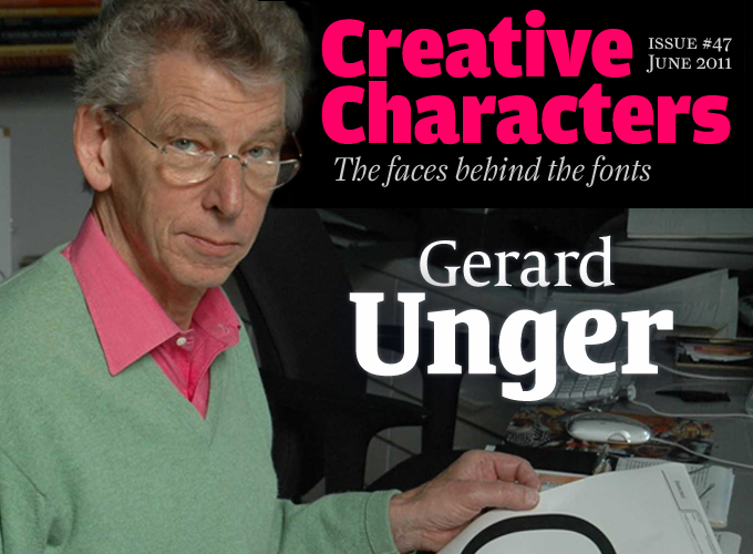
Type design has always been an exacting, highly skilled profession, but that was doubly true in the early days of digital fonts. These faces had to work in highly demanding, challenging environments: CRT monitors, low resolution printers, and in a rapidly evolving newspaper industry. This month we are talking to one of those individuals who tackled the limitations of technology head on. His pioneering techniques, first developed under Wim Crouwel, were later employed by Bitstream and URW, and utilized on road signs and in newsprint, establishing a body of work admired the world over, both for its pragmatic, steely clarity, and its warmth and openness. He has now teamed up with TypeTogether, a foundry run by two of his former students at Reading. It is an honor to welcome Dutch designer Gerard Unger, one of the most original minds in contemporary type design.
You once said that somehow you always knew you wanted to be a type designer. How old were you when you discovered that particular talent and interest — and how did it manifest itself?
Of course, it’s not literally true that I always knew I wanted to be a type designer. In 1961 at the age of 19, I saw drawings by Jan van Krimpen at the Municipal Museum of Arnhem, of lettering for stamps made with pencil on paper. I was struck with the thought: “Is it that simple — all you need is a piece of paper and a good pencil?” I bought both and I was in business; I haven’t stopped since. Later I realized that I came prepared, as a boy having played with copies of Arts et Métiers Graphiques, a famous French graphic design publication, and with a damaged copy of Piet Zwart’s Book of PTT, a famous children’s book about the postal services. Also, my father’s bookshelves were filled with fine typography. When I started reading literature, many books were designed by Van Krimpen as well. And when I decided to study graphic design, my father told me that his father, who had died young and whom I never knew, was a typesetter and printer. So you start wondering…
You enrolled in the Rietveld Academy in Amsterdam. Was that an obvious choice? What were the courses like?
After I had done my stint in the army, my brother, who had recognized my interests, told me go to Amsterdam to study at the Rietveld. There was (and still is) a good art school in the city my of birth, Arnhem, but at that time it seemed better to leave the province. In Amsterdam one of my teachers was Theo Kurpershoek, a painter, typographer and calligrapher, who had much to offer and stimulated a wide interest beyond letterforms. He also brought me into contact with the Amsterdam Typefoundry, its well stocked library (now in the Amsterdam University Library), and many professionals including the Typefoundry’s typographic adviser, professor G.W. Ovink. Otherwise most of the Rietveld courses were still an imitation of the Bauhaus, but we had lots of freedom to pursue our own interests. If you really wanted to delve into a subject, you got all the help you wanted.
Having been trained as a graphic designer, you soon began specializing in typeface design. How did one thing lead to another?
My first job after leaving the academy was with Wim Crouwel at Total Design for six months, followed by another job with an advertising agency. It was all about gathering experience: working with clients, doing business, meeting deadlines, what kind of jobs would I be good at, etcetera. In the evenings and the weekends I kept working on type designs. Basically this has remained my working pattern, combining general graphic design (there are very few jobs I would say no to) with type design and studying the history of these interests and satisfying a wider cultural interest as well.
What impressed me enormously when working with Wim Crouwel and at the advertising agency, was the generosity towards a budding colleague — the help and the support I received. There were a few years when I had several jobs at the same time: part-time advertising design, a part-time job at Enschedé Printers, teaching evening classes at the Rietveld and building up a freelance practice, which began seriously in 1975.
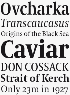
Capitolium News 2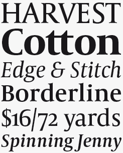
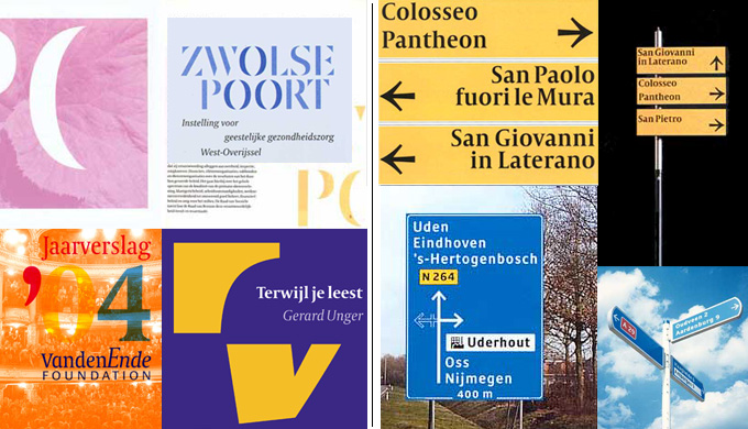
Capitolium News was commissioned by the design firm n|p|k for the wayfinding system they developed for Rome’s Holy Year celebrations in 2000. Although not going all the way back to Ancient Rome, for his inspiration Unger took the work of sixteenth-century calligrapher Giovan Francesco Cresci, who was the first person to design lowercase letters to go with the inscription found on Trajan’s column. The result, rather than being a revival, creates a continuity from Rome’s ancient history, through the Renaissance into modern industrial typographic design.
Oranda
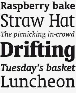
Oranda began life as a custom font for Dutch office printer manufacturer Océ. An office aesthetic was the inspiration for Unger basing his designs on typewriter characters, with subtle modifications including proportional spacing and tapered serifs. In addition to the regular, italic and bold variants, Oranda features a more informal condensed pair of weights, useful for headlines.
What did you learn from Wim Crouwel?
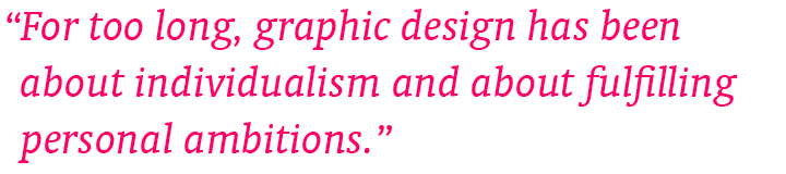
What seemed amazing when I joined his company Total Design in 1967 was how simple it all seemed. When Wim explained how to design and do typography, you got the impression it had always been done like that and that it couldn’t be done any other way — maximum clarity. Later, I realized that this approach also had its limitations. When graphic designers had to select a typeface, they automatically specified Helvetica and stopped thinking. Wim’s own work was different: it seemed clear and simple, but was full of refinement, which comes naturally to him. That is probably why it is so attractive to younger generations: simplicity with sophistication. Yet I personally wouldn’t welcome a revival of Swiss typography — it was too formulaic. Also, I think design should be more of a social thing than that. For too long, graphic design has been about individualism and about fulfilling personal ambitions.
Type design in the 1970s was a very small elite. How did your big break come about?
After graduation you can try to find a job, to try and occupy an existing chair. But you can also make your own chair. You may be able to take advantage of opportunities that you’ve spotted, but you can also create your own. I had something to say. I had a view on letterforms, some of it based on Crouwel, with a lot of clarity and simplicity, but not just sans-serif. So I designed Demos in 1973 to express my vision. To my astonishment and joy it was taken seriously and was bought by the Rudolf Hell company in Kiel, Germany, to be installed on their Hell Digiset machines. I had been introduced to Hell through an Amsterdam printer, Frans Spruijt, who supported young designers and who introduced me to a typesetter who owned a Digiset, who in turn told me to speak to the Hell company’s Dutch representative, who then made a telephone call to Kiel… I was lucky, of course. All these people were fascinated by the new technologies and were men of vision.
What was font production like in those days?
When my work for Hell began, in 1974, their Digiset machines were still equipped with cathode ray tubes — a low resolution light source. All designs were made on graph paper with small black squares. The letterforms were constructed from these building blocks. I made large scale drawings, looked at these frequently through a minifier (the opposite of a magnifying glass) and made corrections with white and black paint. These drawings were scanned (yes, Hell developed the first scanner too) and stored into the Digiset as groups of numbers, as commands for yes and no, light on, light off. Otherwise, the Digiset was a regular photosetter, using photographic films and papers with lenses for enlarging and reducing type sizes. Then, in 1977–78, another German company, URW, introduced the Ikarus system, meaning I could draw my letterforms as pencil outlines on transparent paper. Hollander was my first design made this way.
How did you experience the transition from those high-end machines to desktop typography?
When the Macintosh quickly penetrated the graphic industry from 1985 onwards the change was dramatic for the industry, but not for me. Many type foundries, typesetting machine manufacturers and typesetting studios disappeared over the next few years. When Hell stopped being a client I began working with URW instead. Bitstream asked me for a design, and there were several other big clients. So, I had a good escape.
Coranto 2
Founded on earlier work by Unger (chiefly his typeface Paradox) Coranto 2 is a robust newsprint face with a low stroke contrast and a large x-height. The elegance of its predecessor translates well to the more demanding environment of print, while remaining an attractive choice for a wider range of print and online applications.
Swift 2.0
Unger named Swift after the bird — compact, efficient, quick and elegant. At the time of its design in the early 1980s these were all qualities missing from the prevalent typefaces used in newspaper printing, and Unger’s self-initiated solution helped the industry move towards higher production values throughout that decade. Nowadays seen in books and papers as well as advertising copy and corporate identities, Swift’s heritage clearly appeals to designers looking to evoke the authority of newsprint.
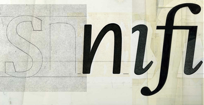
A montage of character development sketches, from left: Oranda, ITC Flora and Swift.
How would you describe your approach to type, your “type design philosophy”?
Hm. On the one hand, what I have always tried is to make typefaces that the customer instantly feels comfortable using; fonts that look as if they have been around for a while. On the other hand, there is an experimental aspect to my typefaces: investigating legibility, clarity, economy — and as much of that as possible, even to the extent of taking letterforms beyond conventionality. With Swift for example, during the first three years of its life, clients and readers saw its novelty; they noticed the experiment with large counters and angularity, and many found this disturbing. Three or four years after its introduction these comments stopped. Apparently clients and readers had grown accustomed to the experimental side. I have always tried to stick to this edge.
Matthew Carter has said that each of your typefaces bears an unmistakable Unger stamp — that you have a style all your own. Do you agree with that analysis? What are those Ungerian traits that are the connecting threads across your body of work?
Very kind of Matthew. For me it is difficult to say. I am very close to my own work and to be able to point out these characteristics, you need distance. I know that all my curves are typically Ungeresque, but to me they are the most common curves imaginable. Linotype’s Nadine Chahine has written that my curves seem to be made of steel. What I have aimed at is to give them tension, to make them active, asymmetrical, never neutral and dull. And then, as mentioned above, there is the openness and clarity.
Amerigo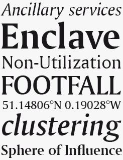
Having not only survived but done well in the mid-1980s environment of low resolution laser printers for which it was designed, Amerigo today is a sharp, tapered and incisive typeface in the tradition of Optima and Albertus, and well suited to the vagaries of variable screen rendering technologies.
Left: a selection of Unger’s graphic design work. Right: Signs for Rome’s Holy Year 2000 Celebration, featuring Capitolium; and the Dutch Motorists Association (ANWB, in collaboration with the design firm n|p|k)
All your typefaces have meaningful names: Swift, Amerigo, Oranda, Gulliver, Capitolium. Could you say something about naming typefaces?
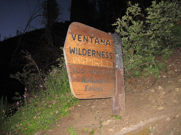
Don’t make too much of this. The story about Amerigo is telling. I first wanted to name it Ventana, the Spanish word for window. When we — my wife Marian, my daughter Flora and I — travelled by car from LA to San Francisco along Highway number 1, there was a sign saying “Ventana Creek” and “Ventana Wilderness”. When we were back at our hotel, I called Mike Parker, who ran Bitstream together with Matthew Carter, and explained to him how I found the name. There was a long silence on the other end and then Mike hesitatingly replied: “Well, there is a difficulty… Six months ago Matthew made the same trip, and right now he is working on a design called Ventana.” When Matthew sold the design to Apple later, they preferred not to use the name Ventana, as it means “window” and was too close to the competition. So it became Skia, and Ventana is still available.
You will understand for whom ITC Flora was named, and Swift… ah, I love those birds. As many people thought I had been thinking of Jonathan Swift, I perversely named a later design Gulliver, and so on.
You’ve worked on a number of custom typefaces for signage. Can you describe some of the particular challenges involved in such a specialist assignment?
Signage involves completely different conditions from print or the screen. Imagine an extreme situation: you are traveling by car at 120 km/h, it is raining, kids are quarreling in the back, you are worried because you think you have missed an exit. A designer has to work with those conditions in mind. Also, signs are often of limited size, requiring extreme economy. Those are the main constraints. Other than that, you want the letterforms to look nice, just as for print.
ITC Flora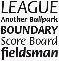
ITC Flora is different from most other typefaces in Unger’s body of work, yet it is perfectly consistent with his more extended text families. Based on the designer’s calligraphy and handwriting studies with a felt-tipped pen, it combines characteristics of a modern sans-serif with those of italic handwriting. The result — a humanist sans-serif italic display face with a slight slant — was unique at time of its publication in the mid-1980s and has remained an inspiration to contemporary designers. Used in brochures, advertising or corporate identities, it lends a clean yet informal character to the page.
You were a teacher at the Rietveld Academy in Amsterdam for decades, before becoming the first university Professor of Typography in the Netherlands. You also teach at the master’s program in Type Design at Reading University. What does teaching mean to you?
Contact with students, difficult questions, all kinds of challenges, the need to keep up to date and well-informed about new developments. It is popular wisdom that by teaching, the master learns more than the students.
Type design used to be quite an obscure profession that wasn’t taught in many art schools. Now there are more and more schools world-wide that offer a degree in type design. Is that a good thing? Will there ever be too many type designers?
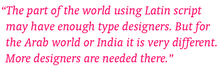
Well, I do think that in the part of the world using the Latin script we may have enough type designers. But for other scripts the situation is often very different. Think of the Arab world, for example, or India. More designers are needed there. In my part of the world, I see too much repetition right now. Many of the “new” sans serifs, for instance, are trying to fill ever smaller gaps between existing sans serifs. If type designers would concentrate more on originality, not only personal originality, but trying to find answers to original design challenges — then I think we could use more designers.
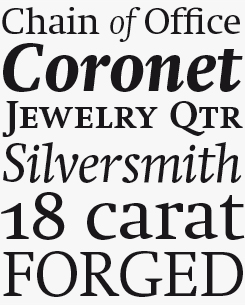
Gulliver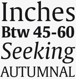
Ownership of Gulliver is a somewhat exclusive business. Unger only sells it through his own site, and at a minimum of twenty licenses a time to “organisations and companies whose printing work will do justice to its space-saving capabilities.” Wide open counters, a large x-height and very short serifs (contrast these letterforms with Swift) make Gulliver “the most economical typeface in the world”. It has literally saved publishers fortunes in printing and paper cost.

Who would you interview?
Creative Characters is the MyFonts newsletter dedicated to people behind the fonts. Each month, we interview a notable personality from the type world. And we would like you, the reader, to have your say.
Which creative character would you interview if you had the chance? And what would you ask them? Let us know, and your choice may end up in a future edition of this newsletter! Just send an email with your ideas to [email protected].
In the past, we’ve interviewed the likes of Michael Doret, Laura Worthington, Jonathan Barnbrook, Rob Leuschke, David Berlow, Ronna Penner and Jos Buivenga. If you’re curious to know which other type designers we’ve already interviewed as part of past Creative Characters newsletters, have a look at the archive.
Colophon
This newsletter was edited by Jan Middendorp and designed using Nick Sherman’s original template, with specimens and type descriptions by Anthony Noel.
The Creative Characters nameplate is set in Amplitude and Farnham; the intro image features Capitolium News 2 and Oranda Condensed Bold; the pull-quotes are set in Oranda BT Italic; and the large question mark is in Farnham.
Comments?
We’d love to hear from you! Please send any questions or comments about this newsletter to [email protected]
Subscription info
Want to get future issues of Creative Characters sent to your inbox? Subscribe at www.myfonts.com/MailingList
Newsletter archives
Know someone who would be interested in this? Want to see past issues? All MyFonts newsletters (including this one) are available to view online here.