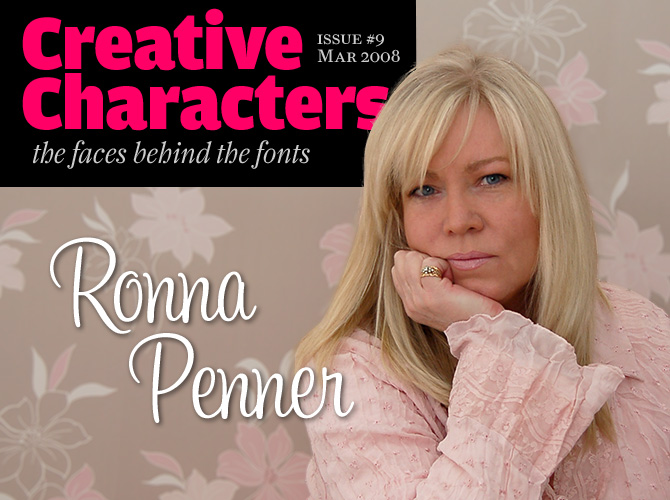
The growing interest in script and handwriting fonts has resulted in some remarkable success stories. A few months ago we featured Font Garden’s Ellinor Maria Rapp, who in turn expressed her admiration for her Canadian colleague Ronna Penner. And Ronna’s story is quite interesting too. Her foundry, Typadelic, submitted its first fonts to MyFonts years ago. Sales remained slow for a while and she concentrated on other activities. But lately she’s come back with a vengeance, hitting the top of our charts with Sweetheart Script and Cookie Nookie. And as you will see, there’s more where that came from.
How did you become interested in lettering and fonts?
I’ve been making them all my life, really. When I was a kid I would scrawl alphabets on every scrap piece of paper I could find. I used to experiment with different type styles, from chunky lettering to pretty script faces. I’d fill page after page with alphabet scrawl until the white of the paper was obliterated.
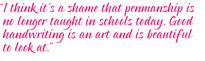
When I was a kid in school we had penmanship classes and I took great pride in my handwriting, occasionally winning penmanship contests. Not hard to do when everyone else was outside climbing trees… I just wanted to draw letters! I still have books filled with my handwriting samples and actually used one of my early samples to create Velvet Script. In that font you can see influences of The Palmer Method as it was taught in schools in the 1960s.
I think it’s a shame that penmanship is no longer taught in schools today. Good handwriting is an art and is beautiful to look at. Compare the penmanship of days gone by with what passes for handwriting today!
When I decided to go to college for graphic design in the early ’90s, my interest in lettering and (especially) fonts came to the fore. Computers were not tools we had access to at that time so we made do with Letraset or we designed our own lettering for titles or logos. This was right up my alley and I really enjoyed it.
Once I graduated I bought my first Mac and shortly after that the internet found its way into my life. It didn’t take long for me to become a font junkie.
Which type designers inspire you?
About 10 minutes after I connected to the internet for the first time, I found Font Diner and fell in love with those fonts and with the site itself. What could be cooler than a font vending machine?
Chank Diesel’s site was another one I visited often, and if I remember correctly, I learned how to make fonts using a tutorial that is still found on his site. Thanks Chank! From afar I thought he was a pretty cool guy and one very prolific font designer.
You were a “concept designer” in the greeting card industry. What does a concept designer do? Is lettering or type design part of the job?
My job as a concept designer was simply to develop concepts for low cost greeting cards.
Interesting lettering is definitely a part of greeting card design. It has to evoke some kind of emotion on the part of the buyer: happiness, a sense of playfulness, etc, and to ultimately communicate what the buyer wants to express. That seems like a rather big job for a typeface to accomplish, and that is where my desire to develop typefaces was born. I spent many hours searching for just the right font for the job, and – not always finding it – decided to develop my own to express exactly what I needed it to.
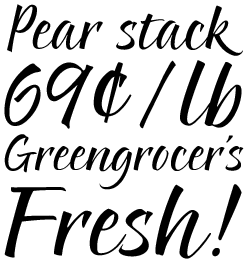
Sweetheart Script
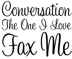
Sweetheart Script, Typadelic’s most popular typeface, is a charming upright script drawn with great care and sensitivity. Its lowercase letters connect impeccably, giving the typeface the gentle flow of a classic piece of hand-lettering. Romantic without being cheesy, cheerful yet restrained, Sweetheart Script is one of the most balanced connected script fonts recently published. We repeat the advice given on an earlier occasion: the caps are meant as initials with the lowercase – so don’t use in all-caps!
Inkster
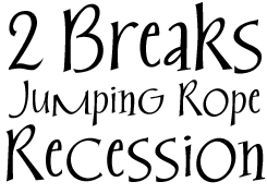
Inkster breaks all the rules – it is capricious and unpredictable. Some letters have serifs, some don’t. Some are condensed, some are impossibly wide. Some lowercase letters have uppercase shapes. The contrasting characters bounce all over the baseline. It isn’t hard to imagine a book cover design using this font in slightly varying sizes to add to the fun. A powerful calligraphic roman, Inkster is your shortest route to a distinctive lettering style. It’s part of Typadelic’s Most Popular Collection.
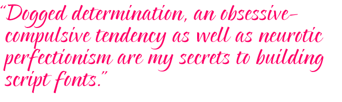
You’ve developed an impressive ability at designing script fonts. Who taught you?
I’m totally self-taught. Dogged determination, an obsessive-compulsive tendency as well as neurotic perfectionism are my secrets to building script fonts.
For me, scripts are probably the most difficult type of lettering to develop. It’s also extremely difficult to achieve the free-flowing, spontaneous nature of handwriting, and to get the letters to join properly as you type on your keyboard. I developed a technique I’m comfortable with, which works for most of my script fonts, so I stick with it.
I love seeing a script font come to life! Really, the hard work for me is building the font in FontLab, then outputting it and testing it to see what’s working and what needs tweaking. I tweak to the point of distraction. I often wonder why I make script fonts because they have a tendency to frustrate me, but I get a lot of satisfaction in seeing the final product.
Your Sketchley font family won an award in the 2001 worldwide type design competition Bukva:Raz!. Did that influence your decision to specialize in type design?
Winning the Bukva:Raz! award was in my early days of typeface design and it absolutely influenced my decision. Sketchley was an experiment to see if my designs had a viable audience. To get some recognition early in my type designing career confirmed that there might possibly be a market for my fonts out there.
So I began working on a few typefaces and developed Typadelic as a showcase for my designs. I haven’t looked back.
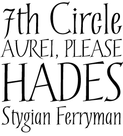
Pointed Brush
Pointed Brush evokes the elegant look of hand-painted calligraphy using a pointed brush. It gives your headlines the confident dash of expert lettering, alternating connected and disconnected characters with a great sense of freedom. It works admirably in longer texts as well – check out the Pointed Brush specimen PDF.
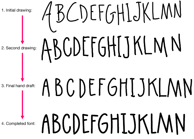
The evolution of Ronna's Jinxed from rough hand sketches to a finished digital font
Your other website is Scrapadelic, devoted to the art of scrapbooking. Could you tell us a little more about scrapbooking – and about the link with your fonts?
I’ve always been a scrapbooker, even before I knew there was a name for it. I’ve always kept my family’s pictures in albums and, later on, added titles and dates and a few tacky floral stickers here and there to make the pages look interesting.
At one point MyFonts asked me to develop an advertisement using my own fonts for a scrapbooking magazine. I didn’t know such magazines existed. After doing some research and creating my ad I soon realized how well my fonts suited digital scrapbooking.
Digital scrapbooking really appealed to the graphic designer in me. Developing fonts can be a colorless and sometimes mundane job but scrapbook design is full of glorious color, a definite change of pace from font making. I started designing scrapbooking kits and selling them online. While I experienced some measure of success and still love the scrapbooking industry, my heart is in fonts and always has been.
Two of your fonts, Sweetheart Script and Cookie Nookie, have been extremely successful lately. Were you surprised – and has it in any way changed your plans for the immediate future?
Sweetheart Script was first released in the digital scrapbooking market as an experiment to see how well it would sell. It had a very limited character set and a low price. I was surprised to find that sales were lower than expected even given its low price, and it was one of the reasons why I decided to pull it from the market. The finished font sat on my computer for two years while I developed my scrapbooking business.
I released Sweetheart Script at MyFonts in December 2007 – and it got a much better reception! That font is my personal favorite and I am pleasantly surprised to see it do so well. It hasn’t changed my plans for the future other than to develop more script fonts. I have one in the works, which I’ll be releasing in early spring.
I have to chuckle when I see the name Cookie Nookie. Can you tell I didn’t know what to name it? To me, naming fonts is like naming race horses. The names don’t always make sense.
Your fonts are usually priced at just under 20 dollars, which is very reasonable. Cookie Nookie costs much less. Why did you make it so cheap?
Another experiment. I’ve spent a few years in the digital scrapbooking industry where products are very under-priced. I personally don’t know many scrapbookers who are willing to pay full price for a font they may use once or twice, so my strategy was to make a really usable, reasonably priced font (read: cheap!) for both the graphic design industry and the scrapbooking industry.
Mirielle
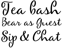
The scope of Ronna Penner’s lettering styles is quite impressive. Mirielle is another connected script, more whimsical than, say, Sweetheart Script, and with more of a calligraphic contrast than Amelie; while informal in style, its rhythm is regular and orderly. Striking a nice balance between sharp angles and luscious curves, Mirielle is an original script with a playful twist. It is part of Typadelic’s Script Collection.
Garden Party
Garden Party belongs to the same category of calligraphic romans as Inkster, but it’s a more regular and therefore perhaps easier to use. It will work wonders on an illustrated book or brochure cover, standing out a little more than a brush script font. Garden Party is part of Typadelic’s Most Popular Collection.
Could you mention two or three typefaces you wish you had designed? What kind of font would you most like to design if you had unlimited time?
I wish I had designed any one of Rob Leuschke’s stunning fonts. His Inspiration is a wonderful, playful, flowing typeface that I use on many of my scrapbooking layouts. Sloop Script from the Font Bureau is a gorgeous typeface and I wish I had the discipline to design something like that. I’ve just discovered Canada Type who also have some beautiful typefaces.
If I had more time I’d like to work on vintage handwriting fonts like some I see from P22, or The Type Quarry.
Why do you give Black Jack away for free?
I get this question a lot. The truth of it is, I didn’t much like that font and couldn’t see charging for it. I have to really like my fonts to release them for sale. However, I thought it would make a really awesome free font! I see Black Jack used everywhere and still can’t say it’s my favorite. The funny thing is, I do feel some pride when I see that someone liked the font well enough to use it on their signage, or packaging. I always say to myself, “I designed that!”
Thanks so much for your time. Keep the scripts coming!
Amelie
Amelie is a monolinear, connected script that could have been written with a felt-tipped or Speedball pen. It’s a bit like a grown-up, less schoolish version of Velvet Script. The little flourishes that connect to the beginnings and ending of letters may lend extra flair to your lettering. Amelie is part of Typadelic’s Most Popular and Script Collections.

Who would you interview?
Creative Characters is the MyFonts newsletter dedicated to people behind the fonts. Each month, we will be interviewing a notable personality from the type world. And we would like you, the reader, to have your say.
Which creative character would you interview if you had the chance? And what would you ask them? Let us know, and your choice may end up in a future edition of this newsletter! Just send an email with your ideas to [email protected].
During the past year, we've interviewed the likes of Chistian Schwartz, David Berlow, Dino dos Santos and Underware. If you’re curious to know which other type designers we’ve already interviewed as part of past Creative Characters newsletters, have a look at the archive.
Credits
This month’s interview was conducted and edited by Jan Middendorp and designed by Nick Sherman.
Supporting fonts
The Creative Characters masthead is set in Amplitude and Farnham; the intro image features Sweetheart Script; the pull-quotes are set in Pointed Brush; the large question mark is set in Farnham, and the small URL at the top is set in Unibody 8.
Unsubscribe info
This message was sent to:
[email].
It is never our intention to send unwanted e-mail. If you no longer wish to receive this newsletter, you may change your subscription settings at: www.myfonts.com/MailingList
Comments?
We’d love to hear from you! Please send any questions or comments about this newsletter to [email protected]