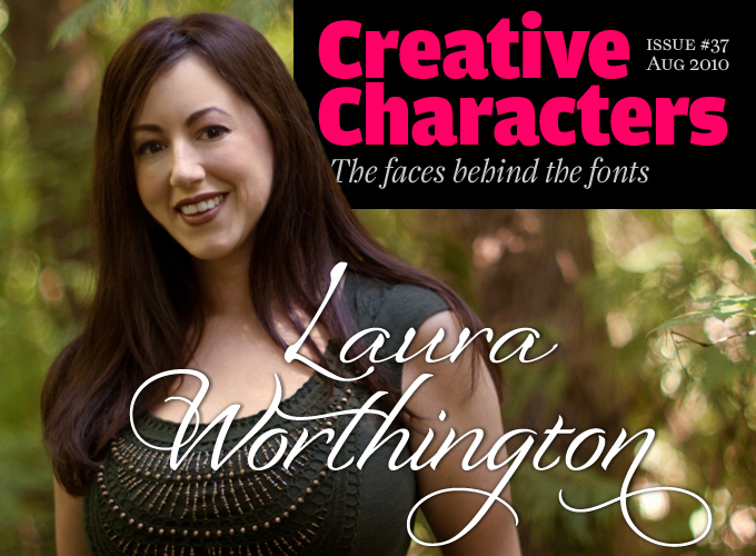
In the eight months since Laura Worthington joined MyFonts, she has published an impressive run of original script fonts, all meticulously designed and each of them very successful. Based in Bonney Lake, south of Seattle, Laura Worthington turns her expertly crafted hand-lettering into fonts through “patience, a tendency towards being obsessive over the smallest details, and the ability to focus your attention on work that sometimes seems like you’re watching paint dry.” Meet Laura Worthington, a woman with a plan.
Laura, you seem to be amazingly versatile: a graphic designer, lettering artist, calligrapher, illustrator, teacher, type designer… Where did it all begin?
Thank you! My love of letters began in elementary school. When I was in the fourth grade, I was fortunate to have a teacher who believed penmanship skills were paramount. She taught our class how to write in Italic script instead of the cursive round-hand styles that were commonly taught. Her theory was that italics are just as aesthetically pleasing as round-hand styles except that since the letters are not connected, they take a little more time and attention to write, making them clearer and easier to read. I was very inspired by her instruction and calligraphy quickly became my main interest. I started lettering certificates and poems for teachers, friends and family and would treat everything I wrote, whether it was a note to a friend or a list, as if it were practice — an opportunity to explore new styles and perfect my skills.
By the time I was ready for college, I knew I wanted to pursue a career that would include some element of calligraphy, but I wasn’t certain of how to approach it. In talking to others I was told that I should consider graphic design. I didn’t quite understand what it was, but I felt that it was close and I liked the idea of combining computers with art. During college, my professor opened up a Workbook (a sourcebook for finding photographers, illustrators and lettering artists) and showed me the section dedicated to lettering artists. It was a defining moment for me. I was very naïve about this. Type and lettering design is so easily overlooked precisely because it is so common and pervasive in our society — it’s everywhere. I finally understood how my love of letters could be used, and I also became aware of the beauty of typography. Then the problem became: how do I break into this? I decided to continue down the related path of design as I knew it would lead me to the answers — all would eventually become clear.
During my years in graphic design, I would create as much lettering and illustration as I could. The problem was that it wasn’t needed that often inside the design studios I worked for. My desire to be independent has always been very strong, and so about five years ago, I struck out on my own, doing identity design, websites, print — just about anything that falls under the graphic design umbrella.
How did you get from lettering and calligraphy to type design? Were you skeptical at first?
I had long been a fan of script fonts and so was never skeptical about the translation from lettering to type design — I saw that it could be done, and beautifully too. To me, the progression from lettering to type design was and is a very natural thing — all of my fonts to date are based on my hand lettering. But the process of how to get there was a bit baffling.
Then, a few years ago, I met Charles Borges de Oliveira, who really has been the key to what I am doing now as a type designer. We would call each other and talk about projects we were working on, what we dreamed of doing in this industry. Charles had been very successful with fonts such as Sarah Script and Alpine Script (he truly is an amazing lettering artist and type designer) and he encouraged me to pursue type design. Although I found it fascinating I resisted at first. It seemed overwhelming to learn an almost entirely new profession when I was still so new to working as a freelance designer.
Finally, in December of 2009, we decided to meet up to spend a few hours together — I answered his questions about Dreamweaver for a website he was working on, and he answered my questions about FontLab. Just that hour or two of his instruction and everything started making sense about how to proceed with developing a font. Charles’ energy and encouragement was what I needed. I began work that weekend on GrindelGrove and finished it a couple of weeks later.I was completely hooked. I felt like I had finally found what I had been looking for — my true passion. Without trying to sound too sappy, I am eternally grateful to Charles for his friendship and support — I’m not sure if I would have done this without his encouragement and tutelage.
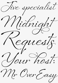
Sheila
Sheila is Laura Worthington’s current bestseller, having topped our Hot New Fonts list for weeks. Although this is, of course, a font and not hand-lettering, Sheila’s letters all impart a sense of individual craft and detail lovingly applied. The overall effect is a natural, open, looping fluidity; of someone meticulously committing carefully considered thoughts to paper. Thirty five alternates and an expanded ligature set — as well as a full character set — place this font squarely in the professional bracket; expertly casual.
GrindelGrove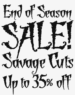
See in GrindelGrove what you will, whether violent slashes, organic, leafy ferns or a spooky, ethereal shimmer, this font has a dramatic edgy character best suited to headlines and short punchy statements. To many, this eye-catching font will immediately shout out “Halloween”! While that or similarly chilling contexts are most obvious (Macbeth poster, anyone?), brave users may want to explore other possibilities of what is actually a very adaptable typeface — Worthington herself designed the original letterforms as titles in a brochure for a native plant garden.
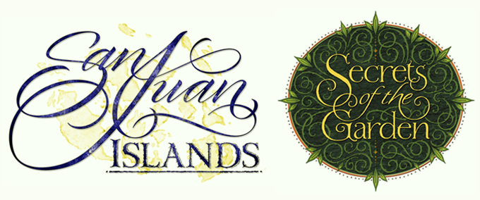
Two examples of Laura Worthington's commercial lettering style. These are hand-drawn letters: no fonts used!
What aspects of your work do you enjoy most?
The initial inspiration of a design starting to really come together, being able to type up a word or sentence in my new font and see it working. I also like putting together the marketing materials for my type designs, I get great satisfaction after finishing up a project. I also really love those moments where I get in this strange creative zone where I don’t notice whether it’s raining or sunny out, I don’t care if I’m hungry or if the phone is ringing… I’m just in this creative haze and the ideas are coming to me faster than I can get them down.
I also like coming up with names for my designs. My fonts are either named after or dedicated to my family members or friends. I do this for two reasons — the first is that this honors those around me who have been important to me in my life — after all, where would we all be without our family and friends? The second is that while working on the design, it helps me develop the personality of the style. I think of the person and what they’re like, their traits, expressions, quirks, and so on, and it gives me ideas and inspiration.
How is designing a complete font different from doing a piece of lettering?
With lettering, you have more possibilities and less restrictions. The letters may be designed and intertwined any way you want, and since they only exist in this particular combination (whether it’s a word or a phrase), there is no need to worry as to whether or not they’d work when recombined — which is of major concern when designing type. All letters have to work together in almost every combination possible — letters colliding — not always very attractive. Because of that, there has to be more uniformity so they all work well together. Uniformity can take out some of the spontaneity of the letters. Fortunately we have OpenType features that allow for more choices with the letters so you can introduce alternate versions of letters that might add more style to a word.
RecherchÉ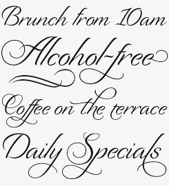
Its name is a French word meaning “with studied refinement and elegance”, while Worthington herself describes Recherché as “modestly extravagant”. With such a richly featured glyph set (11 versions of the lowercase ‘h’ alone, not to mention over 100 swash alternates and a set of formal caps), extravagance could become the default setting, but it is when using such flamboyance as occasional flourish that Recherché really lives up to its billing as a modest, readable and informal brush script, great as the text in an invite or advert.
You’ve been an independent designer for several years now. What are the most rewarding and most difficult aspects of being self-employed?
I love being in charge of how I spend my time. I tend to work in phases. There are times when all I want to do is hand lettering, play around with different ideas and just be creative without the pressure of landing on a final conclusion with what I’m doing. Then there are times when I just want to sit in front of my computer and kern my new type creation. I don’t like distractions and multi-tasking, which is generally the reality when working in a design studio setting with others.
What I find the most challenging is managing my time. I have no sense of routine or schedule in my life. For me, a Saturday is no different than a Tuesday. So I end up keeping very odd hours in my work life — which makes it feel like I spend most of my time working. Not entirely true, but close. Still, being able to work until 3am on a Wednesday night when you’re motivated and inspired to do something and then sleep in the next morning is a glorious thing. And I love being able to hang out with my dogs and work on the couch if I feel like it. Overall, the benefits far outweigh the drawbacks.
At MyFonts, we are often asked why we don’t feature more women in our interviews. The truth is: there aren’t so many female type designers who have a considerable body of work. Any idea why that could be?
I’ve often wondered the same thing myself! The industry of graphic design and of lettering design seems to be evenly balanced, so it’s very odd to me that there is this one niche that is predominantly male. It could just simply be that it doesn’t appeal to women as much as men. There are other professions that are skewed to one sex or the other. Or it could be much more deep and complex with that. I wish I knew!
greeting cards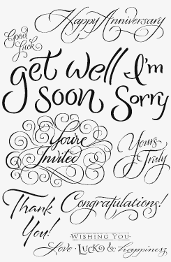
Greeting Cards is a collection of thirty or so exquisitely hand-lettered phrases and messages, from contrite and sympathetic sentiments — “I’m sorry”, “get well soon” — to exuberant declarations of love and invitations to fun times. Many are also composed in both single or multiple line versions.
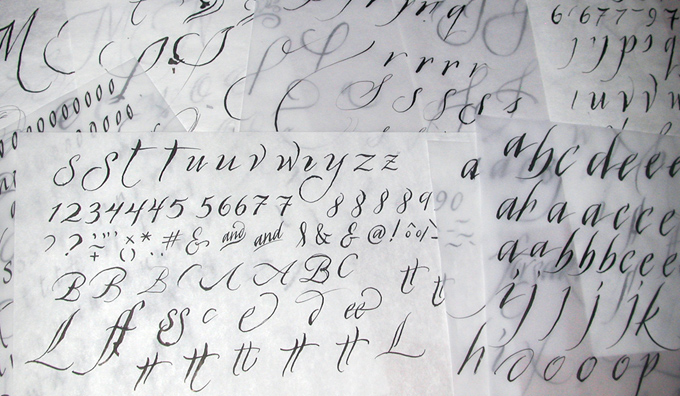
A few of the hundreds of sheets of sketches that formed the basis of the Origins typeface
Apart from a talent for drawing, what are essential qualities for a lettering artist and type designer?
Patience — lots and lots of it, and a tendency towards being neurotic and obsessive over the smallest details and the ability to focus your attention on work that sometimes seems like you’re watching paint dry. You also have to be willing to abandon or put aside an idea or design that’s not working. This can be very hard to do when you’ve put hours into something, but if you can’t make it work there’s no sense in torturing yourself over it. But all is not necessarily lost, you always learn something through the process even if it didn’t seem directly related to what you want for the final outcome. I think it’s even more important to relax and trust your instincts. Let the design design itself. For me, this method has worked best — that is, when you don’t have a specific client you’re trying to please anyhow. You also have to be willing to do research, try a lot of different approaches, and not give up or get discouraged.
How do you go about creating a new typeface?
For me, lettering is very gestural. I usually start out with pencil on paper, drawing the basic skeleton of the letters very large, then I might scan them, scale it down, print them out to a manageable size, then go over them with either a brush, a brush pen or a steel nib pen with tracing paper. Sometimes I start with one of those tools right away, experimenting with the letters I can create with it and develop ideas that way. I mix the two methods up frequently going back and forth from one process to the next.
When it comes to developing the idea for a new type design, this usually starts happening while in the finishing phases of the previous type design project. I’m usually thinking, “Well, that was fun, but now I’m onto the less creative part of this.” My mind is freed up to be creative with something different and that’s when the ideas for the next design start to percolate. So by the time I finish the production of one typeface, I already have a fairly good idea of a direction I want to pursue with the next. But as I am very dogged on starting and finishing a project and focusing on one thing at a time, it’s more of a daydreaming, wouldn-it-be-cool-if kind of thought process. By the time I’m finished with my current type design I am so excited to work on the next one I usually start it the following day after I’ve submitted my designs for publishing.
Could you describe the steps that take you from the first sketches to the finished font?
When I’m working on the lettering for a new type design, I create hundreds of letters. In the beginning, it is primarily experimentation to see how the lettering plays out. There is a big difference between concept and reality. I’ve had ideas that I was in love with, but found to be too difficult to execute so that I had to put them on hold. I’ve learned to not hold on too tight to an idea and just trust my instincts, letting the letters come out as they may. Most of my type designs are far from what I originally intended them to be. At first this was frustrating. For example, when I designed Recherché, the idea I had was more of a casual brush lettered style. By the time I got perhaps 50 hours into it, it wasn’t anything like that original idea any more. As soon as I let go and stopped trying to force it to be something it was not, the design evolved much faster and the process was enjoyable and fun.
From there, I start to refine the idea I want to pursue. Coming up with the ideas isn't difficult — deciding which direction to head in is. I start to do more direct lettering of the style I want, and letter hundreds of variations of the letters. I look at them and mark up which ones I like best, go back and redo the letters I didn’t have enough examples of that I liked. Then I scan them in. I will usually end up with three to five scanned versions of each letter. I lay them all out in Photoshop and seeing them all together like that puts me to the next phase in the design, where I start to refine the idea even further, and pick one or two versions of each letter to redraw or touch up in Photoshop with my graphics tablet. From there I copy and paste the letters from Photoshop into FontLab and redraw them with the pen tools.
Once I have them all roughly drawn in FontLab, I take a look at them again all laid out together… and that’s the point where I’m most likely to abandon the idea or change it dramatically. The process from hand lettering to refining in Photoshop to redrawing in FontLab tends to deteriorate the design from the original lettering. A lot of spontaneity is lost, and letters are all relative to each other — for example, the letter ‘a’ might have looked perfect next to the letter ‘b’, but terrible when put next to the ‘c’. So this is where I start to work out the details about what main characteristics of this type style I want to pursue and what I want to leave out. Usually I have too many ideas in one type style which is what leads to its initial chaotic design, the letters not playing well together. From there, the design makes another leap as I rework the letters to work better together. Now the design evolves very quickly, and usually sees the most dramatic change. After that comes the struggle with a few difficult letters that I always have that are hard to conceive of how to draw them to fit with the main style. Sometimes I find myself asking (whining, more like) — do we really need the letter ‘z’ in the alphabet?
And then it’s on to the finishing work.
Origins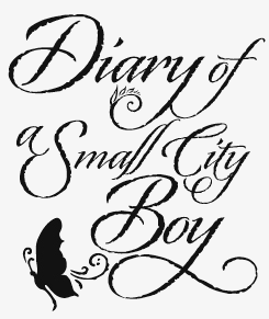
Digital type doesn’t get much more natural in its creation than Origins — finely crafted calligraphy by Worthington using a crow quill on parchment. A substantial variety of gracious ascenders and descenders, natural-feeling rough outlines and a few delicate ornaments together make for an elegant and somewhat antiquated formal look, while providing a versatile toolkit great for demanding modern design briefs; add a hand-lettered touch to unique headlines, titling, invitations, branding and more.
Regina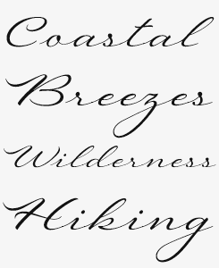
Regina demands room to breathe, coming as it does from an older, slower pace of life. Using Regina, you get the feeling that suddenly you have all the time in the world as its letters take long, swinging strides, enjoying their open, clutter-free environment. Given the right opportunity — organic food wrapping perhaps, or a classic motoring magazine — Regina waltzes in to evoke a more timeless set of priorities and values, without being overly nostalgic.
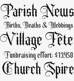
Sepian
Sepian is a hand-drawn font (i.e., not scanned from a printed source) based primarily on Textualis, or Textura in the Blackletter genre — the style most commonly associated with Gothic scripts. The addition of barbs to the terminals enhances its modern, sharp look and feel. Sepian is perfect for anything in need of a wicked, gothic and medieval atmosphere — check out the devil’s tail hooks not only on the initial caps. Use it for tattoos, a headline for a poster, a book cover, a sinister tale and more.
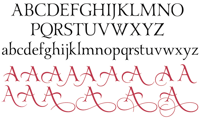
Preview of Laura Worthington’s as-yet-unpublished typeface Yana.
I'm sure there are calligraphers out there who are hoping to turn their writing and lettering into fonts one day. What would your advice to them be?
I think the best place to start is perhaps with some of the online programs that allow you to draw your own lettering, scan, then edit and manipulate your design, to see if they enjoy the process. If they do, they should invest in professional font design software, and from there start with a simple project that will allow them to become accustomed to the software and allow for a faster finish. For those who find they don’t like the process but still want their creation to come to life, there might be a type designer that would be willing to collaborate with them to develop their designs into a font.
Finally, can you tell us something about your plans for the near future?
I love variety, and I tend to want to do something different from the last project I worked on. Right now, I’m working hard on my newest design — Yana — which is a departure from the scripts I’ve been creating up to this point. It is a serif face with an old-style Victorian feel that will have a large selection of alternates both in the uppercase and the lowercase. The idea stemmed from wanting a typeface that could be used for display and text, but to be able to dress it up when needed — in a headline for example. During my time as a designer I found myself doing this often, taking a nice serif face font and altering a letter to add more style — such as adding a swash crossbar, or extending a stem to create a flourish with the letter. So this design is a cross between serif and script. There will be an initial release in September, but more will be added later, such as a bold and an antique version and decorated initials. I’ve only done single weights/styles up to this point, but expect to see larger families of fonts, as well as additions to some of my current designs, such as Origins and Sheila. And of course I plan to continue down the path of creating lots of alternates for most of my designs — especially script faces — anything to make a font look less like a font!
Thank you! We can hardly wait to see those new projects come to life.
Ladybird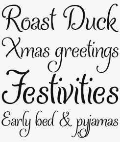
There’s something of the tiger’s tail in the way Ladybird’s descenders hang off the baseline — while at first glance all might seem relaxed and frivolous, there’s actually a steely sense of purpose behind those cuddly curves. Cleanly drawn lines, restrained decorative touches and a well-balanced contrast belie this typeface’s fluidity, making for more utility and range of use than would immediately be obvious. Applied to packaging, literature, advertising or branding, Ladybird will add a playful touch to corporate communications or grown-up functionality in more youthful contexts.
Who would you interview?
Creative Characters is the MyFonts newsletter dedicated to people behind the fonts. Each month, we interview a notable personality from the type world. And we would like you, the reader, to have your say.
Which creative character would you interview if you had the chance? And what would you ask them? Let us know, and your choice may end up in a future edition of this newsletter! Just send an email with your ideas to [email protected].
In the past, we’ve interviewed the likes of Cyrus Highsmith, Nicole and Petra Kapitza, Rian Hughes, Alejandro Paul, Dino dos Santos, Veronika Burian and Jos Buivenga. If you’re curious to know which other type designers we’ve already interviewed as part of past Creative Characters newsletters, have a look at the archive.
Colophon
This newsletter was edited by Jan Middendorp and designed using Nick Sherman’s original template, with specimens and type descriptions by Anthony Noel.
The Creative Characters nameplate is set in Amplitude and Farnham; the intro image features Sheila and Recherché; the pull-quotes are set in Origins; and the large question mark is in Farnham.
Comments?
We’d love to hear from you! Please send any questions or comments about this newsletter to [email protected]
Subscription info
Want to get future issues of Creative Characters sent to your inbox? Subscribe at www.myfonts.com/MailingList
Newsletter archives
Know someone who would be interested in this? Want to see past issues? All MyFonts newsletters (including this one) are available to view online here.

