
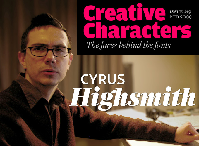
Photo by Adam Twardoch
Cyrus Highsmith is a senior designer at Boston’s Font Bureau. With his contemporary body of work, he has established himself as one of the truly original new voices in American type design. He’s somewhat of a designers’ designer — many of his peers hold him in awe for the sheer audacity of his letterforms. Jean-François Porchez, himself one of the most respected type designers in France, called him “the W.A. Dwiggins of today”. Meet Cyrus Highsmith, a natural draftsman.
Contrary to many other type designers, you never had a previous life as a graphic designer, lettering artist or illustrator. So you must have realized at a pretty early stage: “I am going to be a type designer!” When did that happen?
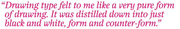
Actually, I did not realize I wanted to be a type designer until fairly late. I studied painting and fine art for a while and eventually landed at RISD to study graphic design. While there I got more and more interested in typography. It seemed to me that to be a good graphic designer, you had know about type. So I wanted to learn about that. To create the typography I wanted, I started to draw my own letters. Drawing letters quickly became the most interesting part of the project for me. Making type was more fun than just using it. But more than that, drawing type felt to me like a very pure form of drawing. It was distilled down into just black and white, form and counter-form, contour and shape. I felt like I really found something I could do.
Like many designers in my generation, the first type designer I had ever heard of was Zuzana Licko of Emigre. In fact, I wasn’t really aware you could be a type designer until I became of aware of her work, which was new and exciting, and it was changing the way things looked. It made a big impact on me.
At RISD, there were no classes in type design. It is too specialized and until recently, it wasn’t really technically feasible for an individual to make a typeface like it is now. In addition, at that time, I think the department was skeptical of the idea of making new typefaces. The classic ones they were accustomed to using seemed to be working just fine. But despite any modernist misgivings, the faculty at RISD was very supportive in the sense that they connected me with Font Bureau in nearby Boston, got out of the way, and mostly left me alone. It was exactly what I needed. I thrive when I can work independently in a more unstructured environment.
As a student, I would visit Font Bureau every few months to show them my work, ask questions, and get feedback. After I graduated I went up for another visit and 11 years later I still haven’t left.
Who taught you how to draw type?
I was mostly self-taught until I got to Font Bureau. My apprenticeship there lasted three or four years. I was very lucky to have been able to work as an assistant for some of the best — Tobias Frere-Jones, David Berlow, and Matthew Carter — which was pretty amazing. Looking back, each one’s lessons ended up being distilled into different aspects of type design. From Tobias I learned a lot of the production tricks and methods that go into making fonts. But the main thing I learned from him was how to see type and how to explain this to other people. From David I learned about spacing and approaching type design using systematic thinking. And from Matthew I learned about craftsmanship and drawing. I still work closely with David and Matthew, although our relationships have evolved.
My biggest influence on the way I draw was my mother, who is an artist. She taught me to look at negative space. The lesson came one day when I was frustrated that my drawings of trees never really looked like trees. They just looked like a bunch of lines. I could not get a feel of the shape or structure of a tree. She taught me to draw the shapes between the branches instead of the branches themselves. When you do that, you quickly come a lot closer to actually drawing something that resembles a tree. When I am drawing letters I use the same approach. I am drawing the white shapes, not the black strokes. So the relationship between the white shapes on the inside of the character and the outside of the character is something I am very interested in.
ZÓcalo series
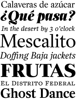
Cyrus Highsmith’s latest font family on MyFonts was commissioned by Eduardo Danilo for his dramatic redesign of El Universal, a leading daily in Mexico City. Zócalo is among the most innovative newspaper typefaces published in recent years. Inspired by sources as diverse as the romans by 17th-century Transylvanian émigré Nicholas Kis, and Chauncey Griffith’s classic news face Ionic, the lively text face is both strikingly original and pleasant to read.
The raw energy of Mexico City pulsates in the more contrasted Zócalo Display. Zócalo Banner is meant for intermediate sizes: it’s more subtle than the Zócalo Text but has less delicate hairlines than the Display.
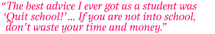
Biscotti
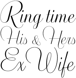
Biscotti is very different from other Highsmith typefaces — that is because it was designed for a different kind of client. Brides magazine wanted “a typeface that makes the reader feel pretty; it should capture the voice of this happy occasion”. Highsmith developed a simple and clean descendant of the flourished engraved scripts that are traditionally deemed suitable for wedding invitations and the like. Biscotti is a contemporary typeface that captures the smiling spirit of these classical forms.
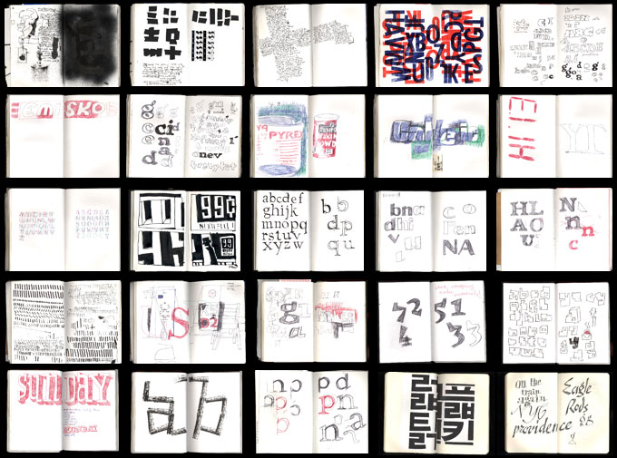
A collection of various pages from Cyrus’ personal sketchbooks (see more here)
If you had not discovered type design, or it hadn’t discovered you, what do you think you might have become?
Who knows? I cannot remember a time when I didn’t want to be some kind of graphic artist. Actually, that’s not true. When I was five or six I really wanted to be a garbage man. Specifically, I wanted to be the guy who got to hold on and ride on the back of the truck.
Many type designers today look at historical models for inspiration, but you son’t seem to do so as much. Apart from a few exceptions, such as Relay, your typefaces seem to have no stylistic precedent. Each one tackles the age-old problems of readability and personality in a very personal and innovative way. How do you do it? How do you generate ideas for new typefaces?
My philosophy is that when an artist really pays attention to the needs of the audience, and is serious about craftsmanship, the result will be work that is imaginative and inventive. Original work, in other words. This doesn’t mean it comes from nowhere, or is a complete break from what has preceded it. It means that the work adds something new to the world. The effect of a new addition can be subtle, or it can rattle the whole ecosystem.
Today, there are more typefaces available than ever before. So do we still need new ones? Maybe. Maybe not. But it’s what happens when it’s done right. Of course, no one can do it right every time. When you create for a living, sometimes your efforts can fall short for a whole variety of reasons. But you try. I think these things are true for any creative pursuit.
But to be honest, at the same time I don’t really know where my ideas come from. It is terrifying in this sense. I am a pretty disciplined person but there is a part of my creative process that is out of my control and I just have to be grateful for it when it works.
As you just pointed out, you’ve spent your entire career so far as a type designer at Font Bureau. Did you ever consider going anywhere else, or becoming independent?
I have been there so long because it is a symbiotic relationship. Both Font Bureau and I are happy when I can focus on drawing. I have the kind of space and amount of independence I need within the organization to do that. It is very unstructured. This can drive some people crazy but for me it is great. Plus I like the people I work with. It is a small group but we all respect and support each other.
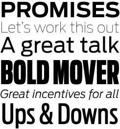
Dispatch / Stainless
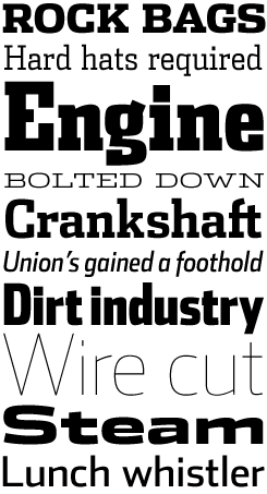
Dispatch is a slab serif typeface that is radically different from the geometric slab serifs of the early 20th century (think Stymie or Rockwell). It has a nuts-and-bolts quality, without being purely mechanical. Its originality and brashness have made it a popular face for magazines and advertising
After Dispatch came Stainless. Highsmith: “I started cutting off the serifs from Dispatch one day just as an experiment. I liked the results so I kept going. The important thing was that the sans-serif design should not appear to be Dispatch with something missing.” Stainless has lower contrast, and reworked shapes to compensate for the missing serifs; yet the two families are highly compatible and can successfully be combined in the same project.
Do you get to decide for yourself what projects you take on, and which typeface you’re going to work on next?
Yes, mostly. In the past, I worked a lot on commission, responding to requests from publication designers. Lately, I work mostly on self-initiated projects which they publish and promote. There are a couple of publication designers whom I continue to work with, and sometimes Font Bureau throws something on my desk that needs to get drawn and I am happy to do it. The most consistent kind of thing on my desk is making new additions to my older work. It seems like there is always something that needs italics or small caps or another weight or something to keep me busy when I’m between new projects.
Your other job is as an instructor of typography, if that’s the right title, at Rhode Island School of Design. In what ways does teaching influence your work as a designer?
I think my official title at the moment is “critic”, which I have mixed feelings about. But it doesn’t matter much what they call me. I am a designer and an artist, and I work with the students as a designer and an artist. My role is to show them what I know how to do, and get out of their way. Students are already connoisseurs and critics by virtue of being engaged enough with their medium to decide they want to pursue it as a profession. Their education hopefully can broaden their horizons. Art history is important. However, skill needs to be the primary focus of an artist or designer’s training.
I teach two classes. "Typography 1" is the first of three required classes in typography all the graphic design majors take. It is often the first typography course the students have ever taken so it is basic but we get really deep. It is a foundation that prepares the students for the next classes in the series where they learn about setting type in different kinds of documents.
The other class I teach is a type design elective for the advanced students — a crash course in letter drawing. Its goal is not to educate type designers: I want the students to become more sophisticated users of type. Drawing your own typeface is a way to sharpen your eyes so you can make smarter decisions when it comes to choosing a typeface and setting type. The goal, in other words, is to make them into better typographers. And if they decide to go further with type design, they’ll be off to a good start.
So I see the students at the very beginning of their design education and some of them again at the end. I don’t know much about what happens in between, and I kind of like that.
The reason I teach is that it offers me another point of view from which I can approach the subject of typography. I enjoy figuring out the structure of the class and figuring out ways to explain things for a lecture. But the more time I spend in an academic environment, the more I want to get back to my studio so I can draw and work on my own stuff. It reminds me how important actually making things is for me. The students are at the exciting stage where they are manic to learn as much as they can, as fast as they can, about everything they can. I am more focused on the slow and often tedious process of getting through a project, trying to get it right while making mistakes and getting lost along the way.
Prensa
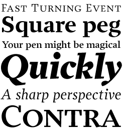
Prensa (that’s Spanish for printing press) is possibly Highsmith’s most successful text typeface to date. The family explores the possibilities of a creating a contradiction between the outside and the inside curves of the characters. Highsmith consciously borrowed this device from the great W.A. Dwiggins, who first used it in his book face Electra. “I liked Dwiggins’ modular approach to letter drawing,” he says. “It confirmed my ideas that there are different ways to approach type design than from a calligraphic point of view.”
Daley’s Gothic
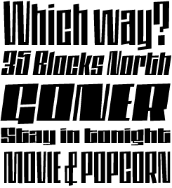
Highsmith’s first typeface published at Font Bureau, Daley’s Gothic (1998), was the outcome of a series of experiments with a steel brush and ink on paper. Dark in color and consisting of straight lines only, the typeface is not a model of legibility, but it doesn’t have to be. As an expressive headline face, Daley’s Gothic is outstanding. Cyrus named the family after his mother, who taught him how to draw in the first place.
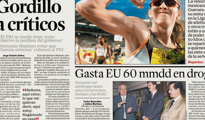
Zócalo used in the redesign of the daily Mexico City paper, El Universal
Which are the most important things you’re trying to impart to your students?
I try to impart all sorts of things but I never know what sinks in. The best advice I ever got as a student was "Quit school!". I had already dropped out by the time I got it but it was nice confirmation. If you are not into school, don’t waste your time and money. My best students are often the ones who have taken time off previously or went to the wrong school first. When they get to my class, they are focused and ready to learn.
I’ve heard you’re writing a textbook about type.
Yes, I am working on a book. It grew out of the lecture series I developed for the basic level typography course I teach at RISD. It is about what goes on inside a paragraph of text, written from my point of view as a type designer. It gets into typography on a molecular level. But the idea is not go crazy explaining everything in a super technical way. The goal is to help the student form a foundation for all the typographic knowledge they will get from other books, teachers, and experience. There are a lot of good books on typography but most of them are written more like manuals, with lots of details or bits and pieces. Hopefully the book I am working on will help the student put all those details into context and see the relationships between the bits and pieces.
Occupant Gothic
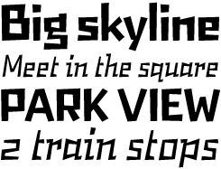
Like Daley’s Gothic above, Occupant Gothic is made with no curves; thanks to its gentler contrasts and thinner strokes, it is definitely more usable. Occupant Gothic was inspired by Highsmith’s impressions of urban Boston where he was living and working at the time. Its rough forms seem to have sprouted directly from the crude skylines and blocks he drew in his sketchbooks. The name magically came to him one day as he was picking up his mail.
With the advent of OpenType programming and multi-language character sets, type design and production has gone through some big changes recently. Have things changed for you?
Yes and no. In terms of text faces, we have been producing typefaces for a long time with large character sets, different sets of figures, ligatures, and a lot of the sorts of features you find in what some foundries call “pro” OpenType fonts. However, these typefaces had to be spilt up into different fonts and the additional features were hard to get to and really only available to the users who specifically asked for them. OpenType has sort of simplified this. There are still a lot of headaches for users when it comes to accessing the features and special characters that are the result of design flaws in type setting software and in the font specification itself. OpenType is a step forward though and there are more improvements on the horizon.
With all this in mind, Font Bureau has recently written a new specification for text faces that all of our new text and text/display series will follow. The new specification is not format specific but from it we can extract OpenType fonts that will have some nice typographic features. In the first quarter of this year we will publish this specification and a new series I developed to prototype it called Ibis.
In more experimental terms, I have been working on a set of borders and ornaments that magically assemble themselves using OpenType programming that I am pretty excited about. I don’t write much code but every once in a while an idea for something will come to me more or less in a dream and I try to make something with it.
Finally, a more private question: You became a father last year… what effect did that have on your professional life?
It has been very liberating. It is easy to get too wrapped up in your work and inflate its importance. Everyday my daughter reminds me of what the important things really are. I still have as much interest in my work as ever but I feel more relaxed about it and willing to take more creative risks.
That sounds promising, Cyrus. We can’t wait to see what you’ll produce next.
Antenna
Antenna presents a fresh look at the sans-serif genre. It is calm and regular, but never bland; it is clean and businesslike, but has an attractive rhythm and a certain loungey coolness about it. Through seven weights in four widths, with matching italics, Antenna’s subtleties show a remarkable sense of proportion. Its many styles make Antenna a versatile typeface for newspapers, magazines, and book cover design.

Who would you interview?
Creative Characters is the MyFonts newsletter dedicated to people behind the fonts. Each month, we interview a notable personality from the type world. And we would like you, the reader, to have your say.
Which creative character would you interview if you had the chance? And what would you ask them? Let us know, and your choice may end up in a future edition of this newsletter! Just send an email with your ideas to [email protected].
In the past, we’ve interviewed the likes of Christian Schwartz, Dino dos Santos, Jim Parkinson, Mário Feliciano, and Underware. If you’re curious to know which other type designers we’ve already interviewed as part of past Creative Characters newsletters, have a look at the archive.
Colophon
This interview was conducted & edited by Jan Middendorp, and designed by Nick Sherman.
The Creative Characters nameplate is set in Amplitude and Farnham; the intro image features Relay and Zócalo Display; the pull-quotes are set in Zócalo Banner; and the large question mark is in Farnham.
Comments?
We’d love to hear from you! Please send any questions or comments about this newsletter to [email protected]
Subscription info
Want to get future issues of Creative Characters sent to your inbox? Subscribe at www.myfonts.com/MailingList
Newsletter archives
Know someone who would be interested in this? Want to see past issues? All MyFonts newsletters (including this one) are available to view online here.