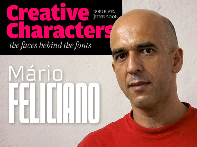
He is a unique figure on the international type design scene. Energetic and open-minded, Portuguese Mário Feliciano is part of a new generation of type designers that has put the Iberian peninsula firmly on the map. A self-taught type designer, he initially made experimental and grungy fonts; but his work quickly gained maturity and professionalism. Having run a successful graphic design studio in Lisbon for several years, he gave it up to fully concentrate on the fonts published by the Feliciano Type Foundry (FTF) and on type consultancy for magazines and newspapers.
Mário, what is early summer like for a type designer working in Portugal? How do you spend your days?
Strangely, the summer hasn’t arrived down here yet. Two weeks ago I was in Denmark giving a lecture at the SND/S annual workshop and it was warmer up there!
Otherwise I keep my work flowing as usual, running the foundry, upgrading old designs and creating new typefaces as well. I also do some consultancy work for special clients, mostly newspapers. Most importantly, I am converting the FTF library to OpenType format. That is a lot of work.
On Typeradio I heard that you’re a surfer. During your early career, you designed surf magazines, just like David Carson. Did you experiment as much as he did — and were your graphic explorations picked up outside the surf world?
I was affected strongly by David Carson, whom I was aware of since his early days at Surfer magazine. For years, Surfer was my favorite magazine. When Carson was hired to do RayGun magazine, that was the thing! He was was my biggest influence — even more so than Emigre, which also influenced me a lot. I was lucky to be able to experiment a lot at Surf Portugal magazine. Maybe I was able to do in a surf magazine what David Carson was doing in a rock magazine!
My work was influenced by worlds outside surfing as well: art, rock, and pop culture. This was when “fonts” came into my life. At the time, the only way to make any graphic design work that remotely looked like David Carson’s was to design my own fonts — that’s how it all started. Curiously I came to know Carson’s work before I knew Neville Brody, let alone Erik Spiekermann or other famous type designers. This was the early 1990s…
Stella
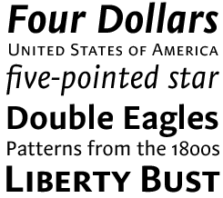
Stella is Feliciano’s humanist sans, although he tried not to give it too much of a pretty, oldstyle-like flow. It was designed to be used as a text face, and optimized for optimum legibility in small sizes, but its careful detailing makes it suitable for uses in display sizes as well. With its supple, narrow italics, small caps, lining and oldstyle figures — proportional as well as tabular — Stella is a versatile typeface that lends character to classy brochure, book or signage projects.
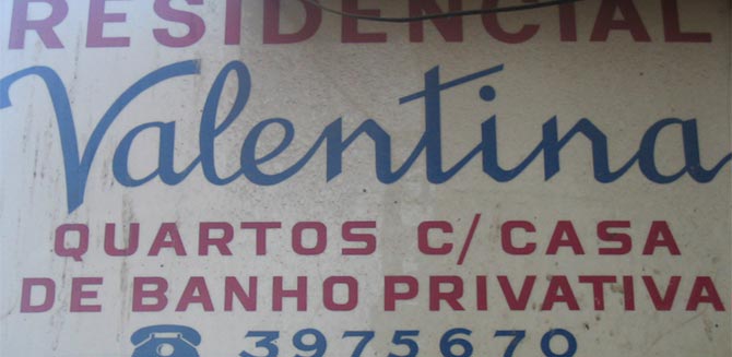
This sign served as inspiraton for the uppercase letters in Morgan Sans.
What were you earliest typefaces like? Are you embarrassed now when you look at them?
No, I’m not embarrassed, even if they look quite bad. There are some I just don’t like any more, but I understand why I did them. There are even some that are still on the market! I have done some wild stuff, and quite a few rip-offs as well…
The computer we had at the magazine was a Mac LC II (I think). One guy left some floppy disks with the first version of Fontographer, and two days later I was modifying fonts and generating them directly on the system folder. Then I bought the next version of Fontographer and started some more serious work. My first fonts were done around 1994 and before that I’d already hand-drawn some alphabets with no practical use. Gradually I got to a more interesting level.
You published a number of playful display faces with T-26 and Adobe. Then, rather suddenly, you became very serious about type design and began working on large type systems like Morgan, and historically inspired typefaces like Rongel. How did the change happen?
Of the fonts I designed during my years of experimentation, several were published including one Adobe original, Strumpf. Then in 1997 I went to the ATypI conference in Reading — and it all changed. I was lucky to meet Peter Matthias Noordzij — the first type designer I ever met, and with whom I created a very special bond, personally and professionally — and John Downer, who also became a good friend and advisor over the years, among another people. At the first night in Reading I had dinner with Matthias, John and Fred Smeijers, Robert Bringhurst, and a few other others that I can’t recall! I had never heard of any of these people! So, I think that dinner somehow changed my career and my entire life. After that I became interested in the tradition of typography and started studying type history.
Escrita
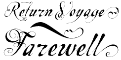
Released more than 10 years ago, Escrita is one of Mário Feliciano’s earliest published fonts. A pioneer of the distorted formal script genre that has become wildly popular lately, Escrita is still one of Mário’s best-selling faces. The name means “written.” Thanks to extra fonts containing fancy initials and endings, the font does a nice job in imitating handwriting — albeit of a very quirky kind.
Since then, you’ve actively sought to establish contacts with colleagues around the globe. Which contemporary type designers have influenced you most, and what have you learned from them?
Several people influenced my work in different ways and and different points in time. In the early days I was lucky to work with Carol Twombly before she left Adobe, and she was very good. I exchanged “mail” (prior to email!) with Rudy Vanderlans, who was very kind to comment on my designs. After that meeting in Reading, more people influenced and helped me. I admire Matthias Noordzij’s work; he only published one typeface [Caecilia] but he is a great typographer and knows very well how fonts work. The dutch tradition has been very important to me; I think of Gerard Unger, Fred Smeijers but above all Bram de Does. His Lexicon is my favorite typeface. Then Christian Schwartz, he is very good, very hard not to be influenced by. And, of course, Matthew Carter.
Landscope
With its rigid structure and simple grid, Landscope is perfect when legibility is not an issue, and atmosphere — neo-geo, or retro-futurism — is everything. “I was not thinking about reading when I drew this font,” says Mario, “rather about a different way to project our mental image of words. Do not try to set a book with this type, please!”
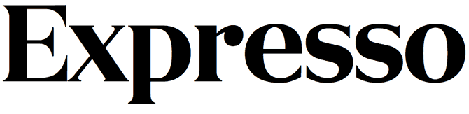
Mário's custom logotype for the Portuguese newspaper, Expresso.
You started the Feliciano foundry in 2001. What made you decide to publish your own typefaces instead of licensing them though an established foundry?
It was more intuitive than anything else. I had a few interesting proposals but I wanted to do things my own way, taking risks. I had been working as an agent in Portugal and Spain for The Enschedé Font Foundry since 1999 and they have a very peculiar way of running the foundry that I have not found anywhere else. I wanted to bring some of that spirit to my foundry even when working alone. However, when I decided to create the Feliciano Type Foundry I was still doing graphic design work and running a design studio. I could not yet imagine becoming a full-time individual type designer. But in he end, that is what I decided to do.
In many creative areas the general tendency is to become self-publishing. Platforms such as MyFonts make it economically feasible; I also have a special joint venture with Village.
I do think that professional relationships mainly based on digital communication are quite limited in terms of the personal bond you create with those with whom you work. You kind of lose the really good part of collaboration: to be with other people.
Rongel
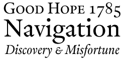
Rongel is one of the font families that resulted from many years of research of historical Spanish letterforms. It is roughly based on a typeface shown in a Spanish type catalogue from 1799. Rongel is a true revival in the sense that it adapts a typeface that only existed in a previous and obsolete technology. However, Feliciano aimed for an interpretation rather than a faithful copy, correcting obvious flaws and introducing new ideas. The result is one of the liveliest recent examples of historically inspired Iberian type.
Among your own typefaces, which is your favorite? Could you tell us something about the way it was conceived?
That’s very hard to tell, really. I would say that the favorite part of my work is the work that I’ve done based on old Spanish types. It comprises a group of six or seven typefaces, not all of them fully finished, including Rongel, which on some days is my favorite. All those typefaces were designed after several years of research on old Spanish books and type specimens, research trips to Spain and a lot of reading about that period. All those fonts went through a long and not very systematic design process, with a lot of trial and error. I do not really make sketches by hand. I did a few in the beginning to please my eye but I found them to be useless. Everything changes (with increments of very small measures!) when you move to the digital world… I really do appreciate other designers who have their sketch books on hand all the time and make all those nice drawings. I can’t do that. Nor do I travel with a computer for work purposes. I can only work at my working room. With music, most of time. Many styles of music, depending on the type.
The past five to ten years, there’s been an impressive upsurge of “Latino” fonts from the Iberian peninsula and Latin America. Do you feel part of the movement, or group?
I don’t know if you can call it a movement. But if that’s the case, I do want to be part of it. I see it more as a rise of interest and typographic consciousness. And in terms of form, style and visual tradition, I think the “latinos” have a lot to say.
Young, budding type designers have more role models today than you did 15 years ago. At the same time it may be more difficult for them to experiment, because so much has already been done. What is your message to them?
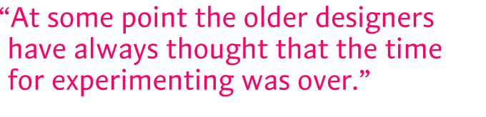
I think that there is always room for experimentation in typography. It has always been like that: at some point the older designers have always thought that the time for experimenting was over.
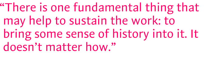
I believe that in terms of style one should follow one’s instinct. For me there is one fundamental thing that may help to sustain the work: to bring some sense of history into it. It doesn’t matter how. The way Matthew Carter does that is quite different from what Jonathan Barnbrook is doing, but they both have a sense of tradition in their work. I guess that helps and gives focus. It is also very important to be up-to-date on the latest relevant technology, both for the use and the design of type.
Not only are your fonts used by dozens of magazines, you’ve also developed custom type for a number of newspapers, including Expresso in Portugal and El Pais in Spain. And then there is BesSans, a type family that was custom-made for a large Portuguese bank. I was told it was very rare for a Portuguese organization to commission a typeface — is this changing? And are these assignments influencing the way you work?
I think it is changing but not significantly. I don’t get those kind of assignments every month, probably not even once a year. Neither do my colleagues, I think. The market is rather small. Companies do not see a reason to invest in custom type. In publications it happens more often, maybe because the time of exclusivity is normally reduced to one or two years and therefore there the costs are lower when compared to those of corporate type that might include five or ten years of total exclusivity.
Working for these companies influences the way I work because it gives me no room to fail, so I have to be very certain about what I’m doing and why I’m doing. It’s a bigger challenge.
Thanks for your insights, Mário! We know there are more Feliciano Fonts in the pipeline, so we’ll keep watching those foundry pages.
Monofaked
Monospaced fonts were originally made for typewriters and matrix printers that only had one way of advancing: a full step at a time. They’re still necessary when writing computer code, but many designers like using them for other reasons — they appreciate the electronic or industrial appeal of mono fonts.
Feliciano realized that by creating a “semi-monospaced” font, the same effect could be obtained without the drawbacks of real mono, like clumsy spacing and poor legibility. Monofaked offers the best of both worlds. The characters do not really share the same width — but they they look as if they do! The look is technologic, but the typographic color is more even.
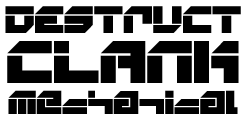
Morgan
The Morgan Project is Feliciano’s superfamily: a versatile suite of compatible fonts. All family members have a basic visual idea in common, of simple, square shapes with rounded corners, but between the various versions there are notable differences, appropriate to each version’s purpose.
The fonts in the Morgan Display Kit 1 — Morgan Tower, Poster and Big — have simplified, square counters; the text versions Morgan Sans and Sans Condensed are smoother and rounder.
Morgan Sans has small caps, lining and old style figures, mathematical symbols and more, many of which are accommodated in separate Expert fonts. If your project calls for a striking font halfway Deco and Techno, then Morgan is the way to go.

Who would you interview?
Creative Characters is the MyFonts newsletter dedicated to people behind the fonts. Each month, we will be interviewing a notable personality from the type world. And we would like you, the reader, to have your say.
Which creative character would you interview if you had the chance? And what would you ask them? Let us know, and your choice may end up in a future edition of this newsletter! Just send an email with your ideas to [email protected].
During the past year, we've interviewed the likes of Christian Schwartz, David Berlow, Dino dos Santos, Ronna Penner, and Underware. If you’re curious to know which other type designers we’ve already interviewed as part of past Creative Characters newsletters, have a look at the archive.
Credits
This month’s interview was conducted and edited by Jan Middendorp and designed by Nick Sherman.
Supporting fonts
The Creative Characters masthead is set in Amplitude and Farnham; the intro image features Morgan; the pull-quotes are set in Stella; the large question mark is set in Farnham, and the small URL at the top is set in Unibody 8.
Unsubscribe info
This message was sent to:
[email].
It is never our intention to send unwanted e-mail. If you no longer wish to receive this newsletter, you may change your subscription settings at: www.myfonts.com/MailingList
Comments?
We’d love to hear from you! Please send any questions or comments about this newsletter to [email protected]