MyFonts offers typefaces of all kinds: from the traditional to the outrageous, from wacky single alphabets to extensive megafamilies. Many of those fonts were made by enthusiastic and talented newcomers. Others are the work of seasoned designers who have been working in the field for many decades. In this special publication, we want to celebrate some of the living masters of type design.
We’ll be showing typefaces that have been recognized by the design community as contemporary classics. Typefaces that are milestones in the typographic landscape – masterpieces of form and function that will stand the test of time and will be around for many decades to come.
Living masters of type design are generally prolific. As a result, this newsletter is a bit longer than usual.
In this issue:
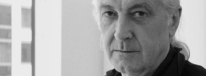
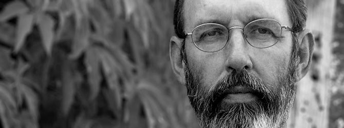
photo by Jan Middendorp
Matthew Carter is probably the most widely read type designer in the world. His fonts, such as Verdana and Georgia, are on most people’s computers. His newspaper faces, notably the great Miller family, are among the most widely used across the world. Turning 70 this year, Matthew Carter has been in the business for five decades. During that time he has worked with virtually every type technology that has ever existed…
At the forefront
It all began in 1956, when Matthew Carter travelled to Holland at 18 for a one-year apprenticeship at the famous Enschedé printing company. At the company’s type design department, he became one of the last people to learn the ancient craft of punchcutting. Carter went on to become a successful lettering artist, working for London design and advertising agencies.
In 1963 he was hired by Crosfield, a firm that pioneered the new technology of photo-typesetting, to lead their typographic program. From then on, he would always be at the forefront of technological developments in typography.
An Englishman in New York
A visit to New York brought on a cultural shock. Carter visited the studios of cutting-edge designers such as Herb Lubalin and Milton Glaser. “I realised that New York was the place to be – this was where the game was played.” He got his chance of a lifetime when Mike Parker, director of typographic development at Mergenthaler Linotype in Brooklyn, invited him to join the team. As the technology was rapidly changing, there was a continuous need of new typefaces.
Among the first fonts that Carter drew for Linotype were Cascade, a cheerful script face, and a formal script that became a classic: Snell Roundhand. He also made fonts on commission. Probably the most famous of these is Bell Centennial, a type family optimized for phone books.
New roads in type
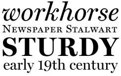
With the advent of early digital technology in the late 1970s, Carter and Parker saw new opportunities for font design and production. They founded Bitstream, the first company to specialize in digital type design and production. Bitstream adapted many existing fonts to digital technology, but also began developing new typefaces. Among the contemporary classics drawn by Matthew Carter during his Bitstream years is Charter, a sturdy, multi-purpose serifed face.
Widely read
Since 1992, Matthew Carter has had a two-person company with Cherie Cone, Carter & Cone Type, working with clients as diverse as Microsoft, New York's MoMA, and the Walker Art Center in Minneapolis. Carter & Cone have frequently collaborated with the Font Bureau, most notably in the production of Miller, a widely used magazine and newspaper typeface. For Microsoft, Carter developed a range of typefaces optimized for screen resolution – such as Verdana and Georgia. So even if you don’t read a newspaper set in Miller, you are almost sure to come across Matthew Carter’s faces on a daily basis.
Chameleon
While many of his typefaces are deeply steeped in tradition, others are playful and experimental – the Walker typeface with its choice of clip-on serifs is a case in point. Says Carter: “Unlike some type designers whose personality comes out in every single letter they draw, I’m more of a chameleon. I like to feel part of a tradition and a historical continuum. And, of course, to have an open mind about new ideas.”
Miller
During the past ten years, Matthew Carter has designed newspaper typefaces for the likes of the Washington Post, the New York Daily News and the Boston Globe. Out of this specialization grew the Miller family, based on a Scotch Roman from around 1800. Miller is one of the most successful newsfaces in recent years: it is now being used by hundreds of daily newspapers.
Bell Centennial
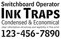
Designed for telephone books, Bell Centennial has forms that are optimized for small print under difficult circumstances. The giant ink traps were introduced to avoid the cluttering of ink on high-speed presses. When used out of context, their function is lost – but they look very cool.
Charter
Like many of Matthew Carter’s typefaces, Charter was designed for a precise purpose and a specific technology. Like its contemporaries ITC Officina and Lucida, It was developed in the mid-1980s with the limitations of low- and mid-resolution output devices in mind. However, Charter became a long-time success on its own merits, being an excellent everyday typeface for a wide variety of uses.
Other fonts by Matthew Carter
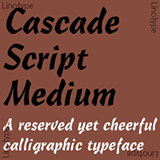
Cascade was Matthew Carter’s very first typeface for Linotype: a brush script originally drawn for photo-typesetting in 1965. Its name refers to the Northeast Blackout of 1965 which happened around the time when Carter was working on the font and was caused by a so-called ‘cascade’ of collapsing power stations.
Galliard is an energetic text typefase inspired by the work of the 16th-century punchcutter Robert Granjon. Its spirited italic is not a copy of any specific Granjon italic, but is true to his spirit. Carter prefers to call it an ‘anthology’ instead of a revival. Released in 1978 for photo-composition, Galliard was an early case of computer-aided type design.
Snell Roundhand, designed in 1965, is the kind of elegantly connected, cursive script which was much more feasible to set with newer photo-typesetting technology. It is based on the 18th-century round hand scripts from English writing masters such as Charles Snell. Its capitals can also be used as initials mixed with other alphabets.
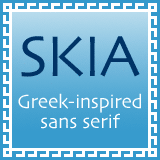
Skia was originally designed for the Apple Corporation in 1993 as a showcase for their Quickdraw GX font technology. Skia is a stylish sans-serif inspired by ancient Greek letterforms. Unlike Adobe Lithos, which has similar origins but is an all-caps font, Skia has a fine lower-case with unusual shapes, resulting in a font with an unmistakable personality.
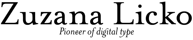

Frederic Goudy used to say that one shouldn’t trust a type designer under 40 – but that was mainly because he had started out at that age himself. In the digital era, most type designers start young and grow up fast. It is not an exception to meet designers in their mid-40s who have already created an impressive body of work. However, there aren’t many whose typefaces have had the kind of impact that Zuzana Licko’s have. Born in 1961, she is one of the true originals of digital type. Her fonts have influenced the work of type designers across the world, as well as the look of graphic design in the past two decades.
Visual laboratory
Zuzana Licko (pronouced Litchko) drew her first typefaces for Emigre Magazine, founded by her partner Rudy VanderLans in 1984. Emigre became an international platform where new ideas on design were discussed and developed; its design, mainly by VanderLans, was an ever-changing visual laboratory. Like the magazine itself, Licko’s digital typeface designs for Emigre were created with the first generation of Macintosh computers. Early Macs had several technical restrictions, such as low-resolution screens and a tiny amount of memory. Zuzana Licko was one of the first to realise that these constraints could also be seen as a challenge – a motive to develop unorthodox design principles and create new and adventurous typefaces.
Attitude
Licko’s view on type was concisely summed up in an interview published on the Emigre website: “A typeface is the ornamental manifestation of the alphabet. If the alphabet conveys words, a typeface conveys their tone, style, and attitude.” While type designers often try to create “invisible” typography in service of the text, Licko allows the type to have something to say too.
Classics
Out of the custom faces for Emigre Magazine grew the Emigre font library, arguably the most influential type collection of the 1980s and 1990s. Zuzana Licko remained the library’s heart and soul. As a type designer, she never stopped developing. After numerous experiments with low resolution and geometric construction, she created historically inspired faces (Mrs Eaves, Filosofia), ornaments (Hypnopaedia, Whirligig) and versatile sans-serifs (Tarzana, Solex). Each of those faces is as original as it is usable; all are potential classics.
Mrs Eaves
Mrs Eaves is Licko’s take on the typefaces designed by the 18th-century master John Baskerville. It was named after Baskerville’s houskeeper, who became his wife and assistant. Licko wanted to capture the warmth and looseness of metal type, and took a totally new approach to Baskerville’s letterforms: she diminished the contrast between thick and thin parts, and gave the lowercase characters a wider proportion and generous spacing. The result is a very personal yet highly functional revival, that is being used everywhere – from junk mail to avant-garde design.
Other fonts by Zuzana Licko
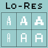
Lo Res is a new name for a set of familiar fonts. From 1984 onwards, Licko designed a series of coarse bitmap fonts with names like Emigre, Emperor and Oakland, created on the Mac with crude public domain software. These designs are now grouped as the Lo Res family. As low-resolution type has become part of everyone’s daily experience, this package of original Emigre pixel fonts is a welcome reissue.
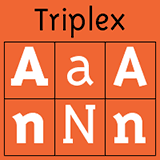
Triplex was Zuzana Licko’s first sans-serif text typeface. It had evolved out of Citizen, a text typeface with straight lines only, which in turn had grown out of the low-resolution typefaces she drew in the early Mac days. When Triplex came out, some people questioned its legibility; but soon, users stopped noticing its idiosyncracies and it was widely accepted as a new and original way of approaching text type.
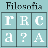
Filosofia is to Bodoni what Mrs Eaves is to Baskerville: a highly personal interpretation of a great classic; a very usable update as well as a smart and thoughtful tribute. Licko studied various versions of Bodoni but did not use any particular one as the model. Having looked at many specimens, she then drew her Bodoni from memory, “akin to the process of transcribing.”
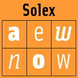
Solex is one of Zuzana Licko’s more recent typeface families, and one of her most usable sans-serifs to date. Its condensed forms and simple geometry echo a 1950s typeface by Paul Renner, the beautiful Steile Futura. Despite its rigidity, Solex is pleasing and inviting, and as such is another typical Licko typeface.

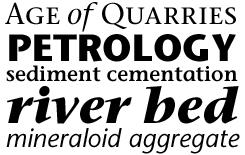
Sumner Stone became a leading figure in the world of digital type in 1984–1989, when he was director of typography at Adobe Systems. His biggest achievement as a type designer is the Stone series, one of the first digital superfamilies. In 1990 he founded the Stone Type Foundry Inc and has since published a series of beautifully crafted typefaces, such as Stone Print, Magma, and Basalt.
Right place, right time
Sumner Stone has played a central role in the development of digital type. A trained calligrapher, designer and mathematician, he was at the right place at the right time. California in the early 1980s was a hothouse of new developments in digital technology. However, the emerging technology or the personal computers was developed by computer scientists who had little or no understanding of typographic principles. Fortunately, the San Francisco Bay area was a place full of type enthusiasts – from the owners of small private presses to the lively calligraphic community – who felt challenged by the changes at hand. Sumner Stone was one of those specialists who managed to apply their insights into age-old principles of readability and elegance to the new techniques for reproducing text, helping to establish quality standards that we still profit from today.
Superfamily
At Adobe, Sumner Stone conceived and coordinated the company’s typographic program, including the influential Adobe Originals. His seminal ITC Stone family came in three styles (Stone Sans, Stone Serif, Stone Informal) totalling 18 weights – numbers that were unheard of at the time. Stone wrote a book about the design of the family: On Stone: The Art and Use of Typography on the Personal Computer. The book, now out of print, has been described as “one of the best introductory books on type and how to use it.” (John D. Berry)
In the 1990s, Stone art-directed the “definitive” Bodoni revival, ITC Bodoni, which he drew in collaboration with Janice Fishman, Holly Goldsmith, and Jim Parkinson.
Like the Stone family, Sumner Stone’s more recent typefaces demonstrate how a sensitivity to typographic tradition can be a guideline for quality in the era of OpenType.
Stone Serif / Sans / Informal
One of the first “superfamilies,” the Stone series consisted of three compatible families: Stone Serif, Stone Sans, and Stone Informal. Recently a new style was added: Stone Humanist Sans.
Other fonts by Sumner Stone
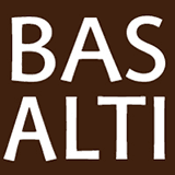
Basalt is an all-caps typeface for signage; it comes as a single font of capitals in wide and narrow versions as well as a set of compatible arrows. Basalt is described by the designer as an attempt to create “a classical Roman sans-serif”: a fantasy about a letterform that might have existed as a sans-serif companion to formal Roman inscriptional forms. Basalt was first used for signage at the Cecil H. Green Library, Stanford University.

Stone Print has some characteristics in common with the 1980s classic, Stone Serif. It is narrower, but wonderfully readable, nevertheless. This makes Stone Print a very economic, “green” typeface. It uses less space and therefore less paper than other popular text typefaces. Made for the reader, the environment, and whoever pays the bills.
Magma looks like a humanist sans-serif, but its terminals are flared like bell-bottom trousers. So technically it belongs in the category of the “glyphic” typefaces that recall an alphabet carved in stone. Magma uses the Halo system, in which each weight has a slightly heavier companion. When using type in reverse printing – light on dark – it usually looks thinner, so these subtly heavier versions are ideal to obtain an optically balanced look.
Cycles is ideal for complex book typography that makes use of type at different sizes. It offers a wide range of versions, each of which has been optimized for a particular point size, from 5pt for footnotes to 36pt (and up) for headlines. Just like in the era of metal type, the fonts for small sizes are sturdier and rather wide, whereas the fonts for titling are narrower, subtler and high in contrast.
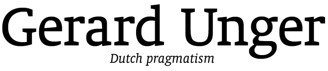

photo by Patrick Post
Gerard Unger may not be a household name to most designers in the Americas, but he is widely held to be one of the great typographic innovators of the last 30 years. Like Matthew Carter, he has always felt challenged by the possiblities and constraints offered by new technologies. Unger has designed typefaces for signage, architecture and phone books; he also set out to make “the world’s most economic newspaper typeface.” As a professor in Reading, Amsterdam and Leyden, he has kick-started the careers of hundreds of graphic designers and type designers.
Many sources
Gerard Unger is the kind of designer who embraces problems as an incentive to think harder. For his innovative type designs, he taps into many different sources. He has done extensive historical studies, and has lectured on past masters such as the Didot family and W.A. Dwiggins, whose originality and humour he greatly admires. He is well-informed about new developments in graphic and product design and art. Although his success as a type designer has been phenomenal, he has continued producing graphic work, from books and brochures to identities and three-dimensional work. But most of all, Unger is driven by a passion that is typically Dutch - the determination to make things work. All his typefaces are made with one central goal in mind: to improve the reader’s experience. He has even written a book about this: While You’re Reading, the English version of which will be released soon.
Beyond the original purpose
Unger began designing type in a period when all systems – first photo-typesetting, then large digital typesetters – still had their own dedicated typefaces. One such system was Digiset from Rudolf Hell in Germany, for whom Unger designed a string of exclusive typefaces in the 1970s and 1980s. These types have later been adapted for use on personal computers, but their past as solutions to a particular problem still shines through. The toughness of Demos and Praxis is clearly rooted in the rather crude cathode ray tube technology; Oranda is as sturdy as other fonts made to look good on 300 dpi printers. Yet Unger’s fonts are so well drawn that they can be used far beyond their original purpose. Swift for instance, his most successful newspaper font, works brilliantly in books, brochures and magazines.
All Unger’s typefaces are originals: he was never one to copy styles from the past. Unger says he couldn’t if he tried: each letterform he draws is unmistakably “Ungerian.”
Swift
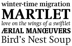
Gerard Unger’s most succesful typeface was designed for newspapers in the early 1980s. It has a certain sharpness and angularity which remain intact even under difficult conditions – like printing at high speeds on low-quality paper. But the typeface also has spirited curves and a certain nervous energy. Hence the name: the agile swift is Unger’s favorite bird.
Other fonts by Gerard Unger

Demos was designed to work in the early phase of digital technology in the 1970s, when letters were stored as rather coarse bitmaps and generated by cathode ray tube. With its characteristic forms it is an interesting font for identities. The German government has chosen it as its corporate font alongside its sans-serif companion Praxis.
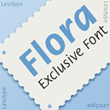
Flora is the third member of the Demos/Praxis family. The script-like face, named after Unger’s daughter, has its beginnings in hand lettering exercises with a felt tip pen. When it came out in 1984, its originality was striking: an upright, sans-serif italic, it was a precursor of many “humanist sans-serifs” to come.
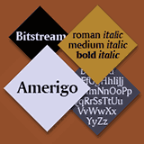
Amerigo was the first typeface that Unger created for Bitstream. It was designed in reply to difficulties that users of “glyphic” typefaces such as Optima experienced when viewing or printing in low resolution. Thanks to its more pronounced flare-serifs, Amerigo works well at low resolutions. In North America it has become a popular typeface for TV screens.
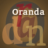
Oranda, drawn for the European hardware manufacturer Océ in 1968, was originally designed to tackle the problem of early medium-resolution laser printers. Oranda, a slab-serif, is described by Unger as his most solid design. Yet its forms are also agreeable and inviting; the Condensed versions work especially well as headline fonts.