Select this license type when you are developing an app for iOS, Android, or Windows Phone, and you will be embedding the font file in your mobile application's code.
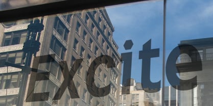
Excite
by K-Type
Individual Styles from $20.00
Complete family of 5 fonts: $20.00

Excite Font Family was
designed by
Keith Bates and
published by
K-Type. Excite contains
4
styles and family package options.
More about this family
- Aa Glyphs
-
Best ValueFamily Packages
- Individual Styles
- Tech Specs
- Licensing
Per style:
$4.00
Pack of 5 styles:
$20.00
About Excite Font Family
Excite is a neo-grotesque typeface named after an x-height that’s as tall as you can get without compromising the distinction between upper and lower case, helping to make it extremely readable both in print and on screen. It is modern and spacious, has short ascenders and descenders, and an airiness augmented by using both horizontal and vertical endings of open characters like C, S and 3. Unusually for a neo-grotesque, Excite has a clean, contemporary, single storey lowercase A. Other distinctive features include a hexagonal dot/period, and the dog-leg tail of the Q. To avoid confusion between similar characters, Excite uses features like horizontal bars on the capital i and a curved tail on the lowercase L. The Excite family consists of four fonts: regular, bold, italic and bold italic.
Designers: Keith Bates
Publisher: K-Type
Foundry: K-Type
Design Owner: K-Type
MyFonts debut: Sep 2, 2009
Excite

About K-Type
K-Type is a small, independent type foundry based in Manchester England, offering a unique range of high quality fonts which are modestly and simply priced for designers, small businesses and large organisations.In addition to creating new typefaces resulting from formal experimentation, many K-Type fonts show the influence of inspirational artists and designers, many exploring the mix of insular and eclectic that has forged the typographical landscape of Britain and America.K-Type is also keen to make affordable fonts from styles which possess cultural currency or an existing social presence, generally redrawn to include comprehensive character sets containing a full complement of Latin Extended-A glyphs. New, previously unavailable weights and italics are often designed and added.
Read more
Read less
- Choosing a selection results in a full page refresh.