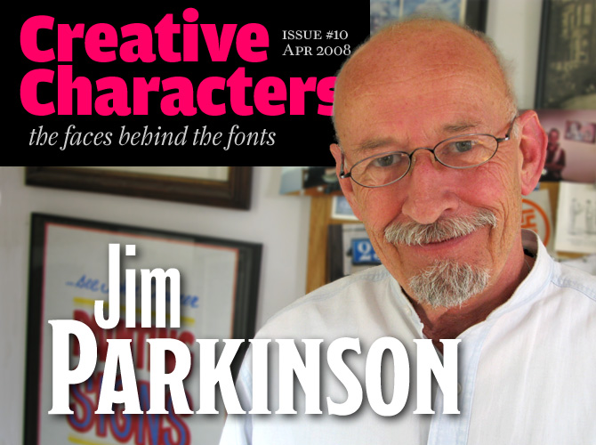
Jim Parkinson has probably designed more magazine and newspaper nameplates than any other designer on earth. Some of his designs have become true icons, like the logos he made for Rolling Stone, the quintessential American rock magazine, and for Ringling Bros and Barnum & Bailey Circus. Drawing on techniques such as hand-lettering and signpainting, Parkinson’s typefaces often evoke past styles and shapes, subtly updated to fit present contexts. You can find most of his fonts at MyFonts, including the faces published by his own company Parkinson Type Design. Meet Jim Parkinson, an expert forger who likes fooling with time.
Jim, I envy you. You were born in 1941, the same year as Bob Dylan, Paul Simon and Captain Beefheart. You graduated in 1963, the year in which it all started happening. You lived in the Bay area when it became the epicenter of hipness. You worked for Rolling Stone when that magazine was just about the coolest in the world… What was it like to grow up alongside rock’n’roll? Did you feel part of the “scene” at some point?
The closest I ever got to the epicenter of anything was a moment at Rolling Stone in the early 1970s, in San Francisco. Jann Wenner had called a staff meeting in his office. I have no idea what I was doing there. It may have been by accident. But never mind. There I was, sitting on the floor in Jann's office along with all of the great artists and writers and staff who were working there at the time. Everyone was packed into the room sitting on chairs, on tabletops, on the floor, and standing or leaning against the walls. Hunter Thompson, Annie Leibovitz, and of course Roger Black, Vincent Winter and Greg Scott from the art department. I was just looking around, taking it all in. I don't even remember what the meeting was about. I just remember this moment with so many of my heroes in one room. I didn't really feel like one of them. I felt more like a groupie, just really lucky to be there. Thinking, "Wow".
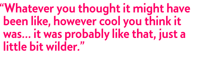
Many people who worked for Rolling Stone in the early years still think it was the coolest job they ever had. I've never been around such a talented group of people. Many, like myself, were living life completely without boundaries, yet we were able to get it together enough to produce this amazing magazine. Whatever you thought it might have been like, however cool you think it was… it was probably like that, just a little bit wilder. The Endless Boogie. The Capri Lounge. The Cosmic Giggle. You had to be there. I still work for Rolling Stone fairly regularly after 37 or so years. In fact, I'm doing a job for them right now and while I work I can drift back into that special head space. Not by wearing bell-bottoms and granny glasses, but spiritually. It's nice.
Parkinson
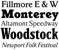
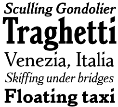
Jim Parkinson designed the original members of this type family during the mid-seventies at Rolling Stone magazine, working with Roger Black. Roughly based on the original Rolling Stone logo by Rick Griffin, its main sources was — as Black wrote — a Jenson revival from the Nebiolo foundry, although Parkinson also looked at the well-known ATF Jenson. Jim lovingly describes his type family as “a sort of Nicholas Jenson on acid”. The series was further developed over the years, becoming the starting point of Jim’s famous Rolling Stone logo, and its subsequent redesign. It then evolved into Font Bureau's Parkinson family.
Rolling Stone magazine logo by Jim Parkinson.
You graduated from the California College of Arts & Crafts in Oakland with a degree in advertising design. Was lettering design part and parcel of the curriculum back then — or were you an exception?
We're talking Stone Age here. Type design was not an option in 1959. Not as a course of study and certainly not as an occupation for a kid like me. Lettering was at the absolute bottom of the food chain. My first exposure to lettering came much earlier. When I was around four years old and living in Richmond, California, there was a showcard lettering artist who lived across the alley from me. Abraham Lincoln Paulsen. I used to sit in his studio for hours, watching him work. I was fascinated. Mr. Paulsen kindled an interest that would fester for years, eventually taking me over. When I finally started at CCAC there were no more than a half-dozen classes devoted to Advertising Design, as it was called. There was only one lettering class offered at the school. It was 3 hours, 2 days a week for one semester. That is all the formal lettering education I have. The rest I just picked up along the way. I'm still learning every day, in fact. That's part of what makes this so damned much fun.
Since college I bumped into the most amazing series of mentors an aspiring lettering freak like myself could imagine. Myron McVay, Rob Roy Kelly, Hermann Zapf, and Roger Black all taught me volumes and helped drive my passion. And these individuals all happened into my life quite by accident.
Today I paint, draw, take photos, write and build things, in addition to designing logos and fonts. Unless a typographic project is client driven, I approach it the same way I approach a painting. I have a mental image, a vision that I want to capture. Something I am trying to understand. Often it's a letter detail so personal and obscure that I'm the only one who sees it. But it's gotta be there. A new font is mostly the answer to some creative question I've asked myself. Or at least an attempt at an answer.
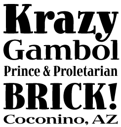
Modesto
Modesto is based on a hand-lettering style that Parkinson often used in the ’60s and ’70s for ads, book covers and posters.“It was my fall-back position, hand-lettering-wise. It was easy and readily accepted,” says Parkinson. Eventually, it became the Ringling Bros logo, which, in turn, became the Modesto type family. Its classic forms and small serifs recall Goudy’s Copperplate Gothic, although it’s more fancy in its details. Modesto Text has an idiosyncratic lowercase alphabet, the Initials font has a gorgeous outline and the Open Caps have distinctive inlines.
Your first job after graduation was in the greeting card business, at Hallmark. Many people in the type business seem to have done a kind of apprenticeship at that company. What influence did it have on your later activities?
When I graduated from CCAC, most of the commercial art jobs available to beginners were cutting amberliths, doing mechanicals, paste-up. Pouring cup after cup of instant coffee for some pompous cigar smoking twit. Arghh! A nightmare. On the other hand, Hallmark was a job where you could do art right away. When I took the job, I didn't have a clue about what I was getting into. Once I had an apartment in Kansas City and started work, I discovered that they wanted me to paint happy, fuzzy greeting card rabbits. Well, it turned out that I was not a fuzzy greeting card rabbit type of guy. I was packing my bags to leave for Oakland when they offered me a job in the lettering department, like it was purgatory or something. Because of my experience watching old Mr. Paulsen and my brief encounter with lettering in art school, I felt that it was something I could enjoy. "Don't give up too soon," I thought. So that's how I became a professional lettering artist… by failing the Fuzzy Rabbit Test.
At that time, the primo lettering artist in the art department at Hallmark, Myron McVay, was working on a new project designing greeting card type styles for Filmotype machines. Mechanizing hand lettering. Hallmark thought of all lettering as either Formal or Informal referring to the type of greeting card the lettering appeared on. Myron thought I had a knack for inventing Informal greeting card lettering styles and he plucked me out of the production line and taught me how to go from making lettering to making type. Of all the people I have been lucky enough to bump into, Myron patiently taught me more about lettering and type design than everyone else put together, save Roger Black. I still do most things the way Myron taught me. And today I still learn from him in long, rambling phone conversations that start, "Hi. How you doin'?" and then turn immediately to lettering. I mean, he's been my friend for over forty years. Almost a half a century, and still, every time we talk he has something more to add. Something we haven't managed to get to yet. Amazing.
After Hallmark, you returned to the Bay area, where you eventually became a very successful independent lettering artist, designing logotypes and nameplates for clients such as Fast Company, Esquire, Newsweek and the San Francisco Examiner. How did that evolve?
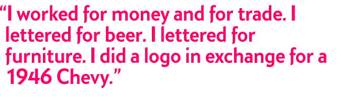
When I first got back to Oakland, the only thing I was sure of was that I didn't want a real job. I had this idea that I would do lettering for people and they would pay me for it. It finally worked out that way, but it took about ten years of struggling to make that happen. In the meantime I was doing design, illustration, whatever. Just as long as it involved doing some kind of art. I worked for money and for trade. I lettered for beer. I lettered for furniture. I did a logo in exchange for a 1946 Chevy. For a while I painted big canvas “grand opening” banners for a chain of Pizza Palaces. I did about two banners a month and I was paid with free pizza coupons. So for several years I lived on pizza and beer.
Eventually I started to get jobs where I was paid with money. But not much. I was doing lettering for album covers, book covers, advertising, packaging — you name it. Once I started working for Rolling Stone a lot in the early ’70s, I started to get an idea of what my Lettering Heaven might be like, but the publication logo jobs didn't really start showing up until the ’80s. And it wasn't until the early 1990s when I was on a Mac that I was able to concentrate completely on logos for publications and on designing fonts.
Jimbo
Cheerful and friendly, this serifed face was based on an early logotype for Parkinson’s studio. The designer likes to think of it as a ‘happy Bodoni’. Jimbo is one of several Parkinson fonts from the 1990s that tap into the charismatic quality of mid-20th-century advertising and sign painters’ lettering. Jimbo comes in three weights and three widths — a versatile and flexible suite of display typefaces for signs, advertising and packaging. It’s great for brochures as well: it is clear and readable in short text settings as small as 12 points.
Avebury
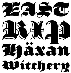
Avebury is wicked: a cheeky, ultra black blackletter that will work on a rock t-shirt as well as a beer label or art catalogue cover design. Avebury Black and Avebury Open were inspired by an early blackletter from the Caslon Foundry, as well as early blackletters from the Bruce Type Foundry. The gothic letterforms were subtly modernized; but although Avebury is more readable than many other blackletter revivals, Parkinson advices against setting a bible in it: “Caution. For display only”.
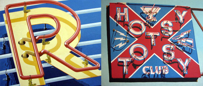
Some of Jim's paintings of neon signs.
Before desktop computers came along, how did you work? How were your pieces reproduced — and how were your alphabets turned into fonts?
Every alphabet or typeface I did from Hallmark on until the End of Analog was done in essentially the same way. First, the initial designing, maybe just vowels. The vowels appear the most and therefore contribute the most to the quality and personality of a font. I like to start with the capital I. It’s not too challenging and offers the designer instant reward and the encouragement to go on.
After the vowels, I add an m and an n. Then I can start tracing long strings of letters to establish spacing, relative weight and proportional characteristics, etc. I always start with “minimum.” Myron’s word. The parade of verticals helps establish spacing and color. After that, it is page after page of tracing lettering strings, adding new characters and adjusting old ones the whole time. Then I would go to the light table and ink the best tracings on pieces of single-ply, plate finish, Strathmore paper. Inking was a craft that I slavishly worked at perfecting. By the time I was back in Oakland, I was getting pretty good at it. For example, I inked both the Rolling Stone logo and the Ringling Bros and Barnum & Bailey Circus logo without needing even a spot of retouch. They both required a lot of beer, but not a speck of white retouch.
Alphabets were turned into fonts in a number of ways. Actually a lot of my early fonts were just alphabets masquerading as fonts. There were no bearings. The spacing was all visual, left to the whim of the designer/type setter. For an alphabet to become a font, the space needs to be designed and included as part of the letter. At least, as far as I'm concerned.
But anyway… First step was stats. Sometimes multiple prints were made and the words pasted up, one letter at a time. Sometimes the letters were pasted up in long horizontal strings with plenty of letter space between each character. A film negative was made, reduced so it could be trimmed out into a two inch filmstrip to make a Typositor font. Sometimes the stats were pasted up with multiples of each character so transfer type sheets could be made. There was no end to the ingenuity applied to the making of these "fonts".
When desktop publishing and digital font production came along, how did you respond to that? Were you in awe of the new technology?
In awe? I don't think so. I thought computers were toys. Like Speak & Spell. I resisted until I was exposed to Fontographer in about 1989 or ’90. Then it was like, “Man overboard!” I took the plunge. Not only was it a gazillion times easier than drawing and inking by hand, but you could charge more money. Go figure. So after twenty-plus years of drawing and inking by hand I was finally free. The new technology not only made my work easier, but it also allowed me time to do more of what I went to art school for in the first place, and that is painting. What do I paint? Mostly pictures of letters.
When I finally started making digital fonts, I realized quickly that it didn't make sense to try a do something that's already popular. By the time you manage to bring your entry to market, that style will be out of fashion. I also realized that it was very likely that I might be the only person to ever see the fonts I designed, so it might as well be a font that I would enjoy designing. So, maybe something easy, for starters. Over the years I had experimented with dozens of styles that I thought someday I might want to turn into fonts. Many were big display styles and the first four or five I made digitally were in the style of classic showcards. I like their irreverence and I like their spirit. My first three digital fonts were Showcard Gothic, Poster Black and El Grande, three showcards for the Font Bureau. Then the Moderne Gothics for FSI and Jimbo for Adobe. I still have a little bit of showcard left in me, but I think I have a couple of more interesting threads I would like to follow until they play out.
Balboa
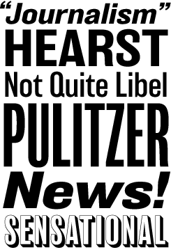
“Boldface” was one of the typographic inventions of the early 19th century, a style of advertising type created for maximum impact on billboards and magazine pages — the earliest mass media. Parkinson’s Balboa was inspired by those primitive sans-serif letterforms, which in their time were dubbed “grotesques” or “gothic” because of their striking looks. Parkinson gave the designs contemporary touches to make a distinctive modern design. With its five weights in three widths, Balboa is a flexible display family which lends a special look to books, magazines or brochures.
Benicia
Benicia reflects Jim’s ongoing fascination with the Golden Type/Jenson genre of the late 19th and early 20th centuries — sturdy adaptations of Nicolas Jenson’s book face from 1470s Venice. Jim felt that “the ATF Jenson thing needed more flogging” and managed to whip the Venetian model into a versatile typeface that works well in both display and text sizes. Its simplified shapes and sober italic make it more 20th-century American than 15th-century Italian. Benicia is named after a historic town in northern California.
Among your many fonts — what is your favorite?
My favorite fonts are still in my head. I can hear them knocking. They want out. “I'll get to you as soon as I can,” I shout back.
Your logos and typefaces cover an amazing range of styles. What is the one you are you most proud of? Do you feel like an actor sometimes — taking on a completely different persona for each job?
First, a couple of things about the typographic logos. They are not just my logos. Every job is a collaboration between a designer or art director or publisher and a type guy. Just as there are many people to blame for a bad logo, so are there many people to credit for a good logo. That collaboration, the logo history of the publication, the personality the publication wants to project, plus any number of other factors help make each logo different.
It is not my signature I am lettering. It is somebody else's signature. Maybe I feel less an actor and more a forger. Nobody comes to me and says, “I want my logo to look exactly like everybody else's.” If they did, I probably wouldn't be interested. I can't keep learning if I'm always doing exactly the same thing. Also, publications want their logos to look fresh and new and old and established all at once. Interesting problem. I love wrestling with that one. When I work on logos, I always try to find subtle little things I can do to make them timeless. Old, but new. It spills over into my font design. When I design a font, I can't see its future. I don't have a clue how its life will develop after I let it go. Will anybody like it? Will anybody buy it? Who knows? So, I might as well design something I feel like designing. After all, the fun of the design process and the learning that comes with it may be the only reward a particular font has to offer. My old lettering jobs offer a rich variety of letter styles that I want to make into fonts. It may give my work a nostalgic look, but my view of the past is much more precise than my view of the future.
One example. I designed a font called Poster Black, early on. A sharp-edged gothic with concave strokes. I wondered what it would look like if it was softened up a little, like it was inflated with air. Poster Black with gas. The result was El Grande, a soft gothic showcard style. It looks so mid-twentieth-century, that even the Font Bureau's own catalog makes the mistake of attributing it as a revival of a style popular in mid-century comic books and grocery store ads. So what looks old may not be exactly what you think. Fooling with time. It's the journey. I love the way things develop unexpectedly. Enjoy the trip.
Thanks for the insight! We'll keep an eye out for when those favorite fonts make it out of your head.
Showcard Gothic & Showcard Moderne
Showcard Gothic and Showcard Moderne are inspired by early to mid-20th century American commercial lettering. The theatrical, cheerful Showcard Gothic is “bulb-topped and showy, like a Betty Boop cartoon,” as John D. Berry wrote. Showcard Moderne has the cheerful confidence of a piece of hand-lettering from the 1920s or 1930s.
Mojo
Like almost all Bay area lettering artists, Parkinson mastered this lettering style that was popularized by 1960s artists Wes Wilson, Victor Moscoso, and Rick Griffin. The style is rooted in the Art Nouveau period and is influenced by turn-of-the-century Czech/Viennese poster designer Alfred Roller. Parkinson ended up designing a font in the same style: Mojo.

Who would you interview?
Creative Characters is the MyFonts newsletter dedicated to people behind the fonts. Each month, we will be interviewing a notable personality from the type world. And we would like you, the reader, to have your say.
Which creative character would you interview if you had the chance? And what would you ask them? Let us know, and your choice may end up in a future edition of this newsletter! Just send an email with your ideas to [email protected].
During the past year, we've interviewed the likes of Christian Schwartz, David Berlow, Dino dos Santos and Underware. If you’re curious to know which other type designers we’ve already interviewed as part of past Creative Characters newsletters, have a look at the archive.
Credits
This month’s interview was conducted and edited by Jan Middendorp and designed by Nick Sherman.
Supporting fonts
The Creative Characters masthead is set in Amplitude and Farnham; the intro image features Modesto; the pull-quotes are set in Richmond; the large question mark is set in Farnham, and the small URL at the top is set in Unibody 8.
Unsubscribe info
This message was sent to:
[email].
It is never our intention to send unwanted e-mail. If you no longer wish to receive this newsletter, you may change your subscription settings at: www.myfonts.com/MailingList
Comments?
We’d love to hear from you! Please send any questions or comments about this newsletter to [email protected]