
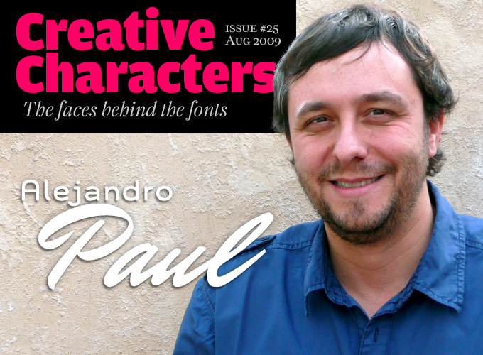
Buenos Aires, the capital of Argentina, has been at the forefront of graphic design in Latin America for decades. Today, one of that city’s most prominent forces in type design is Sudtipos, a remarkable type collective founded in 2001 by four experienced designers from the world of corporate and packaging design. This month’s interviewee is Sudtipos’ spokesman, who became famous for drawing and programming some of the most intricate script fonts ever digitized. Meet Alejandro “Ale” Paul, a man who likes to raise bars — and we don’t just mean chocolate bars.
Sudtipos was founded by a group of Argentinean designers who have all worked with major studios. What were your reasons for starting up your own foundry? How did you get together?
For much of the time the Sudtipos partnership has felt like a kind of “survivors’ group”. In December of 2001, Argentina’s economy collapsed, which caused a far-reaching crisis throughout the country. Everyone was affected both personally and professionally. Naturally there was much less demand for graphic design. I lost my job as an art director and began doing freelance packaging work for some of the few agencies that somehow managed to survive the collapse.
Along the way, I had met other graphic designers who had a particular appreciation for type. The foundry, or collective as we prefer to designate it, started because of that — packaging, editorial or brand designers making fonts for real designers. The first time we seriously spoke about founding Sudtipos was at a Buenos Aires event organized in 2001 by Rubén Fontana.
To what extent is your work as a type designer linked to your experience as a graphic designer?
The type link first became evident in design school. As a student I had to make my designs unique in order to stand out. Type is a design element that helps accomplish that in a big way. At first it was just things like applying type effects, or slightly modifying a letter here and there to make the design more personal. After graduation, real-world packaging design was an eye-opening experience as it implied looking at type very closely. For example, when you have to design the front of an ice cream container, common “fashion” fonts almost never work exactly the way you want them right out of the box. There are millions of containers that use the word “light”, and the last thing you want as a packaging designer is your design to be plain or impersonal or look like someone else’s.
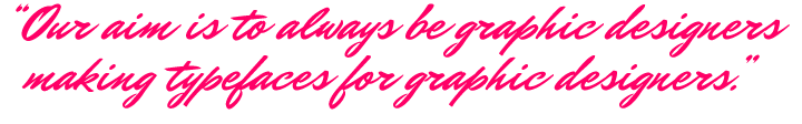
That original link is still there. Our aim is to always be graphic designers making typefaces for graphic designers. We try not to lose that particular focus. We’re always thinking about how to make a graphic designer’s work easier when it comes to using the type element in his or her design. Personally, I really like the idea of a graphic designer consciously choosing the perfect alternate character that fits a specific design project. It shows aesthetic sophistication and professional maturity. Whenever I manage to get a graphic designer to consciously choose an OpenType feature in one of my fonts, I’m happy.
Buffet Script

Buffet Script, which recently became available at MyFonts, is one of a series of wonderfully complex script fonts that made Ale Paul’s name as a master in this field. Like the exuberant Whomp, it is based on fantastic calligraphy by Alf Becker, arguably the greatest American sign lettering artist of all time.
In 1941, Signs of the Times magazine published an anthology of the alphabets Becker had drawn for the magazine on a monthly basis. In the late 1990s and early 2000s many of these alphabets were digitized, but no one dared touch the one alphabet that eventually became Buffet. It’s easy to see why: that particular page shows a jungle of letters running into each other and swashes intertwining — almost impossible to “fontify”. Ale Paul finally pulled it off.
Using the OpenType wizardry that he has become famous for, he turned that single page into a fascinating collection of letters, flourishes, alternates and ligatures. When using an OpenType-savvy program, all these alternates interact to allow the composition of just the right word or phrase. Spectacular.
Some of the old lettering books Alejandro has been inspired by for his typeface designs.
One of your creative partners when designing fonts for Sudtipos is lettering artist Angel Koziupa. How did this collaboration come about? Could you describe the process of working together?
I met Angel through one of the agencies I worked for as a freelancer. I was asked to art-direct a project with Angel. He had been doing lettering and logo retouching for design agencies for decades, but never a complete alphabet. I told him about Sudtipos and offered to help him turn one of his popular logotypes into a complete font. He picked up quite quickly on my instructions, and our first collaboration went very smoothly. Our working process evolved into something a lot like New York City in the 1930s: art director and lettering guy working jointly to create a design. But now of course it’s all digital, so the tasks of each team member usually have something to do with computers and software.
At first we were envisioning a collaboration that produces fonts representing South American cultures in general, and Argentinean culture in particular. Many graphic designers in Argentina, even long before the economic collapse, were dreaming of exporting our design style to the world at low cost. So there’s some of that dream in the first few projects Angel and I did. They were basic and very personal, and they contributed in a major way to shaping Sudtipos as a packaging-oriented type collective. Angel’s experience with lettering was a very good complement to mine with type. We used that dynamic to produce alternates and subtle digital variations to bring the type closer to real lettering. Most packaging designers work under the tightest deadlines, so the less work they have to do with a font, the better for them. The fonts that Angel and I produced seemed to strike a chord with exactly that kind of professional, which was very encouraging and gave us the incentive to keep going.
Our working process varies with the project. How it starts is usually the defining element. Sometimes it starts with one of us noticing a particular market need, or a gap to fill. Sometimes Angel simply sends me some ideas and we take it from there. Sometimes I try to provide inspiration by showing him new trends and ideas. We’ve been at it for a few years now, and we’ve learned a lot from each other. These collaborations have helped both of us in defining and making the most of our individual roles in the collective.
Are many of the Sudtipos fonts based on typefaces that were originally developed as corporate fonts or packaging type for a specific client?
A few of our fonts have their roots in custom logo work we’ve done for high profile clients. Habano ST, for example, was based on one of the most famous logos in Argentina, the Quilmes beer logo, drawn by Angel Koziupa long before the font existed. But the majority of the Sudtipos fonts are really reflective of ideas we’ve had for something graphic designers would need to help make a difference in their design, especially in packaging.
Chocolate

One of the best-loved script fonts from the Angel Koziupa and Ale Paul team. If a typeface could melt on your tongue, Chocolate is it. It comes in three flavors: Dulce (sweet), Caliente (spicy) and Amargo (bittersweet), each offering a different variant of an irresistible lettering style. The OpenType version includes three flavors all in one. Not just for chocolate packaging.
Inoxida

Inoxida is another collaborative work by Koziupa and Paul. Based on the popular Oxida — a common sighting on the packaging of organic foods — Inoxida is smoother and more graceful. Although it follows the same basic structure, Inoxida is not just a softening of Oxida’s rusty edges. It is a complete reworking of its construction, and introduces a subtler relationship between upper- and lowercase.
In Argentinean graphic design and advertising, is it difficult to convince clients to order custom-made type?
It almost never happens here actually. Local agencies don’t recognize the value of type in general. This is mostly an education problem, since design schools here don’t provide adequate focus on type. Designers graduate and begin working for local agencies, and the type-ignorant mentality spreads. But there are some international agencies here that understand the value of customization, and they consult with us for some special work. We’ve done some custom fonts for local children’s books, banks and TV commercials. Those were mostly commissioned by international agencies. The majority of our custom work is for major American and European agencies.
There has been an incredible boom of type design and typography in Latin America, and especially in Argentina. What do you think are the main reasons for this? Why has Argentina — and notably Buenos Aires — become such an important center?
I think the curiosity and experimentation were always there, but not so conspicuously. Graphic designers are always looking for ways to differentiate themselves from the crowd, and type was still officially uncharted territory in 1990s South America. Then came the internet, which brought it all to the surface. Hence the overwhelming exposure of a lot of South American work all at once. And it persisted because the internet suddenly made the whole world an open market for us, instead of the almost non-existent market we’d had here all along.
There is also something to be said about the Argentinean design process, which is part of the appeal to the world markets. Argentina doesn’t have the European design history, but we do put all of our being into our work, and sometimes because of that it comes out looking more innocent, more real, more human, with less of a mechanical base.
Could you tell us something about type design education in Argentina?
Until recently, type design education in Argentina was quite poor. Most of our universities didn’t even have a typography class as part of their graphic design curriculum. Designers interested in type usually just went to a series of talks we started a few years ago, an event called T-Convoca, where we simply learned from each other’s experiences. In 2009, typography in Argentina took an enormous progressive step when the first Master’s of Typography was created at the University of Buenos Aires. It’s an extensive course that lasts a year and a half, given by a team of some 25 teachers, led by Rubén Fontana, the man who introduced typography as a mainstay design class in Argentina more than 20 years ago.
Almond Script

With weathered capitals, with ascenders and descenders tall and wind-bent just the right way, Almond Script is textured calligraphy like only Angel Koziupa and Alejandro Paul can make it. Scarred and wavy like an exhausted warrior, slim and delicate like a tango dancer, this typeface is a unique convergence of the rough ancient brush and the modern Latin elegance. Nine out of ten packaging design experts agree: Almond Script can brand your product like no other script can.
Mati

The story of how Mati came about is one of those heartwarming father-and-son, coming-of-age stories that cannot be summed up in a couple of sentences. Just read it here. Ale Paul lovingly digitized his son Matias’ Father’s Day present, and lo and behold: the result is a cheerful, cheeky, usable 3-D font by an eleven-year-old. Matias is now thirteen, so even bigger things may be expected from him soon.
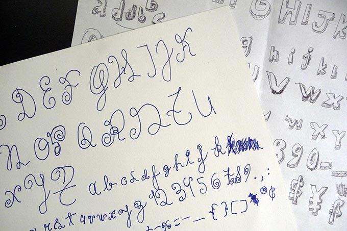
Drawings by Alejandro’s son as a Father’s Day present. The bottom set was used to create the font Mati.
Much of your work was inspired by 20th-century lettering and type design. Do you have any heroes in this field?
My heroes are the American lettering guys from the days before photo composition. People like Charles Bluemlein or Alf Becker amaze me with their ability to branch their work out in so many directions for the same project. These days I find myself in love with the Zanerian school of calligraphy, but that’s the way I’ve always been when doing my research for the projects I’m working on at the moment. Pre-tech American lettering has a fantastic history that is mostly overlooked by academics, so whenever my research reveals something new, it feels like I’ve discovered a treasure.
As far as metal type goes, my favorite faces are the ones by Barnhart Brothers & Spindler, from the late 1900s. I also like the timeless work of Hermann Zapf and Ed Benguiat.
Some years ago, you put together the lovely Bluemlein Collection. We were delighted to see that you’ve recently made the series available on MyFonts. Could you tell us something about your research into the work of Charles Bluemlein?
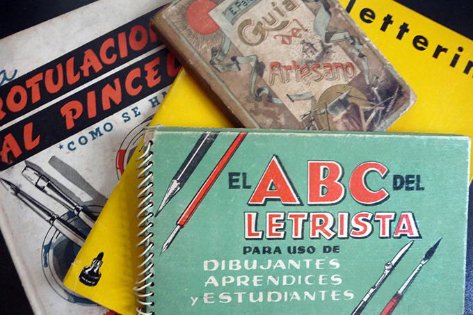
After working with Angel on a few projects, I became very interested in the lettering tools and methods Angel uses. I began researching where all this stuff came from. I remember he once showed me an old lettering book he kept. It was from the 1940s. I wanted to see and learn much more. So I became a library regular, a bookworm and an old book collector. The subject of lettering started spilling over in conversations with my friends. Then a friend of mine showed me a Higgins Ink catalogue and told me that I should digitize all 32 specimens there, because they are a great representation of the golden age of American commercial lettering. That was a time when many calligrapher-letterers like Charles Bluemlein were still trying their best to say no to the new film type technology that was doing a hell of a job mechanically emulating their skills and competing with their livelihood. I felt a solid connection with that last point, because I started designing type for a living when I lost my original job as an art director.
The Bluemlein collection was a lot of work, and it took a long time to complete. It was also quite meaningful, at least to me personally, as the point after which I began designing more elaborate and overloaded scripts. And of course, the Bluemlein collection was a golden moment for my subsequent research and discoveries. It put me on the way to discovering old sign painting masters, showcard letterers and calligraphy artists from all over the world.
Script typefaces are one of the strengths of the Sudtipos collection. Would you say this has to do with Argentinean graphic culture — or is it more of a personal thing?
It’s more of a personal thing. Outside of common product packaging, Argentinean graphic culture is more European and modernist in character, rather than personalized with scripts. My experience in branding product packaging was a natural catalyst for me to be interested in scripts and seek like-minded people for the collective. Since then, my passion for early 20th century American lettering was the main drive for most of the scripts we produced. Sometimes you can find a rhythm expressive of our culture in some of our fonts, like Candombe or Murga, but for the most part our work is done for international users rather than motivated by local culture.
Grover

For those who know Alejandro Paul as the king of scripts, Grover may seem out of character. But a simple search will demonstrated that Ale (and please pronounce that Aah-Leh) is a designer who masters a broad range of styles. Named after Grover Washington, Jr., the jazz saxophone player, Grover is one of his personal favorites for everyday use — a readable display-and-text face that comes in a sans and a slab serif version. Grover unites two very different styles of typeface: the European grotesque of the late nineteenth century and the rounded style found in 1960s America. The result is a clear, friendly face: geometrically constructed, yet very human in appearance.
Miss Le Gatees

The Charles Bluemlein Collection is among the latest additions to our library of Sudtipos fonts. The Collection is based on a 1940s catalogue from the Brooklyn-based Higgins Ink Co., which contained a portfolio of script alphabets credited to lettering artist Charles Bluemlein. The scripts were assembled in an unusual way — by collecting signatures that were then expanded into complete alphabets. Ale Paul took extreme care to render the original scripts authentically, keeping the fictitious names that Bluemlein originally assigned to each alphabet. Miss Le Gatees is one of the most successful: delicate, impeccably connected, beautifully detailed.
What constitutes a good script font?
A good script — just like any other typeface, really — should sucessfully perform the task for which it was made. This has to happen on many levels, like readability and visual stroke consistency. The relationship between characters should be visually balanced. In connected scripts the connections should be perfect, and in disconnected scripts the spacing should provide the visual balance. Technically speaking, the script should be made with the least number of Bézier nodes possible, overlapping strokes should be crisp and simple where needed, and the counter of the script’s overall setting should harmonize as much as possible. A script can have a billion swashes, but it will be visually appalling if everything doesn’t fit together in visual harmony.
Many of your fonts are based on pieces of lettering showing only a limited number of letters or a partial alphabet. Do you have a method for expanding such an incomplete alphabet into a full set of characters?
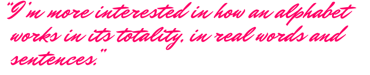
I usually begin working with words. I try to keep it real. ABC and AaBbCc sequences are not real. I realize that sometimes a single glyph shown attractively can sell a font, but I’m more interested in how an alphabet works in its totality, in real words and sentences. I always look for new possibilities of mixing letters, as long as those possibilities are real. In the beginning the mix is just pairs of letters randomly falling together, just to see what works within the concept I have in mind for that particular project, what is needed to fix the original structure, and what kind of limitations I will have to play within. There I said it: Play. I do play a lot with words and letter combinations. It’s really more like a puzzle that I’m putting together, a kind of game.
Is there a particular project in type design that you hope to be able to work on in the near or distant future?
Perhaps one of these days I’ll try my hand at a serious text font, but for now I’m quite content with the projects I have lined up.
Thanks Ale. We’re curious to see what fonts you and your colleagues (and your son!) will come up with next.
Mrs Blackfort

Mrs Blackfort is another ravishing result of that fascinating calligraphic adventure that produced Charles P. Bluemlein’s Alphabets. It is wider and more upright than most scripts, which makes it very readable ever at smaller sizes. A fine script for invitations, menus and the like.
Mr Dafoe

Of all the Bluemlein scripts, Mr Dafoe is one of the boldest and manliest. An alphabet rendered by brush rather than by fountain pen. Great for book covers and showcards.

Who would you interview?
Creative Characters is the MyFonts newsletter dedicated to people behind the fonts. Each month, we interview a notable personality from the type world. And we would like you, the reader, to have your say.
Which creative character would you interview if you had the chance? And what would you ask them? Let us know, and your choice may end up in a future edition of this newsletter! Just send an email with your ideas to [email protected].
In the past, we’ve interviewed the likes of Christian Schwartz, Dino dos Santos, Jim Parkinson, Mário Feliciano, and Underware. If you’re curious to know which other type designers we’ve already interviewed as part of past Creative Characters newsletters, have a look at the archive.
Colophon
This interview was conducted & edited by Jan Middendorp, and designed by Nick Sherman.
The Creative Characters nameplate is set in Amplitude and Farnham; the intro image features Grover and Mr Dafoe; the pull-quotes are set in Mr Dafoe; and the large question mark is in Farnham.
Comments?
We’d love to hear from you! Please send any questions or comments about this newsletter to [email protected]
Subscription info
Want to get future issues of Creative Characters sent to your inbox? Subscribe at www.myfonts.com/MailingList
Newsletter archives
Know someone who would be interested in this? Want to see past issues? All MyFonts newsletters (including this one) are available to view online here.