
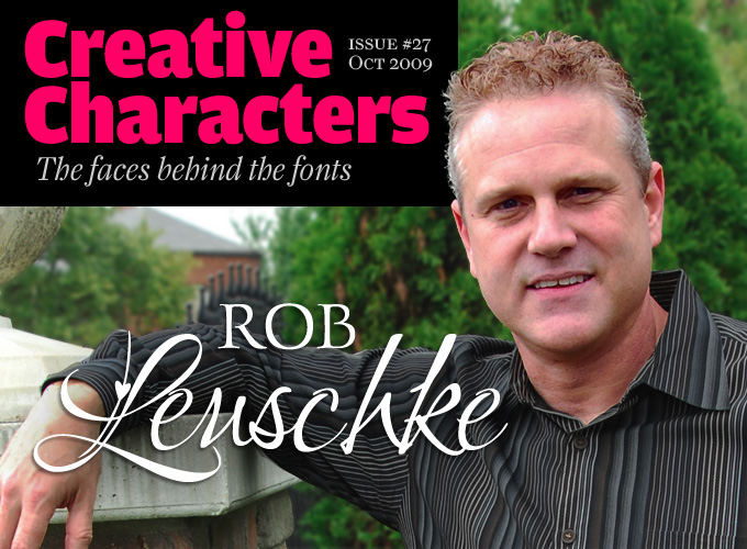
Many type designers make script fonts, but precious few match Rob Leuschke’s consistent high-quality production. Although his letterforms often have an immediate familiarity to them, they are seldom based on existing letterforms. Rob Leuschke does not revive typefaces, he draws them afresh. He doesn’t think of himself as a calligrapher, though. Then how does he do it? Read on and find out how much of what looks like spontaneous handwriting was in fact painstakingly drawn.
Rob, you’ve been free-lancing for over 20 years. Were you always interested in lettering and type design?
Since I was a small boy I had an interest in art and lettering. Handwriting was my favorite subject in first grade and I liked to copy the emblems of professional football, hockey and baseball teams. I’ve never been much of an illustrator, but graphic drawings — especially those containing letterforms — were always a big pleasure. When I got the call to design the word mark for the Minnesota Wild back in 1997, it was an especially nostalgic thrill to do something I dreamed about as a kid.
During my high school years I wanted to become an architect. Drafting and home design were my favorite classes. My drafting teacher was always impressed with the lettering on my home design drawings and in fact wrote in my high school year book that I was the best letterer he’d ever met. He later suggested that it would be quite difficult to become an architect, arguing that I’d need to know someone in the industry to do well. So, I entered college to pursue the more attainable goal of becoming a graphic designer.
At the University of Missouri, my graphic design professor also saw the potential I had with lettering and tried to steer me in that direction. I didn’t think I would have as much potential to make a living doing calligraphy as I would in the more commercial field of graphic design, so I focused on my artwork.
After graduation you landed a job at Hallmark Cards, where you worked with some of the best lettering artists in the industry. Was this something you’d hoped for while in college? And was it difficult to get in?
Recently out of college, I was working for a small sign manufacturing firm here in St Louis, creating proposal illustrations for the sales team. I’d been working there for about a year when I got an invitation to my college roommate’s wedding. Jim Langford lived across the state in Kansas City. He’s a gifted artist and had been hired out of college to work in Hallmark’s Lettering Department. Jim gave me a tour of Hallmark’s Corporate Headquarters and it was then that the light came on in my head, “I can do this!”
I came home inspired and determined to get a job at Hallmark. At the time, the sign company was not doing well, and it was only a matter of time before it would go bankrupt and I’d be out of a job. It did not feel at home there anyway. The kinds of things I saw Jim working on at Hallmark were exactly what I wanted.
So, I put together my portfolio, drove back to Kansas City and talked my way into an interview with the Creative Recruitment Director at Hallmark. He was very nice, but basically told me there was nothing about my work that Hallmark would be interested in. It was too graphic in nature. The disappointment was there, but so was the determination. I began putting together a whole new portfolio of artwork, focusing on lettering. It worked. They flew me to K.C. where I stayed at the Crown Center Hotel and was treated like royalty. I interviewed for two days and all seemed as if I was sure to be hired. Then came my last interview with the vice-president of the company. He thumbed through my portfolio very quickly and said something like, “This work is awful, what makes you think you deserve a job at Hallmark?” I was dumbfounded. Up to that point everything had gone so well! Needless to say, I came home a bit discouraged, but still hopeful that that last interview was not the final say.
About a week later, I got a nice letter from the Director of Creative Recruitment that basically said, “Thank you for coming to interview,” and that they would keep me on file. So I waited. Four months went by and the sign company where I worked filed for bankruptcy. I was a bit desperate. So, I called Hallmark and asked if there was a way I could progress my file, “perhaps by creating another portfolio?” Yes, another portfolio would be helpful. “Gee whiz,” I thought. “I wish I had known that when I was first declined.” The third portfolio took about a month to put together and my work was finally up to Hallmark’s standards. I began working in the Lettering Department in July of 1983, and that’s when I really began to learn how to do lettering. Working at Hallmark Cards was like going to graduate school and getting paid for it. It was fantastic
CORINTHIA
Corinthia is Rob Leuschke’s most successful font to date. It is gracious and more formal than some of his other steady sellers such as Inspiration and Ambiance, but it is never stiff or stuffy. It connects beautifully into a confident cursive flow. Corinthia was originally designed in one weight only. After seeing it used on packaging, the designer added medium and bold weights to allow the user more flexibility on dark or multi-colored backgrounds.
BABYLONICA
Rob has described Babylonica as a “calligraphic, hand-lettered script”. Of course, that casual phrase doesn’t begin to describe the sophistication of this font. Rob’s calligraphic lettering is as expressive as it is professional. Babylonica looks as if it was jotted down with confident speed, using a hard brush or a reed pen. The rough edges are beautifully rendered and the direction of the strokes is different with each letter, making for a lively, energetic effect on the page.
Ambiance
Ambiance is one of Rob's earlier fonts, published at Bitstream back in the pre-TypeSETit days. It is the font that set the tone for many of Rob's later informal scripts. It comes with a wide array of characters, including a swash alternate for each upper- and lowercase letter. Called contextual alternates in OpenType, the swash characters are automatically substituted in the appropriate context when you select them. In case you use a progam that is not OpenType-savvy, we offer two supporting fonts, Ambiance Swash, containing all the swash characters, and Ambiance Coalesce, a blend of the swash capitals and the standard lowercase letters.
What were the main things you learned at Hallmark?
So many people at Hallmark are world class professionals who know how to create styles to express a specific social situation. I gleaned knowledge and skill from the experts in a number of styles. I think the most important thing I learned at Hallmark was what makes a strong letterform. We learned how to take a piece of type, and add embellishments with a pencil on tracing vellum. From there, the pencil marks were cleaned up and eventually inked. A separate group of artists were given the task of taking the lettering artist’s penciled work and inking it to completion.
You’ve drawn hundreds alphabets for greeting cards. How does that work? Do you get a brief, or some guidelines? Who decides whether a piece of lettering is “right”?
I didn’t really design complete typefaces at the time. That task was left to a sub-department of typographers. But I did put the lettering on hundreds of greeting cards. The challenge was to create lettering that would match the artwork I was working with. Hallmark had a very complete review process. For lettering, it was a matter of finding a lettering style that complemented the feel of the product. Once the lettering artist had completed his work, it went to “Committee” for review. Supervisors and directors were very good at determining when a style worked and when it didn’t. If a style got rejected, there was usually very good commentary from the committee as to what was needed or lacking. Any revisions the committee asked for were completed and returned for a second and hopefully final review.
Styles depended on the product. A juvenile card (the industry term for children’s cards) required a completely different look than other products like masculine, feminine or humorous cards. Sometimes there were specific instructions from the designer or art director that required a departure from the norm. After a few months it became easy to look at a piece of artwork and know what kind of style to use with it.
After leaving Hallmark, you made your living creating hand lettering. What got you focusing on font development?
When I first started making fonts in the 1980s, all of my fonts were designed for my greeting card work. I made fonts that looked like my hand lettering. Some fonts were based on examples my clients sent me of looks they would like to have access to. I didn’t sell my fonts back then for two reasons: First, there weren’t many commercial fonts available to my clients that catered to the specific needs of greeting cards; Second, since they were only for my private use, most of the fonts I made didn’t have complete character sets. I simply didn’t have a need for diacritics and some fonts had special characters in the incorrect glyph so I could make more custom designs for the cards.
After 9/11, the economy slowed considerably, and the greeting card work began to dry up. I needed to do something to continue making a living. Not knowing what to do, one day I got an e-mail asking about the word LOVE on my web site. Then I got another e-mail, and then several more. People apparently were talking and wanted that font. The problem was, it wasn’t a font. It was hand lettering that I had created for a client on a project where I had collaborated with Michael Clark, another former Hallmark artist. He and I had done a series of 12 words expressing different emotions. After receiving so many emails, I decided to create a whole font based on the single word LOVE. It was a success, and I decided that other fonts that I’d made over the years might do well, too. So I began finishing fonts with all the characters and diacritics and put them on the market for the public to use. That’s how it got started, and I’ve been creating fonts for the public since.
cherish
Cherish explores yet another area in the calligraphic realm. It successfully mimics energetic handwriting with an inflexible brush or maybe a reed pen, resulting in a scratchy effect.
Love light
Prior to publishing Love Light, Rob had done a few type designs for ITC, Bitstream and others, but never offered his work directly to the public. “Love” was one of the words he designed for a joint project with calligrapher Michael Clark. By popular demand, it was made into a typeface – his first self-published font.
inspiration
Inspiration is another font based on the series of twelve expressive “key words” designed in collaboration with Michael Clark. Inspiration is fun: it dances and swings and bounces. It evokes festiveness, music and sunshine. Inspiration is included in Scrappers Package, one of TypeSETit’s inspirational Value Packs.
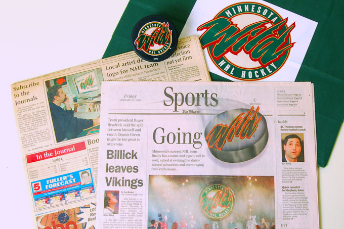
In 1997, Rob was commissioned to design the word mark logotype for the NHL's newest team franchise, the Minnesota Wild. Above are some examples of the logo in use, as well as some newspaper articles about it.
Where do you get your ideas for new alphabets? Do you look at mid-20th-century lettering? At handwriting from the past? Or is it just doodling and trying out letterforms?
I do some doodling, but I find that my doodles all look the same. So I try to look for things that are not what I would typically do, then give them my own adaptation. If something catches my eye, I make a note or take a picture with my cellphone. That’s how I came up with Arizonia. I saw some lettering painted on a truck and took a photo.
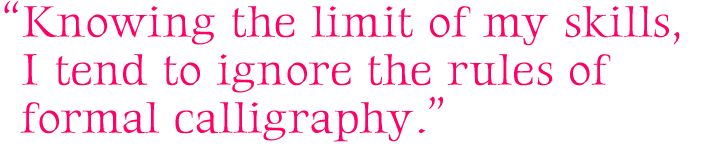
Sign painters have such a gift for beautiful letterforms. As for other designs, since I am proficient at much but master at nothing, I tend to combine styles. I’m not comfortable with my hand-lettered calligraphy. I think it’s a bit amateurish compared to some of the best calligraphy in the world by folks like Donald Jackson, Hermann Zapf, and Sheila Waters. Knowing the limit of my skills, I tend to ignore the rules of formal calligraphy. So, I combine looks.
Take for example, Lovers Quarrel or Bonheur Royale. They have a calligraphic feel, but I intentionally broke rules and added swashes and swirls, especially with the uppercase forms and gave it a more contemporary script look. Why? Well, to be honest, I stink at formal uppercase Roman forms. The kind of lettering I am most comfortable with, and probably best known for, is a contemporary look. I’ve always enjoyed doing work with a brush or architectural ruling pen. So I guess brushy script styles are my forte.
thenautigal
Here’s Rob’s story of TheNautiGal: “When one of my friends asked me to create some lettering for the name of his boat, I got out a ruling pen and put together TheNautiGal. He then took the computer file I had generated and gave it to a sign company to have the vinyl lettering produced. When I saw it on the boat, I realized it would make a nice font. Because most of my work has a light and delicate style, I later decided that TheNautiGal needed a more robust weight that would lend itself to more commercial applications. So I created a bolder version of the font.”

Much of your digital work is apparently based on hand-rendered lettering as well as handwriting. Is there a marked difference for you between those two techniques, lettering and writing? What are your favorite instruments to write or draw with?
Most all my work is hand-lettered as opposed to hand-writing because there is almost always a certain amount of design in each character. As for techniques and tools… with flourished formal scripts, I usually start out with a pencil on slick stock to draw the forms. From there, I overlay a piece of vellum and ink the outlines with a mechanical pen.
For calligraphy, my favorite tool is a Braus flat nib pen. It gives me the best quality of all the brands I’ve tried. Usually my calligraphy is of such mediocre quality, I retouch it with a mechanical pen.
When I do brush lettering, I like to use a Pentel Color Brush, using black ink. I often just dip it in india ink. But much of what looks like brush lettering is actually created with an architectural ruling pen. It’s normally used to draw consistent line work on mechanical drawings. I don’t use my ruling pen for such purposes. Instead, I dip the pen in an ink bottle, turn it on its side and do very loose lettering with it. I can’t take credit for the technique. Guy Guinta at Hallmark first showed me how to use the ruling pen for creating lettering. With the ruling pen, one can load the pen with paint or ink and create beautiful loose lettering. And with a textured paper, the creations take on even more dramatic effects. Unique thick and thin lines are created when the pen is used on its edge. Once the lettering is created, I use a mechanical pen to retouch areas.
Your font Gideon is a very elegant hand-drawn Roman. I could imagine a complete family in that vein, with small caps, old style figures, italics, bolder weights… have you ever considered designing a large family like that?
When Julian Waters released his Waters Titling, I was blown away by its classic beauty. The only thing for me that it missed were the lowercase letterforms to match the beautiful Roman capitals. Gideon was one of those designs I decided to tackle because it is such a departure from my other work. I mentioned that I stink at formal uppercase Roman letterforms. Gideon was a challenge I placed on myself to design a nice Roman style that I would consider using should the need arise. It was a laborious process for me. In fact, I worked on it off and on for months. By comparison, Babylonica took me three days to complete from start to finish. Though I feel out of my comfort zone with a style like Gideon, I think it’s important as an artist to challenge myself and work outside of what’s comfortable.
Funny you should ask about a whole family. I’ve been working for many months on a text family. The intent is to complete a set of serif and sans-serif fonts complete with italic/oblique versions in as many as six weights. It’s a monumental undertaking. I’m in awe of the work from folks like Adrian Frutiger, Sumner Stone, and Hermann Zapf who make typographic design look so easy. This family I’m working on will be my namesake, “Leuschke.” It feels less like a labor of love and more an exercise in futility, but I’m determined to eventually complete it. Being a bit of a perfectionist, and since it will have my name attached to it, I want it to be my absolute best effort.
passionsconflict
PassionsConflict offers a perfect balance between class and informality. It has the elegant thick-thin contrast of an English script, but the varying angles and widths of the single letters lend it spontaneity, swing and pizzazz.
PUPPIES PLAY
Puppies Play is one of Rob Leuschke’s latest typefaces. It is a fun, bouncy script with connectors that give a playful flow. Perfect for baby shower invitations, nursery rhymes, and other items that require a fun, youthful look.
WaterBrush
It’s called WaterBrush, and it’s described as “ dry brush script”. Ah, the joy of name-giving! WaterBrush is nice and rough, with lots of bounce and fun. Great for casual uses as well as sophisticated events.
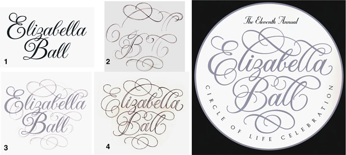
The process of embellishing typography. 1) Initial words created in a style from Rob's library of fonts. 2) Penciled swashes on tracing paper. 3) The tracing on top of the type. 4) An inked outline of what eventually became the piece shown here in its printed form.
Since your namesake family is down the road, do you have any other ideas you’ve been working on? Oh, and how do you pronounce your name?
I have a lot of work that is more for social expression, or scrapbooking, but lately, I’ve been focusing on creating fonts that have more commercial applications. I’ve recently come back to beautiful italics with the thought that I could make an italic font that would be good for packaging and advertising. I’m working on a font now called Italianno. Most of my script fonts have elaborate uppercase forms. I decided I would make Italianno with more simple Roman uppercase forms. Most italic fonts have non-connecting serifs, but I decided to add the twist of creating connectors between the lowercase forms. So, Italianno is an italic in form, but a script in style.
My name is not a common one. My ancestry traces back to eastern Germany. The correct pronunciation is Loysh-kah. My family “Americanized” it a long time ago, so we pronounce it Lusk-ee (rhymes with husky).
Thanks, Rob. I’m sure many people will look at your work with different eyes after reading this interview.
italianno
With his latest offering, Leuschke definitely goes classic. Italianno is an elegant, calligraphic script in the tradition of italics written with a broad nib pen. Its timeless letterforms connect seamlessly. Perfect for invitations, scrapbooking, and packaging.

Who would you interview?
Creative Characters is the MyFonts newsletter dedicated to people behind the fonts. Each month, we interview a notable personality from the type world. And we would like you, the reader, to have your say.
Which creative character would you interview if you had the chance? And what would you ask them? Let us know, and your choice may end up in a future edition of this newsletter! Just send an email with your ideas to [email protected].
In the past, we’ve interviewed the likes of Alejandro Paul, Dino dos Santos, David Berlow, Ray Larabie, and Underware. If you’re curious to know which other type designers we’ve already interviewed as part of past Creative Characters newsletters, have a look at the archive.
Colophon
This interview was conducted & edited by Jan Middendorp, and designed by Nick Sherman.
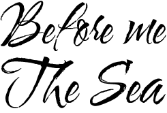
The Creative Characters nameplate is set in Amplitude and Farnham; the intro image features Gideon and Love Light; the pull-quotes are set in Gideon; and the large question mark is in Farnham.
Comments?
We’d love to hear from you! Please send any questions or comments about this newsletter to [email protected]
Subscription info
Want to get future issues of Creative Characters sent to your inbox? Subscribe at www.myfonts.com/MailingList
Newsletter archives
Know someone who would be interested in this? Want to see past issues? All MyFonts newsletters (including this one) are available to view online here.