
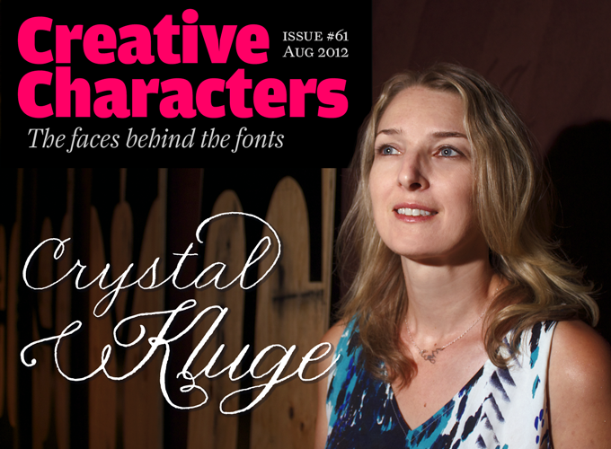
Unlike most of our interviewees, Crystal Kluge never dreamt of working OpenType magic or getting the most out of FontLab software. Pens, pencils and brushes are her tools of choice. She’d already found her own enchanting style of lettering and illustration when she was approached by Font Diner’s Stuart Sandler, who had spotted her work when shopping for wedding invitations in Minneapolis’ Uptown area. In 2006 the twosome started the Tart Workshop. It’s a dream team: Kluge draws cheerful, sassy letterforms and pictograms, Sandler makes them into smart and usable fonts with a catchy swing. And the beat, as they say, goes on.
You’re a lettering artist rather than a type designer. Do you have a formal education in calligraphy or lettering?
Drawing letters has been a recurring theme in my life. I’ve been attracted to letterforms since I was a child. In college, I studied Interior Design and Art. While I did plenty of architectural lettering, calligraphy was certainly not in the curriculum. During that time, I worked as a graphic artist for the university’s graphics shop and as a sign maker for a hardware store (lots of hours with chisel-tipped sharpies mimicking the head sign maker’s hand). After college, I worked in interior design for a few years. Seeking a change, I took a position at a stationery store, where among other tasks, I did store displays. From there, I launched a thriving career as a freelance artist. Although I’ve taken many courses in the book arts (western calligraphy, Japanese calligraphy, letterpress, illustration) and attended calligraphy conferences over the years, I am self-taught.
As a lettering artist, who are your clients? What is the kind of job you enjoy most?
I’ve been blessed to have a range of great clients. For me, having a variety of projects on my plate keeps me inspired and motivated. Over the years, I’ve worked with print and online magazines, graphic design firms, advertising agencies, photographers, clothing designers, stationery companies, gift product manufacturers, sticker manufacturers, art museums, restaurants and bars, retail stores and many design-savvy brides and grooms.
A few things in the studio at the moment: A watercolor map illustration for a local magazine; I’m finishing up a poster design for the upcoming “Expletive Show: Ugly Words to Admire” at Light Grey Art Lab Gallery (it has Bookeyed Suzanne worked into the design); a couple of logo design commissions. I’m working with Anna Corpon of Brevity in Brooklyn to create bespoke calligraphy necklaces — they are quite lovely. A few cute spot illustrations for a photographer. Stationery calligraphy for weddings in Montana, New York and one just across town in Minneapolis. And of course, another new typeface with Stuart Sandler.
Stuart Sandler of Font Diner is the type designer who digitizes your fonts. How did that collaboration come about?
Stuart spotted my lettering at PaperSource. He and his then fiancée Ann had a idea for an illustrated guestbook for their wedding and were seeking an illustrator. Luckily, he liked my style and commissioned me. We lost touch over the years, he and Ann went on to create the Guestbook store, his foundry Font Diner grew and FontBros was born. Then in 2006, we reconnected and started Tart Workshop. More recently, Neapolitan Fonts was created for which I also design along with Stuart and Dave ‘Squid’ Cohen.
Did you ever consider making your lettering into fonts before he approached you?
No, fonts were not on the agenda. I was a fan of P22 (Cézanne and Da Vinci were everywhere) and Emigre, but wasn’t aware of many independent foundries until I met Stuart. Unlike today, when we first met in 2000 it was a much smaller pool.
Nelly Script, Flourishes & frames
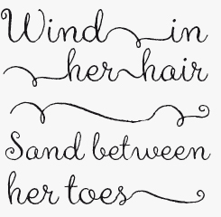
Nelly, with its Flourish and Frames companions, is a romantically inclined semi-formal script with a sensible head on its shoulders: it’s delightfully readable for all its scratch quill tip character, and is well suited to both intimate moments and grand extrovert declarations.
Henparty sans & serif
The Henparty fonts are a pair of nearly-identical twin sisters, Sans and Serif. Let this bouncy, spirited twosome loose on packaging and branding projects that are crying out for a dose of wilful, headstrong girlie-ness. The two of them work well individually, but can also be combined for enhanced variety. Attention: this duo is lowercase-only, there are no capital letters.
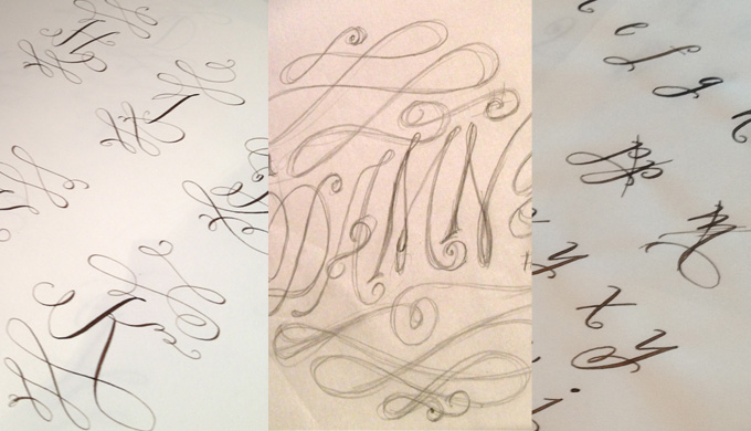
From left: Barocca Monograms proofs; rough sketches for Kluge’s hand-lettered poster for the Expletives exhibition; working sketches for Kluge’s new font San Rafael.
Why Tart Workshop?
Some things are best left for the imagination…
Okay then, how would you describe Tart Workshop fonts?
Whimsical, romantic, quirky, cute, happy, feminine, irreverent, beautiful, dramatic, charming, rebellious, and sweet.
Many people are a bit confused about the difference between a script font and something that is truly hand-lettered. What would you tell them?
It’s the difference between something that is couture and something ready-made. Depending on your project, one may be better than the other. Both can be beautiful. If it’s hand-lettered, it’s designed especially for the project and client, and is similar to an illustration. It can be more unique. If it’s a script font, it will more consistent. Although OpenType allows for some lovely variations to give you a more hand-lettered appearance.
What makes it fun to do?
Tart Workshop fonts are an expression of my personality. The fonts we create are lettering styles I use in my own work and life. Each typeface starts with a spark of an idea, the labor of putting it together, the joyful anticipation of the release and the thrill of spotting the typeface out and about. Seeing how they are employed by talented designers around the world (especially a few I’ve admired for years) is an absolute delight.
It’s gratifying to see my lettering and fonts connect on a personal level with others. Someone emailed me yesterday mentioning that she spotted Nelly Script tattoos on a woman at the beach. Often they are used for wedding invitations and baby announcements, some of the most significant events in people’s lives. One of the most flattering compliments I’ve had was this response to a blog post a few years ago regarding fonts in book title design at Publisher’s Weekly.
“After reading this blog yesterday, I actually had a dream about Henparty. Not the font itself, but the idea of the font. Someone showed me a pair of shoes in the dream, and I immediately identified the whimsical pair as ‘Henparty Shoes’. I’ll leave it to the experts to decide what that means (most likely, that I should stop reading blogs and shopping for shoes online), but I thought I’d let you know that this post stuck with me.”
And I simply haven’t tired yet of putting ink on paper — creating beautiful lines on a page is very satisfying.
Have you considered making books, either for children or grown-ups? What would its story be about?
Unfortunately, strong storytelling is a skill I lack. It would be wonderful to pair up with a talented writer and create a children’s book together. Something in the spirit of Eloise or Olivia would be delightful. Happy, cute and a little irreverent. Fantastic and magical chapter books similar to Coraline, Lemony Snickett, Narnia or Harry Potter would be quite rewarding to develop the visual elements for, hand-lettered titles & headings, maps, character illustrations. Beautiful, clever and a tad dark.
Aya Script
Connecting script fonts are a fairly common sight nowadays, especially those that take advantage of the magic of OpenType technology. Aya Script does that too, but it is Aya Script Ribbons that takes us somewhere really interesting by adding connecting loops, swirls and bows before, after and between words. That OpenType magic means that ribbons automatically connect and mirror each other upon entry & exit.
Bookeyed Suzanne
Bookeyed Suzanne is, in Kluge’s own words, “a modern girl with vintage style”, a font perfectly suited to these times of laptop and smartphone toting crafty, folksy people. Cute and loaded with personality, Bookeyed Suzanne has some powerfully intelligent OpenType goodness working hard under the surface to supply charming alternates. Look out for older brother Jack and new arrival Nelson, the latest to the join the family.
Could you describe your font design process? Which letters come first? How does the collaboration process with Stuart Sandler work?
Most of the fonts created for Tart Workshop are developed from styles I use every day in my lettering work. For example, I’m currently working on a font design based on a logo I did for a photography studio. I always start with the easiest letters, which are those already there in the logo, then move on to those that are similar, then fill out the rest. The last to be created are the symbols and alternate glyphs that seem to demand creating as I do mock-ups. Sometimes these flow easily, sometimes I get hung up on a few glyphs that just don’t work.
Tart Workshop fonts always start by hand. I create the lettering with a steel-nibbed dip pen often using a walnut ink tinted with Higgins Black Magic, which lately is my vehicle of choice in work for reproduction. I like the viscosity of the walnut ink but need more opacity. Sometimes I may begin with pencil sketches, but I often work directly in ink. The letterforms are then scanned at a high resolution and cleaned up and tweaked in Photoshop. Once I’m pleased with the letterforms I pass them onto Stuart. Depending on the font, the time spent seems to be about equally divided between the drawing board and the computer.
Stuart will review the files and let me know his thoughts, proposals for changes, additional material he may need, etc. Once he’s done his magic, he will send me back a rough form of the font to play with and we’ll go back and forth from there. Some fonts have come together very easily, others have taken more time and tweaking. Luckily, Stuart has many years of experience so generally they are pretty solid to begin with.
The fonts created for Neapolitan are more eccentric. The ideas may be inspired by an external place, image, or my own doodles. I use a wider variety of writing tools and materials for Neapolitan. Although the fonts are often a little simpler, the process is similar.
Back to lettering. What would be your dream job?
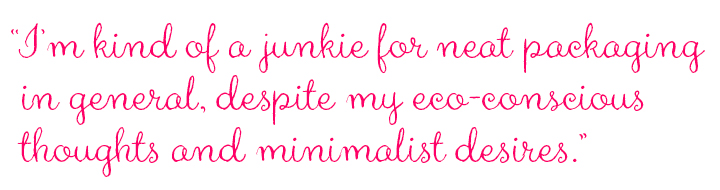
Although my fonts have been used for book titles, I haven’t been commissioned to design a hand-lettered book cover yet. I’d be delighted to do book cover design and wine labels. I adore wine labels. Actually, I’m kind of a junkie for neat packaging in general, despite my eco-conscious thoughts and minimalist desires.
Walking past Saks Fifth Avenue, I fell in love with the “Want it” campaign that Marian Bantjes designed for them a few years ago. Of course, everything Marian Bantjes designs is incredibly amazing (she and Jessica Hische are at the top of my list of contemporary letterers I admire). It sparked a desire to some day design for a major high-end store campaign and walk past my work in their windows.
Madelinette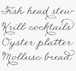
Based on a traditional calligraphic style developed late in the nineteenth century called the Palmer Method, Madelinette is thoroughly traditional and very, very proper. Evocative of an era when elegant cursive penmanship signified considerate, careful communication, this font is enhanced by OpenType programming to ensure a smoothly flowing organic handwritten feel.
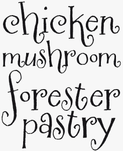
Crafty Girls
Crafty Girls is a simple and even naïve handwriting font, great for crafty projects and for blogging about crafty projects. Now available as an expanded Pro font, enhanced with more characters, dynamic OpenType ligatures and more!
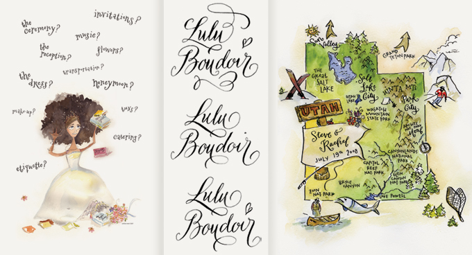
Some of Crystal Kluge’s illustrations and custom lettering pieces. Left: “Frantic Bride” was created in 2007 for a wedding fair in Milwaukee. This lettering style later became the Sugarplum font. Center: Three variations of a wordmark. Right: Hand-drawn maps are one of Kluge’s specialities. Map of Utah for a special occasion.
Do you have any heroes in the calligraphic world?
I first became interested in calligraphy as a 11-year-old having seen a book with Sheila Waters’ art at my grandmother’s house. I am still in awe whenever I see any of her work. She has been integral to the calligraphy revival in the United States and has taught and inspired so many talented calligraphers.
There are a number of amazing calligraphers and lettering artists I admire. The list is ongoing: Michael Sull is a wonder. Doyald Young’s books knock my socks off. Stephen Rapp’s lettering and fonts are consistently beautiful. Laura Worthington is a young powerhouse. John Stevens has an incredible range and dynamic energy in his work. I like Bernard Maisner’s dramatic flourishes. I’ve always found the illustrator Elvis Swift’s lettering charming. I like quirky. I like expressive. I like unconventional.
Most of your work looks spontaneous and whimsical. Have you tried your hand at designing more formal scripts, such as Copperplate or Spencerian?
I am drawn to playful, romantic lettering, perhaps it’s the influence of having two young daughters creating art books in my studio. I have dabbled with more formal scripts, but find myself pulled to more casual, rebellious youthful styles. That may change in the future. I’d love to study Chinese and Arabic calligraphy.
Any chance we’ll see a Tart Workshop text typeface one day?
Perhaps, someday … Right now, I have too many display typefaces dancing around in my head and inside my sketchbook.
We’re curious to see the outcome of that dance. Many thanks!
Sugarplum
Sugarplum is sweet and sassy, smart and restless and fun to be around. It will demand attention but do it while gently squeezing the reader’s hand. Like much of Kluge’s output, these two fonts will have their natural niche on labels and jars of hand-made goodness, but they’re well suited to most branding projects that call for some zip and sparkle.
MyFonts is on Twitter and Facebook!
Join the MyFonts community on Twitter and Facebook. Tips, news, interesting links, personal favorites and more from MyFonts’ staff.

Who would you interview?
Creative Characters is the MyFonts newsletter dedicated to people behind the fonts. Each month, we interview a notable personality from the type world. And we would like you, the reader, to have your say.
Which creative character would you interview if you had the chance? And what would you ask them? Let us know, and your choice may end up in a future edition of this newsletter! Just send an email with your ideas to [email protected].
In the past, we’ve interviewed the likes of Michael Doret, Laura Worthington, Jonathan Barnbrook, Rob Leuschke, David Berlow, Ronna Penner and Jos Buivenga. If you’re curious to know which other type designers we’ve already interviewed as part of past Creative Characters newsletters, have a look at the archive.
Colophon
This newsletter was edited by Jan Middendorp and designed using Nick Sherman’s original template, with specimens and type descriptions by Anthony Noel. Photo by Laurence Penney.
The Creative Characters nameplate is set in Amplitude and Farnham; the intro image features Madelinette and Nelly Script Flourish the pull-quote is set in Aya Script and the large question mark is in Farnham.
Comments?
We’d love to hear from you! Please send any questions or comments about this newsletter to [email protected]
Subscription info
Want to get future issues of Creative Characters sent to your inbox? Subscribe at www.myfonts.com/MailingList
Newsletter archives
Know someone who would be interested in this? Want to see past issues? All MyFonts newsletters (including this one) are available to view online here.