
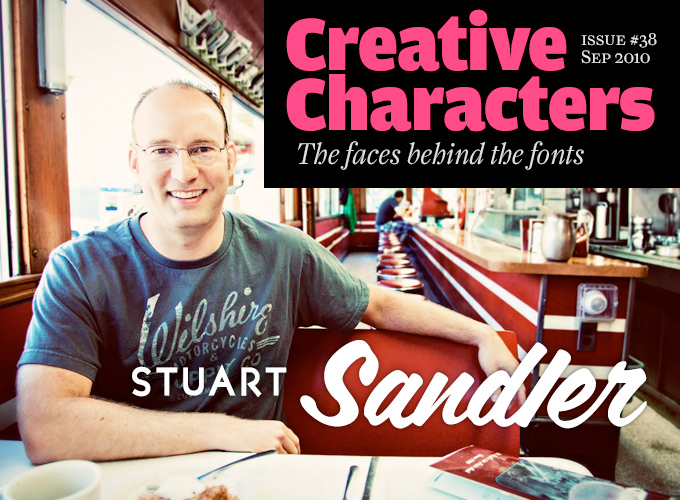
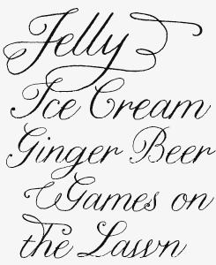
Photo by Jen Schultz of Genesis Photography
Dear Reader: Get ready for the longest Creative Characters interview ever. It’s not just that Stuart Sandler is a talented talker, he also has a lot to talk about. He runs and co-directs no less than five foundries and labels that MyFonts represents: the Font Diner, Sideshow, Breaking The Norm, the Tart Workshop and, most recently, Filmotype. He runs a handful of other companies and web shops as well, including Mister Retro. He is enamored with the lettering and typefaces of the 1920s through the 1960s, a period when letter-making was a very different craft indeed. Meet Stuart Sandler, a master of digital retro-americana.
(Scroll down to read more about the new Creative Characters book!)
Font Diner, the company you founded in 1996, has grown into what is possibly the largest digital collection of retro fonts inspired by American vernacular lettering. Do you remember a precise moment when you realized: Yes! That is what I want to do!
Absolutely! The inspiration that led to that moment had a lot to do with what was going on in my life during that time...
In the mid-1990s, when I was a young art director in Milwaukee, desktop publishing was at an early stage in terms of typefaces available, and the Internet was still just a buzz word. I realized quickly in my design career that better fonts meant better designs and soon became known as the agency’s font guy, usually waiting with bated breath for the next issue of Image Club to arrive on my desk. It regularly featured new fonts that were absolutely original and exciting and I quickly became a first-class font identifier and full-blown font addict. I began spending lots of time blazing through the Internet on the company’s 14.4 dial-in modem scouring the web for unique fonts. I ordered every typeface catalog I could get my hands on and quickly amassed a sizeable library.
During one of those web surfing sessions I discovered a small but impressive font foundry called Fonthead Design featuring some really cool free fonts and font bundles that could each be purchased at the amount Image Club charged for a single font. I was totally blown away by the concept that an individual could make their own fonts AND offer them for sale in a virtual storefront. This was the moment I realized that such a business model existed and that such a profession was possible.
So you were a type-savvy art director before you began specializing in type. How did one thing turn into another?
After discovering the Fonthead Design website, I was consumed by the idea of creating my own font company but I had no idea where to begin. Not only did I have to learn how to design and program a website but I had to go from being somebody who admires fonts to a person that designs them. What led me to that reality was a series of serendipitous events.
One of the accounts I worked on at the agency was Milwaukee Public Television and during the filming of some promos for them, I met an amazingly talented fellow by the name of Charlie White, their Executive Director. He was very generous with his time and knowledge and introduced me to Fontographer. He also made me realize that I could transition my skills as a print designer into that of a web designer, a profession that up until that point hadn’t existed.
Simultaneously, throughout this period I was thinking in the back of my mind about the types of fonts I wanted to make. I knew I needed some sort of concept or theme that merged the fonts with the website and reflected my interests. As I worked at one of the larger advertising agencies in town, our desks were covered daily with piles of computer catalogs, heavy stock photography books and paper company promotions. Upon returning from lunch one day, I was greeted by a snappy cardboard box that contained a black plastic poodle and a small but thick book featuring a collection of vintage black and white illustrations. There was nothing else like the CSA Archive at the time and both the book design and the contents were outstanding. It occurred to me that great vintage imagery needs equally great vintage typefaces and I had found my concept.
I then started in earnest on what would become the Font Diner website although I still didn’t have any fonts of my own to offer. The first iteration featured a handful of free fonts I’d created that I didn’t feel were worthy of selling but it became a platform to feature some nice retro fonts by Brad Nelson of the Brain Eaters Font Company until I had quality fonts of my own to sell. My skills as a type designer and a web designer grew with practice and I eventually pursued full time work as a website designer leaving the print world behind me. As time allowed, I continued to develop and release new font sets, which to me felt like a recording artist making a new album, and every release was accompanied by a fancy dinner with a loved one.
At what point did you realize you could give up your day job?
My day job was very rewarding but the very nature of web design requires that the design of a website should be refreshed at least monthly and fully revamped every sixteen months, which meant that website designs were very much like a dinner at a fine restaurant: meant to be enjoyed only for a limited time and then gone. It was this lack of permanence that really became the fuel for me to pursue the Font Diner full time. By 1999 I had released four font sets and a fair amount of free fonts which all helped to increase site traffic, and the income that the Font Diner was generating was now becoming more regular and growing with each month. The additional income allowed me to go down to half-time at the agency and by 2002, the Font Diner became my day job.
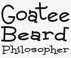
singlesville & fd huggable
Two key words for Stuart Sandler’s fonts are “fun” and “charm”. These two Font Diner releases ooze both. The upright brush script’s full name is Singlesville Script, and it is perfect whenever you need a condensed upright script in those tight spaces. Fontdinerdotcom Huggable — that’s its official name — Is an energetic, fun-loving all-caps alphabet. It’s free for personal use.
cocktail script
Cocktail Script is one of the Font Diner classics that have recently been added to MyFonts. It is an informal yet sophisticated pen script with a characteristic upright silhouette and natural connections.
mR television & automatic
One way of obtaining that retro feel of roadside signs and mid-twentieth century lettering is by combining a powerful script with a geometric sans serif. The Deco-style sans serif is Automatic, the script goes by the name of Mister Television.
cocktail shaker
In Cocktail Shaker, Sandler has managed to make virtually every letter combination look natural and tasty. While the lowercase characters form a calmly undulating chain of connected shapes, with just a few carefully placed interruptions, the capitals stand alone — and it works perfectly. Cocktail Shaker combines playfulness with clean readability and some Atomic Age retro-futurism.
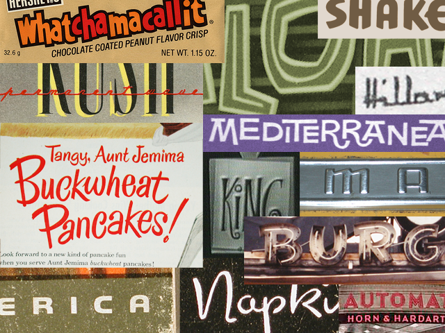
A selection from Stuart Sandler’s huge archive showing the sources of several of the Font Diner typefaces that were recently added to MyFonts
One of your main sources of inspiration is mid-twentieth century commercial art. How do you collect your source material? Are you a collector, a photographer? Have you been able to identify some of the artists that drew those amazing letterforms?
Actually, food was the primary inspiration at the start of my career as a font designer. I had always been fond of vintage menus from restaurants, and the design of canned and packaged items. As I searched around for the kind of typefaces I wanted to create, I always found myself going back to the aesthetic design and lettering on items from my youth. As a kid I was a total candy freak and even then I recall that I was as interested in the packaging as I was in the candy itself. In fact, it was the original Hershey’s Whatchamacallit candy bar that inspired my first vernacular-inspired design, Kentuckyfried.
I also found the city of Milwaukee a source of inspiration. In many respects, Milwaukee in the mid-1990s had not changed much since its heyday in the 1960s when it was home to the nation’s largest breweries. Much of the city’s aesthetic, from the architecture of its buildings to their interior furnishings and furniture had largely remained untouched. This was absolutely fresh and inspiring to me.
I made many font-hunting trips with my camera close by my side to gather font ideas. From Los Angeles, California to Wildwood, New Jersey to the midwestern antique stores of Wisconsin and Minnesota, I would always try to take at least two font hunts a year to shoot photographs of all the signage and ephemera I could get my hands on. When I wasn’t shooting images of lettering, I was scouring the Internet for it and Roadside Peek became a favorite regular stop. In recent years, I’ve been able to do lots of font hunting online via Flickr, but I still get out at least once a year to shoot photos of signage as I travel and see small towns that time forgot.
Not wanting to leave a single stone unturned in my research for font inspiration, I also quickly developed a hunger for coffee table books about vintage subjects which prominently featured authentic period lettering. I would estimate my current library to be around 750 books plus boxes of original magazines and ephemera. It’s in the pages of old smelly vintage magazines where I found the most authentic and accurate reflections of the period and these I treasure above my book collection.
As I look through many of my vintage magazines, I always try to deconstruct the ad layouts and go as far as trying to re-construct them digitally on a computer to learn how and why they were so appealing. To try and figure out what the original designer was thinking when they created the ad at their drafting tables — that’s really the only way a modern designer can appreciate the craftsmanship and talent of these folks.
One significant thing I have learned through all my typographic research is being able to quickly distinguish authentic period lettering and design from mock-retro contemporary versions. I’m as much a preservationist about accurately recording and studying design history as I am about bringing that knowledge and history forward.
sparkly & square meal
Sorry Stuart, we didn’t manage to fit in all the full names in our one-line titles. The good news is that this newsletter has a record number of featured fonts. Fontdinerdotcom Sparkly and Square Meal are both long-time Font Diner favorites. Check’m out. (To be honest, we tweaked the big “L” just a little bit for the sample.)
coffeeshop
A geometric Art Deco font with a difference. In the Font Diner catalog (and beyond) Coffeeshop is no doubt the typeface with the biggest difference in height and width between upper- and lowercase. Use it to create striking magazine headlines, posters, point-of-sale material or menus.
Can you describe how you distill your retro fonts from pieces of vintage lettering?
When I’m working on a design that falls into a specific category, such as my Art Deco inspired sans-serif Automatic, I first define a strict set of rules in terms of the basic shape of the pieces of each letter I want to use in the design as well as defining the proportions of forms. From there I will generally study the inspiration and related styles to determine what would be appropriate to the period for each design. This lends authenticity to the face as I expand the family into contemporary characters that didn’t exist in 1930, such as the Euro symbol.
This same method holds true when I’m trying to craft an authentic and convincing brush script such as my Chicken Basket font. Anybody who’s ever seen my handwriting can tell you it’s perfectly awful and I’m not much better at hand or brush lettering. Rather than pick up a paint brush, I study the outline of each letterform as well as how it was constructed with a brush, and then rebuild them digitally as vector strokes based on how I would imagine a brush or pen would reproduce them.
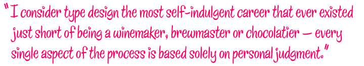
I consider type design the most self-indulgent career that ever existed just short of being a winemaker, brewmaster or chocolatier — every single aspect of the process is based solely on personal judgment. From the shape of the letterforms to the way they are brought together to the simple act of naming each new creation, all of that is in my eyes an ultimately personal expression.
One of your most impressive feats from the early 2000s was the Breaking the Norm project, a joint venture with Brian Bonislawsky and Bitstream. You designed hundreds of fonts under an insanely tight deadline — and very usable fonts at that. Tell us a bit more about that project.
Most type designers can point out specific aspects that helped them improve their skills. For me, there was simply Before and After Breaking the Norm. It was the first of many collaborative projects as well as the most exhausting professional experience of my life.
In early 2003 I was contacted by Jim Lyles of Bitstream, who was always very generous with his font-making knowledge. He had a proposal. Bitstream had built up a font library of around 500 fonts that they offered to software companies to bundle with their products — these are called OEM fonts. At the request of several of its customers, Bitstream wanted to increase its OEM library to 1,000 fonts. Jim approached Brian Bonislawsky and me — we were friends and had collaborated previously with success — to see if we’d agree to offer up our respective font libraries and create any amount that were missing.
After some discussion, Brian and I realized, rather than pillage our libraries, we both felt we were fast enough — each making about four fonts a month at the time — to come up with 250 new fonts each, and we let Jim know we were up for the challenge. When Jim got back in touch, he informed us that Bitstream would like us to go for it, with a handful of caveats: we had to cover a wide range of font styles, very few of them could be derivative “filler” weights, they had to meet a minimum character and kerning set, and lastly they needed the fonts IN NINETY DAYS!
For the next three months Brian and I in our respective home offices took font making to its extreme. My routine started when I awoke usually around 10am after a quick bowl of cereal, a check of daily e-mail and a full pot of coffee (the first of three each day), I set straight off to the task of gathering source materials, drawing small words or lettering samples in Adobe Illustrator and sending them off to Jim and Sue Zafarana at Bitstream for approval. Once approved, I’d spend the day fleshing out the character set, creating derivative weights and sending them off again for approval. Then they were quickly imported into Fontographer, spaced, kerned, and sent off again to Bitstream to be generated. I would continue this process, only stopping for quick meals, till I literally couldn’t keep my eyes open any longer and headed straight to bed.
The days blended together and time with friends and family was rare; this was further complicated with my two young kiddos running around the house. My amazing wife Ann was left to tend to their needs while the time of day was marked by my coming up to eat or refill my coffee mug. Each day was committed to a different part of the process and some days which were spent entirely spacing or drawing and kerning usually went very quickly. While I was in the middle of my own madness in Minnesota, Brian was living the same experience down in Florida and we spent many hours on the phone keeping each other motivated and comparing notes.
We ultimately met our goal of 250 fonts each in 90 days and were both relieved and utterly exhausted. I can’t say I look back on that project fondly — it was absolutely brutal — but it gave me amazing font-making chops and it is very satisfying to see how well many of those fonts stand up over time.
surfer shop
Surfer Shop was one of the 500 fonts that Stuart Sandler and Brian Bonislawsky created for Breaking the Norm in 2003. It still stands out as a usable, playful display typeface that is perfect for beachside living. Comes with alternate caps and a fun fresh flavor.
concurso italian
Concurso Italian is one of the quieter, more subtle fonts in the Breaking The Norm series. It’s a family of three weights plus Oblique, Condensed, Wide and Lined versions. Check out Concurso Moderne, a looser variation on the same theme.
mister sirloin & Lil’ tipsy
Combining the playful Mister Sirloin with the appetizing picture font Lil’ Tipsy, both from the BTN collection, seemed the right thing to do.
MALIHINI
The cheerfully bouncing Malihini comes in two versions: Cuban, with straight serifs, and Tahitian, with rounded ones. Makes perfect sense.
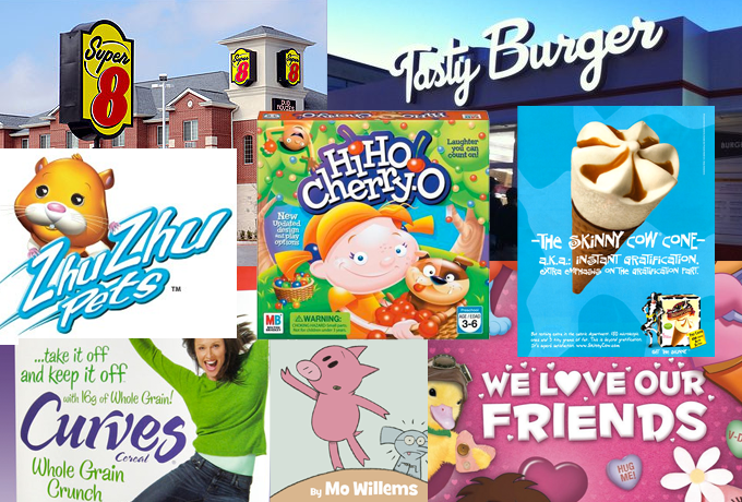
A montage of Font Diner typefaces in use
Collaborative projects represent a large part of your activities; you even set up a Font Diner offshoot, Sideshow, as a boutique foundry with collaborative type design projects in mind.
After a few successful collaborative font projects with Brian, I decided to engage Derek Yaniger, an amazing illustrator I had worked with on vector image collections for my Mister Retro site, to see if he would be interested in making some typefaces based on the fantastic lettering he used in his art. He was thrilled to take on the challenge and several months later released the Creaky family which was met with great enthusiasm.
I realized that perhaps there were other illustrators and lettering artists who had the desire to make and sell typefaces of their own but didn’t want to deal with the steep technical learning curve of font making. Nearly everybody I approached with the concept of making a collaborative font was immediately on board. I knew I was on to something that would amount to a broader range of font designs and decided to start Sideshow to offer these fonts under their own label.
It might seem difficult to combine two minds to create a single product that both can agree on, but having worked in the advertising world for years I was very comfortable with the delicate inner workings of creative compromise to create a meaningful result. The collaborative font making process is straightforward: leave the lettering artist to do what they do best, which is drawing letters, combine that with my expertise and knowledge of font making, share the workload and the income equally. A consistent recipe for success!
How about the other contributors to Sideshow, such as David “Squid” Cohen and French (female) designer Bai Meillon?
After a chance encounter at a Tiki Oasis in San Diego, Squid and I hit it off and we quickly decided to make some fonts together and still to this day he never ceases to amaze me with the range and quality of his typeface designs! As a sculptor and drummer by trade, he is one of those people you meet in life who’s just insanely talented at nearly everything he does. We share a love for the same mod-style 1960s lettering which informs his type designs. He has been the largest contributor to the Sideshow library and folks absolutely respond to the personality he brings out in every face we create together.
It was Squid who introduced me to Bai Meillon who is a talented illustrator in her own right and we found a common interest in creating some revivals from old press-type books. One of the discoveries we made was a series of dry-transfer certificate borders that when burnished in order on a sheet of illustration board made wonderful and unique framing devices. We found that we had enough inspiration to create three sets of these typeable certificate borders, which became the Certified family.
Another successful collaboration is your work with the Tart Workshop’s Crystal Kluge. Could you describe your working relationship with Crystal?
Crystal is amazing! I’m constantly inspired by her range and absolutely green with envy when I see what she can make a pen do!
I met her in 2001, while my fiancée and I were shopping for our wedding invitations at a store called Paper Source in the Uptown area, a trendy part of the Twin Cities ripe with boutiques and restaurants. With each item on display, there was a small but strikingly beautifully lettered little sign sitting nearby that just blew me away.
As it turned out, each was done by the same girl who worked there named Crystal. I left my number asking them to have her contact me. We eventually connected and I hired her to do some fun lettering and illustration work for us which ended up inspiring my wife’s stationery business, the Guestbook Store.
Crystal and I stayed in touch and had lengthy discussions about the state of the font industry, and the kind of type we wanted to create; in 2005 we decided to go for it and start the Tart Workshop. Crystal’s star continues to rise into higher profile custom lettering work and custom typefaces we’ve created together. It’s actually amazing how quickly the faces have found their way into popular culture in comparison to my previous fonts!
creaky frank & solid
The Creaky family, a collaboration project with Derek Yaniger, was the start of Sandler’s Sideshow foundry. “Creaky Frank is for all you boils ’n’ ghouls who dig your fonts fresh from the grave… you know, like creepsville, man!”
coffee service & weird bill
The big writing on the shield was created with Weird Bill, a member of the “dysfunctional font system” of the same name created by Sandler and David (Squid) Cohen.The other font is the successful Coffee Service, a spicy, energetic script that has the charm of a loud, busy street corner café.
Nelly script & flourish
In Nelly Script, Crystal Kluge has taken her hand-drawn letterforms to a new level of sophistication — assisted, as usual, by Stuart Sandler. Elegant and romantic, Nelly Script strikes a beautiful balance between the liveliness of the hand-drawn and the class of a formal script. Nelly Script Flourish is its companion collection of vibrant flourishes & embellished letters.
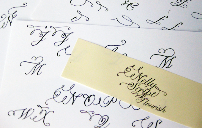
Samples of Crystal Kluge’s lettering for Nelly Script Flourish
A very recent collaborative concept is the Filmotype project, a series of digital revivals based on the Filmotype library, which was a collection of fonts made for a portable typesetting machine in the 1950s and ’60s. You worked with some great specialists of retro-flavored type design: Mark Simonson, Rian Hughes, Patrick Griffin and Rebecca Alaccari… How did that project come about?
Before I ever knew the name Filmotype, I was already quite familiar with its library. I had collected the well-known series of Dover books featuring alphabet showings created by the great Dan X. Solo which were filled with amazing 1950s styled alphabets. A customer of mine asked me to digitize a typeface he had found in one of those books but I felt uneasy about it without contacting Dan and asking his permission to do so. Dan informed me that permission wasn’t his to give as the fonts had been created by a company in the 1950s called Filmotype.
Fast forward a few years and thousands of hours of research later. I acquired the rights to the library, wrote a book about the history of the company, which I presented at Typecon, and recruited a junto of talented and established font designers to help me re-digitize this amazing library of over 520 unique display faces! Being able to bring this library from aging filmstrips back into a typeable living font is absolutely magical. It’s living history and I’m pleased to reconnect designers and font lovers alike with a collection of typefaces that risked being ripped right out of the pages of Dan’s wonderful books without any sense of the rich history of the company, its employees or the talented artists who created this library.
The project that probably involved the largest number of collaborators was Font Aid II, which you initiated right after September 11th, 2001. Other editions of Font Aid have happened since. How can fonts help make the world a better place?
Font Aid is one of those amazing things that form the silver lining that comes out of tragic circumstances and while nothing would please me more than if we never needed another Font Aid, I’m glad it exists should the need arise again. It’s been nine years this month since 9/11 and like many Americans I was at work, unable to do anything but listen and watch in horror to the events I was witnessing on TV, feeling there was nothing I could do but wanting to help.
I had recalled a project that I participated in which was initiated by Claes Källarsson, a font designer from Sweden who started Font Aid in 1999 to raise donations for Unicef to aid war refugees and victims of natural disaster. I quickly presented my idea to revive Font Aid to the board of SoTA to help organize and rally the community of independent type designers to collaborate on a single typeface we could sell to raise money for the families and first-responders of this tragedy. With the help of SoTA and Rich Kegler at its helm, we spread the word and watched in awe as the submissions started to come in. It was a community effort on every level and I’d never been witness to something of that scale nor the resounding response we received and continue to receive with each Font Aid effort.
To answer your question, as a type designer, I like to believe that my work inspires people on an emotional level and if I can use my talents to inspire them to take positive action, encourage their own creativity, or to inspire others, I think in my own small way that certainly can make the world a better place…
Finally, do you have any plans for the future which you’d like to share with us?
During my research for the Filmotype book I discovered another lost font library from a company that pre-dates Filmotype by 20 years called Lettering Inc, founded by Edwin Krauter, which I hope to revive in a similar manner. The legacy of lettering left to us by these great companies and artists deserves its rightful place in history, and I feel a responsibility to see that it is documented and illuminated for future generations to study and enjoy, just as I have.
That was quite a trip, Stuart. Thank you for sharing!
filmotype honey
Filmotype Honey was released by Filmotype in the mid-1950s as part of its hand-lettered script styles and it became wildly popular throughout the 1950s and 1960s. The digital Filmotype Honey was developed by Mark Simonson from the original font filmstrips and includes a full international character set, automatic fractions, ordinals, and a large set of automatic alternate contextual characters and ligatures to allow flawless typesetting in dynamic OpenType format.
FT Lasalle & glenlake
Among the very first handwritten script fonts offered by Filmotype in the beginning of the 1950s, Filmotype LaSalle was designed by Ray Baker, a former Lettering Inc employee. He named the face after LaSalle Street in downtown Chicago. Patrick Griffin and Rebecca Alaccari developed Filmotype LaSalle from the original font filmstrips. It is complemented here by Filmotype Glenlake, a Gothic sans serif whose new digitization includes automatic fractions, ordinals, an ALL CAPS setting, and a suite of alternates.
carrotflower
Carrotflower is a script of childlike simplicity and great versatility. Drawn from one of Crystal Kluge’s most commonly utilized lettering styles, its quiet unfussy nature lends itself well to birth announcements, wedding invitations, birthday parties, bar & bat mitzvahs and crafts.
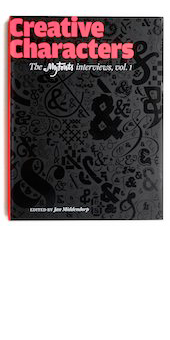
Creative Characters
The book. Available now.
Creative Characters is the MyFonts newsletter dedicated to people behind the fonts. Each month since July 2007, we have interviewed a notable personality from the type world.
The first two years of these interviews have now been collected in a beautifully produced book. Twenty-six interviews, expanded with case histories, behind-the-scenes imagery and superb examples of fonts in use. Interviewees include David Berlow, Jim Parkinson, Cyrus Highsmith, Ray Larabie, Nick Shinn, Rian Hughes, Alejandro Paul, Dino dos Santos, Veronika Burian, Ronna Penner, Gert Wiescher, Hubert Jocham, P22, Underware and Jos Buivenga.
Order the book now at Amazon.com, or at a good bookshop near you.
Meanwhile all Creative Characters interviews will remain accessible in our online archive.
We’re interested in your opinions and suggestions! Just send an email with your ideas to [email protected].
Colophon
This newsletter was edited by Jan Middendorp and designed using Nick Sherman’s original template, with specimens by Anthony Noel.
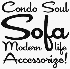
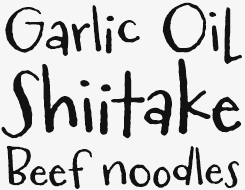
The Creative Characters nameplate is set in Amplitude and Farnham; the intro image features Coffee Service and Lionel Text Diesel; the pull-quote is set in Chicken Basket.
Comments?
We’d love to hear from you! Please send any questions or comments about this newsletter to [email protected]
Subscription info
Want to get future issues of Creative Characters sent to your inbox? Subscribe at www.myfonts.com/MailingList
Newsletter archives
Know someone who would be interested in this? Want to see past issues? All MyFonts newsletters (including this one) are available to view online here.