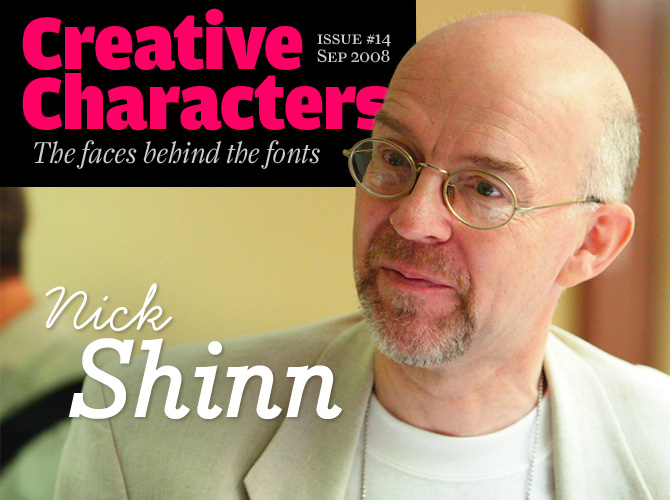
photo by Eben Sorkin / Eyebytes
Usually the Creative Characters interviews are conducted by e-mail, in a series of back-and-forth exchanges. Nick Shinn, an Englishman in Canada, prefers the old-fashioned way: the immediacy and natural flow of a real conversation. This approach seems to relate to how he makes type. Not that Shinn’s type designs are old-fashioned… they’re simply different. And yet, as Shinn would say, all wickedly usable.
You came to type design through a series of other activities. Most notably, you were an art director in a number of Toronto advertising agencies. How did one thing lead to another?
First of all, I went to art school. But I soon decided I didn’t want to be an artist. Then I thought, “what will I do to make a living?”… and dry transfer lettering was something that appealed to me. I thought I might be able to make a living designing dry transfer typefaces and live off the royalties. I was always interested in doing graphic art as part of my fine art and I’ve always liked working in black and white. I did printing and sculpture, I tried everything, but from an early age I particularly liked drawing in black and white. I was pretty much interested in the whole spectrum of culture: writing, music, film, art... I thought that typography combined a lot of things, especially writing and art. So I started submitting type designs to Letraset, but none were accepted.
Then after I’d moved to Canada, I got into advertising. I thought that if you wanted to understand the modern world, you had to understand advertising, and the only way to understand it was to get inside it and become involved in doing it in a practical sense. In those days, when starting at the bottom in advertising you did a lot of manual things, like paste-up and mechanical assembly, and especially comps that would be rendered with a marker pen on paper, showing how an ad would turn out once it had been photographed and typeset. Doing that, I acquired a certain amount of knowledge of typography and the hand skills to draw type. So when I eventually came to design my first digital typeface, Fontesque, it expressed a lot of those skills, and the looseness of that comp drawing.
Some of your lectures and articles present a kind of visual history of advertising typography, much of it done by hand. Were you always interested in hand lettering?
Not particularly hand-lettering, I was just interested in the way advertising was made in the past. Some of it was typography — printing types — and a lot of it was hand-lettering. Looking at the relationship between the technology available and the hand skills at any particular time, I just wanted to understand that; to find out how things were done.
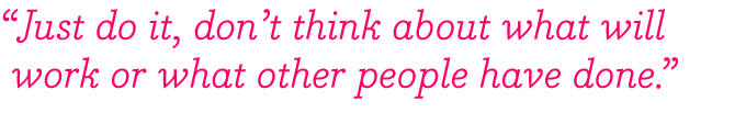
Perhaps another reason why I was interested in hand-lettering was that I had studied calligraphy, because I thought it would help me understand the structure of type. This in turn would be helpful in designing typefaces, given that type evolved from the manuscript hand. So I thought I could learn about it by doing it rather than just reading about it. That’s a big principle of my approach to art and design: just do it, don’t think about what will work or what other people have done. Just work with these tools, with the ideas that currently happen to be floating around in my head, and see what comes out.
Modern Suite
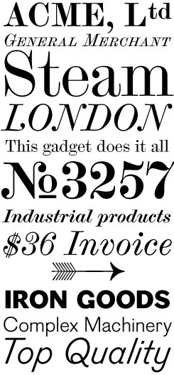
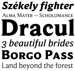
With the Modern suite, Nick Shinn revisits the place and time where the modernity of the machine age began — London in the early 1800s. Typography went through a phase of unprecedented experimentation, with fat face, slab serif, sans-serif and decorated faces developed by typefounders like Caslon, Fry and Figgins.
For the Modern suite, Shinn conceived a convincing reinterpretation of Figgins’ famous sans-serifs, combining it with that iconic 19th-century type style, the Scotch Modern. Shinn achieved authenticity by re-drawing the typeface by eye (with the aid of a loupe). “No scans, no tracing.” Not just a romantic notion — but also a practical way of bridging the gap between metal type and the digital realm.
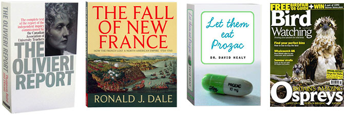
Book and magazine covers designed using Nick’s fonts.
So as a designer of digital type you are totally self-taught. Nobody showed you how to do it.
Yes. I started when Fontographer was relatively fresh. Type design is taught in schools now, but then it was something you just had to figure out. The drawing tools were very similar to Adobe Illustrator, which I was familiar with. In the early 1990s, Fontographer had a very intuitive, Mac-centric interface, which I immediately felt comfortable with.
What prompted you to abandon advertising work and concentrate fully on type design?
One of the things that appealed to me about doing type full-time was: the final cut. It’s like, you’re the boss. I worked in advertising for many years. And you know how it goes, you do great work and it might not get produced. Or it just might go wrong for a number of other reasons. I liked the idea that with type I would be the total boss. If I wanted to do a certain type of work and publish it, I could do so, even if it didn’t make any sense. I could still do it because it would be my idea. That was one reason why I wanted to get into it. The other reason was I realized that e-commerce would make it possible. I had designed other typefaces before [Shinn RR] that had been published by other companies — this goes back as far as 1980 — but as a designer you always got a very small percentage. Once you’re able to become your own publisher, the percentage is much higher. So that’s when I realized that I could start a foundry and publicize myself with my own website and work with third-party distributors like MyFonts. My presence on the internet could be just as significant as a very large corporation. The internet is really a great leveler of perception.
Handsome
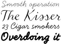
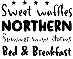
Nick Shinn’s remarkable skill as a draftsman is illustrated by this gem of a script font. Handsome was drawn freehand with a digital drawing tablet to connect seamlessly. What makes the family really special is its choice of writing instruments, from a fineliner to a broad-nibbed pen. Letters subtly jump up and down along the baseline, creating a deceptively natural flow. For the look of real handwriting, Handsome is most convincing at around 15 points. Used bigger, it can be made to look like hand-painted sign lettering, or neon!
There are quite a few type designers who are also writers, but you’re one of the few who write about type and design in a way that is not purely historical or technical. There is a level in your writing that tackles sociological and philosophical aspects of visual culture.
As I said, one of the reasons I went into advertising was that you get to work with words and images. I was working in an ad agency in the mid-80s, and an account executive who thought I was very opinionated said: “You should write your opinions in a magazine.” That was when I started writing a column on art direction for Marketing magazine. So I wrote a lot of magazine articles, in particular for the Canadian computer arts magazine Graphic Exchange. Now when you are a regular columnist you quickly run out of things to say about your specialty, so I started writing about ... anything, trying to get under the skin of it and try to see it from a deeper perspective.
In what way is type design an expression or a symptom of cultural change?
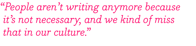
It’s very complex. I do think there are sociopolitical aspects to it. Take the script phenomenon. Scripts have become immensely popular. In America, there is a kind of retro-ironic nostalgia, and I can’t decide whether it’s a backlash to the freedom and experimentation of the ’60s and ’70s — very conservative — or whether it’s a reaction to the high-tech world we live in being so hard-edge that people want something softer and more human. Also, people aren’t writing by hand any more because it’s not necessary, and we kind of miss that in our culture. So there are all these different reasons that script fonts are interesting and people want to use them and design them. And there are other reasons too. With OpenType we have a technology that does a much better job of simulating handwriting and script than has been possible in the past. That’s something I like to explore: the potential of new technologies. I’ve done that in Handsome Pro and the new Duffy Script.
When you make a script like Handsome, there must be a kind of triple joy in it for you: commenting on a cultural trend, pulling a great virtuoso technical trick, and producing something that people may be interested in (which might result in a certain commercial success). Are you aware of all these levels as you’re working?
The trick is like solving a puzzle. If you make every character work with every other character, when you’re done there may be the same sense of completion as when finishing a jigsaw puzzle or, for a mathematician, solving an equation; everything just drops into place. Or maybe collectors have the same feeling when they obtain the final piece of a set, the piece that was missing. So when a new technology comes along, you think, how can I use this to make a font? And then you work towards completing the solution that the new technology is suggesting when it’s applied to the old question of completing an alphabet... and... what were the other levels you mentioned?
The commercial aspect.
I wouldn’t say I want to be commercial by being trendy. I’m interested in the idea of scripts as a contemporary phenomenon, not because they’re “in.” Type design can last a long time. People are still using typefaces that were designed centuries ago, or fifty years ago — they have longevity. You don’t have to make it faddish to make it useful and functional. As long as you design something that is unique and original, because the global market for fonts is so huge, and people in different countries are so different, you never know how people are going to use fonts.
I don’t think you can predict what will sell. Of course you can say, “scripts are popular,” and you can predict that your script will be more popular than a text font. But if you design an original text font or whatever, there’ll always be a market for it. It’s the Long Tail theory of marketing. I designed Panoptica for a very specific use, which was constraint-based concrete poetry where every character had to have the same width. Now there’s not a huge market for that but there will always be someone somewhere who’s interested in it, so it addresses that minority usage, or anything else that people can think up for a novel font.
Bodoni Egyptian
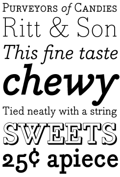
Slab serif fonts — often called ”Egyptians” — are also sometimes referred to as “Mécanes.” Indeed most are mechanical in construction and industrial in effect. Bodoni Egyptian takes a radically different approach, projecting the monolinear finishing of slab serifs onto the proportions of the Bodoni-style “modern face.” The result is a family with simple, neo-classical forms and proportions, and strict detailing that is antique, not machine-age.
In spite of its unorthodox looks, Bodoni Egyptian is very legible and has been used successfully in book typography, mixing it with traditional Bodoni typefaces or small x-height sans-serifs such as Futura or Shinn’s own Figgins Sans. For display purposes, there are the delicate Thin and Light weights as well the Shadow alphabet, for which the Bold can be used as a “fill” font.
Panoptica
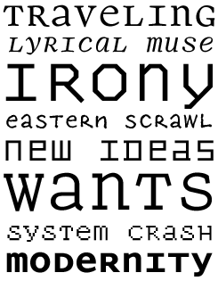
Panoptica was made for a special occasion: a book of concrete poetry by Christian Bök for which the author needed a monospaced font to obtain a grid of vertical as well as horizontal lines. Shinn found that ordinary monowidth type had too many connotations of the office, as well as being uneven in color (compare m and i). His solution: a font family that is unicase (mixing upper- and lowercase forms) as well as monospaced. He then applied the principle to a wide range of styles. Besides the roman, italic and sans versions, Panoptica comes in hand-written, pixelated and octagonal varieties. Finally, there’s Panoptica Doesburg, an homage to the 1920s Dutch artist’s experimental alphabets. Weird, yet surprisingly usable.
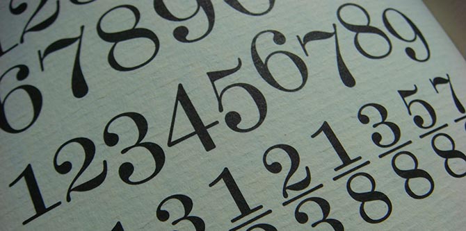
Numerals and fractions from the printed Scotch Modern specimen book.
You seem to be somewhat of a natural rebel.
I would say I’m a contrarian, yeah. I look at what everybody else is doing and I say: “I don’t want to do that, it’s too obvious or too conformist.”
How is that expressed in your typefaces?
Choose a face.
The latest family: the Modern Suite.
A lot of people don’t like the 19th-century Scotch Moderns. They are said to have poor legibility and too much “sparkle” due to the contrast between the thin hairlines and the heavy verticals. But the modern face was the main face used in all kinds of publications in the late 19th century when mass literacy arrived in the United States. So how can you say that it doesn’t have good readability when it was instrumental in promoting mass literacy?! That’s how the contrarian in me looks at it, and it’s why I would do a revival of that face. Another thing is, I didn’t scan it; I drew it by eye, with a loupe. It’s a kind of romantic notion that you can draw a revival typeface like that.
How about Alphaville?
Alphaville is my techno typeface — as I’m very eclectic, I want to have an example of every genre in my catalogue. I designed it at a time when I liked techno music a lot. I also happened to be writing an article about square typefaces and it occurred to me that I had not designed a square font myself. Now the problem with square alphabets is the letter V. Every other letter in the alphabet you can square up with a vertical stroke. There’s no confusion. But if you do that with V, you can’t distinguish it from U. So you have to have at least a minimal diagonal element in your design. As I wanted to keep it absolutely consistent, I introduced these scribal diagonals throughout the alphabet, all with the same angle as the letter V. I find that if you set yourself a set of constraints and follow that in a design, it might not look pretty or trendy, but it has an integrity because it is a designed solution.
Beaufort
There are not many typefaces today that look like Beaufort. It is a near-sans, with tiny, pointed serifs that help enhance legibility at small sizes, and add finesse at display size. It has a 1900s look and feel, recalling the kind of “spur serif” style that was popular in the early 20th century, while its proportions are those of the classic oldstyle types, from Granjon to Times. Yet Beaufort is contemporary, made to take advantage of the way that sharp points in digital type are infinitely scalable and always crisp, their sharpness limited only by output resolution. You can even mix letters of quite different size, and the serifs will have the same sharpness! Designed for clarity and word count, Shinn’s most successful text face is both beautifully even and powerful — “beau” as well as “fort.”
One of your latest fonts is Duffy Script. A script font based on another designer’s lettering, it is an exception in your catalogue. How did it come about?
When I was an art director, Amanda Duffy was one of the illustrators from whom I frequently commissioned work. She would do celebrity illustrations with big heads and little stick bodies, and I always kidded her saying: “You should do a picture of me like that.” One day she did — which was very nice of her — and I said: “In return, I’ll turn your lettering into a font.” Hence the Duffy Script typeface.
To tell the truth, I don’t find scripts as complex and meaningful as text faces. Maybe that is a bit snobbish or academic, but… there had to be something else to interest me in a script, and that was this personal aspect — that she is someone I know. It took me years to get around to it. In fact it was the development of OpenType that led me to a new McGuffin, as Hitchcock would have said; a new gadget that pushed me to interpret her lettering. Her writing is so quirky, it’s all over the place, it dances. How do you get that level of spontaneity into something as rigid as type? Eventually, because I participate on Typophile.com, where a lot of ideas about how to use OpenType’s contextual alternates to animate typefaces are discussed, it occurred to me that I could use those ideas to address her lettering and put it all together.
Is it important to feel part of an online community, to take part in those discussions?
Absolutely! The other alternative is to go to school. But the thing is, if you really want to stay on top of things, you have to be online and kicking ideas around with other people. And we’re very fortunate to have a genuine online typographic community — Typophile — where people from different areas of typography exchange ideas. So you get artists talking to programmers, those are the two extremes: on the one hand you’ve got the glyphs which have to be beautiful, on the other hand you’ve got the programming and coding, which has to make a functional font. When you’re trying to make these work together to max out the beauty and functionality and you discuss it online… I got ideas for the alternate encoding, three or four people that I talked to contributed ideas, and I too contributed, so hopefully we can all use these ideas we came up with together.
When you spend part of your professional life in an online community, the place where you are physically becomes less significant. How important is it for you to be in Canada, in Toronto?
It influenced me more when I was an art director. But we do have a type club in Toronto that meets several times a year, and there is a small typographic community, and I like to collaborate with my competitors. I’m great friends with Patrick Griffin of Canada Type; we feel that rather than being jealous of each other, we can help each other. We’ll all get further ahead by collaborating. We get together, eat sushi, talk type. It helps that we have separate marketing positions… we don’t compete in creating the same kind of type. But then who does really?
Nick, thank you for your insights. We can’t wait to see what other typographic surprises you have in store.
Duffy Script
ShinnType’s latest script is an interpretation of the lettering of contemporary Canadian illustrator Amanda Duffy. Amanda uses this style of script to accompany the hilarious celebrity cartoons she has produced for many major publications, drawn in a style that is “two-thirds Renaissance, and a sixth each of Twenties’ Deco, Beat Generation Cool and postmodern Punk.” Her writing is more like post-punk scribble, though, and Shinn has converted it into a bouncy set of fonts. OpenType coding is used to randomly choose different versions of each glyph for a subtle, natural effect. Magic!
Softmachine
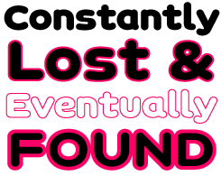
Softmachine is another Shinn font made for a specific use. It is a display font designed for use with standard outline strokes as provided by most drawing and layout programs. In most typefaces, abrupt joints and sharp corners result in awkward clashes and spiky points when applying outline strokes. Not Softmachine! Thanks to its even thickness and smooth curves, making Softmachine glow by adding outline strokes is a breeze; the process is further smoothed by the spacing and kerning of letters.

Who would you interview?
Creative Characters is the MyFonts newsletter dedicated to people behind the fonts. Each month, we interview a notable personality from the type world. And we would like you, the reader, to have your say.
Which creative character would you interview if you had the chance? And what would you ask them? Let us know, and your choice may end up in a future edition of this newsletter! Just send an email with your ideas to [email protected].
During the past year, we’ve interviewed the likes of Christian Schwartz, Dino dos Santos, Jim Parkinson, Mário Feliciano, and Underware. If you’re curious to know which other type designers we’ve already interviewed as part of past Creative Characters newsletters, have a look at the archive.
Credits
This month’s interview was conducted & edited by Jan Middendorp and designed by Nick Sherman.
Supporting fonts
The Creative Characters masthead is set in Amplitude and Farnham; the intro image features Sandwich and BistroScript; the pull-quotes are set in Dederon Serif; the large question mark is set in Farnham, and the small URL at the top is set in Unibody 8.
Unsubscribe info
This message was sent to:
[email].
It is never our intention to send unwanted e-mail. If you no longer wish to receive this newsletter, you may change your subscription settings at: www.myfonts.com/MailingList
Comments?
We’d love to hear from you! Please send any questions or comments about this newsletter to [email protected]