

He is one of Germany’s most productive type designers, and has created some of the country’s best known logotypes. His elegant lettering graces magazine pages across the globe. On MyFonts, his typefaces have been increasingly successful. Nevertheless, he has kept a low profile — stardom has eluded him, and that’s fine with him. Meet Hubert Jocham, an outsider by choice.
(We conducted the interview in German; the original text is available on our German sister site, MyFonts.de.)
Hubert, you were one of the last people in Germany to be trained as a typesetter. You even learned to hand-set metal type. Was this a conscious choice — and was it helpful in your later career?
Being one of the very last to be educated in an obsolete technology was not exactly glorious at the time. All the other apprentices worked on high-end typesetting systems from Linotype and Berthold. Of course, I never planned it that way; at seventeen, I was not fully aware of what exactly I was getting into. Soon after completing my training I began my graphic design studies, and so I didn’t remain a professional metal typesetter for a very long time. But gradually I realized that my work in the “Black Art” — which is how the Germans refer to letterpress printing — has influenced me, strongly and permanently, throughout my career. There are not many people my age who have had the opportunity to experience that.
Your graduation project as a graphic design student dealt with italic typefaces of the Renaissance. What did you learn from that?
In the course of my design studies I learned a lot about type and typography; to this day, the design college in Augsburg has quite a lot to offer in this field. However, I had never designed a typeface. When I chose to focus on the Renaissance italic, it was a stroke of luck; for in order to understand an italic, you must always approach it in relation to its roman companion. So in this way, besides all the historical analysis, I learned a lot about the relationship between printing type and handwriting, static and dynamic letterforms and, very importantly, about convention and the will to create new forms.
Many things I discovered at the time continue to influence my work to this day.
You soon started working internationally as a lettering artist and designer of custom typefaces. How did that come about?
After graduation I worked for various design and advertising agencies in Germany, and started designing typefaces in my spare time. Then in 1996 I spent a month in London trying to get in contact with famous designers to see if there they had any work for me. I had a few interviews, but most of them never called back — except Martin Farran Lee, an editorial designer who later became the art director of Arena magazine. He needed an extra light version of a typeface for a publication he was working on. So I took my old PowerBook out of my bag and started doing a few sketches. He was impressed by how fast he saw things take shape, and I spent the next few days finishing the font. Basically, all the contacts I later made in the magazine business were the result of that one meeting. (Martin is now a professor in Gotenborg, Sweden and I will be there for a logotype workshop in February next year.)
A year later, I wanted to get out of Germany for a while for personal reasons and decided to try my luck in London again. I spoke to Günter Gerhard Lange, the type director at Berthold. He told me that I had to decide what I wanted to be: a type designer or a graphic designer. He advised me to apply for a job in corporate branding at Henrion Ludlow & Schmidt. Lange’s recommendation opened the doors to the branding business for me, and I worked at Henrion’s for a year. Fortunately they discovered that I was good at developing logotypes, symbols and pictograms, which saved me from the bookkeeping jobs of doing corporate identity implementation and manuals.
At the same time, however — and against Lange’s advice — I worked at Frank and Arena magazines, for which I designed text and display typefaces. Thanks to the contacts I made in London, I soon received commissions from magazines in the USA and other countries, while my contacts in the branding business gradually expanded as well.
As a result, today I still spend half my time designing logotypes for companies and products, commissioned by large network agencies such as Interbrand, Landor and The Brand Union (formerly Enterprise IG). My experience in both publishing and branding is very valuable for my type design activities. I know very precisely what kind of typefaces graphic designers need.
Mommie
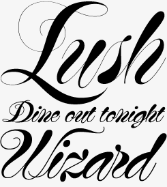
At the start of his career in the early 1980s, Jocham developed a fascination for scripts in the Spencerian style. The luscious alphabet he developed for L’Officiel (Paris) was a kind of freestyle variation on that theme. It was later developed into Mommie, a quirky yet elegant headline script. The regular version has extremely thin hairlines: use large (but never in ALL CAPS!).
NARZISS & Narziss text
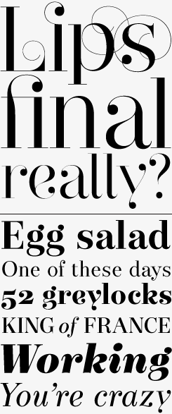
After designing Mommie, Jocham got more and more interested in swirls and ornaments. Out of this fascination came Narziss, a neoclassical headline face with a choice of ball terminals and curls. The basic idea proved strong enough to spawn a text version as well: an idiosyncratic “modern face” that lends grandeur to the book or magazine page.
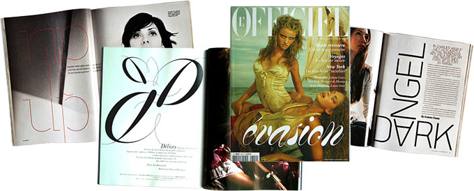
Examples of Jocham’s type and lettering at work in various magazines.
Would you agree that in the German typographic landscape, you’re somewhat of an outsider?
I think that’s true, yes. For a long while, FontShop and Erik Spiekermann’s circle have occupied a large part of what is internationally perceived as German type design. As I said before, I work for almost all large branding networks, but I haven’t worked for any design companies generally associated with those typographic circles. Moreover, I live in Bavaria, which is a long way from Berlin. There simply haven’t been many occasions for our paths to cross.
In German and international type design, do you have any heroes, or movements you have a particular affinity to?
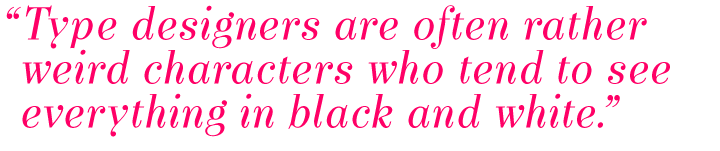
I’m afraid I don’t have real heroes in this field, although I highly respect the work of many. I like it when a typeface has character and power without being overly original. I like to become acquainted with foreign traditions and try to interpret them in a novel way. I collect rules, such as Dwiggins’ M-formula (the ?marionette principle?) and Tschichold’s ideas about what is beautiful and ugly. You do need a certain amount of humor to deal with these things, because type designers are often rather weird characters who tend to see everything in black and white. Everything that helps me to understand how type works is good.
Keks
“And now,” Jocham announces in his text accompanying Keks, “for something completely different.” It’s true: Keks is pretty unique. It has elements of a “broken script” (blackletter), but the proportions of a roman typeface. As a result, the font is very legible although it is composed of straight lines only. In short, Keks (German for “cookie”) is a quirky yet surprisingly usable hybrid of gothic and roman letterforms.
Much of your lettering for branding and magazines has a calligraphic touch, as do many of your typefaces. How much of it is actually hand-written or drawn with ink on paper? Could you describe the steps that lead from the initial idea to the finished digital product?
Very little is actually written. Script-like logos like Hertie, for instance, are carefully sketched and then drawn. The best English term for this is “lettering”. I sketch my scripts according to Gerrit Noordzij’s principle: I first do pencil hatchings at the angle of the broad-nibbed pen in order to obtain the stroke thickness, then I complete the outlines. When you do that quickly it is almost like writing.
When I do a sans-serif or even an oldstyle, I hardly do any sketching. I work almost immediately in FontLab. My text fonts in fact lack that “calligraphic touch”. NewLibris for instance has very few elements of writing, and other fonts such as Granat have a constructed character rather than a calligraphic one.
Most of your fonts available on MyFonts are scripts suitable for packaging. Is this a special interest of yours?
I am very interested in this because I often work on logos for brands or products and therefore know a lot of packaging designers. We have often talked about the kind of typefaces they need for packaging projects, such as self-confident brush scripts. Until a few years ago there was hardly anything available, and everyone used Textile — a free system font. Meanwhile, I have designed seven different brush script typefaces that are all available at MyFonts.
You’ve lately started selling more text font families through MyFonts. You have written that text families are in fact your true love. What makes designing this kind of typefaces so attractive?
Text typefaces are concentrated culture. Written language is still the most important communication medium, and many people are actively involved in producing it. In the case of a text font, the single shapes become less important as the type gets smaller. In the case of a sans-serif this phenomenon is relatively easy to handle but a serifed oldstyle has to be composed in a very complex way. It is a fascinating task. Also, I am very passionate about coming up with forms that respond to the challenges of contemporary graphic design.
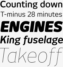
NewLibris
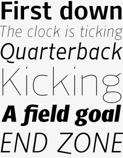
Libris was originally designed in 1997 for London’s Frank magazine, and later became the corporate typeface for Bally Switzerland. NewLibris is the retail version — a clear contemporary sans-serif for text and headlines. Designed for legibility and available in an wide range of weights, NewLibris is a distinctive sans for corporate design and publications. NewLibris is part of a larger family that also includes an interesting serifed version, which will soon be made available on MyFonts.
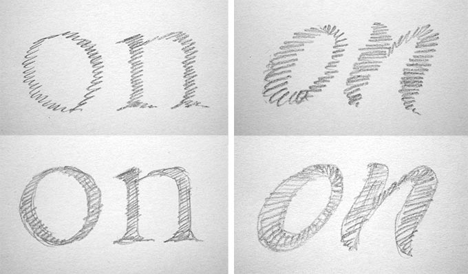
Sketches from Jocham’s notebook showing his method of pencil hatching to build up stroke thicknesses.
You’ve covered a wide range of styles, and you seem to follow trends very closely. Do you like the “fashion” aspect of typography? Is it important for you to react swiftly to what the market seems to want?
That is an interesting question. To be honest, I always try to avoid following trends. But then again, I work a lot for magazines and especially fashion magazines, for which I design custom display fonts. Mommie, for instance, was originally designed for the French magazine L’Officiel. Narziss was also meant to be used in a fashion magazine, although in the end it never took off. Magazines are simply a wonderful medium for trying out typefaces. Sometimes you find yourself suddenly doing something that would otherwise never have occurred to you. That is a very good thing for a type designer, who will gradually mutate into some kind of cranky hermit if he is not forced, from time to time, to take a look over the edge of his little shell.
You’ve designed some of Germany’s best known logotypes. Could you describe the steps that lead to a successful logo?
Successful is a great keyword! The Hertie logo, one of my favorites, was symbolically sunk in the river Spree by former employees after the company (a department store chain) went under last summer. That hurt. [The good news is that, following the logo’s symbolic burial, the private Berlin type museum (Buchstabenmuseum) managed to bring the sign back onto dry land with the help of the ver.di trade union and the Hertie employees. It is now part of the museum’s collection.]
As a designer, you have little influence over the success of a company. There are so many other factors that play a role.
When I work on a logotype project, I don’t think a lot about the likelihood of success or failure. Usually, the idea is to modernize a brand in an adequate way, or propose various directions for further development according to different positioning strategies. First I provide the client with a palette of options that range from a careful evolution of the existing logotype to a revolutionary new approach. Thanks to these intermediate steps, the client becomes well aware of where he stands and can decide in which direction to proceed. Many clients are very grateful for this procedure, because they feel they are being taken seriously in their decision-making process.
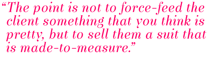
The point is not to force-feed the client something that you think is pretty, but to sell them a suit that is made-to-measure, in which they feel comfortable and which will hopefully allow them to be successful.
Schoko
As the name suggests, Schoko is another great font for food packaging. It’s spontaneous yet clear and legible; an energetic, light-hearted font to make the mouth water.
newjune
NewJune’s open and simple forms have some similarities to NewLibris, but its overall conception is more radical in character. The way the stems are joined to the curves — with all spurs removed — results in a very distinctive image. NewJune is used in magazines around world, such as Harvey Nichols (London) and W (New York). NewJune is part of a larger family that also includes an interesting serifed version, which will soon be made available on MyFonts.
As a lettering artist and type designer, do you have some kind of ambition or dream — an achievement that would be the icing on the cake, so to speak?
Designing typefaces comes easily to me now, and it has become a passion. This means that when I dream of making a certain kind of typeface, I just do it. The thing about wishes and dreams is that they’re usually about something you cannot decide alone or for which you’d have to change your life. Among the things I cannot determine myself are, for instance, large branding projects that allow me to design not only the logo but also the corporate typeface.
As for those ambitions for which I’d have to change my life — and this may seem paradoxical — I’d definitely have to spend less time designing typefaces. I’d like to speak and write about aspects of type. I’d like to give more workshops and perhaps write a book about the various ways to go about designing a typeface. I’d collect the various insights and rules devised by type designers that I referred to earlier, and make them available to those who share my passion.
Sounds like interesting times are ahead for you. We certainly hope you’ll pull it off some day soon. Thanks for sharing!
flavour
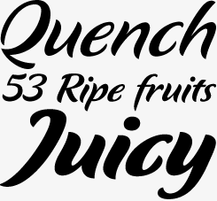
Flavour is an energetic and tasty brush script. What makes it stand out from many competitors is its generous range of stroke weights: five thicknesses, from Light to Bold. Neighboring weights (like Semilight and Regular) are close to each other, which can be a great advantage if you want large and small text to have a similar optical effect. An excellent choice for packaging and product branding.

Who would you interview?
Creative Characters is the MyFonts newsletter dedicated to people behind the fonts. Each month, we interview a notable personality from the type world. And we would like you, the reader, to have your say.
Which creative character would you interview if you had the chance? And what would you ask them? Let us know, and your choice may end up in a future edition of this newsletter! Just send an email with your ideas to [email protected].
In the past, we’ve interviewed the likes of Christian Schwartz, Dino dos Santos, Jim Parkinson, Mário Feliciano, and Underware. If you’re curious to know which other type designers we’ve already interviewed as part of past Creative Characters newsletters, have a look at the archive.
Colophon
This interview was conducted & edited by Jan Middendorp, and designed by Nick Sherman.
The Creative Characters nameplate is set in Amplitude and Farnham; the intro image features Narziss Text and Mommie; the pull-quotes are set in Narziss Text Italic; and the large question mark is in Farnham.
Comments?
We’d love to hear from you! Please send any questions or comments about this newsletter to [email protected]
Subscription info
Want to get future issues of Creative Characters sent to your inbox? Subscribe at www.myfonts.com/MailingList
Newsletter archives
Know someone who would be interested in this? Want to see past issues? All MyFonts newsletters (including this one) are available to view online here.