
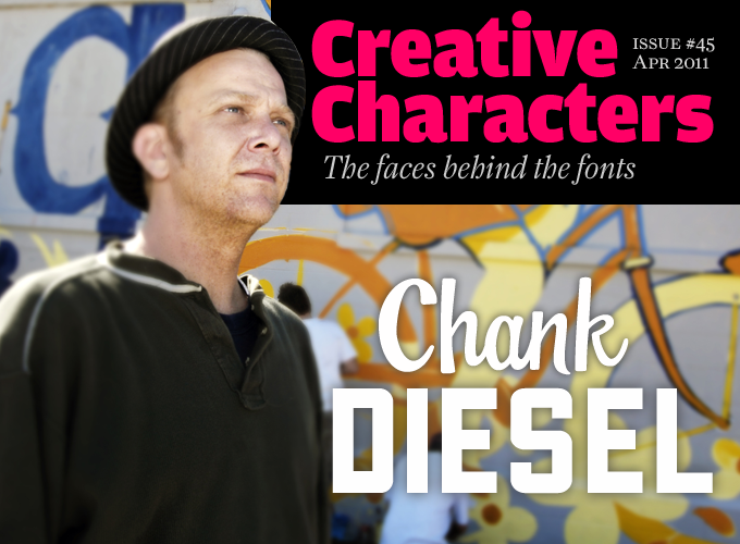
Photo by John Wallace
This month, we’re getting our hands dirty. Our interviewee is as likely to be found halfway up a wall, paintbrush in hand, as behind a monitor. Don’t expect subtle serifs here, or extensive text font families — in this edition, we’re painting with broader brushes. Our subject’s foundry, The Chank Company, has been consistently turning out energetic and substantial display faces since the mid-nineties. In our attempt to sift through this multi-faceted persona, we’ll meet a muralist, a contemporary type exemplar, a mentor and a brand. In there somewhere is a type designer called Chank Diesel. His world is this way...
Chank Diesel... that sounds like a pseudonym. Can you disclose the name your friends and loved ones know you by?
Pretty much everybody calls me Chank. When I was a little kid, it was the mean kids across the street who originally called me “Chanky” but that changed to just “Chank” when I got bigger. Then it was “CHANK!” when I was in college, because it’s kind of a funny name and people like shouting it. But I’ve toned it down a bit since then. (Wikipedia has the correct name info.)
About fifteen years ago, you were a pioneer of the online font community. You probably had more traffic than some of the majors and I, for one, downloaded dozens of your free fonts. Were you an idealist or did you have visions of how your business would one day be booming?
Well, I was born an artist and have always been an artist, so being an idealist just comes with the territory. A nice thing about being an artist is you can create your own ideal world; you just draw a picture of the way you want the world to be, then you walk into it. I learned that from the dude with the purple crayon. I’ve always had visions of my business booming, but the booms never come quite the way I expect ’em to. And while I do have lofty aspirations, I try not to get my hopes up too high because you just never know what’s really going to happen. An artist’s life is full of lofty delusions; those grand ideas are like little friends that keep you going and make you feel warm inside. You have to imagine greatness for yourself before you actually can get there.
Has making and selling fonts turned out the way you hoped it would?
Yeah, I think making and selling fonts has turned out pretty close to the way I wanted it. I always wanted to be a rich and famous artist, I just didn’t expect that getting rich would be so much trickier than being famous. The one part of my dream that still hasn’t come true though is a time when a hot new font release comes out and the font designer who made it sells a million copies or more in the first week, just like rock stars used to do with albums. It just never really happens that way. It takes a long time for a font to get popular, and an overnight smash-hit font release is incredibly rare. Designers need to see other designers using a font well before they “get it.” The best you can realistically expect is a few thousand downloads of a new free font release. That happens sometimes, but I still haven’t been able to figure out how to capitalize on it. So I just try my best to do amazing new work every day and hope the riches come later.
You seemed to cherish a certain secrecy or mysticism about your persona in the early days: a very invisible kind of person. Later, you began giving lectures and workshops. Was this anonymity part of a strategy or were you just shy? Do you enjoy going on the road?
Haha, no, I don’t think anybody’s ever accused me of being shy, even though I think I am shy. Mostly I’m a pretty vain person: look at me! look at me! But I do like to go into hiding sometimes, as an artist is wont to do when it’s time to create. It’s great fun to invent a “web persona” through design and text instead of using pictures of yourself. If you design your brand identity with a look and feel with typography and colors that are right for you, you can’t help but connect with like-minded individuals. It was just a more direct way for me to connect with the kinds of designers I wanted to use my fonts.
I’ve always had a wanderlust and I just love going on the road. There’s so many great places to see in this world! I don’t travel as much as I used to, but I still love it. And a big reason I do the workshops and lectures is just so I can travel to new places and meet great new people. I’m always so flattered when people invite me to their town to speak about my work.
Letterpress Pack
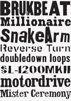
A selection of eight worn and battered letterpress fonts, the Letterpress Font Pack not only recalls technologies of times past, but also a sense that these letters have been gathering dust in a forgotten industrial building for many lost decades. Produced in collaboration with Blinc Publishing in St Paul, Minnesota, this pack combines the honest aesthetic of manual handwork with the convenience of digital typography — like having your own letterpress in your pocket.
Liquorstore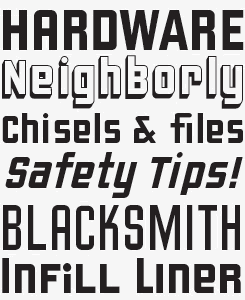
Liquorstore is inspired by handpainted liquorstore signs in and around Minneapolis. Five fonts of contrasting weight and style — including a lowercase version — make this a remarkably versatile display typeface, for anything from handbills and book covers to signage and mega-sized building facades.
How did you start working with type in the first place?
I was working on a music magazine called CAKE back in the day, and I created some fonts for myself to use in the magazine. When people saw those fonts, they wrote to me asking how they could buy them. I never set out to be a font company; I was just a guy making fonts. But once I started selling fonts, I put more effort into it.
I’ve always enjoyed working with the alphabet. I learned from watching Sesame Street, which has been there my whole life. I’m a lefty, so my handwriting is naturally awful. In 6th grade I was held back after school to work on improving my handwriting and that was my favorite part of the day. And since I was told at an early age that my handwriting is not so good, I’ve been working my whole life at improving my type-drawing skills, and I think I may have over-compensated a bit.
You’re a specialist of what people call “fun fonts.” Many type designers of your generation gradually abandoned the fun stuff for serious book faces and large families. Do you have any ambitions in that direction?
A serious book face? Like for books on paper? Hahahahaha! Nah, not really.
Seems to me it’s more important to make fonts that look good on phones, iPads, Kindles and other electronic devices. The fonts made for those devices will look very different from serious book faces, but I hope they won’t look all bitmappy and grid based. I want to make human-inspired fonts that look good on digital devices; that’s much more important to me than making a fancy book font.
I always imagined I’d spend ten years at some point making a fine, seriffed text font that would exemplify all my skills and flair and serve readers for generations to come. But as of today I just have no interest in working on a font like that. I would, however, like to make a display font with multiple serifs on each stem; I’ve got a font like that in my head, but I’m pretty sure that’s another fun font, and not a text font.
I like making large font families and do those sometimes, but those often confuse the casual font user, and I don’t want to alienate those people. Most people can grasp regular, bold, italics and bold italics. When you add mediums and extrabolds and superlights and condensed and extendeds and all that stuff it’s like you’re pandering to fancy-pants high-end designers, and they don’t really want to use my fonts anyway. So I try to focus more on original, flashy, display fonts that come in a single weight.
I do also really enjoy adding extra language support to my fonts, so more people can use them. I’ve added Central European character support to many of my fonts, plus a few sets of Cyrillics. I wish there was more money to be made making Cyrillic fonts, but I haven’t really found a way to monetize that yet. But I really love the Cyrillic alphabet; those backwards Ks are so cool, and I love the small-cap style in some of the lowercase letters.
Swingdancer
Swingdancer’s name says it all. A typeface with all the energy of a big swing band, combined with the sensuous swooshes, curves and inborn grace of a natural dancer. Several discreet ligature pairs ensure the rhythm is never interrupted, while a subtle variation to the vertical angle keeps things nicely informal.
Drunk Cowboy, Dry Cowboy & Cowboy Rhumbahut
Although three distinct typefaces, the casual relationships between Drunk Cowboy, Dry Cowboy and Cowboy Rhumbahut make them an interesting set of display faces with varying degrees of ornamental extravagance — depending on how lubricated one is feeling at the time of choosing the font for your party invitations.
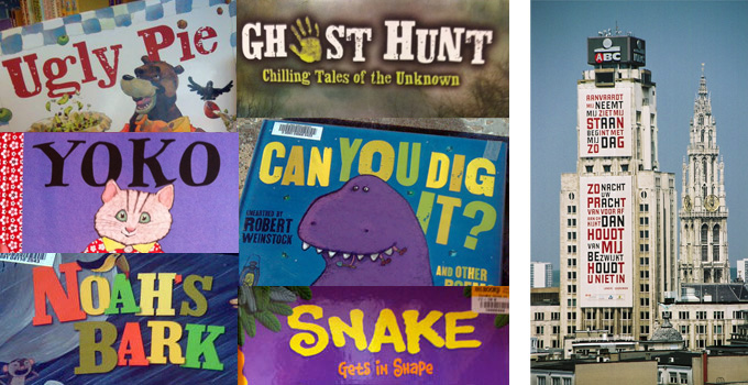
Left: A selection of book covers featuring Chank’s Woodrow, Corndog and several from the Letterpress Pack.
Right: Liquorstore used on a monumental scale by designer Gert Dooreman to set a poem by Tom Lanoye — the bank building declaring its love to the cathedral in the background — for an “alphabetic” festival in Antwerp, Belgium.
You’re an enthusiastic Twitter user. Here’s a recent tweet of yours that I liked: “I found an easy way to create an ink-splatter effect: ya just take some ink and splatter it.” You’re a real hands-on guy, aren’t you?
Working on a computer seems so sad to me. It’s not good for a body to sit in front of a glowing screen going click click click all day long. Just seems pathetic to me, even though that is my job. So I like to mix it up by getting my hands dirty, making an artful mess and using my whole body to make dynamic, exciting art.
And I like Twitter so much more than blogging, because it’s so concise and fun. I worry too much over perfecting longer blog posts, fretting over editing and finding imagery to go with it. It’s more fun to just blurt out something interesting, and let the reader interpret it as they may. I like how Twitter defines people through a stream of offhanded quips and short insights. When people use too many words in their writing, they turn me off just like a person who talks too much.
Going back to getting your hands dirty: talk to us about murals.
Hmmm... so much I could say.
I like making murals and being a painter. A well-painted wall makes a big, strong impression on people, and I feel like I do it well. I like how a mural can immediately change the feeling of the environment it’s in. I like that mural-painting makes use of my whole body and is a physical process that involves a lot of motion. If I sell a smaller painting to an individual and they hang it in their home, it may get seen by twenty or thirty people a year. But a mural in a high-profile urban location can get seen by 100,000 people or more per DAY. So I really like that murals expose my art to lots of people in a way that smaller art cannot.
You’ve seen the four murals featured here?
I did all four of those on one building last fall, and I think they all turned out just great. I am so proud of them. It took about five weeks to do the four of them. Two were collaborative (“Keep Riding” with Adam Turman & “Without Darkness...” with Anne Ulku) and the other two I painted mostly all by myself. I like these four a lot because it’s the first time I’ve ever really painted my actual fonts in my art, which is usually a separate, more abstract style than my computerized font work.
And because of the success of those Creative Lighting murals, I recently had a chance to work with a well-known street artist named EINE aka Ben Flynn. Eine was nice enough to let me help him paint a mural last week in Los Angeles, where his art is currently on display in a big street art exhibit at MOCA. It was an awesome thrill to get to meet him and help him paint some letters on a wall. He’s been one of my art heros for a few years now, and meeting him has really inspired me to go out and paint some more new murals. I hope to work with him again soon, too.
I’ve made hundreds of smaller paintings over the years, and I’ve sold most of them. I make money on fonts, but lose money on my art, but that’s okay. Printing and paint and framing and promotion and studio rent and canvasses all add up to big expenses for an artist, and sometimes even a successful art show can still be a losing proposition, financially. But the art is beautiful because it makes people smile and wins me new friends. Plus, art openings can be such fun magical events, but have you ever been to a really great font release party? I doubt it.?
Handwriting Fontpack
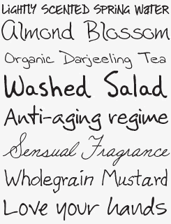
It’s no surprise that the Handwriting Fontpack is such a popular and consistent seller. Even with a full commercial license, 21 fonts for less than $190 is excellent value for money. The eight fonts we did find space for in our sample barely do justice to the possibilities in this extensive and appealing assortment, which will be well suited to personal as well as many kinds of professional design use. If that’s not enough, have a look at Handwriting Fontpack #2, for another 23 fonts purchasable individually or as a set.
Corndog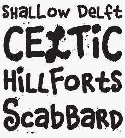
In something of a reversal of the normal way of doing things, Corndog was drawn with a fine tip pen at a very small size and then blown up large using a photocopier and scanned, in the process accentuating all the dust, flecks and spots of ink that come with repeated enlargements. An alternative “clean” version is also available.
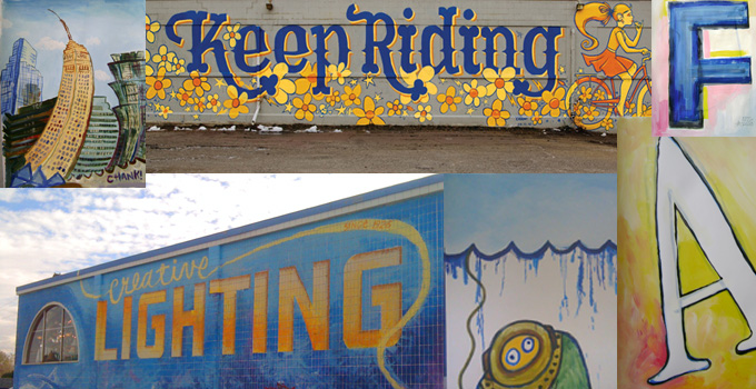
Examples of Chank’s artwork, and a couple of the murals in the flesh.
You’re one of the type designers who have always stimulated creativity in others and given credit and visibility to young designers. Do you still think that when it comes to designing fonts, it’s “the more, the merrier”?
I was lucky to work with Michael Cina, Matt Desmond, Joe Kral, Jess Latham and many other talented young people over the course of my career. And Ben Balvanz of Fontalicious made some fonts for me back in the day. I’m currently working with Anne Ulku on finishing up some of the excellent experimental type designs she created for her Six Word Story Every Day project and turn those alphabet ideas of hers into real fonts. Carla Zetina-Yglesias is another talented designer and MCAD alumni who’s also currently working on a new font with me, too.
I love working with young people because they make alphabets and fonts for pure fun, unfettered by all the rules and traditions of formal type design. They have a vibrancy and enthusiasm that might get dulled if they get bombarded with too much technical information about fontmaking. So I always try to keep it fun for them, to keep that spark fresh. They are often very good at starting new font ideas, and I’m good at finishing fonts and getting them out to the people. So it’s kind of a win/win situation when we work together. And since there’s not a whole lot of money to be made with fonts, the best thing I can reward them with is the credit and visibility, and of course stimulating their creativity so they make more fonts.?
Young people are dreaming up the fonts of the future every day. Every generation has a new set of display faces that are different from previous generations. And by working with the people who are conjuring up these new font ideas, they keep me fresh and inspired, and I can help them be more structured and skillful in their font creation. So I try to always be in touch with whatever young font designers inspire me and keep me interested in fonts as an art form.?
I like including other people’s work next to my own, because they both seem stronger by comparison. If I made all my fonts all by myself, they would all smell the same. But when you mix it up through collaboration, the styles go off in exciting new directions that I might never get to on my own.
Chank, thanks for sharing! And we really enjoyed that walk by the Mississippi river.
Chaloops
Chaloops blends digital OpenType trickery with hand drawn innocence. It’s ideal for anything requiring an effortless energy or an impression of unaffected verve. Its three weights make it particularly useful for “serious” design solutions — stories, family websites and games (both on boards and on screens). Fun with a sense of purpose!
Sister Frisky
Sister Frisky is one of those frantic, urgent characters, full of prickly surfaces and keen edges. Best suited to those short, sharp flashes of text found anywhere attention spans are in short supply.
MyFonts is on Twitter and Facebook!
Far from being an anonymous conglomerate, MyFonts is a (surprisingly small) group of real people passionate about type, design and digital communication. Our team members all contribute to our Twitter and Facebook pages on a daily basis, so join the MyFonts community and enjoy tips, news, interesting links, personal favorites, musings and more from MyFonts’ staff.

Who would you interview?
Creative Characters is the MyFonts newsletter dedicated to people behind the fonts. Each month, we interview a notable personality from the type world. And we would like you, the reader, to have your say.
Which creative character would you interview if you had the chance? And what would you ask them? Let us know, and your choice may end up in a future edition of this newsletter! Just send an email with your ideas to [email protected].
In the past, we’ve interviewed the likes of Michael Doret, Laura Worthington, Jonathan Barnbrook, Rob Leuschke, David Berlow, Ronna Penner and Jos Buivenga. If you’re curious to know which other type designers we’ve already interviewed as part of past Creative Characters newsletters, have a look at the archive.
Colophon
This newsletter was edited by Jan Middendorp and designed using Nick Sherman’s original template, with specimens and type descriptions by Anthony Noel.
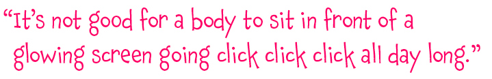
The Creative Characters nameplate is set in Amplitude and Farnham; the intro image features Swingdancer and Liquorstore; the pull-quote is set in Chaloops Regular; the Twitter icon is from LiebeTweet and the large question mark is in Farnham.
Comments?
We’d love to hear from you! Please send any questions or comments about this newsletter to [email protected]
Subscription info
Want to get future issues of Creative Characters sent to your inbox? Subscribe at www.myfonts.com/MailingList
Newsletter archives
Know someone who would be interested in this? Want to see past issues? All MyFonts newsletters (including this one) are available to view online here.