|
|
|
|
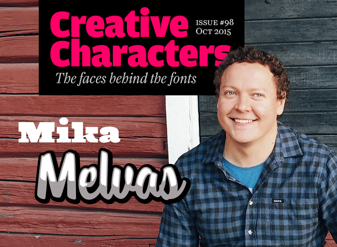
Our series of interviews with type designers has introduced readers to several personalities from Finland, that Nordic country of forests, lakes and, apparently, fine script typefaces. From Sami Kortemäki (cc 7) of Underware and Suomi’s Tomi Haaparanta (cc 31) through to more recent interviewees Emil Karl Bertell (cc 66) and Julia Sysmäläinen (cc 91) there’s a rich vein of inventive, original and modern digital calligraphy waiting to be unearthed. Our latest discovery has been selling his brightly imaginative scripts with MyFonts since 2011, but it’s a handful of his gems that have come out in the last year or so that really caught our eye. Meet Mika Melvas (cc 98), hard-working innovator.
|
|
|
Mika, you’ve designed a string of diverse and original script typefaces. Do you have a background in sign writing or calligraphy?
I have always been interested in various forms of hand lettering; graffiti, sign painting and calligraphy.
As a kid I was very interested in graffiti. I drew and sketched them in my notebooks, and in art class my favorite tasks were always the ones that included some typographical elements.
After high school I went to design school and I knew that in the third semester there would be a type design course. That was something I looked forward to from the beginning. When the course finally started it was quite basic and short but I liked it a lot. We designed a simple display typeface and used Fontographer to put it together. That was the time when I really got excited about type design.
At some point I found calligraphy. I have always liked to draw and do things with my hands. And there was something in calligraphy that fascinated me a lot. It is hard and demanding and needs regular training. And it is so pure; you can’t hide your mistakes or take short cuts. It is just forms and white space.
Mainly I use broad nibs and brush pens. I have also attended some calligraphy courses to sharpen my skills. I’m not a master calligrapher by any means but I like to do it and it makes me a better type designer and lettering artist.
Brush scripts seem to be a speciality of many Finnish type designers. Is that linked to some kind of national tradition?
At my time in elementary school we learned to write with a script hand. That was the only style we used for the first few years so it stuck pretty firmly and is a somewhat natural style for us. Most of the people never use it after that but the base is still there.
Nowadays pupils actually don’t write in a script hand at all. Finnish type designer Jarno Lukkarila just made a new recommendation for Finnish handwriting. It is a non-connected cursive style writing system.
Did you publish any typefaces with other foundries before you decided to go it alone? What were your main reasons for deciding to start up your own foundry?
No, I haven’t published any typefaces with other foundries. It took me quite a long time to realize that I could make a living with type design. At first it was just a hobby for me: I worked as an art director and graphic designer in advertising agencies and did type design on the side. But type design was my true passion. I started to work hard and guide my career towards becoming a full-time type designer and lettering artist. I worked on my calligraphy and lettering a lot, and practiced vectorizing them. After a long period of hard training I was able to resign from my art director’s post and start my own foundry. It was a quite exciting decision, and maybe a little frightening, but I was willing to take the leap and haven’t regretted it. And now I have been a full-time type designer and letterer for a year and a half. I consider myself very lucky to be able to do work I like so much and I have passion for.
Who were your teachers or examples as you learned how to design type?
I’m a self-taught type designer so I don’t have any teachers. It has suited me well and I think it is my way to do this. I have read and collected a lot of old lettering books and maybe that is the thing that has influenced me the most. Of course there’s a lot of type designers, foundries, calligraphers and sign painters whose work I admire.
|
|
|
|
 page has tons more. Top, center: a demonstration of the layers in the recent Paintlay font.](https://cdn.myfonts.net/s/ec/cc-201510/experiments.png)
|
|
|
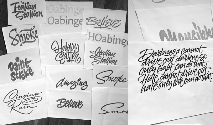
A handful of Melvas’ lettering experiments. His Instagram page has tons more. Top, center: a demonstration of the layers in the recent Paintlay font.
|
|
|
|
Could you describe your method of designing a typeface — how do you decide the style of the next face, do you research possible sources, sketch from scratch, digitize analog drawings?
Every process is a little bit different. Sometimes I just scribble with pens when I discover something interesting and I start evolving from that. Sometimes I see an interesting sign, a vintage logo or something and get inspired. I also do a lot of lettering pieces to test things out and to evolve my skills. Quite often those little experiments are the start of the typeface. That is a crucial thing for me to do those little lettering pieces and type experiments. I can let myself loose, take risks and test things out — really play with type. It makes me more versatile and creative in type design also.
Then I scan those scribbles or sketches and vectorize them. Those sketches usually evolve a fair bit when I start to vectorize them so sometimes the initial sketch and the final typeface are rather different.
What is the phase you like most during the design and production process? What is the part you’d rather leave to others?
Type design is a combination of creativity and engineering and that is very interesting to me. You get the best of both worlds. Sometimes, when you have put your mind and soul in to designing a typeface, it is a good diversion to do the more tedious work like spacing, kerning, coding or putting the diacritics in place.
Edison once said that success is 10 percent inspiration and 90 percent perspiration. That applies well to type design also. It’s not just designing 26 uppercases and 26 lowercases. You have to do all the hundreds of glyphs, punctuation marks, numbers, superscripts and so on with the same ambition. I always think when designing a glyph that someone somewhere might use this in a logo or whatever and it is my responsibility, and a matter of honor, to craft it with so much care that it’ll look good on that. And that goes for every glyph.
If I must choose the phase I like most it is the design part. Especially the early stages when you start a new typeface. The part I’d rather leave to others would be kerning.
I’d like to return to your replies about technique. When you talk about “lettering pieces”, is that hand-lettering? In general, how important is hand-sketching to you when making digital typefaces? Do you ever draw on the screen from scratch?
Yes, I mean hand-lettering. Some type designers use for example TypeCooker to explore with type and test things out. I do also that but beside that I do hand-lettering exercises. I choose a tool, let’s say brush pen. Then I scribble some words with it and select the design or direction I like most. Then I maybe do a refined version of it with pencil or scan that scribble straight to the computer. Then I vectorize and refine it in Illustrator. I call those experiments lettering pieces because those are meant to improve both my type design and lettering skills.
I think hand-sketching is a very important thing – at least for me — especially when you are doing a script font. You can’t beat the flow and rhythm one achieves with just pen and paper. I think you can focus better on the bigger picture; composition, flow and style, when doing things with just pen and paper. I easily rush to fine tune the details too early when using just a computer.
When I’m designing a script typeface I don’t necessarily do a sketch for every glyph. When I know the basic characteristics of that typeface I can do some glyphs on the screen from scratch but I still have my brush pen and paper beside me to test things out frequently.
Do you teach or give workshops? If not, would you enjoy it?
I haven’t given any workshops. I’m not sure if teaching is for me. I’ve been asked to do some lettering and type design courses and workshops but I haven’t done any yet. I think it’s not enough that I know some things and how to do stuff, in my opinion teachers should have some knowledge of and interest in teaching itself. I’m also a bit of a perfectionist so I feel I should know everything in the field of lettering or type design perfectly to be justified to teach.
But you never know. It is something I would like to do, so maybe I’ll give it a try in the future.
|
|
|
|
|
|
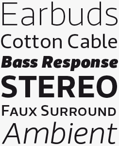
You drew a couple of well-made sans-serif families — Roihu and Riona Sans. Do you have ambitions to branch out further in the text font genre, or do you find making display and script faces more rewarding?
I like doing both display and text fonts, and I’ll definitely do more sans serifs, and serifs too. I actually have a sans-serif type family planned and I’ve started designing, but it is still at such an early stage that it will take a very long time to finish.
Maybe I have done so many scripts lately because those are so much fun to do. The whole process from sketching and doing all the alternates, swashes and ligatures is fun and creative. And of course you can take more liberties with display fonts so it is a little easier to make them distinctive. It is a somewhat harder task to make a text font that stands out and yet still be usable and legible.
During the last ten years or so, a lot has changed in the type world. There are many schools that offer type design courses and even degrees, there are dozens of typography websites and blogs, and an increasing number of international conferences. Do you — or would you — like taking part in all that, the social gatherings, the online discussions? If not, why?
I read blogs and all the major type related sites like ilovetypography.com and typographica.org regularly. I also try to be active on Twitter and Instagram. It’s good for seeing what’s going on in the type industry, keeping up with what other designers are up to and networking with clients and other type designers. It is very important to keep track of new things and keep yourself on display.
Sometimes it is helpful to get opinions from other type designers and I have asked for critiques on the TypeDrawers type forum.
I haven’t been to any conferences yet but that is something I’m definitely planning to do in the future. I usually watch the presentations online if those are available but it would be nice to meet all those great designers in person.
Back to the self-taught aspect. Are there any things that you think you could have learned more effectively or thoroughly if you had been at a specialized design school?
There are some great schools nowadays that teach type design, and for sure there are a lot of things I think I would have learned more quickly, thoroughly and easily at one of them. It is astonishing how much people learn within a year at these schools.
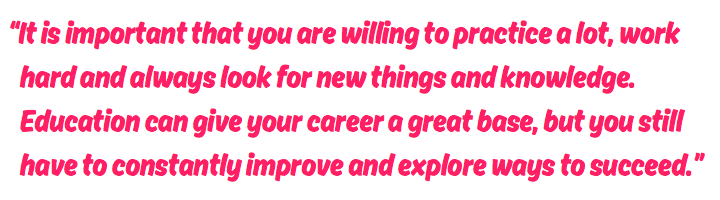
But I also believe that it is important that you are willing to practice a lot, work hard and always look for new things and knowledge. Education can give your career a great base on which to build, but after school you still have to constantly improve your skills and explore ways to succeed in this industry.
I don’t have any ideology or principle behind this. Things just have gone this way for me and I feel this self-taught method has suited me well. I have learned a lot since I started and I know I have still lot to learn. And that’s great!
|
|
|
|
|
|
|
Sketches of lettering and calligraphic work.
|
|
|
|
Many of your typefaces have strong personalities and are therefore interesting components for packaging, branding, or poster design. Do you do that kind of graphic design work yourself? Is it important for a type designer to know how to work with fonts under various kinds of circumstances?
When I was working for advertising agencies I used to do all kinds of graphic design: web design, packaging design, branding, brochures… I’m more focused on type related projects now. Alongside type design I do hand-lettering for logos, t-shirts and whatever else clients come up with. Sometimes I’ll get to do custom fonts for companies.
I think it’s good to have knowledge and experience of graphic design — it has worked for me at least. It means that you have an understanding how your clients would use your fonts and what kind of expectations they have.
Graphic design experience helps with marketing your fonts as well, since you either have to design the presentations and specimens for your typefaces yourself, or hire a designer to do so. A huge part of that is giving ideas and inspiration to people who are searching for the right typeface. I think those marketing images are a very important part of a successful typeface.
Is your working environment as rural as it looks in the picture? Are you inspired by your immediate surroundings?
I live in Vantaa, near to Finland’s capital Helsinki, which is quite suburban really. In one direction it’s 15 minutes to the centre of Helsinki, in the other I’m almost in countryside.
There are lots of nature and forests nearby, which is something I like a lot. We have two dogs and exercising them is a good way to recharge the batteries. I can’t say if my surroundings inspire me, but a good walk in the fresh air and a peaceful environment can shake off designer’s block or help me refresh if I’ve had tedious work to do. The mind tends to be a bit clearer after that.
Thanks for your stories and insights, Mika!
|
|
|
|
MyFonts on Facebook, Tumblr, Twitter & Pinterest
Your opinions matter to us! Join the MyFonts community on Facebook, Tumblr, Twitter and Pinterest — feel free to share your thoughts and read other people’s comments. Plus, get tips, news, interesting links, personal favorites and more from the MyFonts staff.
|
|
|

|
Who would you interview?
Creative Characters is the MyFonts newsletter dedicated to people behind the fonts. Each month, we interview a notable personality from the type world. And we would like you, the reader, to have your say.
Which creative character would you interview if you had the chance? And what would you ask them? Let us know, and your choice may end up in a future edition of this newsletter! Just send an email with your ideas to [email protected].
In now past, we’ve interviewed the likes of Verena Gerlach, Erik Spiekermann, Latinotype, Ulrike Wilhelm, Bruno Maag, Rae Kaiser and Veronika Burian. If you’re curious to know which other type designers we’ve already interviewed as part of past Creative Characters newsletters, have a look at the archive.
|
|
Colophon
This newsletter was edited by Jan Middendorp and designed by Anthony Noel.
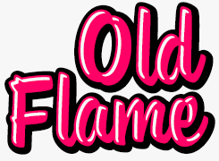
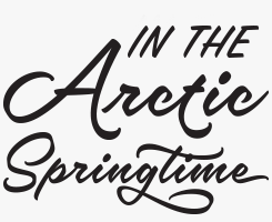
The Creative Characters nameplate is set in Amplitude and Farnham; the intro image features Ringa and Paintlay; the quote image is set in Ahkio Regular; and the large question mark is in Farnham. Body text, for users of supported email clients, is set in the webfont version of Rooney Sans.
|
Comments?
We’d love to hear from you! Please send any questions or comments about this newsletter to [email protected]
|
Subscription info
Had enough? Unsubscribe immediately via this link:
www.myfonts.com/MailingList
Want to get future MyFonts newsletters sent to your inbox? Subscribe at:
MyFonts News Mailing List
|
Newsletter archives
Know someone who would be interested in this? Want to see past issues? All MyFonts newsletters (including this one) are available to view online here.
|
|
|
|
MyFonts Inc. 600 Unicorn Park Drive, Woburn, MA 01801, USA
MyFonts and MyFonts.com are trademarks of MyFonts Inc. registered in the U.S. Patent and Trademark Office and may be registered in certain other jurisdictions. Other technologies, font names, and brand names are used for information only and remain trademarks or registered trademarks of their respective companies.
© 2015 MyFonts Inc.
|
|
|