
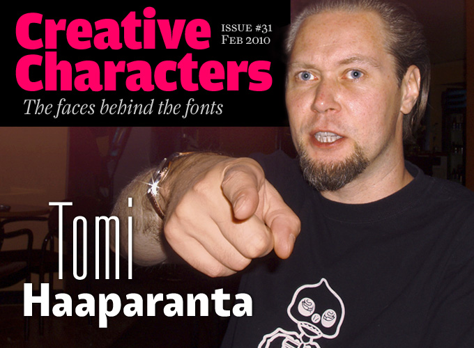
He is probably Finland’s most prolific type designer, and his foundry is simply named Suomi — which, of course, is what the Finns call their country. While working with us on this interview, he realized with a slight shock that he’s been in the font game for two decades. Yet his letterforms are as youthful and fresh as ever. His most recent offerings, such as the smart handwriting face Suomi Script and the spirited Suomi Sans, show a convincing mixture of attitude and maturity. Meet Tomi Haaparanta, our man in Helsinki.
You call yourself “Tomi from Suomi.” Is there such a thing as a Finnish style of type design? Is there a Finnish type design scene?
Yes, I decided to go with Suomi instead of Finland, using that name in the same fashion as Finnish athletes wear ‘Suomi’ on their jerseys, occasionally with the word ‘Finland’ appearing underneath. I think it’s a sense of pride.
Finland doesn’t have much of a type design scene; we are pretty well connected to the international font community, and I really cannot talk of any Finnish style. The reason could be that Finland does not have a long history of type design. Ever since the Finnish language was officially established during the Lutheran movement, most of our influences came from Germany, with heavy emphasis on Fraktur styles.
I still have a hymn book my grandmother gave me, printed in 1902. It’s all in Fraktur, and therefore pretty illegible. The printing guide books I have from the early twentieth century show ads from either German foundries, or Finnish suppliers selling German fonts. Finnish type design came with the Mac and its font design software.
Your best-known fellow Finns in the type scene are probably Underware’s Sami Kortemaki and FontFont’s Julia Sysmäläinen. Both have made splendid script typefaces; your recent Suomi Script is a very original and sophisticated script face too. Is that knack for scripts connected to some national writing or lettering tradition?
Sure, those two are well known, but don’t forget Jarno Lukkarila, who won the Morisawa Award with his Xtra Sans. And there are loads of young designers on the way.
I don’t know if our “knack for scripts” comes from our education, even though my generation was encouraged to write by hand, and after primary school we were not restricted from developing our own style of writing. My own handwriting is pretty flourished. It could be that our language has so many double consonants and double vowels, so with OpenType we can play around with those. But I can not personally think of any tradition for lettering or scripts. So it must be a natural disposition.
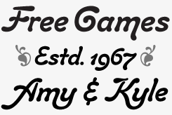
suomi script
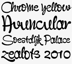
With its gutsy attitude and energetic gestures, Suomi Script stands out among the plethora of brush script fonts available. When using the font in an OpenType-savvy layout program, over 1800 smart ligatures are on standby to automatically create a hand-made look.
tailor
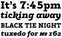
Tailor is a small family — a bold slab serif and its italic — but it’s special in its kind and has been doing quite well on MyFonts. With its round shapes and friendly feel, Tailor is a distinctive, powerful display face. The italic has some nice alternates and the oldstyle figures are a useful bonus.

A selection of logos designed by Tomi Haaparanta for Finnish and international clients.
You’ve been designing type since 1990. Like many young designers back then, you started with distorted grunge fonts like Explosion and simple geometric alphabets like Tantalus. How did those early designs come about? And what made you decide to get more serious about type design?
Twenty years of type design… I only now realized that. I got my spark while studying in Dublin, Ireland. Phil Baines came to show his work, and his type design. Some of the boys promptly copied his programs — I still don’t know how they did that — and I copied Letraset FontStudio from them. I know now that it was illegal, but in 1990 in Dublin, I had no idea I was doing something wrong. And that’s when I started designing type.
In fact I started with fairly basic work: my first font was a tall and narrow design, the next was a bad copy of Neville Brody’s work, and the third was a strange sans-serif version of an uncial.
My first international font release was Target in 1994. It is from the same period as Tantalus — another design I wish I had not done. It was selected for release by GarageFonts, but Brian Kaszonyi, a friend of mine, convinced me to release it with T-26, so I went with that. It’s still a bestseller there. In 1996 Brian was creative director of HEL, the media division of the ad agency Taivas. He asked me to join them as a full-time type designer, and I jumped. HEL was a laboratory exploring different media, from the Internet and animation to guerilla advertising on the streets, as well as new ways of approaching conventional media. For example, we made ProtoKid for the children’s wear department of Diesel Industries. It was an interactive portal, where you could create your own ProtoKid character, dress it with the latest clothes, and move around and talk to other ProtoKids. Something very new ten years ago.
My time at HEL made a big difference. Before that I did fonts as a hobby, but now I was designing fonts for a living. It was during that time I made Explosion, and in HEL we made many other conceptual fonts. Our idea was not to make font families, but instead produce “font sets” for a particular idea. Some of them worked, and some didn’t. I incorporated many of my own fonts in these ideas, so I’m not sorry to use some of those ideas today. Some were just brilliant, yet are still not used.
So — describe the best font you haven’t quite designed yet.
The best font I’m yet to make is one I almost made already, a super-duper mega font family with three axes: weight, width and style (see the diagram below).
SUOMI SANS
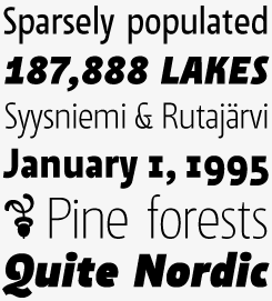
Suomi Sans is narrow sans-serif with a difference. While its silhouettes are those of a basic sans, the counterforms — the inner “white” of each letter — have a strong calligraphic flair with accented upper left and lower right hand corners. With six weights in roman and italic, Suomi Sans works well for both headlines and medium-sized longer texts.
toffee script
The sturdy Toffee Script is part psychedelic brush script, part Art Nouveau lettering. Distinctive and legible, it comes with two sets of figures and some surprising ligatures for typographic finesse. Like many Suomi typefaces, it contains a charming set of typographic fleurons.
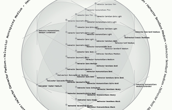
A sneak preview of Tomi’s “super-duper mega family” in the making. Working name: Helvector.
Could you describe the process that helped you increase the quality of your work and tackle more complex tasks, such as large families?
Time in Taivas’s HEL was the very thing for me. I had an opportunity to study a craft for eight hours a day, and get paid for it. That was essential. During that time I had the opportunity to attend ATypI conferences, link with people like House or LettError with the possibility to pay for their assistance. Who had that? The oddest thing was, I made a profit for the company. Taking me in was considered a liability, but in the end I made them money. A lesson to all.
During that time, working as professional, I developed a routine that enabled me to establish a world record: designing a sans-serif font in 3 hours and 4 minutes from start to PDF sample.
For large families I found Luc(as) de Groot’s optical weight formula or “interpolation theory” and once again learned a lot. I compared Helvetica’s weights to fonts designed by Luc(as), and saw the sense of this idea. I still use it, with a grain of salt. Also Sumner Stone’s glyph spacing method was something I used for years, until I had it in my backbone.
There’s also a more practical process — something I discovered only five years ago: to open an old commercial font, and see what they have done wrong. Adobe Caslon looks horrible to my eyes today, and Gill Sans is also full of flaws. But by studying how they are made and spaced, you can learn how to make a commercial font. Do not copy those things, but learn from them.
The very first thing you should look to learn is scale. That took me a while. Look at the size.
Please elaborate...
Scale is such a basic thing in type design that it gets easily overlooked. Beginners often make their serifs way too small for the stem; they often get caught on the shape of the serif, and only after they look at the whole glyph, they notice that it is way too tiny for their intended design. I see this a lot while teaching. Also, in my students’ designs the overshoot for curved forms tends to be just one or two units, rather than ten to fifteen, even though I’ve pointed this out to them more than once. Even basic contrast of the font gets forgotten while tinkering with the pursuit of the perfect shape. One should keep looking at the whole font, instead of single shapes.
ticketbook
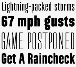
Movie posters tend to defy legibility with credits set in extremely narrow type. Though often used, the compressed versions of Univers and Helvetica offer a rather limited choice of variants. Ticketbook comes in seven weights designed for space-saving legibility: problem solved!
tame
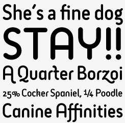
Tame, a charming headline font with rounded terminals, comes in one single weight but offers three degrees of liveliness. Select appropriately.
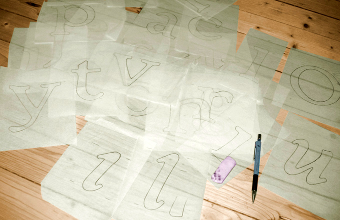
Hand-sketched alphabets are a rare sighting in the Suomi studio.
You said you don’t think copying Gill or Caslon is a good idea. But you did recently publish two families of sans-serifs based on historical models: Tee Franklin and Kaapeli. What was your motivation to revisit designs that are 80 to 100 years old and have been digitized by others before?
What I meant was that copying the font data itself is somewhat illegal (sic), but I’ve found dissecting an existing font does have its benefits for a beginning type designer.
Yes, I have made my own versions of several old typefaces. Tee Franklin was commissioned by British Vogue, but just as I finished the family, they informed me that they’d decided to go with American Typewriter instead. I was not happy. Kaapeli came about during book design, and I once again came across glyphs I really disliked. So, I made my own interpretation of the original, with my choice of glyph design.
The story behind Suomi Slab Serif is similar. A friend of mine asked me to make an update of American Typewriter. I kept the basic forms of the Clarendon design, but got rid of all the smooth and overly polished aspects, making it crisp and clean.
tee franklin
Tee Franklin began life as a custom face for a glossy magazine. Existing versions of Franklin Gothic lacked the light and thin versions that are a must in today’s fashion mag design. Taking Morris Fuller Benton’s original as a starting point, Haaparanta digitized the face anew, making subtle alterations. The result is an interesting alternative to other digital Franklins.
I think Tang is one of your most remarkable families, but it has been remarkably unsuccessful. Could you tell us a bit more about the ideas behind it and the way you designed it?
Thanks. I personally like Tang very much, and I’ve used it in book design, in product design, and also as my own house type. Tang started as a study of ink trap intakes, as well as a study of typeface for the Finnish language (like I said earlier, our language has some incredibly long words, and double vowels and consonants). That’s why the design is fairly narrow.
I made the Medium weight first, and tested just how big an ink trap could be without disturbing the form/counterform relationship. I first went over the top, and then came back to more normal size, and finally decided on the current size of Tang. After some tinkering I turned those ink traps – a mechanical function – into a design feature. They work well in very small sizes, but they also give character to the text in headline sizes. After the italic variant, I made the Thin weight to see exactly how thin I could go, and then moved over to the heavy side. I first made Black for interpolation, but made an Ultra Black as well, and really went over the top with that one.
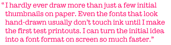
In general, how much of a typeface is drawn on paper before you take it to the computer?
I hardly ever draw more than just a few initial thumbnails on paper. Even the fonts that look like they are hand-drawn usually don’t touch ink until I make the first test printouts. I find scanning, cleaning and vectorizing a waste of time, since I can turn the initial idea into a font format on screen so much faster, cutting out the middle man.
Finally: is there any other designer or artist, apart from yourself, that you would have liked to be?
I’m very happy just to be me.
TANG
Ink traps are a way of avoiding ink clutter in sharp corners when printing at very small sizes or on bad paper. With today’s sophisticated offset presses there is not much use for them, but in some typefaces the functional device has become a stylistic element. Christian Schwartz’s Amplitude is a perfect example of this. In Tomi Haaparanta’s Tang, the ink traps are even more exaggerated, cutting deep into the flesh of the letter. When using the middle weights in text sizes, the cuts are rather inconspicuous; but they lend a striking and novel quality to the light and black weights when used large.

Who would you interview?
Creative Characters is the MyFonts newsletter dedicated to people behind the fonts. Each month, we interview a notable personality from the type world. And we would like you, the reader, to have your say.
Which creative character would you interview if you had the chance? And what would you ask them? Let us know, and your choice may end up in a future edition of this newsletter! Just send an email with your ideas to [email protected].
In the past, we’ve interviewed the likes of Cyrus Highsmith, Rian Hughes, Alejandro Paul, Hubert Jocham, Underware and Alexandra Korolkova. If you’re curious to know which other type designers we’ve already interviewed as part of past Creative Characters newsletters, have a look at the archive.
Colophon
This interview was conducted & edited by Jan Middendorp, and designed using a template by Nick Sherman.
The Creative Characters nameplate is set in Amplitude and Farnham; the intro image features Ticketbook and Tang; the pull-quote is set in Suomi Slab; and the large question mark is in Farnham.
Comments?
We’d love to hear from you! Please send any questions or comments about this newsletter to [email protected]
Subscription info
Want to get future issues of Creative Characters sent to your inbox? Subscribe at www.myfonts.com/MailingList
Newsletter archives
Know someone who would be interested in this? Want to see past issues? All MyFonts newsletters (including this one) are available to view online here.