
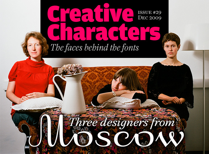
Previous issues of Creative Characters all featured the work of a single designer or studio – people with a large enough body of work to fill a newsletter. But there is a new generation ready to be discovered. They may not have as many fonts on the market, but their work is often surprisingly mature. Many come from countries that, typographically speaking, used to be marginal at best. And, quite amazingly for a craft that was always a man’s world, about half of them are women. So it is time for a slightly different approach: Our end-of-the-year surprise is an interview with three young female designers from Moscow. A warm welcome for (from left to right) Vera Evstafieva, Alexandra Korolkova and Elena Novoselova.
You all studied under Alexander Tarbeev. Could you tell us something about his approach as a type designer and teacher? He seems to have inspired a great many young people in Russia. What makes him so special?
Alexandra: He’s a genius. Well, he is probably the only person in Russia who, being a brilliant type designer, can teach everything related to it. His basic course at the University of Printing Arts consists of the history (and practice) of European calligraphy, history of type, practice in lettering and microtypography, and type design itself, and he always makes it all interesting for the students. So if you study well, by the end of that two-year course you are already quite well trained and you can just continue designing typefaces in his Type Design Workshop.
Also, Tarbeev always makes you think that you can do better, and he never tells you what to do until you ask, and are ready to know the answer.
Vera: Alexander Tarbeev likes to repeat his teacher’s words – “It is impossible to teach students any skills, but it’s possible to create conditions for them to learn.” There is something in his attitude to type design, his high expectations and demands, which gets students involved in this rare profession. He combines a wide knowledge and interest in computer technology (as an engineer by education) with manual skills (as a book and graphic designer by his second education).
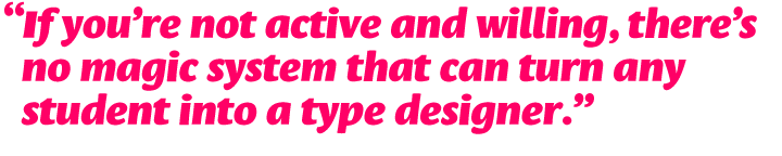
The student’s initiative is very important here – if you’re not active and willing, there’s no magic system that can turn any student into a type designer. Education in Russia is often based on teachers serving ready-made information which the students simply accept. In that sense, it is different and sometimes not very easy at the Type Design Workshop. This is a challenge, and it’s fun.
Elena: Tarbeev is a contemporary man, both in design approach and in technical skills. He teaches people to reinterpret tradition in a modern way for contemporary needs. He even teaches some programming, like NodeBox and Processing. He always has a million ideas, which he shares with his students. While some type designers complain about the illogicality and ugliness of the Cyrillic alphabet, he never does. For him, letters are a unity of black and white, of form and counter-form. It doesn’t matter what script it is. He is also a charismatic man full of irony; an erudite person.
Vera, after your training in Moscow you studied in the Netherlands, and graduated from the Type]Media postgraduate at the Royal Academy (KABK) in The Hague. What did you learn there that was different from what was being taught in Russia?
Vera: The school of The Hague shows a clear link between calligraphy and text type design, whereas calligraphy studies in Moscow were delivered just to get acquainted with history. The studies of writing serifed letters with two basic tools — the broad pen and the pointed flexible pen — are an analytical key to understand the nature of lettershapes. They helped build quite a clear system in my head. Also, calligraphy is used as one of the sketching techniques besides drawing.
The most important thing I learned in The Hague is how to start designing a typeface. I learned this not only through the experience of my own final project but also from my classmates. Design problem → research → design as an answer to the problem. The great sketching techniques come in very handy here.
Another thing, which probably sounds kind of funny… I used to think there was one Type Truth which all experienced masters know. Learning from so many teachers in The Hague I realized that even former students of one great teacher (Gerrit Noordzij) can have very different views on type, and this helped me to also clarify my own priorities and preferences in type design.
Leksa
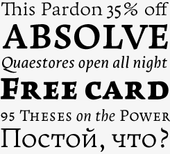
Alexandra Korolkova’s Leksa was Text Font of the Month in our most recent Rising Stars newsletter. It was not a subjective choice: Leksa is currently one of the most successful new text typefaces in our shop. The designer describes her font family as “oldstyle, even a bit old-fashioned”. It has elements of Jenson’s roman from the late 15th century, but its details and structure are totally 21st-century. With six weights ranging from Light to Black, it is an extremely versatile family. Needless to say, the family has a superb Cyrillic which, together with Leksa Sans, won Alexandra an “Excellence in Type Design” award in the Superfamilies category of Paratype’s 2009 Modern Cyrillic competition.
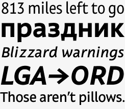
Leksa Sans
Built upon proportions that are identical to the serifed version, Leksa Sans is the perfect companion to the idiosyncratic Leksa. In the sans-serif, Leksa’s rather picturesque qualities have been neutralized, but the charm has remained intact. And so has the legibility: contrary to more geometric sans-serifs, Leksa will work well in lengthy text settings. A set of beautiful oldstyle figures adds to the appeal of this humanist sans. The Cyrillic, of course, is beautiful.
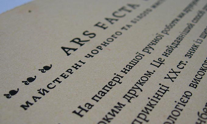
A letterpress print by Officina Daubmanni (Fedir Shulga) using Alexandra’s Leksa
After your year in the Netherlands, did you have a different or more pronounced view of what you could contribute to typography in your own country?
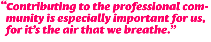
Vera: While studying in the Hague I became aware of the growing interest in multilingual type design. I think we can take advantage of our long tradition of multilingual design in Russia, we just need time and hard work. It’s also very important to teach — otherwise our type designing efforts won’t be understood, and will ultimately be in vain. Contributing to the professional community is especially important for us, for it’s the air that we breathe.
Elena and Alexandra — Vera became your teacher as Alexander Tarbeev’s assistant after she had returned from the Netherlands. Did you find her approach unusual or surprising?
Elena: Vera told us fantastic things. I found out about Gerrit Noordzij’s theory, about Fred Smeijers’ books, about Dutch type in general. We started attending ATypI conferences and learned from that as well. I realized that stone carving is really useful for understanding letterforms, as much as calligraphy is. Vera inspired us with her knowledge and with the amazing work she had done.
Alexandra: Tarbeev’s way of teaching is quite close to Gerrit Noordzij’s theory, in that it is based on the difference between broad and pointed pen and so on, so Vera’s approach seemed very natural. But her stories about her and her classmates’ graduate projects were compelling and very helpful, and she also brought different lettering techniques to the Type Design Workshop, such as stone-carving, glass engraving, etc.
Direct
A signage typeface must be easily readable from some distance away and have simple letterfoms with clear-cut features to quickly identify characters. If the typeface is not destined for use in a particular building, its shapes should be neutral, so that it agrees with different styles of architecture. The result of this purpose-driven thinking is Vera Evstafieva’s Direct, the first Cyrillic typeface created for wayfinding purposes. Direct has nine styles optimized for wayfinding signage. The family’s dynamic and modern feel suggest other applications as well, such as corporate design.
In today’s digital type design, all Cyrillic fonts come with complete Latin character sets. And indeed, you are all very prolific in Latin letterforms as well as Cyrillic. Is the Latin alphabet taught alongside Cyrillic at school? Does it constitute a special challenge for you to have to express yourself in both scripts?
Elena: Almost all children learn English in school so we are familiar with the Latin alphabet in that way. When designing fonts with both Latin and Cyrillic, you are faced with a special kind of challenge. The main problem is to achieve compatibility of these two scripts, to find a union in style, rhythm, and texture without losing the peculiarities of each script.
Vera: Here in Russia we begin our English lessons quite early, sometimes even in kindergarten or at primary school, so children start reading English (or French, German, Spanish, Italian) just a bit later than Russian. We are surrounded by Western brands, labels and music. We have Latin e-mail and website addresses and we sometimes use transliteration for SMS messages. And of course there are many Latin or French quotes in classic Russian literature. We live in a two-script environment — especially in Moscow.
This does not mean that everyone speaks foreign languages, but the visual environment of our everyday life is not purely Cyrillic.
When we enter design school, you might be surprised, but learning lettering, calligraphy and type usually starts from Latin styles and history. Sometimes there’s not even enough time left to finally study Cyrillic with any depth, or to practice much. Hopefully this is changing now. We do our best to contribute to the development and systemization of teaching Cyrillic.
Until recently, most of the text typefaces used for the Cyrillic script were expanded versions of existing “Western” typefaces. This is rapidly changing, with original typefaces being designed by people like you. What are the most important factors that have contributed to this shift?
Vera: For many years, designing Cyrillic versions of great Latin typefaces was the main policy at ParaType, Russia’s largest type design studio. This is still quite common — for instance, when a foreign company or a magazine starts working here they need a Cyrillic version of their fonts. But I was taught to think about a type project from scratch, and that’s much more challenging for me.
The shift is probably somehow connected with the separation of some designers from ParaType and also with the appearance of young type designers who can choose what is most convenient for them. Adapting Latin to Cyrillic doesn’t seem to work best for me and for some of my colleagues — both as a design practice and as a business model. I prefer to work on original designs.
Elena: Several factors contributed to this development. The Letterhead studio was established in Moscow, and began making original display fonts. Bukva:raz! was an international competition of type design, sponsored by the Association Typographique Internationale (ATypI) which took place in Moscow in 2001. This was a new kind of event in the area of Russian type design and typography that enabled designers and students to see what was going on in their field. Also, of course, Alexander Tarbeev started teaching. Vera and Ilya Ruderman, who both studied at the KABK, inspired young people. And more generally, designing type became more accessible for technical reasons.
Heino
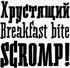
Heino by Elena Novoselova is a decorative face with two styles that was inspired by a piece of lettering in an old magazine. Among its most conspicuous features are the heavy serifs and tight spacing — particularly when choosing the Black version. The bouncing letters create a cheerful impression in children’s books and magazines, on candy and food packages, holiday and circus posters and flyers.
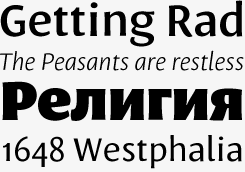
Mezzo
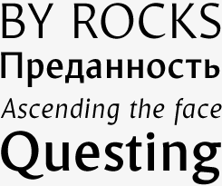
Elena Novoselova’s Mezzo is a special kind of sans-serif. It has the classic proportions of a humanist text typeface and its subtle thick-thin contrast lend it some of the charisma of an oldstyle. Its four styles are elegant and slender, making Mezzo a useful family for creating packaging, candy and pastry wrappers, perfume and wine labels, etc. It will also work perfectly in food and fashion magazines.
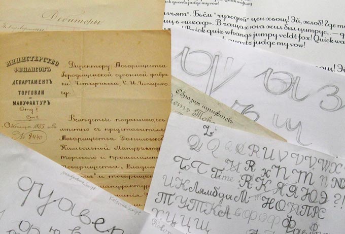
Source material and sketches for Vera’s Dulsinea.
I imagine that when you begin a new typeface with the Cyrillic alphabet and draw the Latin characters later, the result is likely to be different from when you use the opposite procedure. How does this work for you?
Vera: Starting a typeface design with Cyrillic is actually quite a rare case and depends on the project — the most effective method, in my opinion, is to start sketching both Latin and Cyrillic to define characteristics of the new design which don’t contradict with or disturb any of the parts.
When adding any of the parts later, the process itself forces the addition to be more or less secondary. The first part cannot be modified and it will dictate rules which do not always translate well into another script. When designed simultaneously these two parts are more friendly to each other (or more parts if the designer knows how to design several scripts). This doesn’t mean any harm to Latin shapes but gives more freedom for Cyrillic to reveal its native features.
Elena: Usually I make both alphabets simultaneously. I don’t think it matters where you start. The Latin is really logical, it has been taking shape for ages. It was born from calligraphy and it follows it. Cyrillic is much younger, and it’s an artificial alphabet. For instance, you cannot write Cyrillic with a broad-nibbed pen without changing the angle of the pen.
Alexandra: The main differences in lowercase Latin and Cyrillic characters are the differences in stroke connections (e.g. in п and н) and the greater symmetry (and number of serifs) in Cyrillic, so you must think about how to make both scripts look similar overall. So I, too, usually design Cyrillic and Latin letters simultaneously.
I have the impression that in the countries of the former USSR, schools attach a lot of importance to manual skills, craftsmanship and precision. Is this true? And has it helped you become better type designers?
Vera: Yes, that’s true and I think it must certainly have influenced our abilities in some way or other. Although, there’s probably no direct link between drawing an object or a human body to drawing a system of letters that works as a good typographic tool. What definitely is learned from drawing, painting, engraving, woodcut and other crafts are the complicated spatial relationships of a shape and surface, form and counter-form. It’s a good school to start seeing and manipulating this phenomenon.
Alexandra: I think it depends a lot on when you studied what. I can’t say they paid much attention to craftsmanship and precision at university — you could just draw rough sketches and be OK doing everything else on the computer. But when I studied at art school, we had to do everything by hand, and manual skills were really important. This has certainly helped me in studying traditional calligraphy.
Mirta
Elena Novoselova’s Mirta is a great find for those who like the “modern face” style of the Bodoni and Didot typefaces, but find the digital versions of these classic too rigid or too thin. Mirta has character and power — dynamic shapes, strong serifs, a contemporary look and feel. Its well-balanced roman is complemented by surprisingly vigorous italics. Its superb clarity makes it ideal for children’s books, but it will work equally well in non-fiction books and magazines. Its typographic sophistication is enhanced by a fine set of oldstyle figures.
Elena, your Mirta typeface is a hidden treasure: a very clear and elegant modern face (“Didone”) text family. Was this choice the result of a personal preference, or did you respond to a precise briefing from your client or from the studio?
Elena: The teacher in my school who supervised my graduation project gave me an old Didot book. The book was so graceful, the type of such elegance that I was absolutely thrilled. So when I decided to make my first text typeface, I wanted a taste of Didot. However, it has a lower contrast, which makes it a slab serif rather than a modern face. It was my first project at Art. Lebedev Studio, and it was made with no briefing. Vera was a great help in getting started.
Vera, could you say something about the inspiration behind your Dulsinea typeface?
Vera: Dulsinea was one of those exceptions where the design started from the Cyrillic. Its concept is based on a Russian writing style from the late 19th century. It began when I chanced upon some old papers in my family’s archives; I liked the pace of the script and its pattern. I then continued researching into this style in both Cyrillic and Latin writing and type design. Some special constructions of the letters caught my eye in this slow roundish writing and became the main motif for many letter shapes like o, a, g, etc. While my original inspiration came from this historical material, my sketching very soon involved Latin letters as well. So when I began to digitize, all the shapes were already more or less in place.
Alexandra, both your Leksa font series and your lovely Gorodets symbols are strongly inspired by traditional techniques and styles. What can we learn from the past? Do you have a penchant for nostalgia?
Alexandra: I think that the historical background is very important for type designers because type design tradition plays a great role in the overall process. I began both of these typefaces quite a long time ago. Gorodets was a kind of training in drawing Bezier curves, and Leksa (which was completely reworked about five times) was my very first type project, and I spent several years learning everything about type design while working on it. As I remember, I tried to choose the most difficult kind of typeface to start with, to get as much experience as possible during my studies. And I realize it is not an universal typeface. It works best in some old-fashioned print (as, for example, Fedir Shulga’s letterpress.in.ua project).
I have designed several typefaces since (not available at Myfonts yet) which are not so close to the techniques of the past. For instance, a neutral sans-serif with a very extended Cyrillic set, designed for ParaType in collaboration with other designers, will appear next year.
We can’t wait to see new projects by each of you appearing on MyFonts. Thank you very much, and happy New Year!
Dulsinea
Dulsinea by Vera Evstafieva is based on handwriting found in old documents from the family archive. The result is a connected script in a style common in documents from the second half of the nineteenth century. Its round forms suggest slow, thoughtful movements and result in great clarity and legibility, even at smaller sizes.
Gorodets
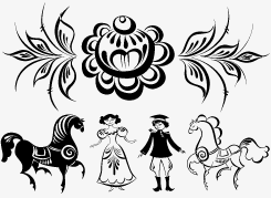
Gorodets by Alexandra Korolkova is the most authentic set of traditional Russian decoration that you are likely to find in digital form. It is based on a traditional wood-painting style from the town of Gorodets on the Volga river. The style’s main motifs are stylized flowers, birds, horses and people, painted in black, red, blue and green. The Gorodets font consists of 60 manually traced images divided into two parts: filled and empty ones. The font is ideal to create rustic-looking greeting cards and scrapbook pages.

Who would you interview?
Creative Characters is the MyFonts newsletter dedicated to people behind the fonts. Each month, we interview a notable personality from the type world. And we would like you, the reader, to have your say.
Which creative character would you interview if you had the chance? And what would you ask them? Let us know, and your choice may end up in a future edition of this newsletter! Just send an email with your ideas to [email protected].
In the past, we’ve interviewed the likes of Christian Schwartz, Dino dos Santos, Jim Parkinson, Mário Feliciano, and Underware. If you’re curious to know which other type designers we’ve already interviewed as part of past Creative Characters newsletters, have a look at the archive.
Colophon
This interview was conducted & edited by Jan Middendorp, and designed by Nick Sherman.
The Creative Characters nameplate is set in Amplitude and Farnham; the intro image features Mirta and Dulsinea; the pull-quotes are set in Leksa Sans; and the large question mark is in Farnham.
Comments?
We’d love to hear from you! Please send any questions or comments about this newsletter to [email protected]
Subscription info
Want to get future issues of Creative Characters sent to your inbox? Subscribe at www.myfonts.com/MailingList
Newsletter archives
Know someone who would be interested in this? Want to see past issues? All MyFonts newsletters (including this one) are available to view online here.