|
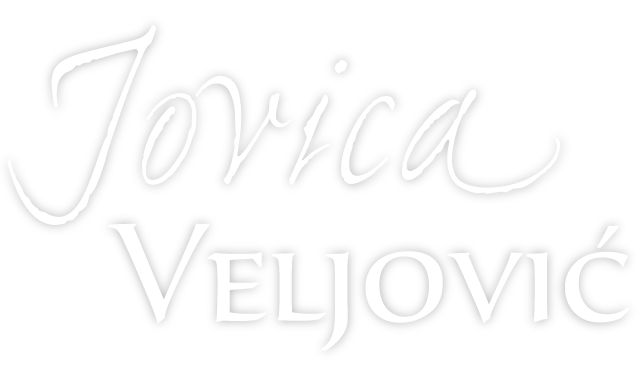
By the time Jovica Veljović released his first font family in 1984, he was already an internationally renowned calligrapher. Back then, he taught at the art academy in Belgrade, the capital both of Serbia and the former Yugoslavia. Since 1992, he’s been professor for type design at Hamburg University of Applied Sciences. (A great honor — despite Germany having so many professional type designers, only a few universities have chairs for it.) Over the past thirty years, Jovica has released fonts through ITC, Linotype, and Adobe, and he is still working on new designs. Our interview with Jovica took place in his Hamburg apartment on New Year’s Day, 2016. Welcome Jovica!
|
We conducted the interview in German; the original text is available on our German sister site, MyFonts.de. |
|
|
|
|
When you were born in 1954, Serbia was part of Yugoslavia, which used two writing systems: Latin and Cyrillic. Which did you learn at school?
In Serbia, you learn the Cyrillic alphabet in elementary school first. The Latin alphabet comes later, although you’d think Cyrillic is complicated enough! I learned the Latin alphabet in second grade, when I was about seven years old.
There’s probably no other country where Cyrillic and Latin are used together as much as in Serbia. The Latin alphabet’s visibility is ever-increasing, thanks to influences like international pop music but also an unawareness of Serbia’s cultural heritage. There are commercial reasons, too. Serbian publishers tend to print books in the Latin script. The market is small, and they wouldn’t sell many copies in neighboring Croatia if they printed with Cyrillic. Serbo-Croatian is the language spoken in both countries. In Serbia, the official writing system is Cyrillic, in Croatia it’s Latin.
When did you start learning calligraphy? Did they teach it at school?
At fifteen, I entered an art school. Calligraphy was a subject taught there. I first became interested in handwriting because of my grandfather. He wasn’t a calligrapher, but he liked to show off his handwriting. He was especially proud of his lowercase ‘k’! He told me that this complex shape was his own discovery. That intrigued me. What made this ‘k’ so special?
Originally I wanted to be a graphic artist and make etchings, lithographs, and woodcuts. Those techniques are fascinating. In Yugoslavia, lettering wasn’t as important as in countries like West Germany, where it was used in advertising and artists earned money with it. Yugoslavia was socialist, so the demand for advertising was low.
My interest in type was sparked when my friend Ivan Boldižar lent me the book Über Alphabete, by Hermann Zapf. This is the German edition of his About Alphabets. I thought that the book’s design was just perfectly balanced, with its beautiful binding, the choice of paper, of course the typefaces, and the calligraphic examples printed onto pasted-in plates. My life changed direction: I began to really study calligraphy and lettering.
|
|
|
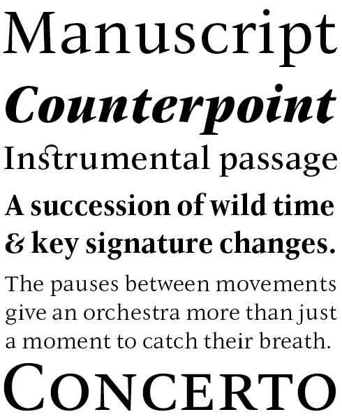
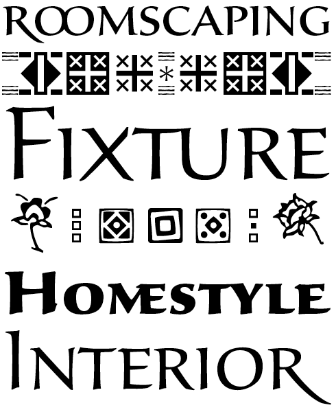
Thirty years after its publication, Jovica Veljović refreshed and extended his very first commercial typeface, ITC Veljovic. The design is characterized by triangular, sharply pointed serifs that — together with clearly defined forms — give the impression that the characters have been carved in stone, rather than drawn with pen and ink. The monumental grandeur of the uppercase letters brings to mind Roman inscriptions yet sparkles as if chiseled only yesterday. The calligraphic heritage is visible in the energetic weight stress, the animated bowls, and the flare terminals — the bold italics, (an unwelcome obligation for many type designers) beg to be selected for duty. For all its vitality, ITC New Veljovic communicates simply and effectively. Full counters and strong serifs aid readability in longer texts. The fonts include an alternate set of characters with longer ascenders and descenders. Each font’s range of glyphs covers the needs of most European languages, but also includes oldstyle and lining figures, small caps, numerous ligatures and Cyrillic characters. The condensed styles save considerable space when it comes to setting longer texts, and the display versions show off the crystal-clear forms of ITC New Veljovic at their best in larger point sizes.
|
|
|
|
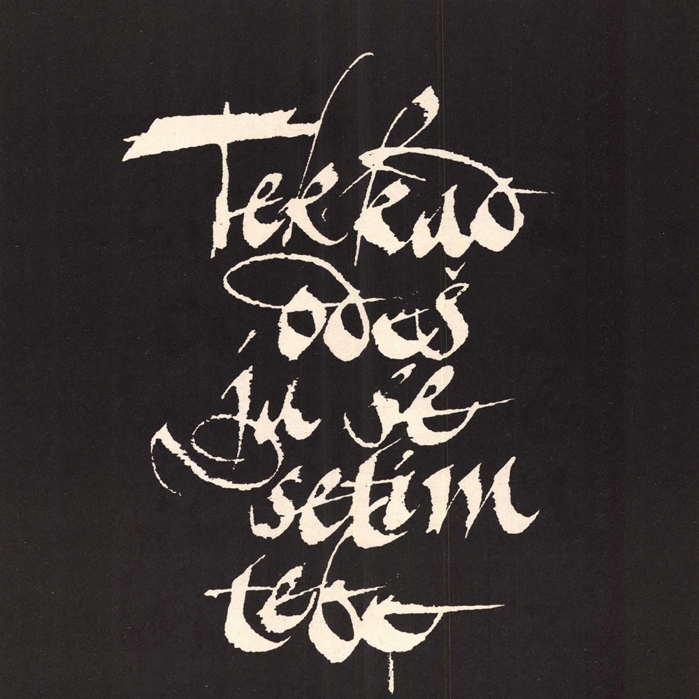
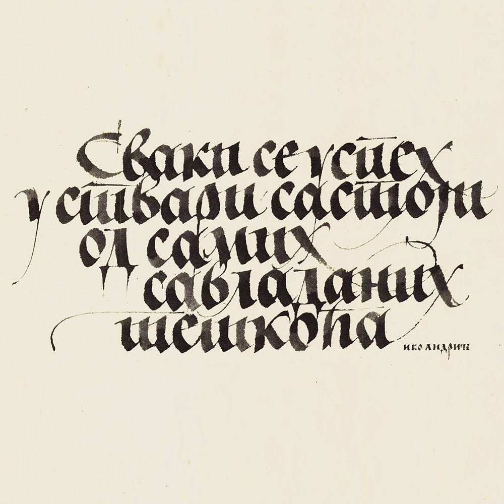
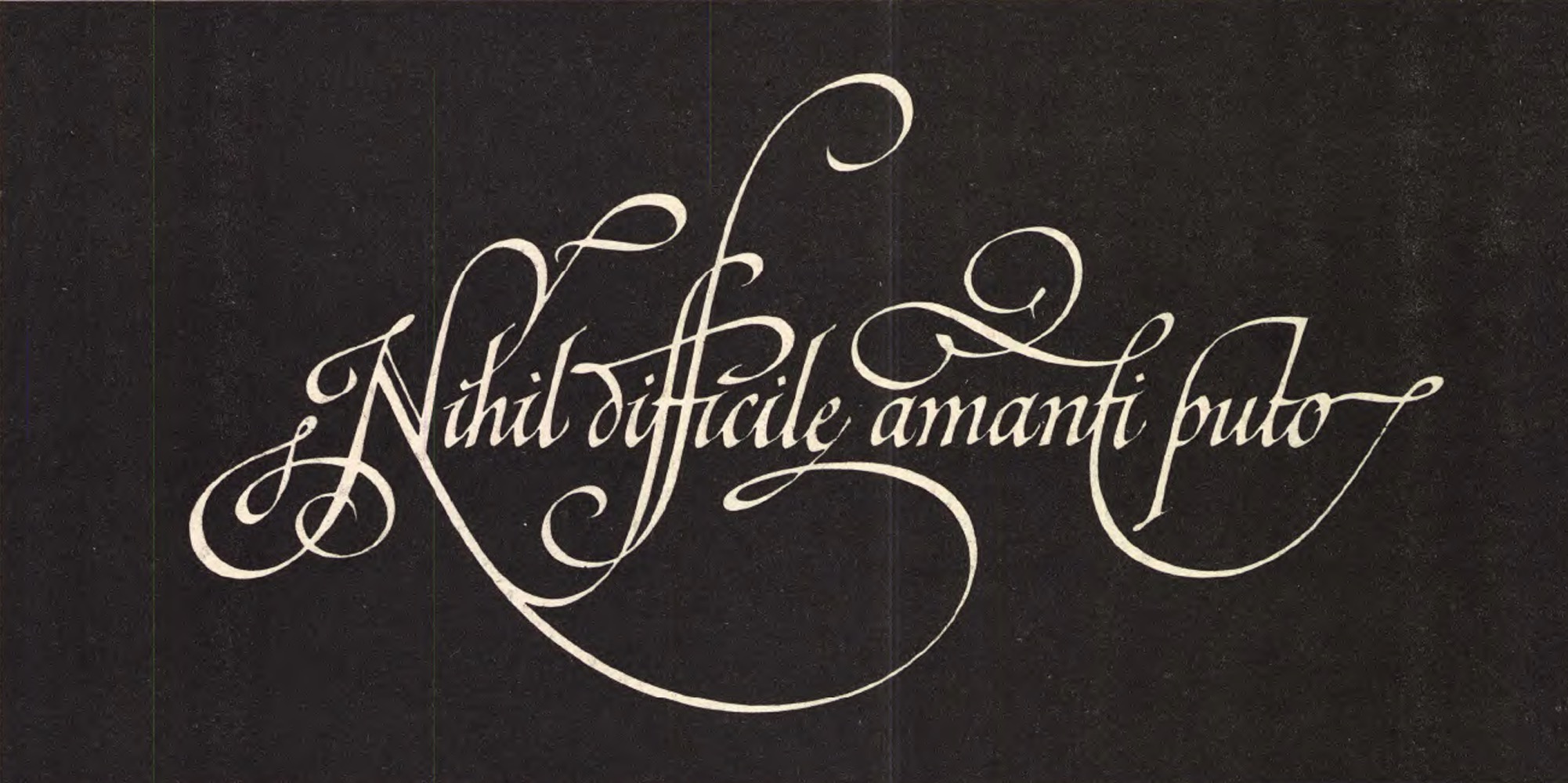
Three of Veljovic’s early calligraphic pieces, produced for U&lc magazine.
|
|
Not all calligraphers design typefaces. Was it because of Zapf’s example that you wanted to become a type designer?
In the 1970s, making type was a complex process. It wasn’t like today, where you can design a digital font and make it available online for everybody to use. Back then, you first needed to find a company to produce your typefaces. Yugoslavia didn’t really have any, so I looked abroad. Once you found a company, there was no guarantee they’d accept your work — you submitted a proposal and waited for their assessment.
How did you learn about the technicalities of type design? At art school?
After seeing About Alphabets, I was intrigued enough to draw my first letterforms. None of my teachers were type designers, so they couldn’t help me — I had to discover everything on my own. For example, when I came to the fi-ligature, I wondered how that was made. How do you establish the right distance between ‘f’ and ‘i’? Today, you’d just open a font and take a closer look. It sounds trivial, but at the time I found that quite complicated.
Did you find any mentors while you were teaching yourself type design?
As a student, I wanted to get to know all the type designers in the world personally! I think this desire isn’t so common today — maybe I’m a bit outdated. But I made an etching with lettering on it, and sent this out. I found a book published by the international typographic association ATypI, listing the addresses of its members. It had Hermann Zapf’s address. I also discovered Henri Friedlaender’s name. He lived in Israel, which sounded very exotic to me. I had seen a photocopied version of one of his books at art academy, too — so I sent him a print. Interestingly, both Friedlaender and Zapf responded. Zapf was fascinated by the sharpness of my etching. His questions surprised me: He wanted me to describe my technique in detail, each step of the process. That was typical Hermann!
Friedlaender became a key person for me. I approached him with one of my first attempts at type design. I had made a typical mistake, which many students repeat today: I wanted to design the most original font in the world! A typeface no one had seen before. When he sent me his reply, he had pasted some photocopies of woodcuts next to my samples. These were woodcuts by Aristide Maillol for Virgil’s Eclogues. They made me realize that my typeface was too painterly and complicated, almost like an Art Nouveau font. I later visited Friedlaender in Moza Illit near Jerusalem, and I guess he taught me most of what I know about typefaces.
When did you first meet Hermann Zapf in person?
I met him at the 1978 ATypI conference in Munich; I was still a student, in my third or fourth year. He was around 59, and he took time for me. We always remained in constant contact after that. Gerrit Noordzij and Werner Schneider were there, too, and I also got to know Georg Trump, Karlgeorg Hoefer and Friedrich Poppl. That was a great generation.
Your first professional typefaces were drawn for ITC — the International Typeface Corporation in New York. How did that connection came about?
I finished my studies in the late 1970s, and then had military service for a year. At the time ITC organized a calligraphy exhibition — International Calligraphy Today. I submitted my work. Four pieces were included in the exhibition.
So you flew to New York to see it?
No, I couldn’t. ITC later covered my costs when I did visit, though. If I had to pay my own way, I might just as well have wished to fly to the moon! ITC’s U&lc magazine was still designed at Herb Lubalin’s studio in New York; I was fascinated by the copperplate lettering that Tom Carnase, Ed Benguiat and Tony Di Spigna made for Lubalin. When I was invited over, some meetings were organized for me. I met Paul Standard, who was about 90, as well as Jeanyee Wong, Bob Boyajian, Lili Wronker, Jerry Kelly, and other great New York calligraphers. It was actually my dream to somehow work with Lubalin, but he was already very ill. I visited him at home, and three weeks later he died.
So this is how my story with ITC began. At ITC I met Aaron Burns. He encouraged me to return home and to make fonts for them. Burns and Lubalin had conceived of ITC as a typeface company offering designers a new kind of freedom. Other companies such as Berthold, Linotype, and Monotype created exclusive fonts for their typesetting equipment. ITC came up with a new idea: typefaces any company could license, and distribute for their own hardware.
Burns was a visionary! I remember my second or third visit to New York, ITC had an office near the United Nations. One evening we stood looking out over the city and he said to me: “Look! All these lights are offices. Imagine if each one had a laser printer. It would need fonts, and even if a font only cost a dollar, imagine how many fonts people would need!” He was one of the finest people I have ever met.
ITC designers still worked with paper and brushes in those days. The idea at ITC was to produce fonts suitable for body text as well as headlines. You’ll understand this by looking at ITC Garamond. I started making fonts for them with that idea in mind. In general, I’ve always designed typefaces I was convinced were the ones I wanted to make. I’ve only worked on two commissions: first for the newspaper Politika in Belgrade, and secondly to redesign Tiemann-Antiqua for the German weekly Die Zeit’s headlines. Everything else originated from my own initiative… I did what I wanted.
|
|
Just like an experienced storyteller varies the timbre of his voice and deftly inserts longer pauses to bring his tale alive, Agmena performs a similar feat with proportion and space. Agmena is a poetic choice for book design. Its letterforms were optimized over the course of several years to create a vehicle for contemporary text. Agmena’s beauty lies in its details — slight differences in differentiation on the ascenders’ terminals, or in the lengths of the letters’ serifs, for instance. All eight fonts in the family include small caps and various numeral styles, as well as Cyrillic and Greek support. The fonts’ ligatures aren’t limited to Latin; they also include special combinations for Greek and Serbian. Initial letters, alternatives, and ornaments aren’t forgotten, either. Agmena received a Certificate of Excellence in Type Design at the Type Directors Club of New York TDC2 competition in 2013.
|
ITC Gamma is a special kind of typeface: it has verve and a warm personality. The design was created by paying special attention toward maximum usability and communication efficiency. It takes its name from the third letter of the Greek alphabet, being Jovica Veljović’s third commercial typeface (it was first released in 1986). ITC Gamma’s letterforms are built out of solid, sturdy shapes. There are no sharp corners here. Serifs, stroke endings, and terminals are all rounded. Its overall effect in text is that of a soft, friendly face. ITC Gamma’s characters have been drawn just slightly condensed, too, in the interest of saving space.
|
ITC New Esprit is one family with two systems: one optimized for extended texts, the other for display settings. Its design blends classical proportions with the grace and charm of a calligrapher’s style; its fine balance between distinctive character shapes and conservative proportions create a typeface that is highly legible and conducive to readable typography. Overall the design has a superbly restrained calligraphic nature, revealing itself subtly in the flared bars of E, F and T, and the low junctions in italic b and p; revealing itself brazenly only in the italic g and y. OpenType features like small caps, alternates, and a broad character set make this a welcome addition to any font library.
|
|
|
|
Tell us more about your early fonts for ITC — families that are now seen as modern classics.
When I came back from New York, I worked like crazy. I isolated myself from society for about three years, almost like a monk. ITC Esprit was the first typeface I drew, but ITC Veljovic was released before it. Back then, ITC had the policy that a designer’s first typeface should bear his or her name. I found the publishing process quite interesting: I had initially drawn my letters to a 14cm cap height, so when I saw the first round of proofs at 12pt text size, I couldn’t even recognize them at first! I always tell students what kind of paradise we live in today; you can design two characters, and then immediately print them out any point size.
With ITC in the mid-80s I only had two opportunities to revise each design. Like I just said, I really had to wonder if they were my designs when the first samples came back. But I took out my magnifying glass and made corrections. Then another sample would be prepared, and corrected if necessary. That was it! I recently refreshed my ITC fonts — not just to rethink the letters, but also because of their kerning. Back then, I didn’t get to do things like letterspacing and kerning for myself. This had to be done by other people.
Were your first ITC fonts originally designed for photo-typesetting instead of desktop publishing with a laser printer?
They were! And I was always surprised how good they looked in photo-composition — better than the first digital versions did. It’s interesting how things changed with subsequent digitization processes. For instance, I drew all eight styles of the original ITC Veljovic by hand. There was no interpolation — i.e., no automatic design generation of the intermediate weights. I worked on the ITC Veljovic drawings for six months, until I thought their forms were good enough. I drew from 8am until 9 or 10pm at night, four or five characters per day, in all eight styles. When it looked like I wouldn’t manage the rate I had set for myself, I would think: “OK, to finish a fifth character today, just draw the period, because that’s only a circle!”
How do ITC New Veljovic and ITC New Esprit differ from their older versions?
Well, aside from revising many letters, I re-did the numerals, especially for the bolder ITC New Veljovic weights. I improved their proportions. Other characters changed a lot, like the German Eszett (ß). That was a totally alien character to me in the 1980s — I didn’t know what it was, where it came from, etc. I’ve been living in Germany for a long time now, and can get it right.
I don’t leave production to font technicians anymore — I try to do as much as possible myself. Some type designers think that kerning is just a technical aspect that anybody could do, or which could be automated. I think it’s part of the design process, and very creative work. That’s why I like doing it. What is also great about kerning is that, by the time you’ve started with it, you know the typeface is almost done!
What font design software do you use? Have you started using newer applications like Glyphs or Robofont?
I still work with FontLab. We also have Glyphs at the university where I teach, and I think Glyphs is superior to FontLab (at the moment) in some areas. But I’m old-school. I find that, in type design, drawing is the most essential thing, no matter how fast everything can now be produced. For me, FontLab has everything I need. I don’t always draw immediately on-screen; if I can’t find a shape right away, I take a pen and start writing. Then I look at this while drawing the outlines; I don’t need to scan anything in.
|
|
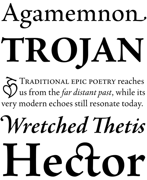
Sava is a calligraphic uppercase and small caps design. Available in six weights — light, regular, medium, semibold, bold and black — it includes support for most western and central European languages, as well as for Greek and many Cyrillic languages. Typographic features include a series of non-standard ligatures and a large collection of specialized Byzantine ornaments. Influenced by the forms of medieval calligraphy, Sava is named after St. Sava, the first Archbishop of Serbia, who was famous as a peacemaker, and for his educational and charitable works.
|
Silentium Pro is an attractive and sturdy family with letters based on Carolingian minuscule — a western European book-writing hand from the eighth and ninth centuries. The typeface’s name is the Latin word for silence, a discipline commonly practiced in the medieval monasteries and court scriptoria. The family’s fonts capture the subtle energy and surprising versatility of this ancient manuscript style. They include a plethora of alternate forms, ligatures, and titling characters. There are four distinct sets of capital letters included: the first capitals are based on the flat-pen or built-up Roman forms. The second has capitals based on Jovica Veljović’s contemporary angled-pen forms, where an axis similar to that of the true-Carolingian-minuscule lowercase makes both cases’ capitals integrate well with one another. Then there are inline titling capitals, a set of reversed initials, alternates, interlocking capital ligatures, and a set of ornaments.
|
|
|
|
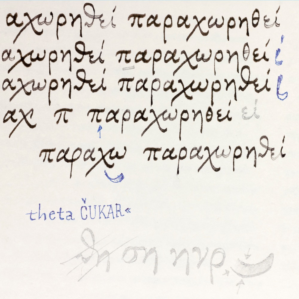
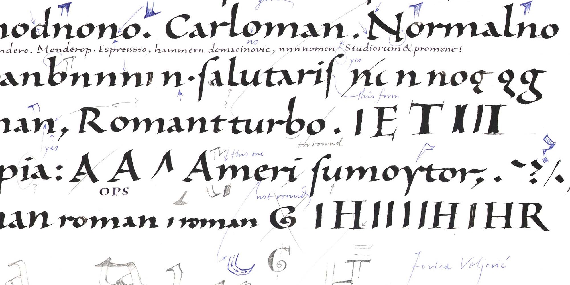
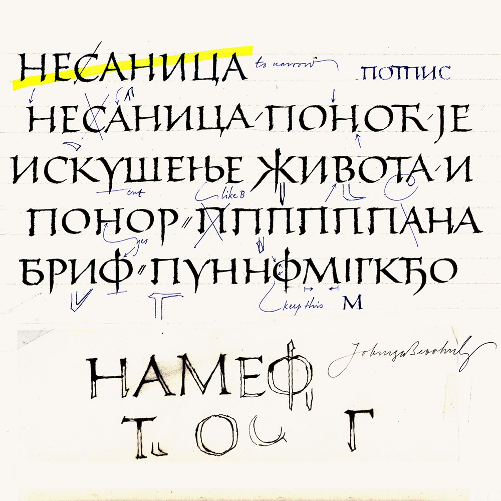
From left: Development sketches for Agmena’s Greek glyphs, Silentium and the Cyrillic characters for Sava.
|
|
How important is drawing for a type designer?
I’ve always been convinced that it’s crucial. Saul Bass once said in an interview that, more than anything else, he advised young people to learn to draw. You cannot play catch-up with that! During my first two semesters at art academy, I was fortunate to have had drawing lessons every morning, five days a week. Painting and drawing classes taught me more about type design than typography classes.
When I tell my colleagues that we should pay more attention to drawing during our department’s entrance examinations, they say it’s not so important. But over the past 20+ years, it has never been a mistake to fight for a candidate who could draw well. They never turned out to be bad students.
People today believe too strongly in computers — that it’s enough if everything looks nice and clean. I remember when presentations for illustrated books used to be hand-made. Text was printed on film and glued onto the pictures. Nowadays, you almost see better results in presentations than in the actual printed books. People are satisfied too easily, and that’s deceptive. Computers have become something we react to passively, like how we watch television.
Do you see a new interest in lettering and calligraphy among your students?
Yes, designers are becoming aware that digital work isn’t everything. Many young people have discovered that whatever they make with a computer, anybody else can do, too. They look for ways to express themselves, and find it in techniques like calligraphy, handwriting, drawing, etc. Many people think that design for the Internet is the most important thing, but whoever builds a broad foundation at art school has a good chance for a career that can successfully span 40+ years. Art history is totally trivialized nowadays, too. If you mention a name from history, students often have no idea who it was or what they did. Such ignorance worries me.
How did you come to Hamburg?
By the end of the ’80s, I already had a premonition that Yugoslavia’s political climate wasn’t developing like I’d hoped. As a student, my classmates came from all over the country — nationalism wasn’t something that concerned us. When that began to change, I decided to leave. Adobe offered me a job, but the USA felt like a world away. In those days, travel still took a long time. A professorship opened up in Hamburg, and Prof. Werner Schneider encouraged me to apply. Moving to Germany would allow me to visit my home country more often.
Adobe fascinated me because they were at the forefront of font technology, developing things like the Multiple Master format. However, I think that it was fate that brought me to Hamburg. I was pragmatic about the decision. While I didn’t speak German yet, I had already been teaching at the academy in Belgrade. Also, the URW font foundry was in Hamburg; I thought I might be able to work for them. That was a big consideration.
Even though I never moved to California, I did work with Adobe. At first I was a consultant, like the Swiss typographer Max Caflisch. We consulted on some fonts Adobe had designed, and at their Cyrillics. Later, they published my Ex Ponto, Sava, and Silentium typefaces.
Do you keep track of what kinds of fonts customers buy? Or is your work independent from market trends?
My fonts tend to start as parts of other personal projects. I’ll be working on a book, and need a new typeface for it — something not out there already. I’m not so concerned with trends. If sans serifs are popular at the moment, or scripts, that doesn’t influence my decisions. I try to make typefaces that fill a cultural need; I don’t design them just to earn money. You have to make things you really believe in. If you’re just chasing trends, what’s the point?
Ex Ponto arose out of the pure fascination I had writing with Brause 505 nibs. I experimented with a specific kind of paper — the results were the rough edges you see in the typeface. Commercial ideas didn’t drive the project, although Ex Ponto sold well, just like some of my other typefaces. Naturally, I am pleased when my fonts do well, but we can’t influence the market as much as we hope to. Trends come and go. If a few years pass, and Bodoni isn’t popular anymore, that doesn’t mean that Bodoni is a bad typeface!
Many thanks for your insights, Jovica — we hope to see more of your typefaces soon.
|
|
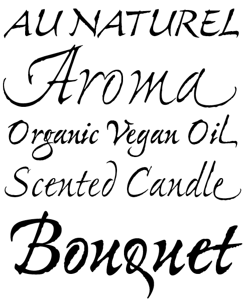
The vibrant intensity of Ex Ponto Pro rivets eyes to whatever page, poster, or package it is used in. This spirited script family is based on the rhythms of Jovica Veljovič’s own handwriting. It combines the vigor of spontaneous lettering and the grace of meticulously crafted italic typography. Jovica began Ex Ponto’s design process with written samples, which he wrote out on rough paper with a Brause 505 nib. He then carefully modified these ragged-edged letterforms to produce the final gracefully balanced typeface. In all of its weights, from light to bold, Ex Ponto sparkles with the nuances of masterful calligraphy.
|
Libelle is a new English Copperplate-style typeface. Its letterforms are less mechanical than those originally designed for metal type and photo-typesetting during the twentieth century. As you’ve been reading in this interview, Jovica Veljović is a real calligrapher, and the knowledge embedded in his hands shines through all of the forms of this typeface, breathing new life into an old genre. Libelle makes liberal use of OpenType features and offers users about 400 extra glyphs, including initial and final forms, contextual alternates, ligatures, and ornaments. Some of Libelle’s special Discretionary Ligatures include substitutions for ct, ll, ss, st, tt, and tz.
|
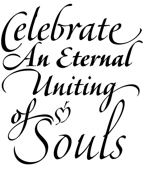
Veljovic Script is a family of informal, calligraphic brush-style fonts. Its letters generally don’t connect, although some combinations do overlap. Like so many of Jovica Veljović’s designs, this one offers support for both Latin and the Cyrillic script. All of the Veljovic Script fonts contain hundreds of alternates. Virtually all the characters of Veljovic Script have alternate versions available, including initial and final forms, swash capitals, and special forms of common abbreviations like “Dr.”, “Mr.” or “Ms.” There are also small caps, ligatures, and multiple numeral styles available, too (tabular or oldstyle, proportional or lining, inferior or superior, etc.). By activating the OpenType “contextual alternates” feature, the font will choose certain alternate combinations that fit together perfectly.
|
|
|
|
|
Who would you interview?
Creative Characters is the MyFonts newsletter dedicated to people behind the fonts. Each month, we interview a notable personality from the type world. And we would like you, the reader, to have your say.
Which creative character would you interview if you had the chance? And what would you ask them? Let us know, and your choice may end up in a future edition of this newsletter! Just send an email with your ideas to [email protected].
In now past, we’ve interviewed the likes of
Mika Melvas, The Northern Block, Matthew Carter, Ulrike Wilhelm, Maximiliano Sproviero, Dave Rowland, Crystal Kluge and Steve Matteson. If you’re curious to know which other type designers we’ve already interviewed as part of past Creative Characters newsletters, have a look at the archive.
|
|
|
MyFonts on Facebook, Tumblr, Twitter & Pinterest
Your opinions matter to us! Join the MyFonts community on Facebook, Tumblr, Twitter and Pinterest — feel free to share your thoughts and read other people’s comments. Plus, get tips, news, interesting links, personal favorites and more from the MyFonts staff.
|
|
|
|
|
Comments?
We’d love to hear from you! Please send any questions or comments about this newsletter to [email protected]
|
|
|
Newsletter archives
Know someone who would be interested in this? Want to see past issues? All MyFonts newsletters (including this one) are available to view online here.
|
|
|
|