|
Last autumn ATypI (short for Association Typographique Internationale) crossed the equator for the very first time in its 59 year history. The global forum for the type community held its annual conference in South America, in the city of São Paulo, for four days. For many northern hemisphere attendees a whole new world was opened up, discovering and meeting typeface designers from Brazil and the neighboring Latin American countries. One of them was Marconi Lima, designer and owner of the independent Brazilian type foundry TypeFolio.
|
|
|
|
|
How important was it to have the annual ATypI conference in South America, more specifically in Brazil?
This was the first time I attended an ATypI conference, so I had been looking forward to this moment for a long time. For me personally it was an amazing experience in every possible way — from the interaction with people from different cultures to everything I learned during the high-quality lectures and workshops. Judging from the enthusiastic reactions and feedback I have the feeling that hosting the ATypI conference in São Paulo put not only the typeface design and typographic research of Brazil, but of all of Latin America, in the limelight.
Especially with regard to the future of the Brazilian typographic scene, the event consolidated the importance of typography in an academic environment. From a commercial perspective many Brazilian professionals active in the type industry had the opportunity to discuss lesser-known issues such as business models, licensing of type, relationships with the creative industry, piracy, and so on. An event of this importance is the perfect platform for meeting people with common interests. These meetings foster new ideas and help plans take shape, which encourages people to join forces, combine skills and knowledge, and pool financial resources to realize new projects.
You mention the Brazilian type scene. Do you feel Brazilian typography has a recognizable national identity?
I don’t think there is a specific ‘typographic culture’ in Brazil, because we have no real tradition in this area. I don’t consider this to be a problem; I am merely stating a fact. Like so many other countries, for centuries we imported type and machinery from European and American countries that already had an established type industry. Only in the 1990s, when the computer finally started to take off in Brazil, were we able to take our first steps in digital font production. But what we lack in typographic tradition is compensated by the cultural and creative diversity that characterizes Brazilian design. Thanks to our culture full of convergences and divergences, which is a reflection of our miscegenation, we can make a valuable contribution to the global typographic scene.
So things are changing?
Brazilian type designers have enjoyed an increased visibility in recent years. We only recently emerged from our initial learning phase - I prefer the term learning rather than experimentation - and transitioned to a period of being exposed to more mature work. Studios throughout Brazil are now developing projects on a grander scale, more extensive and complex. There is a promising evolution that can be connected to factors other than type production — the promotion of typographic culture in academic and professional circles, the online dissemination of information and tools, the participation in international events, cooperation between professionals, to name just a few examples. This variety of initiatives can effectively contribute to the consolidation of typeface design in Brazil, and by extension in South America.
|
|
|
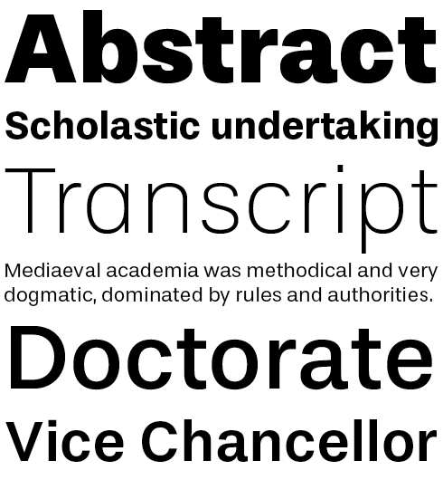
Pétala Pro is a dashing neo-humanist sans serif family of nine weights and particularly personable companion italics. That personality doesn’t come at the expense of readability either — a flexible, multipurpose family, this is both a clean and functional text face suitable for setting long passages for immersive reading, and an expressive set of display fonts in one package. Solidly constructed lettershapes with generous dimensions, combined with dramatically cut inktraps and a range of stylistic alternates, Pétala Pro will brighten and enliven corporate branding projects, place elaborate data visualizations on a firm footing and allow for multiple levels of information to be efficiently organized.
|
|
|
|
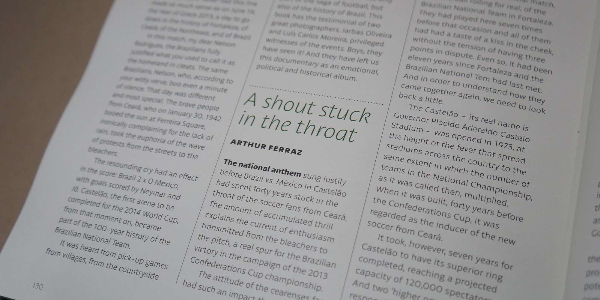
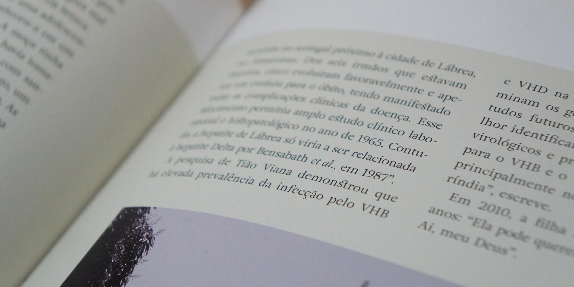
Left: A spread showing Pétala Pro in use in a design by Alvaro Beleza from the book No Ângulo, by Jarbas Oliveira and LC Moreira. Right: Detail of Adriane Text in use in Rumores do Silêncio designed by Daniel Justi.
|
|
Now that we have a better idea of the Brazilian type design scene, let’s hear more about you. How did you discover typography?
As far as I can remember I always observed typographic forms with unusual interest. I was intrigued by their design and their phonetic value. Because I loved books and developed the habit of reading from an early age, I realized that there was more to letters than just the words they spelled out. For example I found it amazing that the letter ‘a’ could take on so many different forms yet still represent the same basic sound. Then I discovered the work of sign painters. I admired the letters they painted, without even suspecting that professional typeface designers created the letters those painters reproduced with such skill.
In the mid-1990s I started working as a designer in an advertising agency. In the extensive library of the company I ran into complete collections of classic magazines like HOW, Novum, U&lC, Print, Emigre, and many others. This made me realize the crucial role typography plays in communication, so it became a key element in my work. I also had access to the printed catalogues of Letraset, Bitstream, Linotype and International Typeface Corporation. These gave me a better understanding of the business aspect of typography — I pondered how and why those type families were designed, and by whom. Discovering this parallel universe called typography was very exciting. This all happened as my agency transitioned to desktop publishing with the arrival of computers and specialized software in South America.
So how did you get from admiring and using type to designing fonts?
My job required me to draw hundreds of ad layouts, packaging designs and logotypes by hand. Through careful observation and constant practice I acquired a great intimacy with typefaces and their design features. However the idea of creating and designing a type family didn’t come to mind yet, and it was necessary to wait for time to do its work. Fortunately I quickly realized that the learning curve in typeface design is steep and virtually infinite. This insight helped me muster up the necessary patience and discipline to learn and grow, step by step.
At the end of 2005 I got a copy of Fontlab. I had just begun frequenting internet forums, especially Typophile. My interaction with the international type community helped me build important personal and business relationships, many of which still last to this day. Simultaneously an exciting collaborative environment around typography emerged in Brazil, with meetings and courses, books in Portuguese, and the first Brazilian typefaces, all with the support of Brazilian associations and academic institutions. Slowly but surely I continued to study typographic history, type technology and typeface design. This eventually culminated in the release of my first font family: Adriane Text, released through my own foundry TypeFolio, and published on MyFonts in November, 2007. Since then my involvement in the type business, and with both the national and the international scene have grown considerably, and I continue to design typefaces. I love to deal with all these aspects on a day-to-day basis.
|
|
Lima’s Adriane suite of text and display families was his first major release, produced in collaboration with Silas Dilworth. The core family is Adriane Text, a package of four style-linked fonts as suitable for use in office applications as they are for ambitious book typography. Classified as a transitional typeface, with a medium contrast and generous x-height Adriane shares characteristics with both traditional oldstyle romans and the more formal elegance of the modern style such as a vertical axis. Adriane Swash and Lux are single weight display families; all fonts feature a wide selection of glyphs including oldstyle and lining figures, ligatures, ornaments, dingbats and more.
|
|
|
|
When you start designing a typeface, what is your motivation?
On the one hand it is the passion I feel for letters, combined with a deep interest in aspects such as the history of type, typographic styles, type classification, technology, and so on. On the other hand the daily challenge of managing a business and keeping it both sustainable and enjoyable also plays an important role in my decisions. I am convinced that freedom and constraint are both sides of the same coin in typeface design.
I often have specific applications for my typefaces in mind, and many users understand what purpose they were designed for. Interestingly, my fonts are sometimes used in ways that are quite far removed from their original purpose, yet that are very creative and functional. This is the most rewarding aspect of typeface design: seeing how other people use my fonts. Being an independent type designer grants me the freedom to shift between projects that meet specific demands, and more informal ones. Yet they always have their roots in my personal observations and ideas about typography and design. Over time, I want to achieve a level of refinement and quality in type design that meets my high personal standards, while at the same time offering type users fonts that are characterized by technical and functional quality, and, most importantly, are a relevant addition to the design canon.
How does this translate to the type market?
Peculiar as the type market may seem, the business aspect follows the same basic rules as any other market seeking to survive and thrive in a competitive, globalized arena. Offering good products or services at consistent prices, and engaging in strategic partnerships and communicating effectively all contribute to the success of your business. Yet first and foremost you need to be a good type designer to enjoy real and lasting success. It takes a lot of time and dedication to reach a certain level of quality. If I was asked to summarize in one word what distinguishes professional type designers from those who, let’s say, ‘experiment’ I would use the word ‘discipline’. Concepts like ‘knowledge’, ‘innovation’ or ‘creativity’ for example are irrelevant, because we are in a niche creative market after all.
Does inspiration for new typefaces come easily, or are you always on the look out for the next big idea?
I have acquired a visual awareness for type, and aim to deepen the understanding of my potential. This has helped me become a better typeface designer. I developed the habit of reflecting at length on the work I’m doing, and even more on what I intend to do. This helps me to get into the mindset of an apprentice. I perceive this as my ideal, because it allows me to remain acutely receptive for any references or influences that can light the spark for a new typeface, be it during my work or while I’m doing other, even unrelated activities. Furthermore I own a sizeable collection of printed specimens, and books and documentaries on typography and calligraphy, in addition to a lot of scribbled sheets of paper, mostly with sketches for the letter ‘a’. Finally, I have a fair amount of digital sketches on my hard drive that wait to be expanded.
How has your foundry evolved since it was founded in 2007?
Almost two months after ATypI, I was a guest speaker at DiaTipo, the most important typography event in Brazil, held annually in São Paulo. Being part of the ‘Type and Market’ track, I talked about my professional background as a full-time type designer, based in a city far from major centers, in a country without typographic tradition. I explained that TypeFolio always expanded as far as my time and availability allowed. The release of Madre Script in 2014 marked the transition from my old job as art director in an advertising agency to running my own foundry. 2015 was the year I deeply immersed myself in the type business. By fully dedicating myself to the foundry I could significantly strengthen its relationship with the design market. This resulted in commissions ranging from the creation of icons and logo refinement to, more recently, the customization of a typeface from the TypeFolio library.
|
|
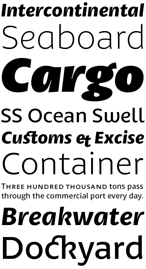
With its straightforward range of seven upright weights (no italics here), Stevie Sans is at first sight a conventionally old fashion display grotesque. It’s a more subtle beast than that though, not least because its Book weight will happily handle mid-length texts alongside the more obviously poster-sized settings that the Thin and Black weights demand. With a very high x-height, more open forms and a selection of stylistic alternates for several characters, Stevie Sans offers more in terms of light and shade than its better known and more ubiquitous genre-mates, and is a great alternative for those design briefs calling for strong, bold but simple typography.
|
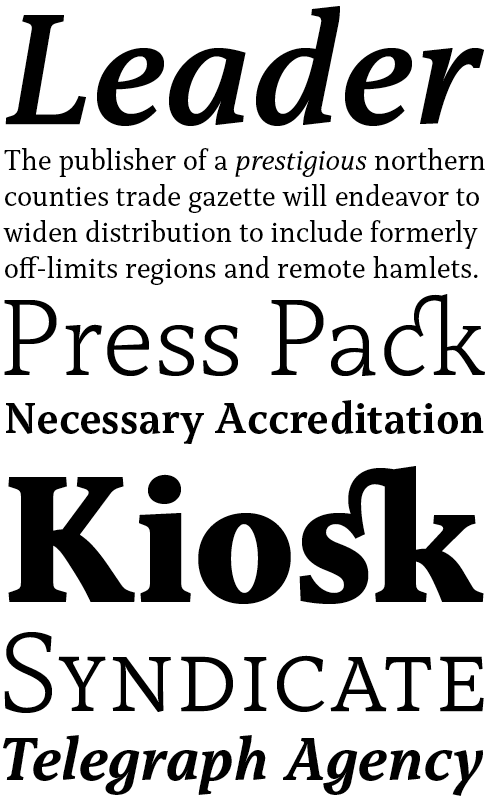
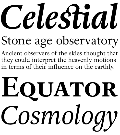
Capitolina is a ten font family intended for sophisticated editorial design for both screen and paper publications. Rationalist in origins, its letters are based on constructed forms rather than written, calligraphic shapes — although there are traces of a calligraphic hand, particularly in the italics. Chunky serifs with minimal curves and an even contrast make this a dependably robust choice for long form reading. A good range of weights and styles offer plenty of potential for managing various levels of typographic hierarchy, while the fonts are equipped with lots of OpenType features, such as case-sensitive forms, small capitals, ligatures, localized forms, number forms, fractions and more. Lima’s first collaborative release, Capitolina was begun by fellow Brazilian Christopher Hammerschmidt while studying and finished over the course of several years.
|
|
|
|
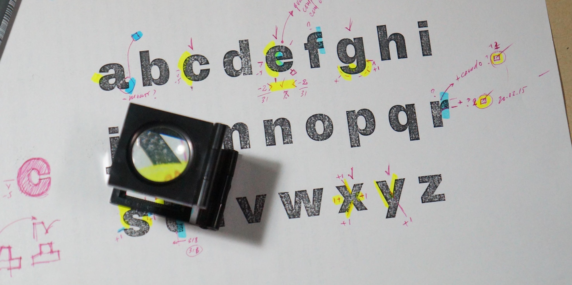
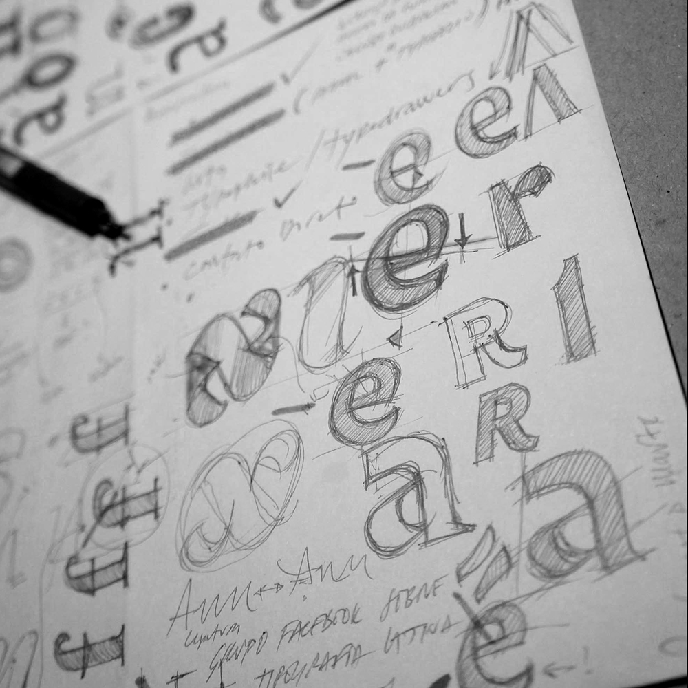
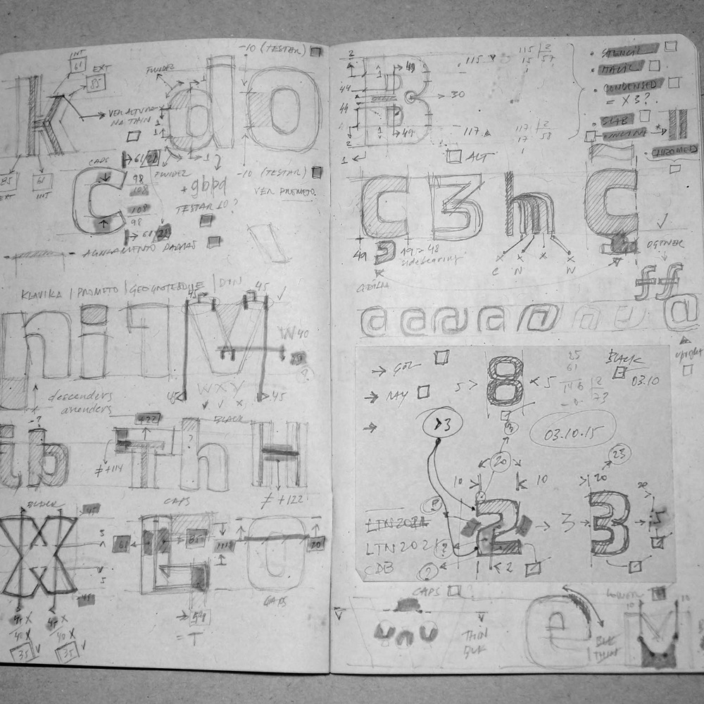
Left: Marked up proofs for Stevie Sans. Center and right: Lima’s sketch books are crowded with ideas.
|
|
Last year you released the first typeface from another designer — Capitolina by Christopher Hammerschmidt.
From its early development Christopher shared the Capitolina project in search of opinions, criticisms and suggestions over a period of about five years. I offered some advice about the design, leaving it up to him whether to implement it or not. After graduating from university Christopher was able to devote more time and energy to finishing Capitolina. Once it was ready, he had to decide how to release it. Under which label? Through which distribution channels? With which EULA? At which price? These were some of the questions I could answer in our email exchanges. At some point we realized a partnership would be interesting and mutually beneficial. After formalizing our agreement Capitolina was included in the TypeFolio library, and this has proven to be the right decision.
What are your plans for the foundry in the future?
My many plans are not restricted to typeface design, but touch upon other aspects of the typography business as well. I try to devote as much care to each of them with the utmost dedication. At this moment I am developing a new site while working on the final stages of a new typeface that shows potential for expansion to many styles. For now I don’t have plans to release more typefaces from other designers through TypeFolio. One of the reasons is that I want to focus on my own projects which, by their very nature, are challenging, and encourage me to improve every day.
I sometimes have a hard time believing that I achieved my goal of devoting myself completely to my studio and to typography. I am very grateful for having been able to accomplish this transition to type design on my professional journey, and making a living as an independent type designer and owner of a foundry is a huge privilege. The best way I can imagine to give back is to continue creating fonts at the best of my abilities.
Thank you Marconi! It was a pleasure getting to know you.
|
|
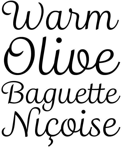
Lima designed Madre Script, his first foray away from multi-weight text fonts families, to be a harmonious meeting of mechanical, repeatable typography with the fluid freedom of script lettering. The result is lithe and supple, and deceptively simple — enhanced as it is with a set of smartly programmed OpenType features that intelligently substitute ligatures and contextual alternates for seamless connections between the letters. This single weight family will suit branding and packaging projects, headline typography for lifestyle magazines and make for expressive personal blog mastheads and titles.
|
|
|
|
|
Who would you interview?
Creative Characters is the MyFonts newsletter dedicated to people behind the fonts. Each month, we interview a notable personality from the type world. And we would like you, the reader, to have your say.
Which creative character would you interview if you had the chance? And what would you ask them? Let us know, and your choice may end up in a future edition of this newsletter! Just send an email with your ideas to [email protected].
In now past, we’ve interviewed the likes of
Mika Melvas, The Northern Block, Matthew Carter, Ulrike Wilhelm, Maximiliano Sproviero, Dave Rowland, Crystal Kluge and Steve Matteson. If you’re curious to know which other type designers we’ve already interviewed as part of past Creative Characters newsletters, have a look at the archive.
|
|
|
MyFonts on Facebook, Tumblr, Twitter & Pinterest
Your opinions matter to us! Join the MyFonts community on Facebook, Tumblr, Twitter and Pinterest — feel free to share your thoughts and read other people’s comments. Plus, get tips, news, interesting links, personal favorites and more from the MyFonts staff.
|
|
|
|
|
Comments?
We’d love to hear from you! Please send any questions or comments about this newsletter to [email protected]
|
|
|
Newsletter archives
Know someone who would be interested in this? Want to see past issues? All MyFonts newsletters (including this one) are available to view online here.
|
|
|
|