|
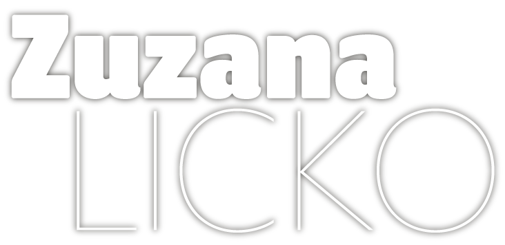
If there is any type designer who single-handedly opened up untrodden territories and shifted paradigms in the early days of desktop type design, it is Zuzana Licko (pronounced Litchko). Together with her partner Rudy VanderLans she created the earliest small type foundry that accommodated pioneering typefaces by a broad group of designers and artists. She became the tireless curator of its expanding collection. Both European-born but based in the California Bay Area, they called their venture Emigre Graphics. Their Emigre Magazine (originally founded as a whimsical art mag for expats) became the most influential showcase for cutting-edge typography, and the type avant-garde’s leading discussion forum. Ranging from adventurous experimental faces to inventive revivals, Licko’s typefaces invariably show courage, attitude, and immense talent.
|
|
|
|
|
Zuzana, you grew up in the United States, but were born in former Czechoslovakia — which technically makes you an “émigré”. Do you feel your European roots influenced your attitude and approach to design?
Yes, I was born in Bratislava, Czechoslovakia, when it was still under communist rule, and I was seven years old when my family emigrated to San Francisco, California. When I entered grade school in the US, I was learning a second language and customs in school, while maintaining the Slovak language and customs at home. This made me aware of the differences and has given me the perspective of an outsider. This probably formed my tendency to question things, and this questioning of preconceptions is what drew me to the design profession.
You were one of the very first graphic designers who became interested in digital type design, and one of the first type designers to use the Mac. How did you get there?
Growing up, I loved drawing, building with Legos, and math. So, I thought I wanted to be an architect, and got into the College of Environmental Design at U.C. Berkeley. When I got there, I realized that I was more interested in all the related classes, such as photography, letterpress and typography. The college had just discontinued their Visual Studies program, but many of these classes remained on offer to broaden the horizons of the architecture students.
That’s when I realized that I really wanted to be a graphic designer, with an emphasis on type. I was fascinated by experiments in type as illustration. But I was piecing my major together from the fringes. I remember telling a classmate that I had signed up for the typography class. We were a couple of minutes into our discussion before I realized he had misunderstood, and had been talking about topography (mapmaking). Thats how marginal these classes were.
When I began my college education, there were no type design programs at universities, and computers were large mainframes, that usually lived in the basement. Taking a computer class would give you access to a terminal, which would allow you to type up your program, which would then be batch processed overnight. In my last year, I managed to get into the computer graphics class, which generated primitive line drawings through hard coding.
Your first fonts became a crucial element in the design of Emigre, the magazine founded and edited by your partner Rudy VanderLans. How did the magazine come about — and whose idea was it to make it a showcase for your typefaces?
The magazine was started by Rudy and two Dutch artist friends who all lived and worked in the Bay Area at the time, and they thought a magazine publishing their work and the work of their friends would be a great shortcut to fame and fortune. Originally, it was to focus on Dutch artists, but the goal was soon expanded to feature work that was in some way influenced by travel or working abroad. That’s where the “Emigre” name came from. To cut a long story short, after only a few issues, Rudy’s friends realized it was difficult to make the magazine profitable, so they moved on and left it in our hands. I had already started providing a lot of the typesetting for the magazine, using the bitmap fonts I had created on the Mac.
The first time we used the Mac for Emigre, in 1985, there were no page layout programs. PostScript and laser printers didn’t even exist yet. We printed out low resolution type on an ImageWriter dot matrix printer, on paper, as large as we could, and then we reduced the type using a stat camera and pasted it down on boards. But the magazine didn’t start out as a showcase for our typefaces. We used the Mac and the bitmap fonts simply because it was a cheap alternative to having professional typesetting done, which was quite expensive in those days. However, designers started asking if the fonts we used were available. For a while I was actually doing typesetting for other designers, since very few designers had computers in those days. They would send me the specs and I would sell them typeset printouts using my fonts. Then, when more designers started using computers, we started selling the font data on floppy disks. That was the start of Emigre Fonts. It was only then that we realized the magazine was a great vehicle to feature and promote the fonts.
You were probably the first designer of digital type who was interested in the low-resolution screen and print resolution of the early Macs as a visual element. You drew a big series of pixelated fonts that later became the Lo-Res family. What attracted you to those jaggy shapes?
When I first got my hands on a Mac, the process of designing typefaces was a mystery to me, and the early Mac computer was very primitive, so it was a perfect starting point. I loved the building block approach of bitmaps. It seems trivial today, but it was magical to see the changes on screen instantly; so much faster than coloring in blocks on grid paper! From then on, my experience and skill with ever more sophisticated typeface designs evolved along with the Mac’s ability to support more complex font programs.
I thoroughly enjoyed the limitations of the early technology. Paradoxically, it allowed for more free exploration than today’s limitless possibilities. There was something to react against, a puzzle to solve, or a problem to overcome. Stripped of our familiar tools, we had to reconsider basic assumptions. This way of working leads to unusual forms that might otherwise not be explored.
|
|
|
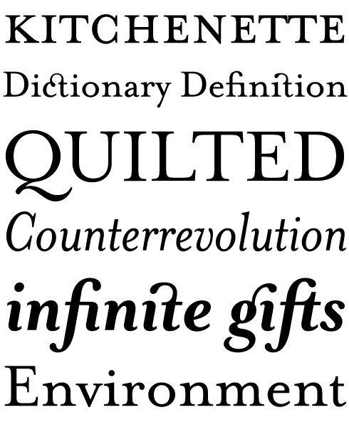
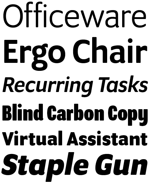
The successful Mrs Eaves is Licko’s take on the typefaces designed by the 18th-century master John Baskerville. It was named after Baskerville’s housekeeper, Sarah Eaves, who became his wife and assistant after her husband died. As described in the interview, Licko wanted to capture the warmth and openness of the printed metal type. She took a totally new approach to Baskerville’s letterforms: she diminished the contrast between thick and thin parts, and gave the lowercase characters a wider proportion and generous spacing. The result is a very personal yet highly functional revival, that has been used everywhere — from junk mail to avant-garde design. Later Licko developed Mr Eaves, a set of striking, supple sans-serif companions — Mr Eaves Sans is the variation that relates more closely to the serif version, while Mr Eaves Modern provides simpler and more geometric-looking shapes.
|
Filosofia is to Bodoni what Mrs Eaves is to Baskerville: a highly personal interpretation of a classic. Compared to many digital Bodonis, Filosofia is sturdier and more usable in day-to-day design work; it is both a smart, unprejudiced update and a thoughtful tribute. Licko studied various versions of the original Bodoni in printing, but did not use any particular one as the model. Having looked at many specimens, she then drew her Bodoni from memory, “akin to the process of transcribing.”
|
|
|
|
|
|
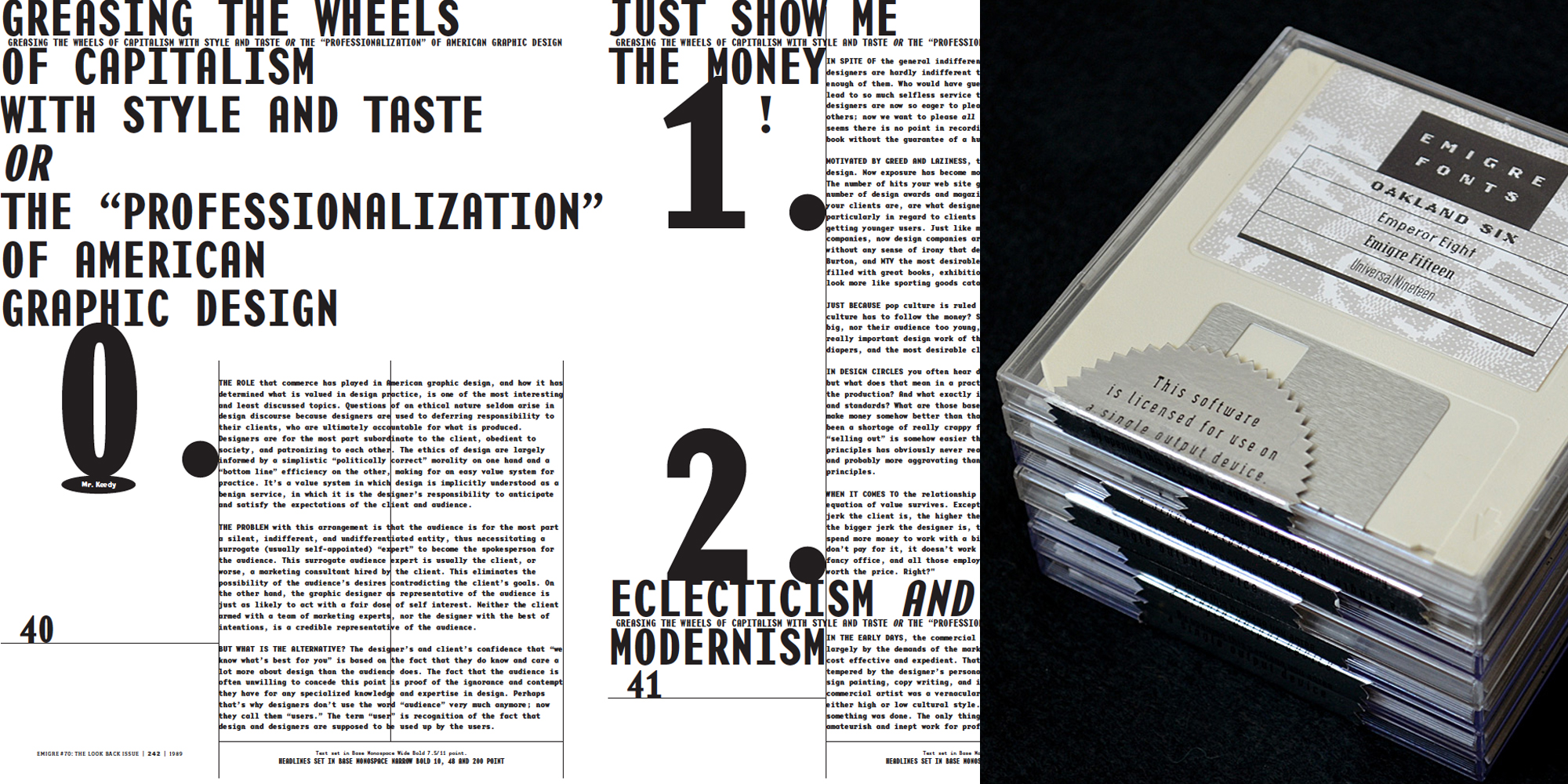
Left: A spread from issue 43 of the Emigre magazine from 1997, exploring “the dark side of design” — Greed, exploitation and selling out. Right: A stack of Emigre’s floppy disks, used to distribute their fonts, circa 1994.
|
|
|
Many of the typefaces from your early period seem to explore meeting points of history and technology: Blackletter fonts and digital processing in Totally Gothic; oldstyle shapes and straight-lines-only in Journal, etc. How did your thinking work at the time — did you make lists of themes to explore in type design?
The themes emerged organically, as the technology changed, or new software or hardware became available. Many of the designs were inspired by asking: “what if…”
For example, with Oblong, the goal was to make a bitmap design that did not show “jaggies”. So this design has no diagonals or curves, only right angles.
Similarly, Journal has no curves, they are approximated by segments of straight lines. I had wanted to try my hand at an old style stress design, but found the curves difficult to draw with the relatively primitive font tools of the day. The geometric arc curves employed in Modula, Matrix, and other designs that I had developed previously were easier to create with these early tools because arc curves are more predictable from a construction standpoint and therefore easier to envision. In fact, it was not so much the drawing tools that were the problem, but the preview display. The screen display was not very faithful to the mathematical digital drawing, nor the laser printout, due to the primitive screen rasterizer and the coarse resolution screen on the monitor. Remember, this was before anti-aliased screens and stochastic ink jet printing came to personal computing. Taking a magnifying glass to the 300 dpi printouts, I studied how the curves were represented by a series of stair-stepped lines on the black and white (non-aliased) grid of the laser printed page. This inspired me to construct Journal with straight-line segments instead of curves; approximating each curve by a series of tangent polylines. This not only solved the screen display preview problem, but gave Journal a rustic look, which nicely complimented the old style stress. The subtle crudeness is reminiscent of the irregularities that appear in letterpress printed specimens, and evokes informal qualities, making Journal suitable for correspondence.
Another design that employed segments of straight lines to approximate curves is Citizen. With the introduction of laser printers, the “smooth” printing option was provided as a shortcut to increasing the resolution of bitmaps from screen to printer. This smooth printing option seemingly polishing stair step pixels into smooth diagonals. I enlarged the structure of the smoothing geometry, and this became the inspiration for Citizen.
Totally Gothic started as an experiment with auto-tracing. One of my experiments began as a blackletter bitmap, which was not so interesting in itself, so I played around with auto-tracing it. Due to the crudeness of the bitmap and the primitive tracing technology, the results were unexpected, and lead me to play with the automatic PostScript curves that it generated.
Variex, designed in collaboration with Rudy, was another concept that was inspired by technology. The early PostScript fonts were in Type3 format, which allowed monoline drawings, of a single weight. Variex was conceived as a stroke design; each character is defined by center-lines of uniform weight, from which the three weights are also derived. Varying the weight of a stroke typeface changes the thickness around the center line and thus alters the alignment of some characters. Variex incorporates these variations of alignment in its design, making adjustments to the center lines unnecessary when changing the weight. As a result, the x-height varies among the three different weights.
|
|
Realeased in 2013, Program is the most recent new typeface designed from scratch by Zuzana Licko. Emigre describes it as “a type designer’s typeface.” Program examines and celebrates the craft of typeface design and the particular details and effects that type designers fret over when they design type. It mixes different structures, stem endings, and weight distributions not usually combined in a single family of fonts. It features both rounded edges evoking the effects of reproduction, and ink traps, the technique used to counteract that effect. The idea was to create a series of fonts with strong individualistic features, challenging the constraints of a central theme that is usually imposed on a family of fonts, while still relating to each other in terms of overall look and feel.
|
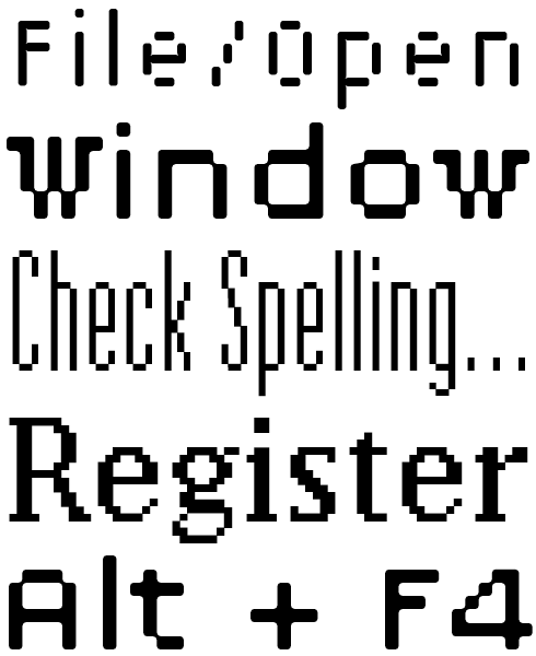
Lo Res was a name given in the new century to a set of fonts that is clearly rooted in the early digital type experiments of the late 20th century — a kind of revival of Emigre’s earliest typeface releases. Starting in the Year Zero of the Mac, 1984, Licko designed a series of coarse bitmap fonts with names like Emigre, Emperor and Oakland, produced with crude public domain software. These designs are now grouped as the Lo Res family. As low-resolution type has become part of everyone’s daily experience, and has become a kind of nostalgic stylistic element in print and web design, this package of original Emigre pixel fonts is a welcome reissue.
|
|
|
|
Your next phase in type, so to speak, was to have a look at historical models. In the mid-1990s, you made Mrs Eaves, based on the Baskerville types, and Filosofia, based on Bodoni. What were your main motivations to turn to the classics?
Bodoni and Baskerville are two type families that I enjoyed using when I was a graphic designer and typographer in my earlier career, before I started designing typefaces. In fact, Bodoni was my favorite.
Once I felt my type design skills had matured enough, I was tempted to create my own versions of these two classics.
My early experience with using Bodoni was from the Mergenthaler photo version, and I often wished for a less contrasty version when it came to setting text. In many instances Bodoni would be simply too hard to read, so I would switch to another typeface design, although I would have preferred the feel of Bodoni.
I did not intend to follow any specific model. Instead, I wanted to capture the warmth of the original printed samples, while creating an updated version that would be appropriate for digital technology, and that would address my problem with the high contrast. My preparatory work included researching printed samples, amongst them the Manuale Tipografico, which I located at the Bancroft library on the UC Berkeley campus, which I was lucky to have nearby. I discovered that over time Bodoni developed a personal style that tended toward simplicity, austerity and a greater contrast, resulting in what we know today as the modern face. This variance in Bodoni’s design encouraged me to imagine my own interpretation.
In what way do you think your approach was different from the more conventional revivals?
I aimed to distill an overall look from the varied qualities of the various printed samples, setting out to draw the letterforms “from memory” so to speak. I let the impression and memory of the printed samples I had studied guide my drawings. This is the same method I used for my Baskerville revival, Mrs Eaves. Drawing a Baskerville “from memory” was suggested to me by Erik Spiekermann, which I thought was a great idea.
Filosofia shows my personal preference for a geometric Bodoni, while incorporating such features as the slightly bulging round serif endings which often appeared in printed samples of Bodoni’s work and reflect Bodoni’s origins in letterpress technology. With each style in the family, my intent was to create a distinct texture which would differentiate, for example, the italic from the roman, to reflect the handmade quality of letterpress type. I wanted to explore the opposite of the “neutral” typeface. The more neutral a typeface design is, the more it will lack specific character, and I wanted to stay away from that.
For Mrs Eaves, I wanted a more fluid design, so Baskerville, being a transitional design and less rigid than Bodoni, was the model. However, Baskerville’s types were often criticized for being too perfect, stark, and difficult to read, and I noticed that revivals of Baskerville often continued along the same path of perfection, using as a model the qualities of the lead type itself, not the printed specimens.
Instead, I looked to the printed samples which were heavier and had more character due to the imprint of lead type into paper and the resulting ink spread. I reduced the contrast while retaining the overall openness and lightness of Baskerville by giving the lower case characters a wider proportion, then reducing the x-height relative to the cap height to avoid increasing the set width.
The intention of my revival was to take those elements from Baskerville that have become familiar, and thus highly legible to today’s reader, and to give these my own interpretation. I wanted the spacing to feel open, which gives the impression of a somewhat slower pace, making the reading unhurried.
|
|
After her first series of coarse bitmap fonts (now the Lo-Res series) Licko explored the increasing possibilities of digital type technology in several font families that built bridges and made jumps from low to high resolution. The Base series is an eminent example of how this unorthodox thinking could lead to a very usable typeface with a strong personality. The design is anchored to the bitmapped screen fonts in various pixel heights that were a necessity in the times before anti-aliased screen rendering became standard. “The Base families,” says Licko, “explored the proportions of the various bitmap masters, and kept the spacing true to the grid. Rather than deriving the screen font from the printer font, I decided to derive the printer font from the screen font.”
|
Citizen is one of Licko’s designs in which the constraints of primitive type design technology became a key to something original and striking, instead of an obstacle. The design is based on the proportions and contrasts of an oldstyle, but refrains from using curves, as they were simply hard to draw and used up more memory. So she resorted to a method that has been a stylistic element in expressionist type designs such as those by Czech designer Vojtech Preissig — building classic-looking lettershapes by using straight lines only.
|
|
|
|
|
|
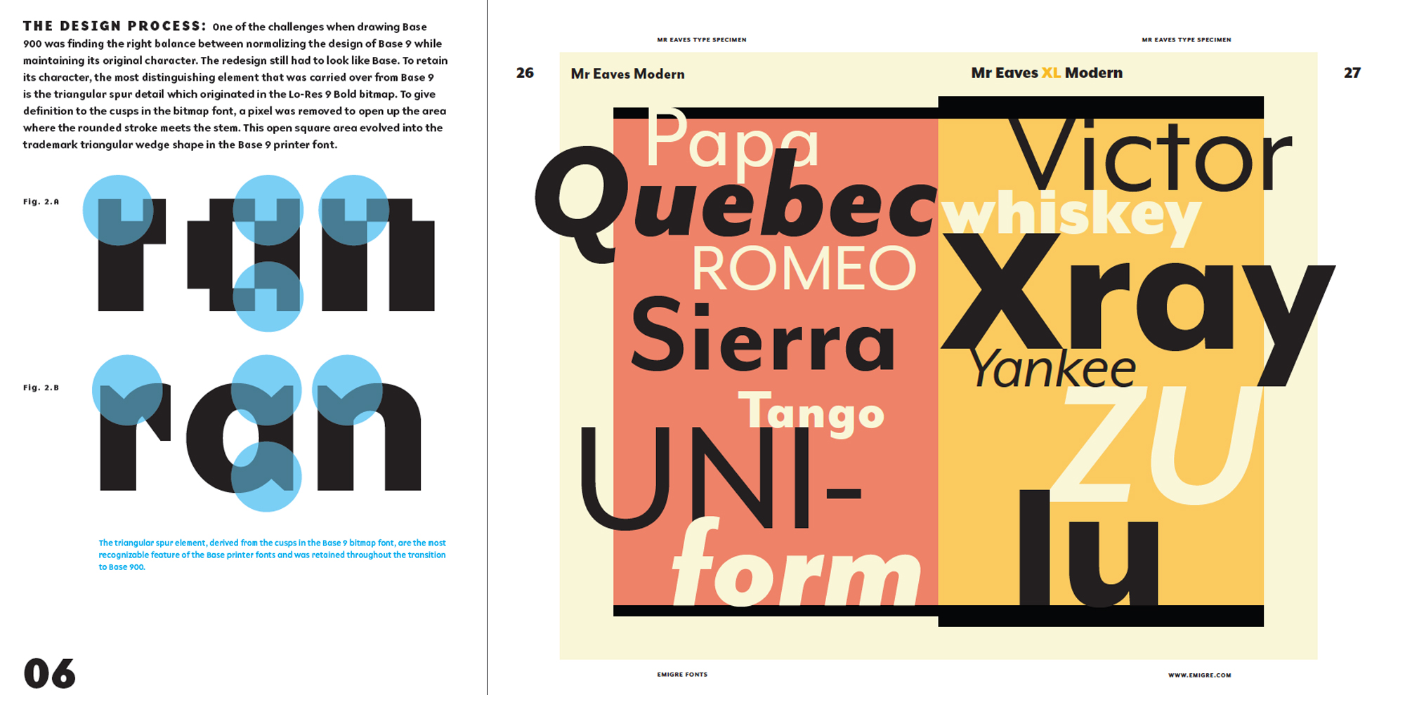
Spreads from Emigre’s new book of type specimens
|
|
|
It must have been around the same time that you began working with ceramics, “a distraction from the tedious aspects of typeface design work” as you wrote. What else did it mean to you, and in what ways does it relate to your type design work?
I have been experimenting with ceramics since my childhood, and spent many summer vacations in pottery studios instead of summer camp. I enjoy the satisfaction of creating objects, and I came to miss it after being preoccupied with the digital medium in my early career.
Over the years, I’ve discovered that pottery and type design are connected in many ways, some of which are contrasting. Both disciplines deal with creating visually and structurally balanced shapes. Both deal with the duality of inside & outside form. And both require resolving transitions of curves. When throwing a piece on the potter’s wheel, the conceptualization of the shape can be reduced to a single line of curve transitions, which represents one half of the symmetrical cross section. These curve transitions and balance of form have much in common with constructing curves in letter forms.
The differences between these two disciplines, however, are equally intriguing. The making of a ceramic piece is finite, relatively instantaneous, and exists in the physical realm, while a typeface design has no physical boundaries and can be reworked endlessly. In fact, a typeface design requires a meticulous reworking of elements over a long period of time. Often I must put a typeface away for weeks, even months, in order to resolve problems that seem unsolvable at the time. Ceramics, on the other hand, have real time, space and material limitations. Particularly in wheel throwing, a piece cannot be worked and reworked for very long, as the clay becomes water logged and stressed. In its finished form, a piece ultimately exists as a static entity, whereas each letter in a typeface is designed to work in conjunction with the other letters, in virtually any combination, and so the appearance of the typeface will differ, depending on the particular letter combinations and typographic setting as it is used.
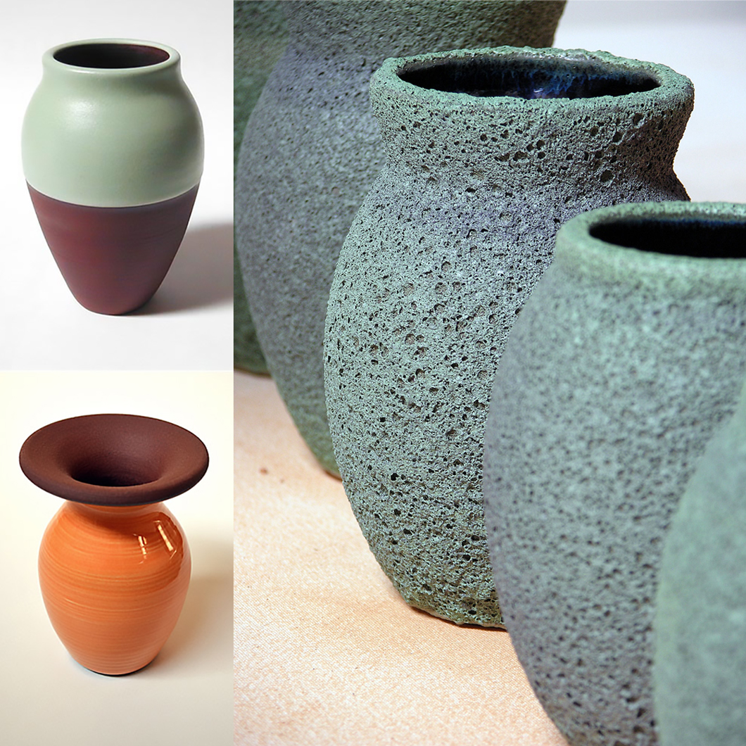
A selection of Licko’s ceramic work
|
|
Designed in 1986, the original Matrix was one of the first full-fledged original text fonts designed on a desktop computer, with all the quirks and simplified solutions that were unavoidable when using the primitive tools available at the time. Developed in 2007, Matrix II is an update of that Emigre classic. Licko used the opportunity to make subtle changes and fine-tune many of the existing characters: the contrast between thick and thin strokes was decreased in some instances; overshoots were corrected; the width of various characters was adjusted and regularized; some individual characters were redesigned. Seven new fonts were added to the family: Semi Narrow, Semi Wide, Semi Tall, Inline Italic, and 3 weights of Italic — a less flamboyant version of the display type Matrix Script. To clearly set this version apart from the original Matrix and to avoid conflict with previous versions, its name was changed to Matrix II.
|
In the early and mid-1990s, some Emigre typeface were embraced by cutting-edge designers as well as mainstream agencies; in some graphic cultures they became ubiquitous. Take Belgium: the logo of the national phone company was designed with Barry Deck’s Template Gothic, and adverts of Flemish authorities were set in Triplex. Developed between 1985 and 1989, Triplex was Zuzana Licko’s first sans-serif text typeface. It had evolved out of Citizen, a text typeface with straight lines only, which in turn had grown out of the low-resolution typefaces she drew in the early Mac days. When Triplex came out, some people questioned its legibility; but soon, users stopped noticing its idiosyncrasies and it was widely accepted as a new and original way of approaching text type. A rather calligraphic italic drawn independently, but in a similar style, by John Downer in 1985 was later adapted to become Triplex Italic — a miraculous fit.
|
|
|
|
Let’s look at the bigger picture of Emigre Graphics. Almost from the start, you also became a curator of a unique and influential type library. I’d say you invited both people who were “crazier” than yourself, and people whose approach to type was more conventional. Please tell us a bit about your principles and motivation as someone putting together a type collection.
I wouldn’t say any of us were “crazy.” We did release a number of conceptual fonts that were designed by people who were not type designers — they were graphic designers, who approach type design from a different perspective. The professional type designer is always concerned with tradition and established reading habits. Graphic designers have something else in mind. Their type is usually filled with contradictions, critiques and idiosyncrasies. Their typefaces are often an outgrowth of specific design jobs. They’re less restricted by tradition, which results in surprising and unusual letterforms. We always had a soft spot for these slightly more experimental typefaces when we were building our library.
Emigre seems to have reached a much quieter phase now. How do you see the future, for yourself and the company?
My personal interests are steadily moving towards creating textures and patterns, and we’re not even sure if we’ll release these commercially as fonts. Currently, I’m using font software to create sketches for my ceramic sculptures, which exist of modular elements. Each sculpture has a variety of shapes that can be combined to make different sculptures. The font software helps me go through all the possible variations. I’ve also been working on a pattern font, tentatively called Tangly, that I envision using for textile prints. But the idea is to sell the textiles, not the fonts.
Instead of endlessly adding to our library, I see ourselves more in a curatorial role these days, trying to safeguard the Emigre legacy. And instead of designing new fonts, we’re fired by the idea of showing our existing fonts in new and different contexts and shining a new light on them. Rudy has focussed on this with our recent type specimen booklets like Historia, Sampler, The Collection, and Nine Literary Types.
Young type designers today may come to you and ask what it felt like to be a pioneer. What would your main advice to them be?
We were lucky. We were at the right place at the right time. Technologies were changing. There actually was something to pioneer. We had to figure out a lot of stuff with very primitive tools. We had to figure out how to sell type online from scratch when the internet was in its infancy. The situation is very different today. Young designers today, their bed has been made. The tools are there to do anything they like, which is an entirely different challenge.
Our main advice to young type designers? Sit up straight behind your computer.
Thanks Zuzana, that really was a journey through time!
––
Breaking news postscript: Emigre have recently donated a huge archive of legacy materials to the Letterform Archive, a San Francisco Bay Area organisation dedicated to the design and lettering communities. Read their press release for more information.
|
|
Variex, designed in collaboration with Rudy VanderLans, was another design inspired by technology. In early type drawing apps and formats, geometry was relatively easy to achieve. In the case of Variex, the early PostScript Type3 format — which allowed monoline drawings — suggested developing the face as a stroke design, defining each character by center-lines of uniform weight. From these skeletons, the designers derived the three weights. When the center line remains in place, the varying stroke thicknesses result in differences in alignment between weights and single characters. Used with consideration, this effect can result in a text design that looks both modernist and jumpy.
|
Designed in 1998 Tarzana was developed with the objective to balance the neutrality required for a text face with just enough idiosyncrasies to create a slightly unfamiliar and intriguing design. As Licko wrote, “Tarzana’s design process was one of visual editing; discarding overly familiar ideas, while assimilating new ones without compromising legibility. Often, a particular decision would conjure up more questions than it answered, and changing one character often led to the reworking of an entire range of related characters.” Designing the roman (upright) and italic simultaneously, Licko allowed the italics to influence or guide the design of the roman — resulting in such features as the curved arm on the lower case ‘k’, the asymmetric capital ‘Y’ and the rounded capital ‘E’ yielding an informal feel to the entire family. It is easy to see that these design principles used in Tarzana have influenced a broad range of sans-serifs by other designers throughout the 2000s and 2010s.
|
|
|
|
|
Who would you interview?
Creative Characters is the MyFonts newsletter dedicated to people behind the fonts. Each month, we interview a notable personality from the type world. And we would like you, the reader, to have your say.
Which creative character would you interview if you had the chance? And what would you ask them? Let us know, and your choice may end up in a future edition of this newsletter! Just send an email with your ideas to [email protected].
In now past, we’ve interviewed the likes of
Mika Melvas, The Northern Block, Matthew Carter, Ulrike Wilhelm, Maximiliano Sproviero, Dave Rowland, Crystal Kluge and Steve Matteson. If you’re curious to know which other type designers we’ve already interviewed as part of past Creative Characters newsletters, have a look at the archive.
|
|
|
MyFonts on Facebook, Tumblr, Twitter, Instagram & Pinterest
Your opinions matter to us! Join the MyFonts community on Facebook, Tumblr, Twitter, Instagram and Pinterest — feel free to share your thoughts and read other people’s comments. Plus, get tips, news, interesting links, personal favorites and more from the MyFonts staff.
|
|
|
|
|
Comments?
We’d love to hear from you! Please send any questions or comments about this newsletter to [email protected]
|
|
|
Newsletter archives
Know someone who would be interested in this? Want to see past issues? All MyFonts newsletters (including this one) are available to view online here.
|
|
|
|