|
Our long running interview series (now well over 100) usually places the emphasis firmly on the type designer — this edition takes a slightly different approach. At the TYPO Berlin conference back in May, we paired up esteemed writer and graphic designer Catherine Dixon with Nadine Chahine, a specialist in legibility and designer of some of the first harmonized Arabic/Latin typeface systems. Their wide ranging conversation travels from the design zeitgeist to the minutiae of type in automobile dashboard interfaces, taking in type’s relationship to dance and the tsunami of mega-super-multi-weight families along the way. Enjoy!
|
|
|
|
|
Catherine: Our first interview was back in 2011. I was teaching design in Brazil, you were designing Arabic type in Germany. Now we’re both in London. A lot has changed for us in that five years, not least your appointment as Type Director for Monotype UK. What does that job title even mean? How and to where do you direct type?
Nadine: Font Development at Monotype is overseen by several Type Directors, each working with a team in different parts of the world. The size of the design teams varies. The UK office comprises myself, two full-time designers, and an intern. Malou Verlomme and Toshi Omagari are both great to work with so it’s really interesting to have this small studio environment within the larger organization.
In terms of what we do, there’s the development of the libraries of retail typefaces that we sell and also our custom type design work. With both I am in continuous dialogue with our designers in terms of the design direction we’re taking. It’s a question of zeitgeist. For every place and time, a conversation is taking shape as the visual arts and design practices engage with the wider public, on the street, on our screens, and everywhere in between, informing our visual language and our collective memory. As designers, our ability to participate in this conversation is dependent on our understanding of the design and cultural psyche of the world we live in. For me it’s important to engage with that. It’s about the spirit of a typeface, and what that is adding to the design conversation of today.
Catherine: How do you begin to add something to that conversation when that conversation is already quite noisy?
Nadine: When we first discuss a project, I don’t like to start the conversation with the idea of a category of typeface, such as geometric sans-serif etc. Instead, I prefer to discuss what the typeface needs to deliver in terms of functionality, and then those requirements might match to one of the categories, that we know today. But the source of inspiration should not be the category, because then you have automatically drawn a room around yourself and you have no space to move. If you step outside of that, and think of the underlying paths and structures of letterforms, and their movement, then that can help you to design something beyond the boundaries we have today.
|
|
|

Nadine began her Arabic version of the Frutiger typeface several years before joining Linotype as their Arabic specialist in 2005. Designed with Adrian Frutiger acting as a consultant during the development, Frutiger Arabic was released in 2007, with several customers already eagerly awaiting this first harmonized dual Latin/Arabic type system. It very quickly found a home in applications ranging from low resolution display devices to billboard-sized advertising. It best suits display settings such as airport signage systems or corporate identity and branding applications.
The style’s origins are in the highly structured, geometric Kufi form of Arabic, but given a more humanist feel by Nadine to make for a more informal and friendly result, in keeping with its Latin companion.
|
|
|
|
|
|
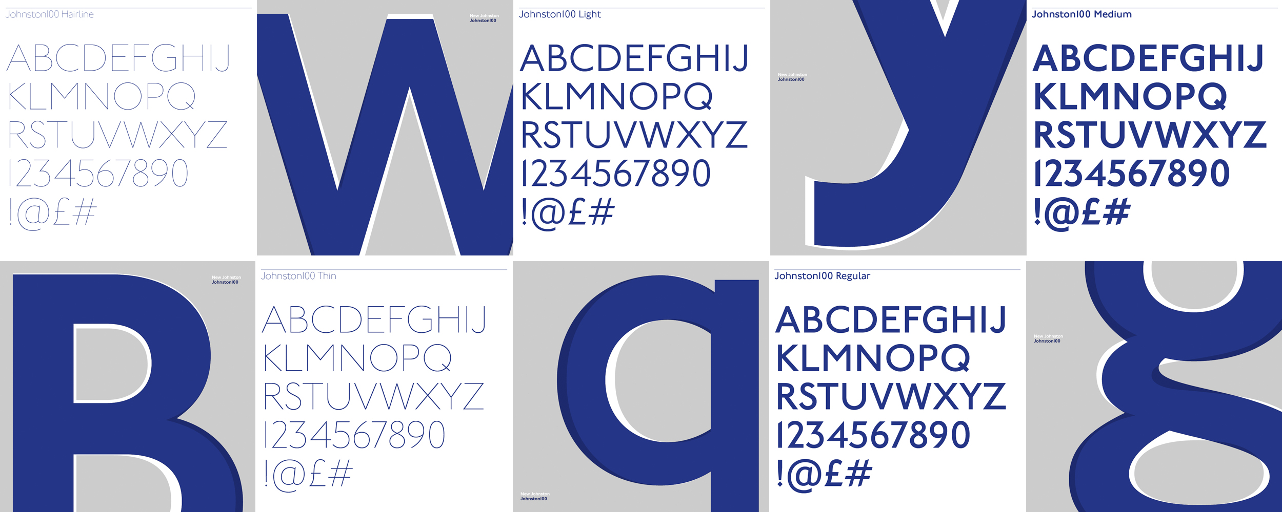
Pages from the Johnston100 typeface specimen, produced by Monotype for Transport for London under Nadine’s direction
|
|
|
Catherine: Is this sense of movement in type coming from your experience of Arabic type design? I seem to recall you once speaking at TypeCon about Arabic dance in the context of Arabic calligraphy.
Nadine: Yes! That presentation was interesting to do because there is so much commonality between the kinds of movements that we make in Arabic calligraphy and in Arabic dance. When I am looking at calligraphy, I am concerned with the pathways of the pen, and how the structures of letters combine with gesture to influence the final shapes. It is this combination of tool, movement and structure, which determines, for instance, the thicks and thins of a letter, and the way the shapes come to life. As the relationships between these ideas became fixed over time, so evolved the various genres we have in Latin type. But, when we step beyond these ready-drawn spaces, and look at type design in a different way, then I hope that we can add something.
Catherine: You very definitely add something in how you write about the drawing of type. I am not sure anyone else quite matches you for joy!
“There is a moment in the life of every typeface when the outlines come to life, when the letters in Arabic, at least, start to hold hands. Suddenly the pieces fit together and the energy starts to flow. It’s a moment of pure uninhibited joy, a moment of design-infused euphoria, when suddenly you are able to see with your own eyes the images that had occupied your thoughts for so long.”
But how do you balance your evident love for being a hands-on type designer with your current role and all its responsibilities?
Nadine: I don’t get a lot of time to draw these days, that is true, but I am always trying to find a balance. It’s been extremely fulfilling to be given the responsibility as Type Director, because I’ve had a lot of ideas for things that I want us to do at Monotype. In my capacity now I have a bigger role than before and I get to do things I would never have been able to do.
For example, the Font Marathon we ran in New York in 2015 brought together intuitive design, freedom to experiment, and speed in a completely open-ended way and with absolutely no guarantee of success. The great thing is that the typefaces that Jim Ford and Toshi Omagari worked on were both outstanding, with the latter going on to win a European Design award. That was before I was even in this new role, but I hope that we can do more font marathons and projects like that in the future.
As to being in London, it’s given me the chance to take part in some rare and iconic projects. Directing Johnston100 was a great privilege, and I’m very excited to become more involved in the design scene in the city.
Catherine: As a creative person there are things I’d like to be able to do, that I can’t, because there’s only me, and so having a team must be great! But I was also thinking, how easy is it to delegate creativity?
Nadine: Right. The way I see myself working with a team is that I give them the creative freedom that I have been always able to enjoy. I have been extremely lucky in having that space. Mainly because in working with Arabic, which was such a niche market, came the freedom to do the kind of projects I wanted to do. So it’s more about setting up an environment for creativity and taking the pressure off the team. It’s also about opening the eyes of our designers to new perspectives. Coming from an external background, coming from the non-Latin, I have somehow un-typical ideas on where our sources of inspiration should come from. It’s very much about type design relating to the context it lives in. A source of inspiration is more than a type specimen, it’s life itself. All of these ideas I discuss with the designers and then hopefully they are able to respond, in their own way.
Catherine: When you talk about your non-Latin design background as being ‘external’, I think that this is something else that has changed in the past five years. Back then non-Latin type design still felt quite fringe. Whereas now, you are UK Type Director, not in spite of your non-Latin background but rather, I should imagine, because of it. Non-Latin is now far more mainstream. How would you advise graphic designers to go about selecting non-Latin type?
Nadine: Yes absolutely. When I started with the company there were no Arabic projects and barely any Greek or Cyrillic. Now these scripts along with Hebrew, Indic, and Thai are as normal as Latin to be working with. It’s definitely becoming a more international way of design and it just requires that, as a designer, you always think a few steps ahead. If you know in advance that your project requires other scripts, especially those for which the typographic scope is very small, it would make sense to write a list of requirements of the typeface. Don’t lock down the choice and get the approval from the client before you have managed to find a good solution for the non-Latin. And don’t box yourself into a corner with a choice of a typeface in Latin that cannot be translated into other scripts. There are certain styles that are just not easy to translate. For example a Bodoni is very difficult to match in Arabic given the high contrast, hairlines, and fine serifs. Many scripts in fact do not have the capacity to support such design language.
|
|

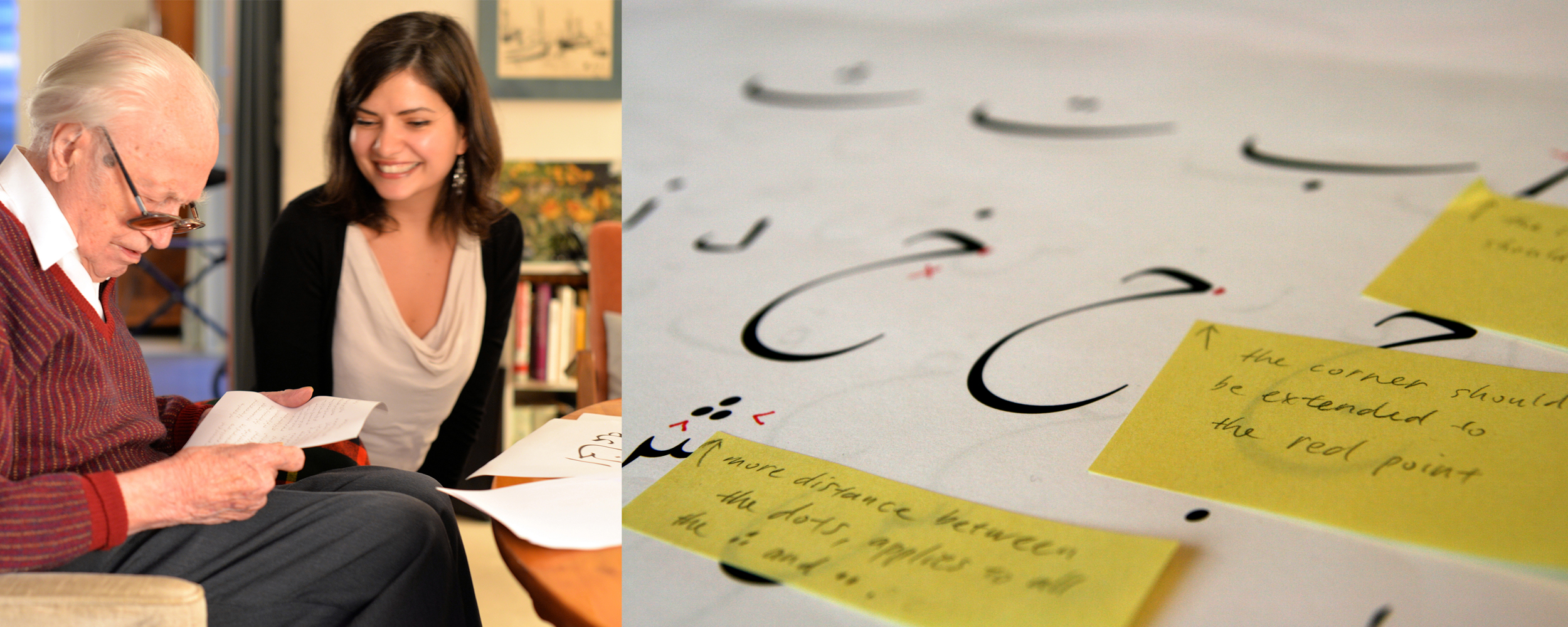
Hermann Zapf’s iconic Zapfino typeface presented Nadine with a particular challenge — what she calls her Mount Everest — given that the calligraphic script created by Zapf was based entirely on his own handwriting and no Arabic equivalent model existed. Nadine therefore had to invent an entirely new Arabic calligraphic style for Zapfino Arabic, emulating Zapf’s style and constantly putting the development work out for public feedback to ensure that what she was making felt both authentic and readable to Arabic users.
|
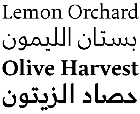
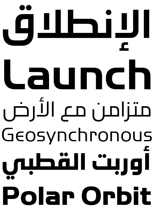
Nadine’s Koufiya typeface, begun as part of her MA project at the University of Reading and later released by Linotype, was the first of its kind: a dual Latin/Arabic type system designed by the same designer at the same time with the intention of creating a harmonious balance between the two scripts. The Arabic half of the family is based on early medieval Kufi script, while its Latin counterpart recalls western European, particularly Dutch influences. Both Arabic and Latin parts have been carefully designed to maintain the same optical size, weight, and rhythm so that they work well together on the printed page and appear harmonious when they are mixed together within the same paragraph.
|
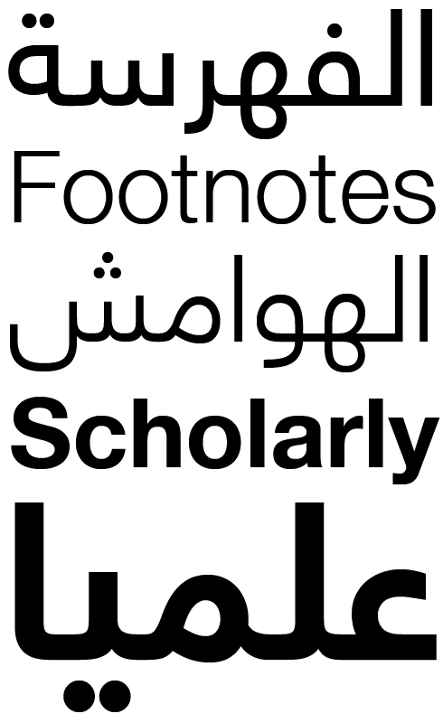
Nadine’s Arabic version of the Helvetica Neue typeface is a hybrid of the Kufi and Naskh script styles, leaning more towards Naskh. Nadine removed any sense of a pen from the design to make the outcome more neutral, less organic, with a sense of more controlled movement appropriate to the source typeface.
|
|
|
|
Catherine: Arabic flourishes in calligraphic form but found itself in something of a straitjacket in typographic form. OpenType technology is now freeing it typographically as a script, allowing for the necessary fluidity and flexibility. With such possibilities it’s arguably a super exciting time to be a type designer.
Nadine: As an Arabic type designer, I am really excited about the possibilities for Display typography, designing typefaces that are more funky, more playful, and with more movement. I have been working in calligraphy with a rounded brush, just to get that kind of energy into my work. Playfulness and energy. Those are two keywords for me.
For Latin too, though, I would like us to be more experimental. As Latin type evolved I think people were freer in how they approached design. Nowadays it just feels far more uniform and more formulaic. Perhaps you tweak a few things and think it’s done. But what’s the point of that? There is surely more room for experimentation and discovery.
In Arabic it’s a different and more personal story for me. I have a clear vision of particular letters that I want to draw. Their forms are in my head, and I get stressed if I don’t get them out, so I need to design! In Latin my approach is more as a user than a type designer. There has never before been so much technical freedom and support available for designers. Compared with the required drawing or punch-cutting skills of the past, the craft of type design is so much easier with all the software we use today. Yet, while this technology should be giving us the freedom to offer more, the serif and sans serif styles we produce are often all too familiar.
Catherine: From a user’s point of view, the freedom introduced by technology, has resulted in many modern fonts that are perhaps overly complex. Huge families and immense character sets can be pretty daunting.
Nadine: Sometimes you are managing complex user requirements, and that can result in a typeface with 50 weights. But that is far from being necessary all the time. It depends on the creative rationale for the typeface. If that doesn’t support the idea of 50 weights, then why put time and energy into making them? It’s your life at the end of the day.
Catherine: It’s not just the type designer’s life, it’s the poor person who’s got to use the typeface!
Nadine: Ah! Which weight should I use? Let me scroll through the 500 options. Not to mention all the other OpenType features with their stylistic alternates. And then we complain that people aren’t using the OpenType features on offer. It’s true. Sometimes we don’t need to have it all. Again, it comes down to the creative rationale for the typeface. If OpenType features logically enhance this, then why not?
Catherine: I do think there’s a really strong case for the role of editing in typeface design now.
Nadine: Well there’s also some pressure. Who is offering the most glyphs? It’s a little bit like the gadgets that come with a car, and you just keep slapping features on left and right, when sometimes it’s just the basics that are needed. From the point of view of the user, though, it can be hard to make sense of. It’s scary enough to go to a website, find thousands of fonts, many of which look the same, and think, “Am I blind not to see the difference?” Obviously, a trained professional can see the differences, but for many designers just starting out it must seem overwhelming.
Catherine: And quite a lot of the typefaces available are free. That whole notion of value, how do you deal with that? It’s an issue I have with my students who wonder why they should even think about paying for a font.
Nadine: There are obviously different opinions in terms of pricing structures for fonts. We live in a time when open-source is a very big thing, as is the idea of giving things away. It started with free email, 20 or so years ago, and by now everything is supposed to be for free. People forget the months and years that are required to get a typeface to work. And if all typefaces look the same, how can we expect people to understand the effort that goes into their design. There is of course an erosion of value. We need to educate people.
|
|

The Palatino Arabic and Palatino Sans Arabic typefaces were developed a few years apart (in 2007 and 2010 respectively) by Nadine working in close collaboration with Hermann Zapf, and is based in part on Zapf’s earlier Al-Ahram typeface from 1956. Intended for immersive long form text, the priority for the designers during the development of the Arabic version was to find a functional harmony between the two scripts, rather than a visual harmony. As with Latin text faces, an important aspect of an Arabic text face is making the reader feel at home, and Palatino Arabic achieved this by aiming for a comfortable, familiar style for its letterforms.
|

As with her translation into Arabic of the Helvetica typeface, Nadine’s Univers Next Arabic was an exercise in developing a solution for a unified Latin/Arabic type system where none had existed before. Leaning more towards Kufi script styles this time, Univers Next is better suited to display settings and shorter texts due to the dominant geometric structures of the letterforms.
|
|
|
|
|
|
Left: Nadine at work with Hermann Zapf on Zapfino Arabic. Right: Zapf’s notes on a marked up sheet of Zapfino Arabic sketches.
|
|
|
Catherine: There is so much in the type design process that is invisible to the end user. We obsess about outlines, but it is perhaps more pertinent to think of a font in terms of performance, and the complexity of how a given typeface will work on a particular screen, tablet or digital environment.
Nadine: Absolutely. That’s why some typefaces become more popular, because they have proven themselves. And that’s why, if you try to do a cheap knock-off, it doesn’t work. You’re unaware of all the micro-decisions that have gone into perfecting the design. When I’m looking at typefaces I’m also taking the long view. Where will this typeface be in twenty years? Will it survive the test of time? Some typefaces aren’t meant to, especially Display typefaces. When people 20-30 years from now write a history of typography for the beginning of the twenty-first century, what typefaces will stand out? What will we, as a community, have contributed to the design conversation? That’s what I really mean by the design conversation. What have we added? Have we just done the same as those before us? Or have we found new solutions and different tones of typographic voice? Recently I asked my colleagues, “How do we show sarcasm in typography? Wouldn’t it be fun to explore that?” Wouldn’t it be great to throw type design open to these kinds of possibilities?
Catherine: Your ability to keep asking questions extends beyond the playful and provocative and into your more formal research work. A moment here for me to congratulate you on your PhD! Still a work in progress five years ago, how is your legibility research informing how you now design type?
Nadine: The work that we are undertaking at Monotype with the MIT AgeLab is about glance legibility, the ability to read text in a clear and very fast manner. This is important for HMI devices in a car where the speed of reading is absolutely essential, and perhaps life threatening if things go wrong. It’s about more than understanding type design better. It’s about learning how our design decisions affect reading. Typefaces are design ingredients and we need to better understand how they behave in order to use them properly. These experiments are all about finding the answers, because some of our assumptions are wrong. It’s what we in the type design community need to understand, that not all of our assumptions are correct.
Research can help us. Yes, using what we know from experience is relevant, but so too is what we can learn from psychology, from tracking eye movement, and from vision science. Scientific advances are such that they can help us to actually confirm some of what we have come to understand via design practice, and also to settle some age-old questions we continue to argue about, such as serif versus sans-serif, and this theory of legibility over that.
Choosing a typeface for situations of glance legibility is not simply an issue of preference or familiarity. Rather, we can turn to vision research for answers. We need to do that more. Equally though, when the question “can we read this very fast?” is not so key, when it’s about conveying a certain tone of voice or trying to express a particular idea through a design, then we can play some more. It feels a little like a paradox, but I am like that in life. It really depends on the purpose of the design.
|
|

Unlike her Palatino Arabic project, discussed above, the visual similarity of the Latin and Arabic scripts in Nadine’s DIN Next Arabic designs is notable. The stiff geometric formality of traditional Kufi calligraphy is an appropriate match for DIN’s machine-made origins and, of all Nadine’s Arabic/Latin fusion designs, DIN Next Arabic is the most visually integrated between the two scripts. Like her other strongly Kufi-influenced projects, DIN Next Arabic is principally a display face intended for clean, high impact headlines and call outs, but it will also work reasonably well in mid-length texts too.
|
|
|
|
Catherine: I like very much how, through your research, you are dismantling visually-driven brand strategy as the dominant way of thinking about typography in a commercial context. Sometimes function matters more than voice.
Nadine: Yes, for sure. The personality of a typeface is, of course, very important, but typography is no longer confined to the spaces of printed documents, billboards, and so on. These days our touch points for interacting with brands are increasingly on screen, with the activity of reading often undertaken on the fly when speed and distraction are issues. More than ever we need to understand that the typography of a brand is not limited to its aesthetic qualities alone. So an appropriate typographic brand language might include a suite of typefaces; for example, a typeface to carry the main typographic voice, and a companion with the functional characteristics that lend it to on-screen communication, or HMI, or whatever is needed.
As type designers, typographers, and graphic designers today we know how to match typefaces. We know how to establish relationships across different families. We don’t need to stick with the idea that a brand has only one typographic outfit, which it needs to wear to everything. Given the way a brand interacts with its audience across so many different platforms we need the vision to be able to express that across a range of fashions.
Catherine: There’s one other thing that’s changed in the past five years: you’ve started to learn to play the piano. How has that affected your typeface design?
Nadine: I don’t know if I’ve ever said this before, but there is something common to dance (because I also used to dance), piano playing, and typeface design. That is the idea that the movement should feel effortless. It’s the most important thing. When you are dancing, while there is perhaps some internal tension, the outward movement stays soft and elegant. When I started to play the piano, my hands were stiff, and even though the sound might have seemed ok, it wasn’t. My hands were still too stiff. It’s only when you really know what you’re doing and your hands have memorized the movements, then suddenly you’re playing and the hands are relaxed and it’s almost effortless. And it’s the same with type design, because when a typeface looks as if it’s struggling to roll across the page, it is not a typeface you want to read. And it’s not the dance you want to see, and it’s not the music you want to hear. It needs to be effortless, the way the characters connect to make words, and the words connect to make lines.
That’s a good question!
////
For more on the Johnston100 project, read London Reconnections’ excellent article, and check out Monotype’s own case study.
|
|
Nadine’s design for the Arabic version of the ITC Handel Gothic typeface shows how even something with its roots in medieval Arabic script can be harnessed to create something else that feels entirely contemporary. Her Handel Gothic Arabic is pure geometric Kufi script, yet this wouldn’t feel out of place dressing the set of a science fiction movie or on the poster for an urban music festival.
|
|
|
|
|
|
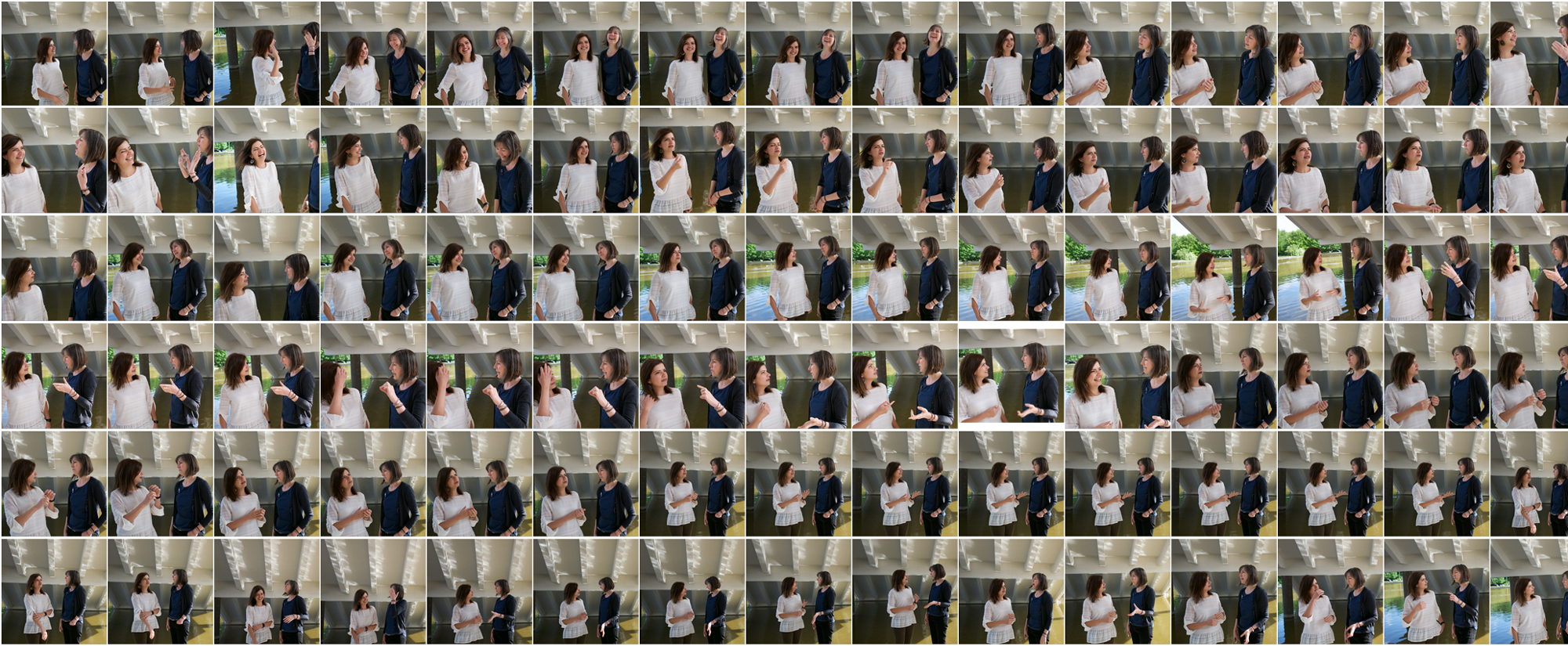
Nadine and Catherine in animated conversation
|
|
This edition of Creative Characters was edited by Catherine Dixon
Catherine Dixon is a designer, writer and teacher. As a designer she works with text-based projects, including typographic covers for the award-winning Great Ideas series for Penguin Books. As a writer and researcher she has a particular interest in letterforms, her Doctoral thesis focusing on the problems of describing typefaces. She also writes regularly on letterforms in environmental contexts, contributing to the website publiclettering.org.uk and co-authoring with Phil Baines the book “Signs: lettering in the environment”. She is a Senior Lecturer at Central Saint Martins (part of University of the Arts London) where she teaches typography on the Graphic Communication Design programme and co-curates the Central Lettering Record. From 2011–12 she was a Visiting Professor at the University of São Paulo in Brazil.
|
|
|
|
|
Who would you interview?
Creative Characters is the MyFonts newsletter dedicated to people behind the fonts. Each month, we interview a notable personality from the type world. And we would like you, the reader, to have your say.
Which creative character would you interview if you had the chance? And what would you ask them? Let us know, and your choice may end up in a future edition of this newsletter! Just send an email with your ideas to [email protected].
In now past, we’ve interviewed the likes of
Mika Melvas, The Northern Block, Matthew Carter, Ulrike Wilhelm, Maximiliano Sproviero, Dave Rowland, Crystal Kluge and Steve Matteson. If you’re curious to know which other type designers we’ve already interviewed as part of past Creative Characters newsletters, have a look at the archive.
|
|
|
MyFonts on Facebook, Tumblr, Twitter, Instagram & Pinterest
Your opinions matter to us! Join the MyFonts community on Facebook, Tumblr, Twitter, Instagram and Pinterest — feel free to share your thoughts and read other people’s comments. Plus, get tips, news, interesting links, personal favorites and more from the MyFonts staff.
|
|
|
Colophon
This edition of Creative Characters was guest-edited by Catherine Dixon. Managing editor and designer: Anthony Noel. Editorial assistant: Michael Pieracci. Cover photo by Laurence Penney.
The Creative Characters nameplate is set in Tabac Slab and Rooney; the designer’s name is set in Hamra Str and Rooney ; the quote is set in Koufiya and the large question mark is in Tabac Slab. Body text, for users of supported email clients, is set in the webfont version of Rooney Sans. |
|
Comments?
We’d love to hear from you! Please send any questions or comments about this newsletter to [email protected]
|
|
Subscription info
Get our monthly designer interviews, popular new fonts, the latest trending promotions and free font goodness to your inbox. Sign up here: MyFonts Mailing Lists
|
|
Newsletter archives
Know someone who would be interested in this? Want to see past issues? All MyFonts newsletters (including this one) are available to view online here.
|
|
|
|