|
Meet two of the most unheralded heroes of that most modern of cultural phenomena — the comic book. Their typefaces (close to 250) are so popular that you won’t find a comic shop or newsstand without some of their work, and they number Marvel, DC and Pixar among their clients. Some releases emulate the “Crash! Bang! Kaboom!” of sound-effects (they were early pioneers of the chromatic fonts trend); others are digitizations of the styles of well-known comic book letterers. Richard Starkings — letterer, colorist, writer & generally a jack-of-all-comics — and type & graphic designer John (JG) Roshell spoke to our Editor at Large Joshua Lurie-Terrell about making comics, lettering, type and graphic design, and the explosion of activity where all these disciplines collide. Dive into the world of Comicraft!
|
|
|
|
|
JLT: How much of Comicraft is type design, how much is custom lettering, how much is other aspects of making comics?
Rich: I’ve never considered Comicraft as one specific kind of business. I chose the name to cover all the bases in the world of comics. My old roommate in Venice Beach called his carpentry business “Proud Craft” and I liked the idea that what was important was his craft — not the wood, or the nuts and bolts and the sandpaper, but his whole approach. I had already worked for seven years in comics as an editor, writer, designer, letterer, colorist, production manager and all-round enthusiast, and I didn’t want to be tied down to one area, and that’s as true today as it was when I got my first work in comics in the eighties.
John: My time is split evenly between design and lettering work for clients, and creating and promoting our fonts. It’s a good balance. Being busy with projects that serve other people’s needs creates demand and inspiration for new fonts, and it’s also nice to be able to clear my head and create a font that I want to create because I’ve always wanted to have it.
JLT: JG, you do most of the digitization and the actual type design, from your own and Rich’s lettering; how did you choose this career path, and how did the two of you start working together?
John: I was a few months out of college in late 1992 when Richard called my girlfriend (now my wife) looking for someone who could quickly type comic book scripts into his new computer system. I practically grabbed the phone out of her hand — “Letter comic books? That sounds fun! Do you work on Spider-Man?” Rich had spent a year creating a font based on his pen lettering, but once I got my hands on Fontographer, I went crazy for it, reworking his font to more closely match his pen style, and creating all kinds of other fonts for sound effects, titles, and weird character voices. Comicraft was just Rich and I working in his spare room that first year, as he painstakingly tried to convince Marvel and DC editors to let us use “computer lettering.” Eventually we wore down their resistance as they started to see the speed and quality of what we could provide. Before long we were lettering most of Marvel’s output and a lot of DC and Image titles as well. The studio grew to over a dozen people, but contracted when the industry collapsed in the late ’90s and the major publishers figured out what we were doing and started in-house departments. Now it’s us plus two craftsmen who exclusively do lettering work.
Rich: I had worked with a couple of friends before meeting JG. Their role was more along the lines of data entry at that point, as I was still figuring out how to recreate the role of the pen letterer on the Mac. I was lucky in that a former assistant editor at Marvel Comics was out here on the West Coast singing the praises of Apple computers. He put that first thought in my head that I could work digitally. His roommate, Neal Sofge (now a senior systems admin at NASA, as well as a board game designer), was a computer boffin working at RAND … it’s all about the roommates! Neal helped me figure out Fontographer and QuarkXPress and from there I created my first font. I knew I had to hire someone more permanently and a friend put me in touch with JG’s girlfriend, and from there we started hiring friends and other people working tangentially in comics. At our peak, there were 17 people on payroll and it was too much — I was more of a manager than a creator and I wasn’t sorry when the industry contracted later that year.
|
|
|
Spills is a sophisticated layerable chromatic display family styled after baseball team pennants, with all the rich sporting and general Americana that world evokes. The six separate fonts can be combined in several different configurations to create various lighting, shade and 3D effects, plus there are six lengths of smartly programmed automatic tails to make for cool, timelessly nostalgic logotypes and titles.
|
Readable, casual and apparently effortless, Legendary Legedemain is a comic font intended for the serious business of reading. Equipped with the essential four styles for setting mid to long texts — Regular, Italic, Bold and Bold Italic — this family will have a useful life outside its natural home of comics and graphic novels. It will confidently handle more “grown up” applications: imagine it creating a relaxed contrast to the more formal sections in corporate publications, setting a newsletter for young families or the signage for your local supermarket. Legendary Legerdemain’s utility is further extended by the complementary Legendary Legerdemain Leggy family; the same design in a slightly condensed width.
|
You Blockhead is a stocky muscleman, not particularly subtle yet surprising supple, smart and athletic: straight out of the box, it’s a hunky, chunky squarish comic display font; turn on OpenType and the discretionary ligatures feature will activate a set of interlocking glyph contortions that will turn this already restless font into an energetic type gymnast.
|
|
|
|
|
|
|
|
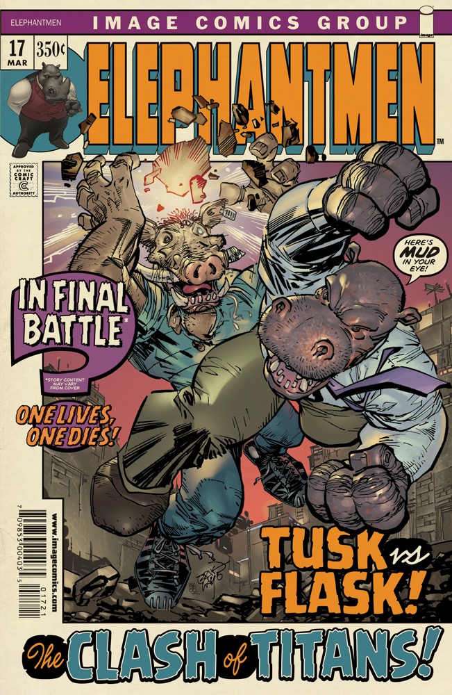
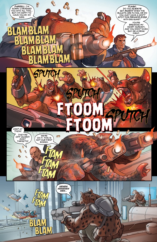
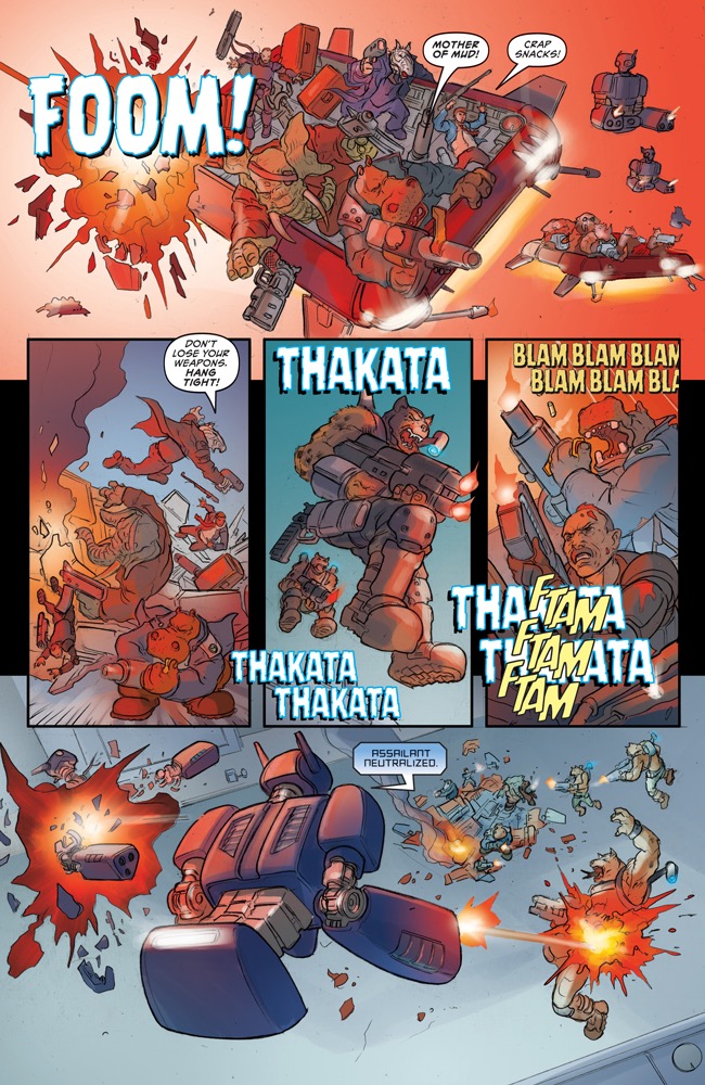
Spreads from Comicraft’s own Elephantmen comic featuring Battle Scarred, Primal Scream, Battle Damaged, Battle Cry, Spookytooth, Resistance is Futile, Rumble, and Grimly Fiendish
|
|
|
JLT: Rich, your flagship project (and a personal favorite of mine) is Elephantmen, which is both a sales tool for Comicraft as well as a successful comic series in its own right. You do a bit of everything in its production and the end result really shows your passion for comics. When did you decide that making comics is what you did and who you were, and that this was going to be your craft?
Rich: I’m in comics for life. As a child growing up in Yorkshire, England, I started working on my own comics when I was just 9 or 10 years old. I drew Doctor Who comic strips in my teens that were published in various fanzines and really enjoyed creating logos and the lettering and balloons. I read an article in a comics anthology called Warrior (the original home of V for Vendetta) that lettering was a quick and easy way to get into comics so I focussed my attention on my lettering portfolio and was getting pen lettering work pretty soon after that.
John: As a kid, I could recognize type styles like Helvetica and Gill Sans, even if I didn’t know what they were called, or how anyone had access to use them. In high school, I discovered Letraset rub-on letters for Microgramma (which became Eurostile) and used those and a photocopier to make flyers and cassette tape covers for my band. My dad discovered a major called “graphic design” at UCLA, so I applied for that, and got a great job on campus using the Mac to make flyers and posters and videos for the campus stores and restaurants.
Rich: Yes, Letraset! When I was as a designer at Marvel UK in the mid ’80s I remember how outrageously expensive sheets of Letraset were — we would often get in trouble for ordering too many sheets for our titles and would create bromide copies of certain letters so that we didn’t have to buy another sheet just to get another “Q” or “X.” When I started looking into digital lettering I thought that I’d buy fonts for the simple reason that you’d never run out of those less useful (outside of comics) letters ever again!
JLT: You told me how you “tricked” editors who claimed not to want to ever use digital lettering by showing them digitally-typeset and conventionally-lettered pages side by side — and they couldn’t tell the difference or even picked the digital. Despite the improved consistency and easier workflow, are there some things you miss about analog lettering?
Rich: I miss sharpening pencils, drawing sound effects on the artboard, all the smells you associate with pencils and ink; the tactile nature of drawing letters — “cold type must be warmed by the living hand!” as a Luddite lettering legend acquaintance of mine once said to me while steam blew out of his ears!
John: I almost always sketch out my type and logo designs with pencil on paper. There’s something about drawing a thing by hand first that helps me capture that liveliness on the computer. I also find there’s a tendency when brainstorming visual ideas on the computer — because everything looks so polished and neat — to think that a logo is done even if it hasn’t been thought through with a solid concept behind it. The result might be pretty but it isn’t as satisfying.
|
|
Starkings’ Absolutely Fabulous has its bowler-hatted head firmly in the clouds of sixties and seventies spy and action-hero glamor. Sartorially ambiguous, subversive and unsettlingly sharp, this three layered chromatic typeface sets out to create gorgeous, pop-tastic titles and display graphics that scream taut, tense, sexy magnetism. In case of overheating, use sparingly!
|
Hedge Backwards is, in Starkings’ words, “the font that started it all”. Based on Starkings’ own hand, the Hedge Backwards family comprises Regular, Bold and Bold Italic styles in Upper and Lower versions, and is supremely suited to setting informal medium to long texts, with plenty of scope for getting emphasis and changes of voice across while keeping the type harmonious for the reader.
|
|
|
|
JLT: Comicraft is one of the most specialized type foundries in the world. Are you ever tempted to surprise the world with a sober sans or text family, or some kind of conservative script?
John: No way. Boring! Every month I see some NEW! sans serif font which I can’t tell from the last. So there are clearly plenty of other people already doing that. And I think it would probably require a painstaking level of mathematical precision that would take the fun out of it. I like making fonts that capture a spirit and an energy and a feel, and are something I want to use that doesn’t yet exist.
Rich: Comic book creators are rebels, we learn the rules and then break them. We like to keep everything irreverent and fun because that’s how comics should be! I love coming up with cool, funky names for fonts and writing copy that creates a comic book identity for each font. It helps us stand apart from the slightly stuffy fonts out there that look down their long stemmed verticals at us and sniff their serifs in disgust.
JLT: Did you work with Joe Kubert on the typeface that emulated his handwriting, and if so what was that like? How do you feel knowing that decades after his death, Joe’s ghost could, through your efforts, still be lettering Sgt. Rock (among other titles)?
John: I didn’t get to work directly with Joe, but I have worked closely with some other comic book legends to develop their fonts, including Dave Gibbons, co-creator of Watchmen, Scott McCloud who created Understanding Comics, Spider-Man artist J. Scott Campbell, and Batman artists Tim Sale and Brian Bolland. I think it must be a strange feeling for them, seeing their handwriting come to life in a font, and then appear in other people’s comics!
JLT: Rich has done pretty much everything on the creative side of the comics business — and has had many successes as a writer, editor, colorist — and, most extensively, as a letterer (with involvement in dozens of series, from 2000AD to a numerous X-Men titles and everything in between). How does this wider view of the industry and what its practitioners need define your projects?
Rich: JG slowly took over creating fonts from scratch as I moved into making my own comics — my Elephantmen series is ten years old this year and we letter it exclusively with Comicraft fonts. It was always my intention to market our fonts to create the freedom to make comics ourselves. JG’s series Charley Loves Robots appeared in the back of Elephantmen, and we have two new series in the works for next year. I’m still known for my work as a lettering artist and am actually going back to pen and ink next year for a new project with Hellboy creator Mike Mignola. We’ll see how that turns out! I do occasionally miss it even though I don’t miss cleaning out pens or washing black ink off a callus on my middle finger.
JLT: One of my favorite letterers was Ira Schnapp, who did a lot of really interesting and unique specialized letterforms. How do you address situations where you come up against styles like this — which seem, at first glance, to defy using an actual font?
John: Well, a lot of our fonts, particularly the sound effect faces, are really meant as a starting point for actual lettering work. After we type out a “crash” or a “kaboooom!”, we create outlines in Illustrator, and move and reshape the letters around to form a word to fit that particular space with maximum impact. We’ve created fonts full of pre-made sound effects, but really, if you’re lettering comics for real, no two sound effects should be exactly alike.
Rich: The computer is just a tool, just as the pen is just a tool. We can be more creative on the screen sometimes than we can on an artboard. There’s certainly more freedom to try out — and undo — different things on the computer … once you’ve put ink on paper you’re pretty much committed! I love looking at work by Danny Crespi, Ira Schnapp, Tom Orzechowski … but I also love coming up with new ways of using digital lettering to make my own comics jump off the page.
|
|
Designed by Roshell and Spanish lettering artist Ferran Delgado, Battle Cry is part of a series digitising sound effect and display lettering styles of sixties comic books. Delgado has made a career painstakingly reproducing those styles for the Spanish language editions of Marvel Comics. Outside of comic books, Battle Cry’s Base and Open styles work well individually or layered for chromatic effect, for packaging, posters, book jackets and even mid-length call outs for magazine spreads.
|
Killjoy is a layerable, chromatic display face in Regular and Italic styles. Roshell has loaded this exuberant and, in defiance of its name, fun-loving family with features that make reproducing a handlettered look a doddle — including subtly different character pairs activated by your design software’s automatic ligatures feature.
|
Produced by Starkings and Roshell for Marvel’s Fantastic Four series, Flame On is an excellent example of Comicraft’s expertise in building SFX font families. Three layerable styles combine to create a dramatic, high impact handlettering style font with plenty of character and superhero-levels of energy.
|
|
|
|
|
|
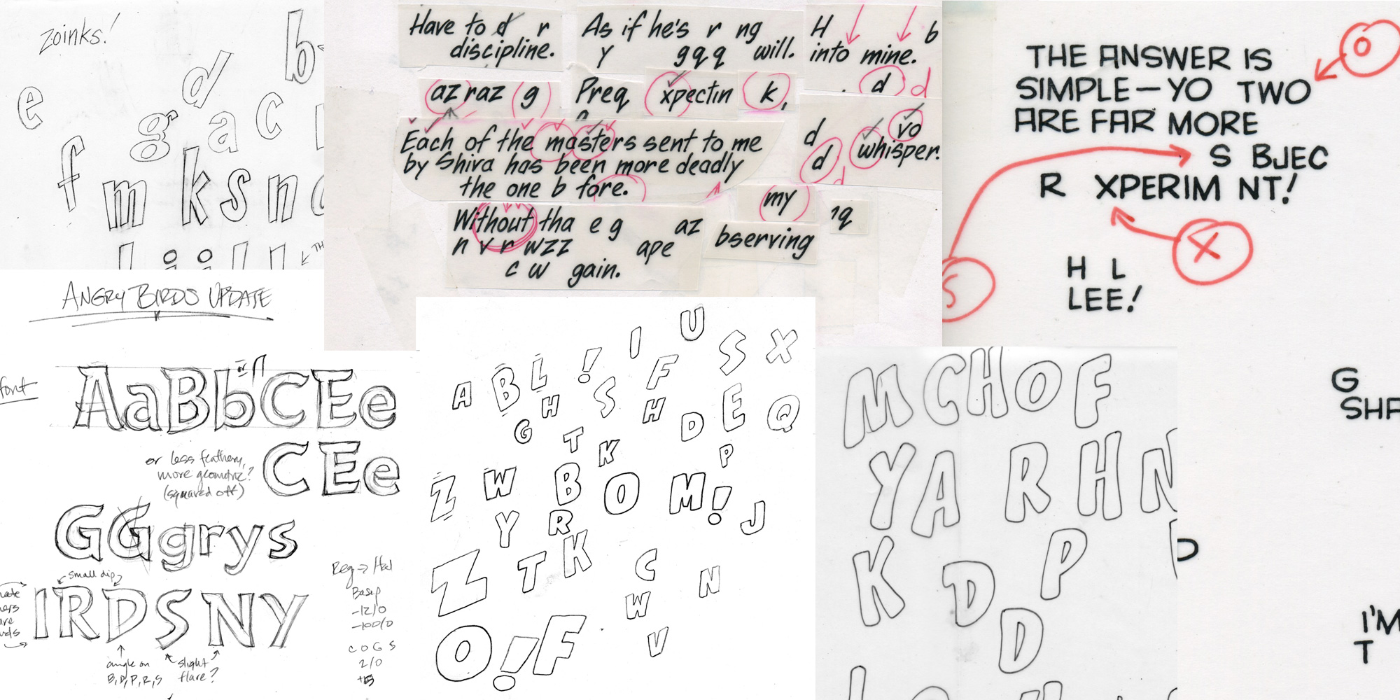
Sketches and drawings for (from clockwise top left): Zoinks, Dear Diary, Yada Yada, Splashdown, Shake and a custom typeface developed for the Angry Birds Movie
|
|
|
JLT: A lot of designers are not as well-versed as we could be in regards to comic lettering — surprising, maybe, since many people in the comics world were trained and worked as graphic designers. Who are some of the greats who have not been digitized and whose work may not be easily visible in a local comic shop? What do you think that designers, letterers and type designers today could learn from their work and the discipline of comic lettering?
John: I grew up reading Spider-Man comics of the 1960s and ’70s, so the two main guys for me are Artie Simek and Sam Rosen (the latter was trained as a calligrapher), who lettered most Marvel books in those days. Occasionally another letterer would fill in, and I can remember feeling like that story wasn’t as “real,” as if whatever happened in that issue didn’t count — just because of the lettering!
What I appreciate most about their lettering, and the “style” of comic lettering as we think of it now, is that it wasn’t a conscious attempt to create a style as much as it evolved from very real practical limitations. Comic book lettering had to be easily readable at small sizes with lousy print quality on cheap, absorbent newsprint, while working under back-breaking deadlines. Yet those early letterers were still able to channel the energy and excitement of the stories, and somehow develop recognizable (to us, at least) styles.
Now we designers and letterers don’t face those same limitations (except for the back-breaking deadlines), so what limitations define our styles? Disk space? Screen resolution? Even those are always changing. Really, the possibilities now are endless, which can actually make the process of making a decision pretty difficult! I tend to fall back on two basic rules, which I learned from comic book lettering — be readable, and be in service of telling the story.
And comic books aren’t just one visual style — they tell all kinds of stories, from swords and sorcery, to the old west, to outer space! One thing I like about designing fonts for comics is being able to bring in all sorts of graphic styles — Victorian, Art Nouveau, Art Deco, 1950s googie, ’60s beatnik, ’70s disco and punk, ’80s arcade games — all of those influences are useful for lettering comics, and show up in the fonts we make. And I like spending time making something that not only I can use, but that other people might find useful too.
It’s exciting to see our fonts show up in all kinds of strange places, from toilet paper packaging to Toy Story to The Colbert Report. And to be a place people from outside of comics come to when they want fonts that are readable and fun, like those we made for Clash of Clans and Angry Birds.
Rich: Before we finish, I must give credit to the British lettering artists that inspired me… First and foremost, Dennis Collins who illustrated and lettered The Perishers for the The Daily Mirror. Posy Simmonds created a comic strip called The Silent Three for The Guardian, Bill Nuttall & Tom Frame worked on the seminal — and still running! — Rogue Trooper and Judge Dredd for 2000AD, Steve Craddock whose beautiful lettering graced the pages of Alan Moore and Alan Davis’s Captain Britain and last but not least, Frank Bellamy, whose dynamic and graphic art in the ’60s and ’70s always incorporated lettering as if it was part of his art, which, of course, is always our goal.
Thank you for that trip around the Comicraft Universe!
|
|
Zoinks is something like Comicraft’s flagship sound effect font — it’s a simple, single weight style, with no bells or whistles, just a great tool for that punchy, uncompromising need to go big and loud in print.
|
WildWords and WildWords Lower are a pair of hand-drawn faces for setting extended text. Both families are flexible enough for use in both display and text contexts, although WildWords Lower has a full complement of bold and italic styles in its four fonts, while WildWords has only Regular, Italic and Bold Italic styles — making it a bit better suited to display uses.
|
Monster Mash is the archetype comic display face — use to energize, shock, shake up or otherwise set your packaging and display designs on edge.
|
|
|
This edition of Creative Characters was edited by Joshua Lurie-Terrell
Joshua Lurie-Terrell is a graphic designer, writer and editor who designs typographic props for movies and television, book interiors, and political and social campaign graphics. He can often be found buried under a pile of (his own) children or at his day job at the California State Capitol in Sacramento.
|
|
|
|
|
Who would you interview?
Creative Characters is the MyFonts newsletter dedicated to people behind the fonts. Each month, we interview a notable personality from the type world. And we would like you, the reader, to have your say.
Which creative character would you interview if you had the chance? And what would you ask them? Let us know, and your choice may end up in a future edition of this newsletter! Just send an email with your ideas to [email protected].
In now past, we’ve interviewed the likes of
Mika Melvas, The Northern Block, Matthew Carter, Ulrike Wilhelm, Maximiliano Sproviero, Dave Rowland, Crystal Kluge and Steve Matteson. If you’re curious to know which other type designers we’ve already interviewed as part of past Creative Characters newsletters, have a look at the archive.
|
|
|
MyFonts on Facebook, Tumblr, Twitter, Instagram & Pinterest
Your opinions matter to us! Join the MyFonts community on Facebook, Tumblr, Twitter, Instagram and Pinterest — feel free to share your thoughts and read other people’s comments. Plus, get tips, news, interesting links, personal favorites and more from the MyFonts staff.
|
|
|
Colophon
This edition of Creative Characters was guest-edited by Joshua Lurie-Terrell. Managing editor and designer: Anthony Noel. Editorial assistant: Michael Pieracci. .
The Creative Characters nameplate is set in Tabac Slab and Rooney; the foundry’s name is set in Kill Zone and Battle Cry ; the quote is set in Wild Words Lower and the large question mark is in Tabac Slab. Body text, for users of supported email clients, is set in the webfont version of Rooney Sans. |
|
Comments?
We’d love to hear from you! Please send any questions or comments about this newsletter to [email protected]
|
|
Subscription info
Get our monthly designer interviews, popular new fonts, the latest trending promotions and free font goodness to your inbox. Sign up here: MyFonts Mailing Lists
|
|
Newsletter archives
Know someone who would be interested in this? Want to see past issues? All MyFonts newsletters (including this one) are available to view online here.
|
|
|
|