|
Eleven years ago, Vicente Lamónaca became the first Uruguayan designer to publish a digital font. His Económica family has been on MyFonts.com ever since. Later, he joined forces with Martín Sommaruga and Fernando Díaz to start TipoType, his country’s first digital type foundry. Since then, TipoType has created a library with dozens of font families that have proven popular with our customers. TipoType is also actively building up a type design scene in their native Montevideo. The foundry’s three principal designers are the subject of this month’s issue of Creative Characters; we hope that you’ll enjoy learning about their design outlook as much as we have!
|
|
|
|
|
Many foundries are operated by individual designers. Quite a few duos and trios are made up of designers who studied together, or have known each other for years. Since the three of you aren’t the same age, what brought you all together?
Martín Sommaruga: We each studied graphic design at Universidad ORT, Montevideo. Vicente and I were in the course’s first generation. We weren’t classmates, but we lived nearby and had actually met through the local music scene first. We graduated the same year, in the same ceremony. Type design is still a new discipline in Uruguay, and we’re committed to helping it grow. We want to leave behind something for future generations in our country to relate to. One of the good things about type design is the possibility of creating intergenerational bonds. For instance, after Vicente began teaching typography at the university, Fernando was one of his students. TipoType was born out their initial collaboration, which I then joined.
Before TipoType came onto the scene, where did Uruguayan designers get their fonts?
Fernando Díaz: Well, from abroad! As many readers know, not all of the fonts installed on computers around the world are necessarily properly licensed. We believe our presence has helped the community understand the work involved in type design. Among other things, we’ve helped designers to think about how important it is to properly license fonts.
Would you say that there is something like a national “style” among Uruguay’s graphic designers?
FD: A decade ago, when we first started designing type, I think you could say that there was a specific Uruguayan style. We were preoccupied with it ourselves back then. Our first fonts — Económica and Quiroga — are condensed and save a lot of space. That kind of concern has dissipated through the years. Today, Uruguayan typography includes many different graphic styles.
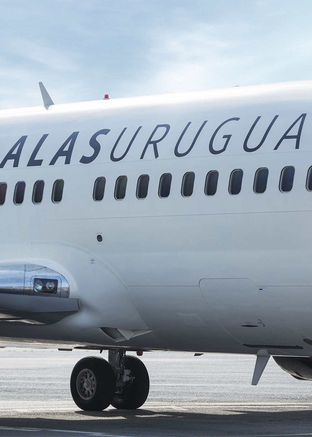
We’re fortunate to be in direct contact with designers from all over South America. At conferences, it used to be common to discuss how regional and national styles manifested themselves typographically. It was a recurring question; there was somehow a feeling that it almost a necessity to be able to identify signs of distinctive, formal identities. Nowadays, as the discipline has matured in the region, we believe that type designers are no longer so concerned with searching for these identities. They simply let them surface. It’s impossible to completely evade one’s own identity. That being said, it’s also true that using national fonts in a project can be a sign of collegiality for many Uruguayan designers, as well as for some of their clients. We’ve been lucky to see it become more common for our fonts to be used in local contexts. It’s even more impressive when they are used in important national projects, like for our country’s airline (Alas Uruguay), or our national identification papers, the Ministry of Public Health, etc.
While TipoType is a team of three, you also publish fonts from external designers. How do you decide who to work with? What makes a design a “TipoType typeface”?
Vicente Lamónaca: TipoType was born to showcase our typefaces, but from the beginning, we also wanted to collaborate with other designers and help them publish their own projects. For example, Fernando designed Brother 1816 together with Ignacio Corbo, and I collaborated with José Perdomo on Económica Next. Increasingly, we’re incorporating other designers into more parts of the process. It is also true that TipoType is seen as the natural font-publishing vehicle for some Uruguayan type designers. We’ve published Gafata Pro from Lautaro Hourcade, as well as three families by Fernanda Núñez (La Paz, Carmencita, and Salinas).
FD: We also collaborate with designers from across Latin American. Rogliano and Aromo are excellent typefaces from the Chilean type designer Rodrigo López Fuentes. We recently published Neftalí, designed by Franco Jonas Hernández, another Chilean designer. Then we also have Agatha, from an Argentine design duo. We want to do what we can to encourage new designers. Establishing our annual TipoType Award helped us expand our network. This year, we’ll make some changes in the run-up to the competition’s fourth iteration. We may use the opportunity to define more clearly which characteristics TipoType fonts should fulfil.
|
|
|
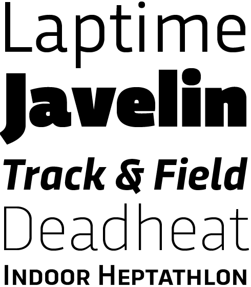
Mariné and Mariné Rounded are related families of geometric sans serif fonts. Despite an underlying geometry, their letterforms retain the softness of calligraphic (or humanistic) strokes. These strokes are virtually monolinear. Their mild amount of contrast, combined with the families’ broad number of font styles, allow the fonts to have a wide array of potential uses. Try the regular and bold styles out in text sizes, and the light and black weights in larger settings. Many of the families’ styles have a separate “Up” fonts available. Wondering what makes these different? In those variants, the letterforms’ calligraphic features have been “turned up” significantly, adding a greater degree of informality to the design.
|
Arazatí is a fresh take on the iconic letters that Edward Johnston designed for the London Underground more than 100 years ago. Johnston’s design may have been the very first of the humanist-style sans serif faces, which have been increasingly popular ever since. Arazatí is not a strict revival of Johnston’s work, but more of an homage. The font family has an astonishing number of variants — 48, to be exact. It is fitting that it was designed by Vicente Lamónaca, a Uruguayan designer, as Johnston himself was born in Arazatí, which is located in San José, Uruguay.
|
|
|
|
|
|
|
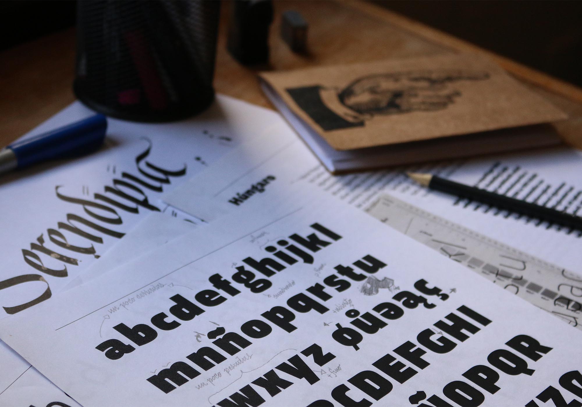
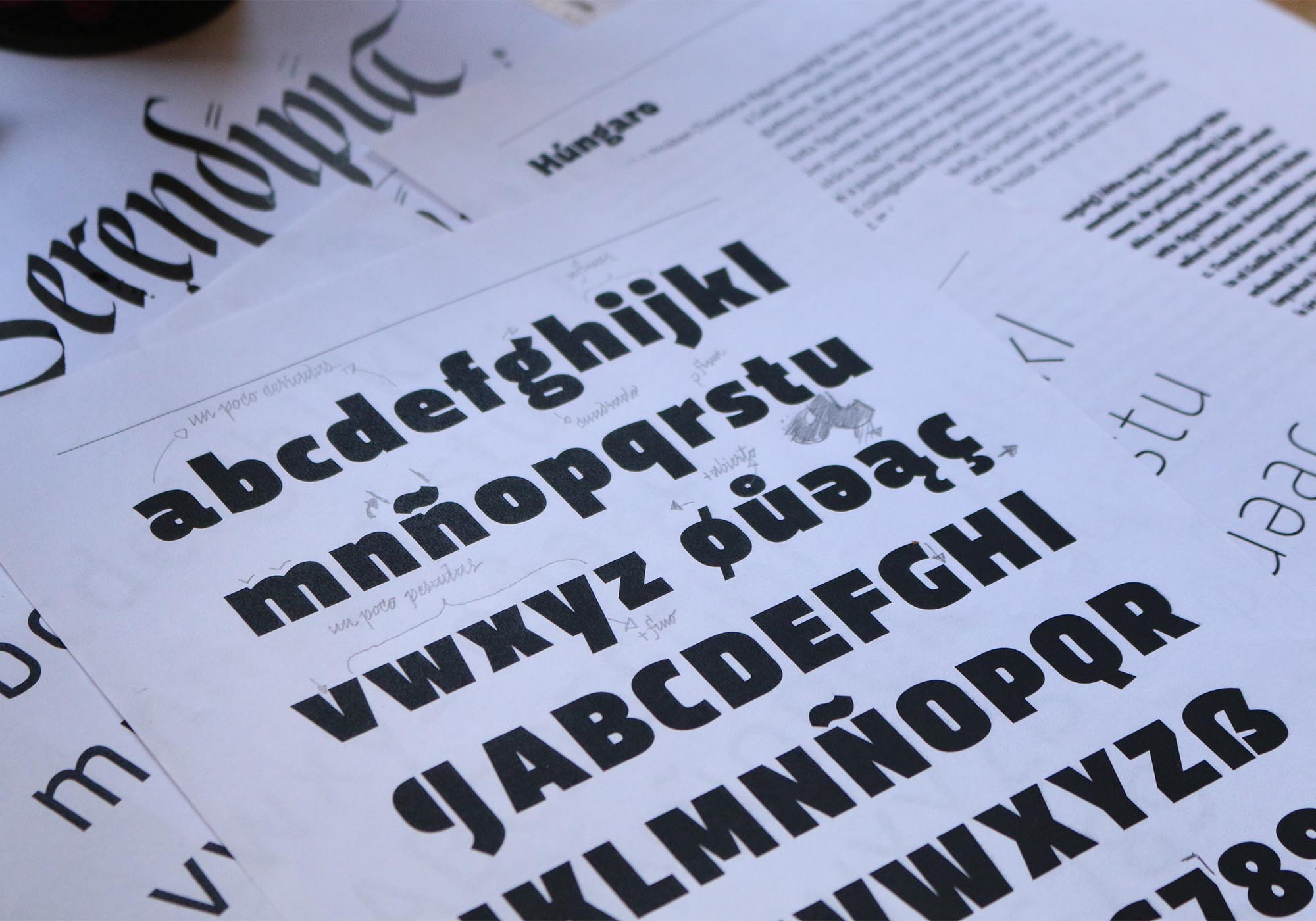
Test print-outs of the Trasandina typeface in progress
|
|
|
Tell us more about the TipoType Award.
VL: This is intended to give emerging type designers an opportunity to publish their work with an established foundry. We had the idea before TipoType was even born, but it was only about four years ago that we felt our foundry was finally mature enough to invite others to participate in a competition like this. We see the award as a way of encouraging graphic designers to become involved in type design. We give them our support, easing them into the world of commercialising and/or distributing their fonts. Our main objective is to make their journey simpler than it was for us. Several very interesting typefaces have emerged from this competition and joined TipoType’s portfolio. One example is Jauría from Pablo Marchant, which is distributed for free.
MS: For us, this project is very satisfying and enriching. Every year, we get more submissions, and these keep getting better, too. The award allows us to meet people from other parts of the world and discover new typographic styles. One of the distinctive aspects of our award, in respect to other competitions, is the potential we see in typefaces that are still “works in progress.” We hope to come across typefaces that — aside from being interesting — present us with an opportunity to contribute something of our own, too.
What about the “olden days”? Before digital design and offset printing, do you know where Uruguayan printers got their metal type from?
FD: Aside from designing type, we try to examine the past and get to know our predecessors’ work; to understand what was made, and how we got here. The history of typography in our country is somewhat unexplored, although our printing history has already been documented. We’re currently investigating Montevideo’s first printers and the items they made. We’re fascinated by history, but we aren’t driven by nostalgia. With a strong understanding of our collective foundation, we’ll be able to build a better future. The first printing press arrived with the British invasion of the River Plate in 1807. “The Southern Star Printing Office” employed movable type from the UK. The Bell typeface, designed by Richard Austin, was used heavily. By the time multiple printers were operating in Uruguay, the majority of them made do with used or recycled equipment. Most printing presses and typefaces were of British, North American, and French origin. There was probably Spanish type, too. Much of this would have been acquired from Argentina and Brazil. We also have local type founding history: between 1817 and 1824, the Ayllón brothers cast the first fonts of movable type here. In 1838, the first Uruguayan typeface catalog was printed at the Imprenta de la Caridad.
Edward Johnston (1872–1944) was born in José de Mayo, Uruguay — to British parents. For many of our readers, he may be the designer from your country that they are familiar with, even though he only lived there for three years. Was that long enough for you feel a connection with him?
VL: It’s true that Johnston lived here from 1872 to 1875. We could try to remark on how important the first years of life are for one’s personality development, or we could even try to find psychological theories that might highlight the importance of Uruguay in Johnston’s life. Realistically, it’s unlikely that our country had an impact on his calligraphic and typographic work. We prefer to look at the question from another standpoint. In our article “El calígrafo criollo,” we wrote that, “Edward Johnston was born in Uruguay. There’s no doubt about that, but we should ask: Was he Uruguayan? Probably not. The important thing that we believe is that he can be Uruguayan. In the future? Yes, in the future. In Latin America, we are building up our typographical history and tradition. For that, letters are not enough. We need people, myths, discussions, and reflections. Can we create typography? Why, and for what purposes do we make it? What do we want to contribute? The figure of Edward Johnston is a flag of Uruguayan typography — a kind of symbol that can spread, and bring us closer to the construction of an identity.”
Johnston’s story serves as a great tool for establishing discussion. For instance, journalists from San José have discovered the house he lived in. We’ve had the opportunity to visit on more than one occasion. The strange feeling that invades your body there is undeniable; you feel certain that you’re standing in a very significant place, where everything started. It is just the truth that this house is in Uruguay, not in another part of the world.
|
|
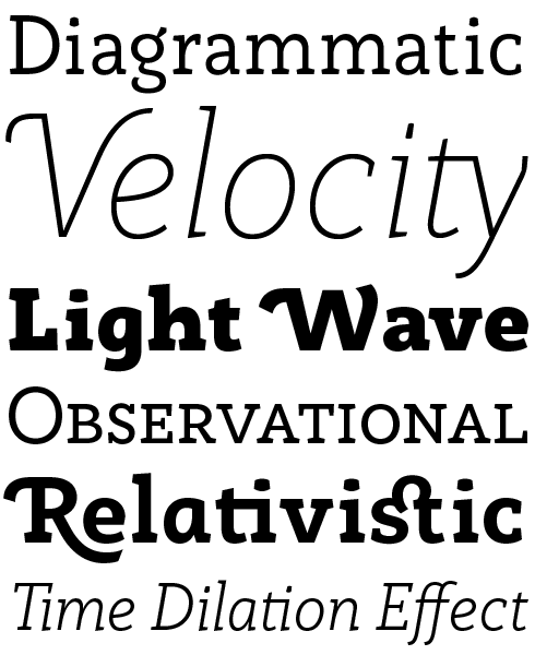
Trasandina is a versatile typeface with personality. Nine weights make up the family. Each weight has an upright and matching italic font available. Fernando Díaz arrived at this incredible range by applying Luc(as) de Groot’s Interpolation Theory in his process; but Trasandina is also so versatile because of its character set’s breadth. Each font has 800+ glyphs, supports over 200 languages and includes several OpenType features, too. Trasandina is easy-to-read in small sizes. In terms of the design language, the family’s middle weights appear quite neutral. The geometric nature of Transandina’s design is more noticeable in the lighter and bolder weights. Those styles come to good use in identity and poster design.
|
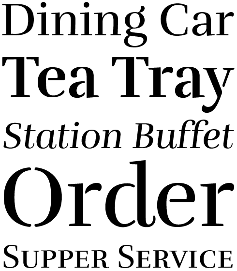
Rufina is a family of elegant serif fonts. While it is primarily intended for text-setting, its companion family — Rufina Stencil — offers designers a refined choice for larger-format typographic projects. Martin Sommaruga designed both of the families by taking a high-contrast, Bodoni-influenced letter structure and combining it with emotive, calligraphic strokes. As a result, text set with Rufina appears quite warm. Although the letterforms are delicate, they still hold up well in small sizes. The glyphs in Rufina Stencil do not feel overly “industrial” in the least, a problem that plagues many stencil-style designs.
|
|
|
|
Since its release last year, Brother 1816 has been very, very popular. Its design isn’t a revival of William Caslon IV’s original sans serif face; rather, it is more like an homage to the last two hundred years of sans typefaces.
FD: That’s right, the goal of Brother 1816 wasn’t to create a faithful revival. Instead, it is a celebration, commemorating the 200th anniversary of sans serif type. Unofficially, it also celebrates the centenary of Edward Johnston’s design for the London Underground. It was also published ten years after Uruguay’s first digital font (Vicente’s pioneer face was also a sans). Even more important than these anniversaries was that Brother 1816 offered an opportunity for me to collaborate with Ignacio Corbo. Besides being one of my best friends, he’s one of the most talented designers and illustrators I know. In mid-2015, I invited him to co-design a typeface with me, and we discovered the advantages of working with four hands. The process was enriching; we were able to combine very structured working methods with the ability to trust our own eyes. It took us completely out of our comfort zones — but in the end, we complemented each other very well.
In the last few years, other type designers have emerged from Montevideo. How does the “type community” there compare with other Latin American cities?
FD: From our point of view, Montevideo has two advantages. The first is its scale — there are over a million inhabitants. The second is a clear desire in the typographic community to join forces. It is possible for all the designers with an interest in typography to just meet in a bar and talk. The discipline in our country is still “novel,” but we also all know one another, to some degree. We’ve been fortunate enough to be in the community since the beginning, and we feel like we are part of a growing movement.
VL: Exactly! One of the benefits of our society is the strong “face to face” tradition. We meet people we didn’t know before all the time in bars. That’s a value we try to keep in our business development, too.
Friends in Buenos Aires tell me that they can get to Montevideo quickly. Do you feel like you are in a sort of dialogue with designers between the two cities? Is there a general graphic design interaction as well?
VL: Besides being geographically very close, Buenos Aires and Montevideo — as well as Argentina and Uruguay, generally — have a common historical background. This dates back to the time both nations were established. The ferry ride from downtown Buenos Aires to downtown Montevideo is just three hours. About ten years ago, the typographic dialog was practically unidirectional; however, we now believe that we have our own design vision today. In many cases, this has even attracted interest from “the other side.”
Do the three of you work with similar methods and processes? Are there analog steps that any of you take at the beginning?
VL: Fortunately, we each have different methods — and sometimes even different goals — when designing type. The good thing is that our methodologies and objectives are often compatible. Martín and I were students at a time when design careers didn’t really include type as a possibility, so we’ve built a system that is sometimes far from the skill-sets learned in academies. When we get together to look at each others’ work, we often wonder, “how did he do that?” But beyond technical or procedural aspects, we also have different conceptions, interests, and knowledge when it comes to type design. For example, I tend to have a more geometric and modular way of working, which can even include automating certain steps.
FD: In most cases, my ideas for creating new typefaces appear to grow out of graphic design work I’m doing. Often, I can’t find the exact typeface I need, and that becomes the seed of something new. This was the case for Libertad, for example — especially its italics — as well as Trasandina, which has a squarish ultra heavy weight. Sometimes, I do market research to understand trends; but in the end, I always end up listening to my instincts.
|
|
Rogliano is a casual slab serif. On the one hand, its design is typified by Industrial-Revolution-era antecedents. Its multiple stylistic alternatives, border glyphs, and other decorative ornaments flirt with styles of lettering that were popular in the lithographic posters of the Victorian era. On the other hand, Rogliano has a contemporary stability to its letterforms. They would not be out of place in branding or editorial design projects; not by any means! The Rogliano family includes seven weights, ranging from Thin to Black. Each weight includes an upright font, as well as an italic.
|
This celebratory typeface commemorates 200 years of sans serif type! A flexible, multifaceted font family, Brother 1816 mixes geometric shapes with humanistic strokes. Each style in the family includes 20+ alternate characters to help generate the right feeling in your work. In fact, the alternates allow you to pick between two flavours of sans serif: Brother 1816’s humanistic flavour is easier to read and more legible in small sizes. It is perfect for branding, editorial design, and signage systems. The geometric flavour has more personality and is therefore better suited for larger sizes. All 32 of the Brother 1816 fonts have also been hinted to increase their readability on screen for use in web design.
|
|
|
|
|
|
|
|
|
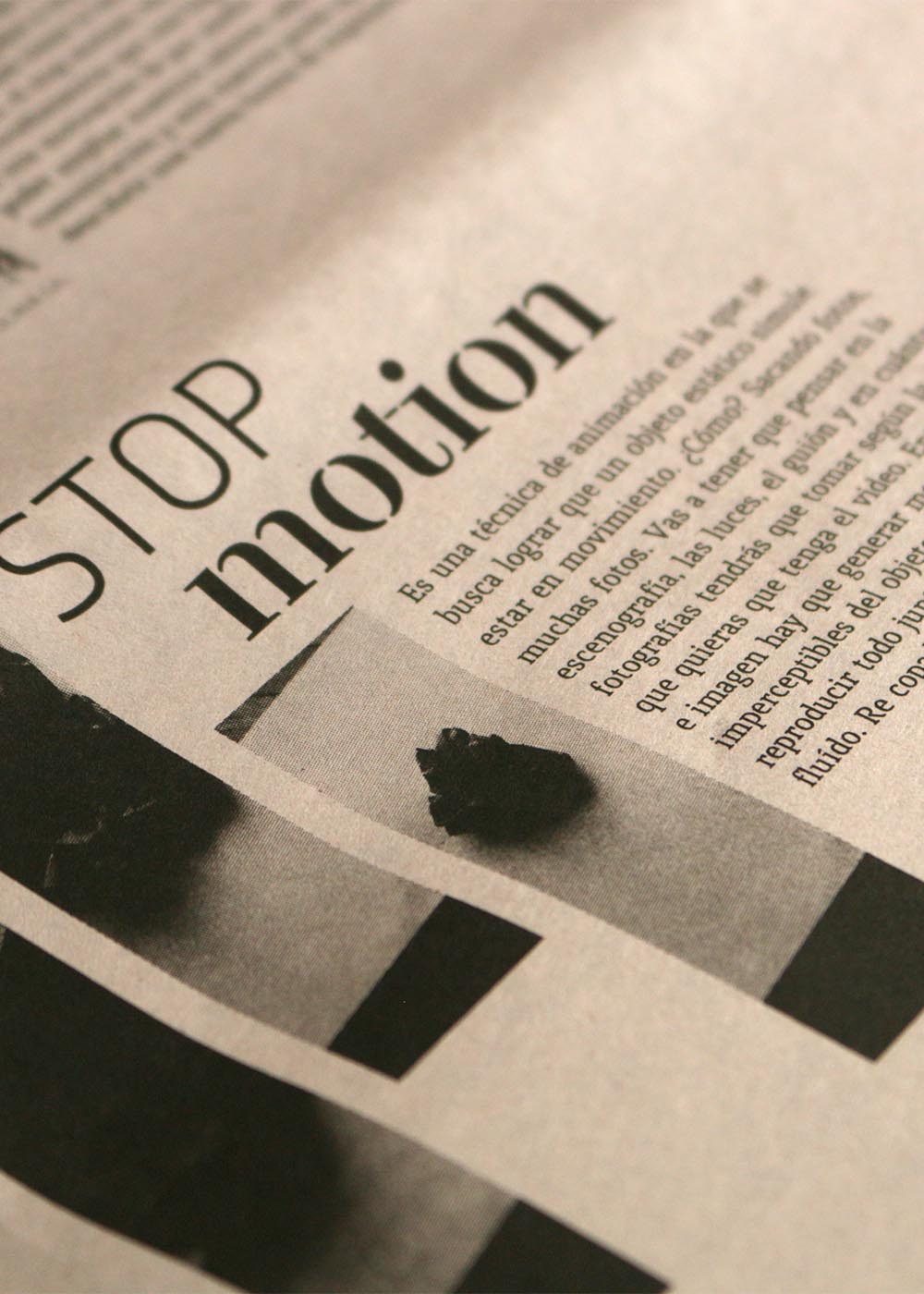
TipoType typefaces are used in Uruguay and throughout the world in a diverse array of projects
|
|
|
Arya is one of my favourite TipoType families; I’m especially fond of Arya Double and Arya Triple — prismatic type is a great genre. Arya is a playful design; do you try to strike a specific balance between serious and playful as your product catalog expands?
VL: Arya was born out of an experiment. It’s part of a trilogy, along with Prevya and Yapa. In these three typefaces, I wanted to yield different results from the same geometric matrix. Arya is modular. While it’s true that there was playfulness in its creation — like when I added in layers and swashes — I always like to test the possibility of achieving different results from a mixture of the same basic pieces. As we’ve mentioned, each of us has a different personality. I feel that Martin and Fernando take more formal paths; their work is more historically accurate and is better documented, too. My way of working is a little freer, because I’m not so much concerned about respecting traditional type design aspects.
Rufina and Rambla are large serif and sans serif font families, respectively. They each seem like they can be used by designers to tackle a wide variety of projects. Did you plan for them to be used together?
MS: Rambla began as a learning exercise in everything that type design involves; it was the first font family I published. It isn’t a response to a specific problem, so at the beginning I did not consider specific premises or objectives — but I did prioritize learning and experimentation. As a reference, I took the fonts that I used the most often, as well as the ones that I liked the most. I decided to design a sans serif because at that time, I thought they were easier to start with. My main goal was for the result to work well in medium-length texts. From the experience I gained with Rambla, Mariné would later be born; I was very honoured when Mariné became a Rising Star on MyFonts.com. For Rufina and Rufina Stencil, my idea was to mix elements of transition and find a point of contact between typography and calligraphy. Rufina has a roman structure with a central axis, but its terminals refer to handwriting tools like the tip of a flexible pen or a brush. While Rambla and Rufina were not intended be used together as a system, several of our clients have done this, with good results.
Finally, I have to ask you about Type&Beer! What is it, exactly? From the name, I like it already; it sounds to me like it combines two of my most-favourite things.
Martin: Type&Beer emerged as a way of blending two interests of mine. Since 2012, I’ve been home brewing. I’ve always told Vicente and Fernando that the process of designing a typeface and the designing/producing of a beer recipe have many things in common. There’s a mix of variables that can lead to an in infinite number of unique results. We planned a workshop where attendees cooked up a beer and then worked on a typographic design piece, like a poster or label design.
Stop right there! You’ve already told me more than enough to want to visit Montevideo. In the mean time, good luck with all of your future type design design projects.
|
|
Arya and Arya Rounded are two families of all-caps display fonts. Their letterforms’ shapes are based on the canon of Ancient Roman capital letters. Each of the families contains three basic styles: thick monolinear single-stroke letters, double-stroke letters, and triple-stroke letters. The styles can be combined with each other on different layers, in order to facilitate chromatic typesetting. The families’ Triple Capsula Black styles are another helpful tool that can be used to quickly design elegant labels and point-of-sale display graphics.
|
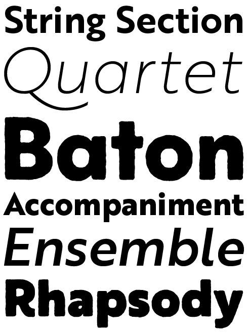
Rambla is a humanist sans serif for medium-length texts, designed by Martin Sommaruga. The family is compact in its size — there are three weights available, each of which has a regular and an italic style. The design of Rambla’s letterforms is slightly condensed. They also feature a generous x-height and short ascender and descenders, too. Indeed, the fonts’ proportions help users save as much horizontal and vertical space as possible. Rambla is elegant when used in large sizes; at the same time, it is also legible when set small, thanks to the rhythm and the quality of its inter-character spacing.
|
|
|
This edition of Creative Characters was edited by Dan Reynolds
Dan Reynolds is an independent designer with a focus on letters: he draws typefaces, builds fonts, writes about typography, and teaches, too. Originally from Baltimore, he’s spent most of his adult life in Germany, living in Berlin since 2009. From 2011 he has been part of the communication design faculty at the Braunschweig University of Art, following seven years at Linotype GmbH — first in the product marketing department, and then in the font development group. He was a co-founder of the Offenbach Typostammtisch; similar type-focussed meet-ups have since opened in Basel, Berlin, Hamburg, Saarbrücken, Stockholm, and Zürich.
|
|
|
|
|
Who would you interview?
Creative Characters is the MyFonts newsletter dedicated to people behind the fonts. Each month, we interview a notable personality from the type world. And we would like you, the reader, to have your say.
Which creative character would you interview if you had the chance? And what would you ask them? Let us know, and your choice may end up in a future edition of this newsletter! Just send an email with your ideas to [email protected].
In now past, we’ve interviewed the likes of
Mika Melvas, The Northern Block, Matthew Carter, Ulrike Wilhelm, Maximiliano Sproviero, Dave Rowland, Crystal Kluge and Steve Matteson. If you’re curious to know which other type designers we’ve already interviewed as part of past Creative Characters newsletters, have a look at the archive.
|
|
|
MyFonts on Facebook, Tumblr, Twitter, Instagram & Pinterest
Your opinions matter to us! Join the MyFonts community on Facebook, Tumblr, Twitter, Instagram and Pinterest — feel free to share your thoughts and read other people’s comments. Plus, get tips, news, interesting links, personal favorites and more from the MyFonts staff.
|
|
|
Colophon
This edition of Creative Characters was guest-edited by Dan Reynolds. Managing editor and designer: Anthony Noel. Editorial assistant: Michael Pieracci. .
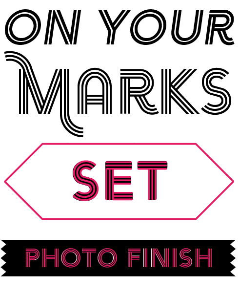
The Creative Characters nameplate is set in Tabac Slab and Rooney; the foundry’s name is set in Trasandina Ultra and Marine UP Light; the quote is set in Rufina Stencil and the large question mark is in Tabac Slab. Body text, for users of supported email clients, is set in the webfont version of Rooney Sans. |
|
Comments?
We’d love to hear from you! Please send any questions or comments about this newsletter to [email protected]
|
|
Subscription info
Get our monthly designer interviews, popular new fonts, the latest trending promotions and free font goodness to your inbox. Sign up here: MyFonts Mailing Lists
|
|
Newsletter archives
Know someone who would be interested in this? Want to see past issues? All MyFonts newsletters (including this one) are available to view online here.
|
|
|
<
|