|
In the early 1990s, Martin Majoor was one of the very first designers to publish fonts through FontFont. Indeed, like Martin, many of the first designers to collaborate with the Berlin-based foundry were from the Netherlands. Born in 1960, Martin has divided his time between his native Arnhem and Warsaw, Poland since 1997. His most recent-typefaces are all part of The Questa Project, a large superfamily of four interrelated designs Martin co-developed with fellow Arnhem-based designer Jos Buivenga. Recently, we asked him about some of the details behind The Questa Project, as well as his earlier work.
|
|
|
|
|
Martin, The Questa Project is comprised of four different font families: Questa Serif, Questa Sans, Questa Slab, and Questa Grande. What brought you and Jos together to create this series in the first place?
In the early 1980s, both Jos and I studied at the School of Fine Arts in Arnhem. Back then, we would occasionally run into each other in the hallways or at parties. After graduation, we did not meet again in person until 2009, when the Fachhochschule Dortmund organized a conference called “33 pt.” Both Jos and I had been invited to the conference as speakers. After the event, we visited each other in Arnhem. We had a few beers and decided to collaborate on a typeface. That’s how The Questa Project got started.
When you design type, do your working methods differ from Jos’s?
Since we have been working together for more than six years, I think you can say that our working methods have become more similar. This is not so strange, considering the complexity of the workflow in something as large as The Questa Project. Before I worked with Jos, I spent much time and effort in manually justifying and kerning my fonts. I learned a lot from this, but at the same time, it was quite time-consuming. Jos had good experiences working with Igino Marini, who has a service for spacing and kerning called iKern. This uses special software that Igino has developed himself. When I saw the first iKerned results for Questa, I was immediately convinced by iKern’s quality. I wouldn’t kern a whole typeface myself anymore. When it comes to sketching on paper, both Jos and I have abandoned that step almost entirely, too. Nevertheless, I still would recommend that young type designers who are first starting out should begin with just pencil and paper for their initial sketches.
What about the name? Does “Questa” have a particular meaning? Was the project something of a quest, even?
Questa was a name that Jos had already come up with, before we started collaborating. He had used it for an unfinished display typeface, which we eventually based The Questa Project on. I think one of the most difficult aspects of type design is coming up with a good and catchy name. So I was quite happy I didn’t have to worry about this here!
Before designing The Questa Project typefaces with Jos, had you collaborated with another type designer on a typeface before?
I am quite a solitary person when it comes to type design. Questa was the first typeface I designed by collaborating with someone on a 50/50 basis. In 1994, I designed a custom typeface called Telefont for the Dutch telephone book. It was a crazy three-month project. The advice and help I got from my colleague and buddy Fred Smeijers was absolutely invaluable. I couldn’t have finished the project in such a short time without him. So you surely could call that a collaboration.
Another one was the FF Seria Arabic typeface, which I developed together with Pascal Zoghbi, a great type designer from Lebanon. The FF Seria Arabic fonts were not a real “collaboration,” though; Pascal, as a native speaker and reader of Arabic, did all the design work. I merely delivered some basic shapes for the Arabic characters.
You made your first typeface, the unpublished Serré, while your were still a rather young designer. A few years later, your first serif family, FF Scala — was published by FontFont. I believe it was the library’s very first serif text face? You later adapted FF Scala Bold for the signage in the Muziekcentrum Vredenburg. Is FF Scala something like the “Urform” behind all of your serif designs?
Serré was designed in 1983, while I was still studying in Arnhem. In 1986, my graduation project was to make a digitized version, with Peter Karow at URW in Hamburg. He invented the Ikarus system, which could be used to digitise typefaces by creating vector outlines for each letter — really the first application that could do that. He had offered me the opportunity to work on Ikarus stations from the early in the evening until early in the morning. It was my very first encounter with computers, and during the presentation at my graduate show, my old teachers were convinced that this computer thing was only a hype that would soon blow over.
I didn’t release Serré, though. I didn’t know how to go about doing something like that back then. Also, I was more busy with book design at the time. When I designed the FF Scala typeface, I took certain elements from Serré, improved upon them and fine-tuned them. There are a lot of similarities between Serré and FF Scala; you could ascribe it to the DNA of a type designer. I wouldn’t call FF Scala the “Urform” behind my typefaces though, but it was the first typeface that I dared to release. Originally, I designed FF Scala for the signage system of the Vredenburg Concerthall in Utrecht, but I took too long with it. So in the end, they actually used another typeface for that project. It turned out that FF Scala could still be used for Vredenburg’s printed matter — which was lucky for me. Much later, an adapted version of the FF Scala Bold font would be used for the signage after all.
|
|
|

When the FF Scala® typeface was released in 1991, it was the very first serious text face in the FontFont® library. In 1993, Martin followed that up by releasing the incredibly successful FF Scala® Sans type family. Back then, it was one of the few sans serif designs to have a “real” italic; normally, sans serif fonts had sloped roman, or oblique companions. Today, the FF Scala® and FF Scala® Sans fonts continue to be customer favorites, and their spare but readable style is prized by book designers all over the world. The idea to create a serif, humanistic typeface from which a sans serif version can be derived — is what Martin calls the “two typefaces, one form” principle, and it became the basis of his type design philosophy. Most of the other fonts discussed in this newsletter are part of larger systems or “superfamilies” that include two, three, or four related-typefaces.
|

As a book designer himself, Martin often had difficulty with the FF Scala® fonts because of their short ascenders and descenders. In his judgement, these gave the text on the page a “stubby” look, which was inappropriate for literary works, or for poetry. The FF Seria® design solved this with its extremely long ascenders and descenders, and very fine detailing. Because of the popularity of the FF Scala® and FF Scala® Sans designs being two typefaces based on a common form, Martin reprised the tactic when he designed the FF Seria® and FF Seria® Sans fonts. A combined serif and sans serif superfamily based on a single concept has proven to be highly desirable in corporate and newspaper design projects, too. The letters in the FF Seria® and FF Seria® Sans families’ italics are almost entirely upright, as you can see above. The design has crossed many lingual borders, too: in 2009, an Arabic version was added. FF Seria® Arabic was developed by the Lebanese designer Pascal Zoghbi.
|
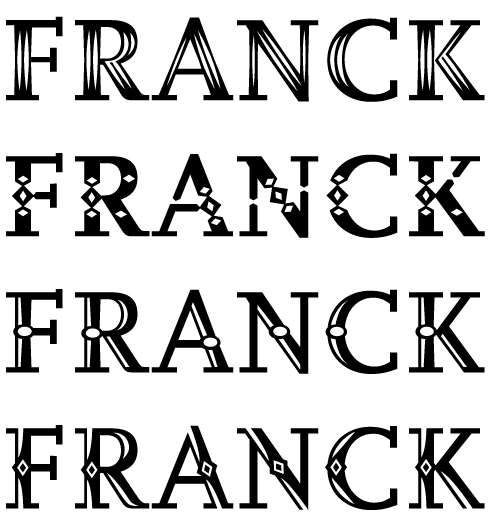
The FF Scala® Jewel family is a set of four decorated typefaces. Each member of the family features a unique decorative element in the design of its letterforms. The different elements are referenced in the various fonts’ names: Crystal, Diamond, Pearl, and Saphyr.
|
|
|
|
|
|
|
|
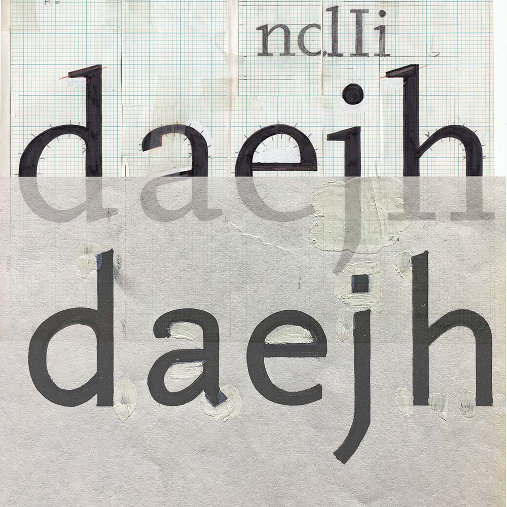
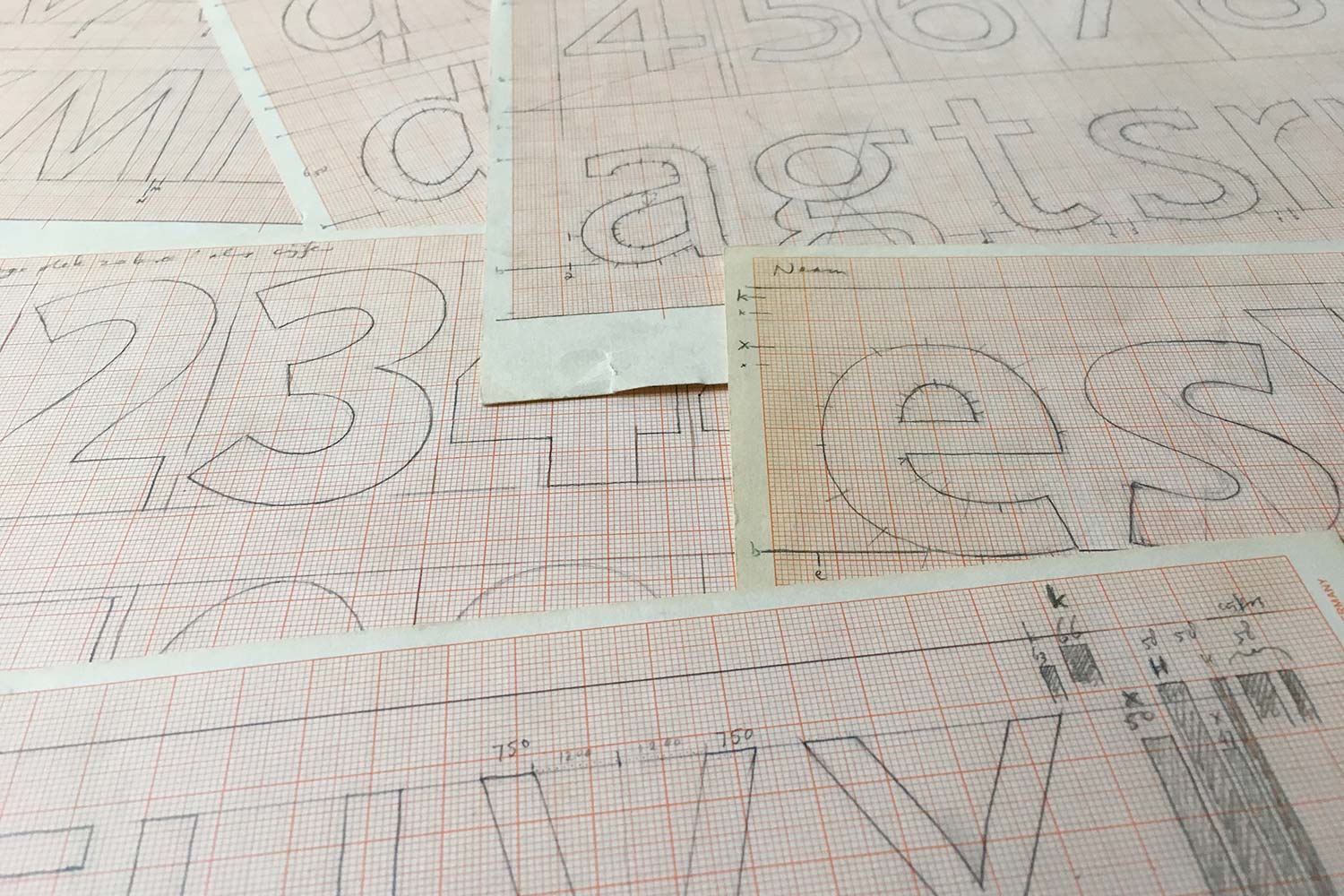
Left and centre: Sketches and development work for Scala, ca 1988. Right: Production sketches for Telefont from 1993
|
|
|
FF Scala Sans was designed after the serif, correct? I’ve always viewed the FF Scala and FF Scala Sans type families as part of the first generation-or-so of digital designs to offer matching sans and serif versions. While this wasn’t the very first typeface to do so, it was the first that I learned about as an art student in the ’90s!
The combination of FF Scala and FF Scala Sans came at the right moment in time. Typefaces like the Lucida font (1985), ITC Stone (1987) or Rotis (1989) all had a serif and a sans, but none of these families offered the full typographical “bookish” features, like small caps, old style figures, and ligatures. FF Scala Sans even became the first typeface to ever offer small caps in the italics. Together with Fred Smeijers, who designed the FF Quadraat families at the same time I made the FF Scala and FF Scala Sans typefaces, we were bringing back the lost typographical features into the first digital typefaces. We felt like we were like Goodwill Ambassadors for Excellent Typography. Both FF Quadraat and FF Scala are nowadays considered “digital classics.”
Your subsequent commercial typefaces, like FF Seria, FF Nexus, and The Questa Project, were all released as superfamilies: they have at least two matching kinds of typefaces within their systems. Do you think that all of your future typefaces will be as systematic, or might you ever go back to designs with narrower palettes?
When designing a sans serif it is my conviction that it is more easy and more logical to derive this from a seriffed typeface. This doesn’t mean you cannot design a sans from scratch, it is just easier to base it upon a seriffed version. Right now I am designing a new typeface, a seriffed one. But already at an early stage of the design process I experiment with sans shapes that I derive from the serif. I can always decide NOT to make the sans, but the basis is there anyway. When it comes to custom-designed typefaces I look what the company needs. These are often typeface with a more narrow palette.
The ascenders and descenders of the letters in both FF Seria and FF Seria Sans are available in two different lengths: long and short. How do designers go about using these different versions? Which get put into what kinds of typography?
The ascenders and descenders of the FF Seria and FF Seria Sans designs are quite long. It had been my plan to make another version of those typefaces with shorter ascenders and descenders, much in the spirit of Bram de Does’ Trinité; however, when I was making the first trials for that, I discovered that I wanted to change so many other things that I decided to turn my version with shorter ascenders and descenders into a new typeface instead. Four years later, this became FF Nexus. The FF Nexus families have shorter ascenders and descenders, and their x-height is exactly 125% larger than that in FF Seria. If you would like to combine FF Seria and FF Nexus, you could set FF Nexus at 10 pt together with FF Seria at 12.5 pt, but I don’t know if there are designers who have actually combined the families in this way. For most graphic designers, the FF Seria fonts are difficult to use; they often don’t understand that the size they are using should be larger than expected. One typographer who did understand this very well was Robert Bringhurst, who used FF Seria in a perfect way in his book Carving the Elements.
The italics in FF Seria and FF Seria Sans are upright italics. To me, in fact, the italics of all your designs seem more lively than those from a great many other typeface families of the digital age. I think this is especially true for the italics accompanying your sans serifs. Why don’t you just slant the italic letters in your sans serif designs?
Historically, italics have had different constructions than the roman letter did. It all has to do with how the letter shapes were originally written with broad-nibbed pens. When writing italic characters, the pen is continuously moving; it never leaves the paper. You push it and pull it along. In doing so, the shapes you write often get slanted, but this is not necessarily a requirement. In the italic styles of FF Seria and FF Seria Sans, I used this knowledge to make an almost-upright italic, but still they are “real” italics in the sense of their construction. Since I always derive my sans serif shapes from the seriffed ones, the italic sans serifs also follows the construction of the seriffed typefaces. Therefore, the italics in my sans serif typefaces are never slanted romans or “obliques.”
Unlike FF Scala and FF Seria, which each have companion sans serif families available, the FF Nexus design has FF Nexus Serif, FF Nexus Sans, and FF Nexus Mix. What kind of design does FF Nexus Mix embody?
The suffix “Mix” is maybe a bit confusing, I probably should have called them “Slab.” After having derived a sans from the serif, it is a small step to derive a slab serif version from the sans again. I attached serifs back onto the sans serif letters; however, the shapes of those serifs were drawn in the same spirit, and with the same low contrast as the base sans serif letterforms. So the FF Nexus Mix type family is a true slab serif design.
|
|

Martin expanded on his type design philosophy with the FF Nexus® Serif, FF Nexus® Sans, and FF Nexus® Mix typefaces: instead of just two themes, this superfamily has three typefaces, all based on the same formal principle. The FF Nexus® Serif design is a serious text face, with features like small caps, ligatures, oldstyle figures, and fractions. Its proportions lend themselves to a wide range of design applications, from weekly magazines and scientific books to logos and posters. The sans serif FF Nexus® Sans design is derived directly from the serif, just like the FF Scala® and FF Scala® Sans typefaces, or the FF Seria® and FF Seria® Sans type families. All of the serious text-typeface features that are present in the FF Nexus® Serif fonts can also be found in the FF Nexus® Sans design, making it into the ideal partner, and enabling the two typefaces to be combined intelligently.
|
The FF Nexus® Mix family was derived directly from FF Nexus® Sans design. It is quite a humanistic slab serif typeface, whose design is in the same strain as the PMN Caecilia® typeface. The fact that the FF Nexus® Mix fonts can be combined effortlessly with the sans and with the serif makes it a very useful addition to the versatile superfamily.
|
|
|
|
FF Nexus also has monospaced typewriter fonts. Those seem to have been quite a type design trend for a while, both in the late-90s and the aughts. Do you know if those were used as often as the proportionally-spaced FF Nexus fonts?
I have seen the FF Nexus Typewriter fonts being used in smart ways, but mostly to express a sense of temporariness. A good example is the Bielefeld Bible that was designed at the University of Bielefeld. The different sorts of texts in the bible (stories, chronicles, hymns, psalms, letters) are all treated in a different typography. All versions of FF Nexus (FF Nexus Serif, FF Nexus Sans, and the slab-seriffed FF Nexus Mix are used in that project. For the Epistles and Letters, FF Nexus Typewriter version is used.
I’ve spent much of the last few years looking at 19th-century type, and I must say that I’m fascinated by your theory that the proportions of late-19th-century German grotesks might be based on earlier serif faces like Walbaum Are there any historical models that are particularly influential for you when you work?
In the case of FF Scala, I was influenced not only by my writing with a broad-nibbed pen, but also by historic typefaces like Bembo. This makes the FF Scala typeface a “humanistic” design, and at the same time it makes FF Scala Sans humanistic, too. That was quite rare at the time, because most sans serifs before FF Scala Sans had neoclassical appearances.
In the case of Questa, the historical model was along the lines of Didot, Bodoni, and Walbaum — typical neoclassical typefaces. The sans serif version of Questa was literally a serif version where the hairline serifs had been cut off, and where the contrast between horizontal and vertical strokes had been equalized. We didn’t want to make it nicer than it was. What came out looks very much like a late-19th-century German grotesk, the sort of typeface that later revived in typefaces like Helvetica. With Questa, we have tried to re-create the historical path that most of the first sans serif designs might have followed.
FF Scala Jewel is your only display typeface published to date, right? Would you say that you are more interested in text-face design than decorative type?
You might say that, yes. It probably has to do with my background as book typographer. Before I designed typefaces, I was a book designer — something I have always considered as an essential starting point for my career as a type designer. If you don’t know how to use type, how can you design it? It is fascinating for me to design a text face that is detailed enough to also be used as a decorative face. The other way around is not possible, display faces can never be used as text-faces. I am not excluding the possibility of designing a decorative typeface from scratch: for me, designing the FF Scala Jewel types was like playing around with different ornamental details. Two of the four versions were based on historical decorative typefaces, and the other two were more personal. In any case, it gave me lots of pleasure.
A few weeks ago, you gave a lecture at a design conference in Amiens on Telefont, a typeface you designed for Dutch telephone books. This was a sans serif and it went into use about a year after FF Scala Sans was published. Has Telefont had any influence on your later type designs?
The Telefont design had some very specific needs and features. It was developed to be used in very small sizes. At the same time, it had to allow for minimal space between the lines, and it had to be suitable for extremely fast rotary-offset printing on cheap paper. As a result, Telefont has short ascenders and descenders, a large x-height, and open counters. In Telefont, you can probably find my type design DNA, especially in the italics. Every typeface I make is influenced by my previous work. Design is a continuous learning process, and I am always trying to improve myself, correcting my many mistakes.
|
|

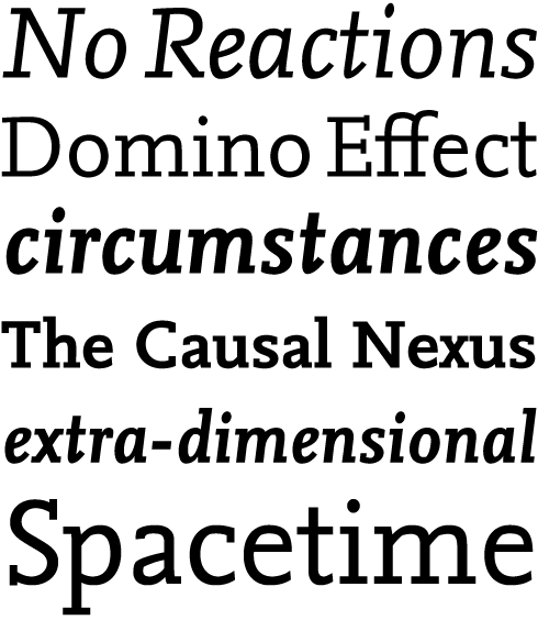
The Questa Grande typeface is a display design that is directly based on its text-sized companion, Questa Serif. Where the Questa Serif design has an almost workhorse-like quality, Questa Grande is more elegant and refined in its details. The robust unbracketed serifs found in Questa Serif, the text typeface, have been replaced by thin hairline serifs. In the text-optimised Questa Serif fonts, the weight of both the serifs and the thin strokes increases incrementally as the family’s weights get heavier. These are thinner in Questa Serif Light than in Questa Serif Black. In all five weights of Questa Grande, however, the thin parts retain exactly the same stroke-thickness.
|

The Questa Sans letterforms are based on those seen in Questa Serif, above. This means that Questa Sans can be perfectly combined with the Questa Serif and Questa Grande fonts, or with Questa Slab. Nowadays, slab serifs are seen as welcome — and often necessary — additions to superfamilies with serif and sans serif versions. Questa Slab is directly based on Questa Sans, often just with attached thick bracketed serifs. Whereas the lowercase characters of the upright fonts simply have those thick bracketed serifs attached, in the Questa Slab italic fonts, the serifs are treated in a different manner: rather than attaching straight bracketed serifs everywhere, the bottom serifs of the lowercase italics are more like “bended stems.” This feature makes the whole appearance of Questa Slab Italic rounder and more friendly-looking, something rarely associate with slab serif type.
|
|
|
|
Finally, I’ll close with a question from your friend Jan Middendorp, who used to coordinate the Creative Characters interview series. Jan is curious about your relationship with music. Do you think that music has a strong relationship to type design?
I have had discussions with Jan about the relationship between music and design, comparing traditional, classic, and modernist values and influences. Modernism, in both music and in design, is a movement that started by radically rejecting traditional values. In the beginning, this made sense — in a way. But now, a hundred years later, it has become an extremely dogmatic movement. Composers and designers calling themselves Modernists hide behind grids and mathematical rules. Even without talent it is easy to be a Modernist. I am not a modernist. I believe in tradition. Robin Kinross once described me as being a Modern Traditionalist (as opposed to a Traditional Modernist). He meant that I try to preserve the traditional values, and use them to develop a modern view on type design, without being dogmatic. It is like handing over your own mistakes to yourself, in order to improve the world of type. I will never say: Let’s keep it this way. I’d rather say: Let’s move on!
Thank you, Martin! We look forward to seeing the typefaces you’re working on, once they are finished up and published.
|
|
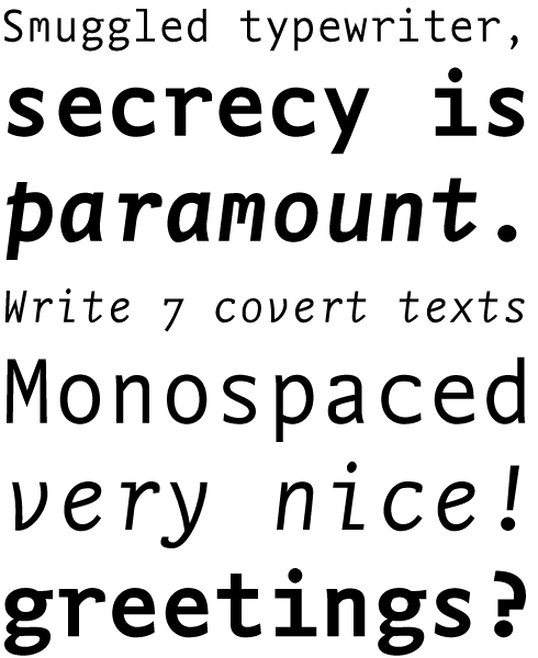
The monospaced FF Nexus Typewriter type family comes in Regular, Italic, Bold, and Bold Italic styles. All four fonts offer a choice between oldstyle figures and lining figures. The color of the FF Nexus Typewriter design looks more even in text than in other monospaced fonts. Characters such as the “m” and “w” often get clotted up because of the small spaces they have to inhabit. In the FF Nexus Typewriter fonts, the “m” has a special design: its middle bar is shortened, in order to give it a lighter feeling. For the same reason, the “i” has long serifs; those help it match the color of the other characters better.
|
|
|
This edition of Creative Characters was edited by Dan Reynolds
Dan Reynolds is an independent designer with a focus on letters: he draws typefaces, builds fonts, writes about typography, and teaches, too. Originally from Baltimore, he’s spent most of his adult life in Germany, living in Berlin since 2009. From 2011 he has been part of the communication design faculty at the Braunschweig University of Art, following seven years at Linotype GmbH — first in the product marketing department, and then in the font development group. He was a co-founder of the Offenbach Typostammtisch; similar type-focussed meet-ups have since opened in Basel, Berlin, Hamburg, Saarbrücken, Stockholm, and Zürich.
|
|
|
|
|
Who would you interview?
Creative Characters is the MyFonts newsletter dedicated to people behind the fonts. Each month, we interview a notable personality from the type world. And we would like you, the reader, to have your say.
Which creative character would you interview if you had the chance? And what would you ask them? Let us know, and your choice may end up in a future edition of this newsletter! Just send an email with your ideas to [email protected].
In now past, we’ve interviewed the likes of
Mika Melvas, The Northern Block, Matthew Carter, Ulrike Wilhelm, Maximiliano Sproviero, Dave Rowland, Crystal Kluge and Steve Matteson. If you’re curious to know which other type designers we’ve already interviewed as part of past Creative Characters newsletters, have a look at the archive.
|
|
|
MyFonts on Facebook, Tumblr, Twitter, Instagram & Pinterest
Your opinions matter to us! Join the MyFonts community on Facebook, Tumblr, Twitter, Instagram and Pinterest — feel free to share your thoughts and read other people’s comments. Plus, get tips, news, interesting links, personal favorites and more from the MyFonts staff.
|
|
|
|
|
Comments?
We’d love to hear from you! Please send any questions or comments about this newsletter to [email protected]
|
|
Subscription info
Get our monthly designer interviews, popular new fonts, the latest trending promotions and free font goodness to your inbox. Sign up here: MyFonts Mailing Lists
|
|
Newsletter archives
Know someone who would be interested in this? Want to see past issues? All MyFonts newsletters (including this one) are available to view online here.
|
|
|
|