|
Typography. Lettering. Type design. Illustration. These are just a few of the skills that are constantly incorporated into the work of designer Scott Biersack. Whether seen in his colossal typographic chalk murals, digital typefaces, identity designs, or even skateboard illustrations, Scott’s work has a spirit of fearlessness — and an unmistakable tactile quality in which type takes the lead.
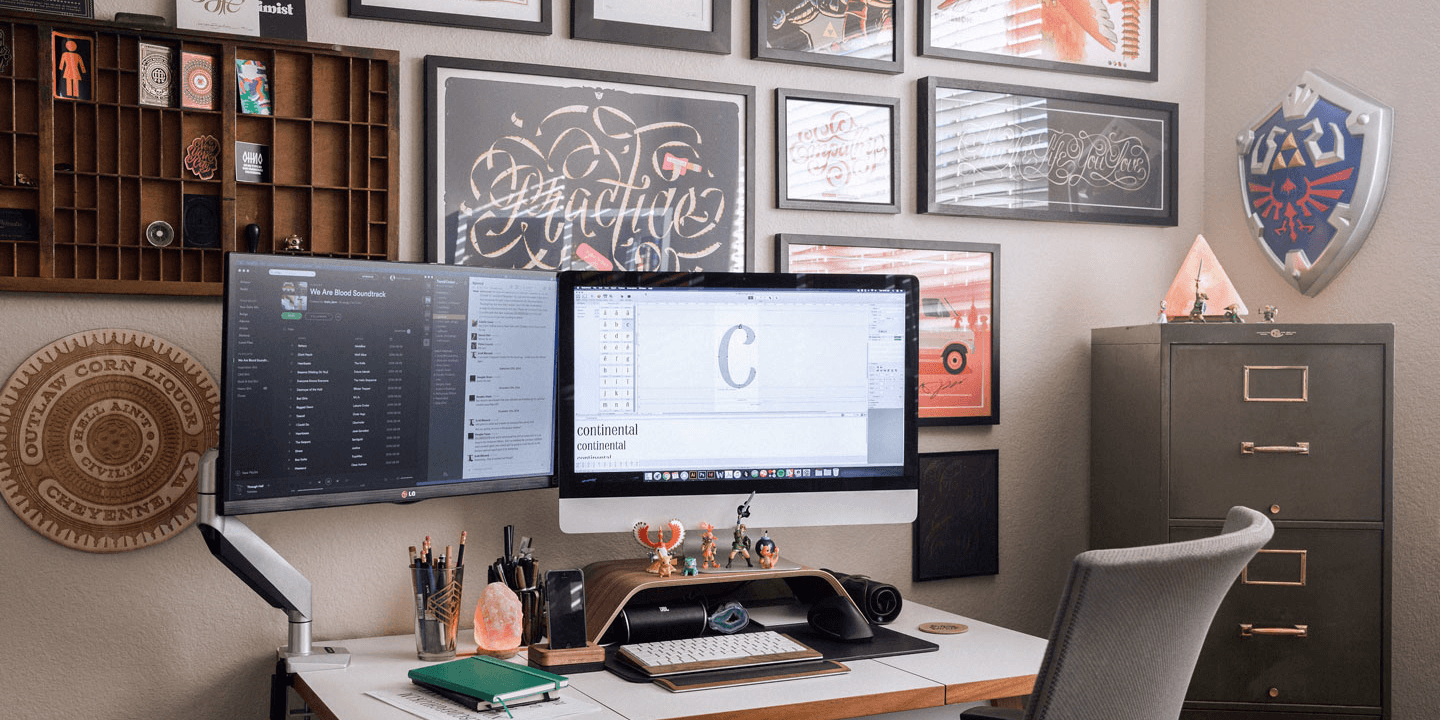
A graduate of Arizona State University, Scott further honed his typographic prowess as a student in the Extended [email protected] program. Now a full-time freelance designer based once again out of Phoenix, Arizona, Scott shares with us some insights into his design process, and five of his most-trusted typefaces.
|
|
|
|
Scott’s Type Recommendations
|
|
|
|
|
INDUSTRY
Typeface family of 16 weights
|
| |
|
|
|
|
|
“Mattox always creates top-notch typefaces and Industry does not disappoint. Perfect for that bold futuristic look with the geometric forms and lovely angled counterforms. A great typeface to set nice and tight due to its vertical nature, along with the short ascenders and descenders. There’s a huge attention to detail in every character in this set. Lots of optical adjustments to make it that much more successful.”
|
|
|
|
ITC BARCELONA™
Typeface family of 18 weights
|
| |
|
|
|
|
|
“I might be a little biased because I’m using this typeface for my personal branding, but the ITC Barcelona type family is a beaut. I’m a sucker for a tall x-height, short ascenders and descenders and brush-like terminals. My favorite characters being the lowercase ‘k’ and ‘g’ — really lovely forms! There are a wide variety of weights to let you set this type in numerous ways and numerous sizes for display and text.”
|
|
|
|
FF META® SERIF
Typeface family of 12 weights
|
| |
|
|
|
|
|
“The sharpness in the Meta Serif type collection and its lovely italic forms really caught my eye. Absolutely love the lowercase ‘y’ and the overall calligraphic nature the typeface portrays. This monster of a typeface has 12 weights so you can really put it to work for nearly anything you can think of. And! It’s part of a super family which means you can really put it to work with its sans and headline families. You can’t go wrong with the Meta Serif Extra Bold design!”
|
|
|
|
ITC QUAY SANS®
Typeface family of 6 weights
|
| |
|
|
|
|
|
“This typeface is very unique in its nature due to the incredibly subtle flares on the ends of the terminals. Those subtleties bring it to the next level. It’s an excellent typeface that fits into the realm of a sans serif, but still doesn’t feel too similar to others like it. With its open counterforms and somewhat high x-height, it’s incredibly readable at nearly any size.”
|
|
|
|
AHKIO
Typeface family of 5 weights
|
| |
|
|
|
|
|
“Mika is another excellent type designer with a huge attention to detail. I particularly love the Ahkio design because it’s not like most brush script typefaces out there. That’s the thing really; it’s not even a script. Each letter is disconnected, while still giving it that brush characteristic. A very natural and rounded type of brush typeface that’s perfect for headlines. Most definitely needs to be used for some Hawaiian inspired artwork!”
|
|
|
|
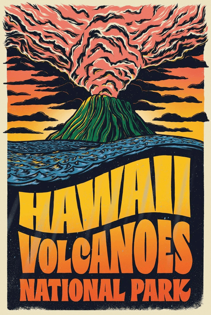
“I had a blast being able to get back to my illustration roots with this project and draw directly on screen. This poster was designed for the Type Hike — a couple of wonderful dudes that gathered a group of awesome designers to create posters of America’s national parks. These posters & postcards were sold, and 100% of the profits go directly to our parks for yet another spectacular century.”
|
|
|
|
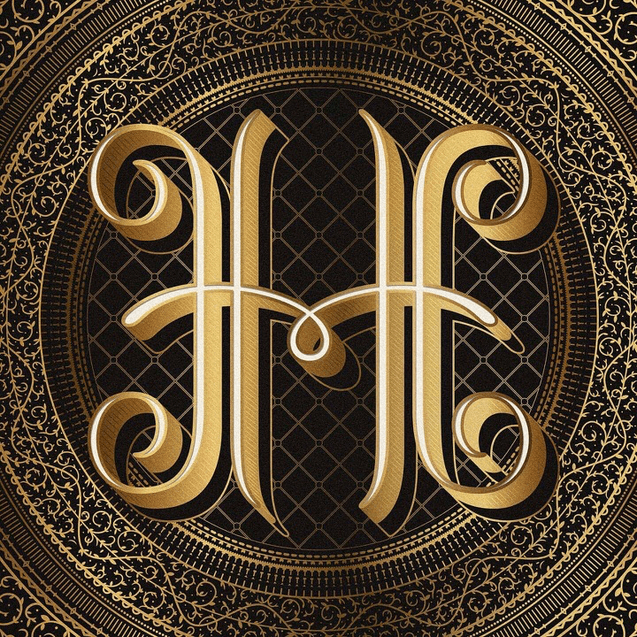
“Whenever I have creative freedom with a project, I tend to go a bit overboard. With this project, that definitely was the case. Created for the notorious Type Fight (an online typographic duel), I went head to head with the brilliant, Jennet Liaw. By the way, she destroyed me. Because hers was seriously, so awesome.”
|
|
|
|
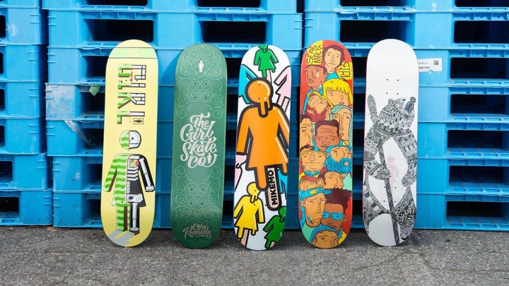
“This project was, and probably always will be, my favorite project. Nothing can ever top the amazing experience I had creating this artwork. Adobe and Girl Skateboards were looking for five talented students to intern at Girl HQ and create their next line of boards. So, four others and myself were selected from around the globe to work on the next limited edition line of decks for Girl. My buddy Caleb and I were selected to take part in a two-day on-site “internship” at the Girl HQ in Torrance, CA. We got to hang with the Girl design team, explore the warehouse (which has a skate park in it, of course), and so much more. It was a dream.”
|
|
|
|
|
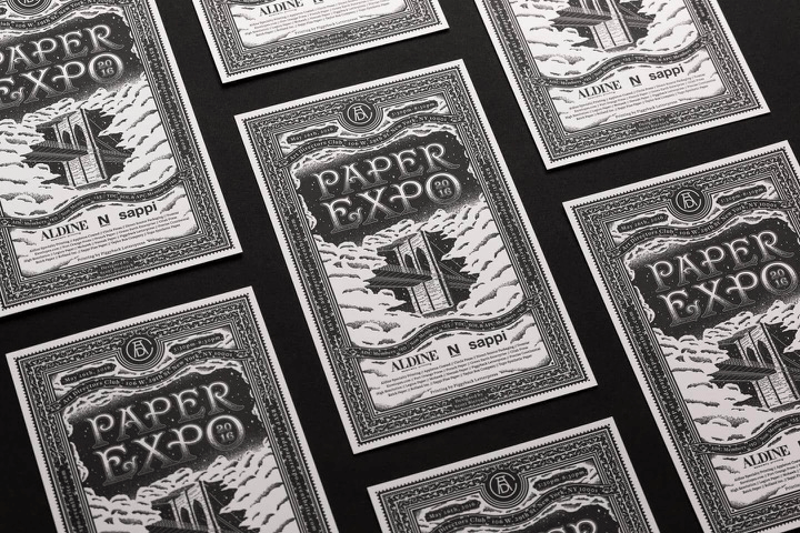
“You know when I mentioned I go a little overboard when given creative freedom? That seems to be a reoccurring theme for me! The same happened here with this Paper Expo invite. Each year the Art Director’s Club hosts the annual Paper Expo, which is a great opportunity for professionals to meet with leading paper manufacturers and printers. I wanted to create an invite that won’t just be mailed to people, but will hopefully be kept for years to come because it’s too nice to throw away! Many, many hours were spent on this bad boy, but I loved every second of it!”
|
|
|
|
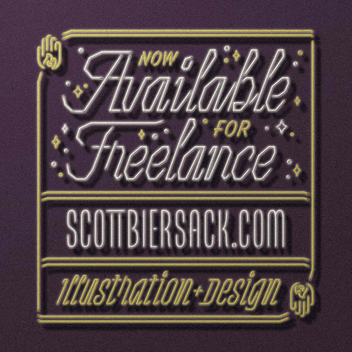
“As a freelancer, sometimes things get slow and you don’t work for 3 months. But, that’s the freelance life! It’s a nice time to explore different things, work on those passion projects, and hey, maybe advertise that you’re available for work. Just sayin’ I’m available and ready to make more cool stuff!”
|
|
|
|
|
|
“It may be obvious to some, but when I found out this trick, it saved me so much time! In Adobe Illustrator, with your type selected, you can hold down the Option key on Mac (Alt for PC) and hit the left/right arrow keys to quickly adjust your letterspacing! With one press of the arrow key, you’ll go up/down in increments of 20. If you hold down Command + Option (Ctrl + Alt on PC), you can nudge the letterspacing in increments of 100. It gets better. With your type selected and Option held down, pressing the arrow keys up/down will easily edit your leading (space between lines). This will edit your leading in increments of 2. But, with Command + Option held down, you’ll edit in increments of 10. It’s amazing and saves an enormous amount of time when laying out type.”
|
|
|
|
Find Scott on Dribbble, Instagram and the Web
|
|
|
|
|
We want to know what you think
|
|
|
|
|
Get in touch at [email protected] and tell us what you think of this new series highlighting the type habits of graphic designers and font addicts just like you. Want to share your Favorite Five with us and the rest of the world? We’re looking forward to hearing from you!
|
|
|
|