|
Alana Louise understands type, and isn’t afraid to wield it masterfully. A 2010 graduate of Savannah College of Art and Design, Alana’s design work is expressive, and encompasses a breadth of visual voices — some projects lean on clean, geometrically driven composition, while others employ the power of raw, hand-drawn illustrative forms.
A designer at Helms Workshop in Austin, TX, Alana’s work — including identity and packaging work for breweries and eateries — showcases a keen sensitivity to typographic pairings and hierarchy.
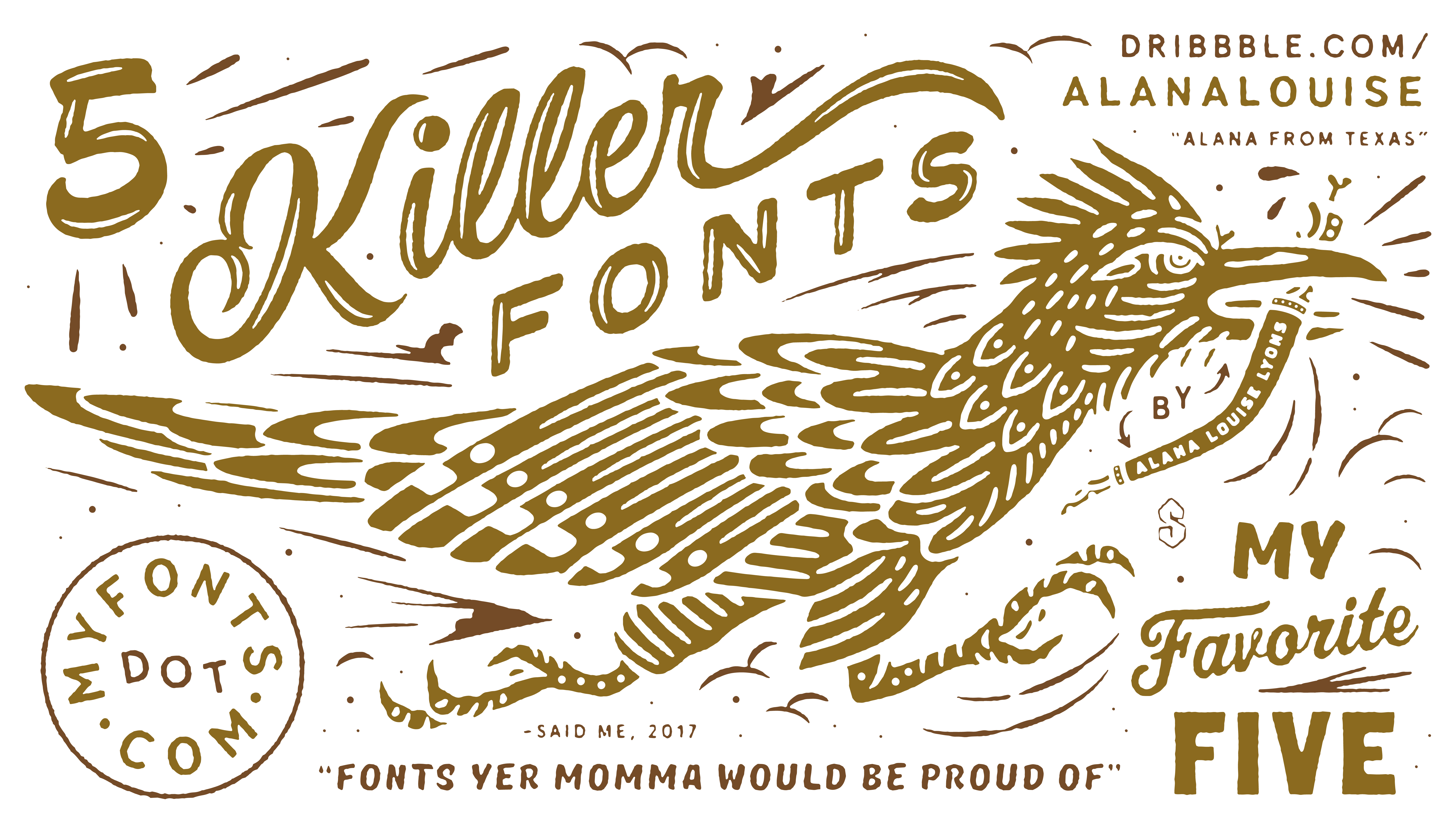
While off the clock, she’s also one half of the The Good Folks Co., a creative partnership with Chicago-based designer Colin Miller. In issue no. 3 of My Favorite Five, Alana shares her work with us, and some of her go-to type families that you can find on MyFonts:
|
|
|
|
Alana’s Type Recommendations
|
|
|
|
|
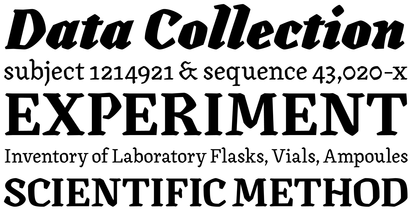
ITC GOUDY SANS®
Typeface family of 10 weights
|
| |
|
|
|
|
|
“I am a sucker for sans-serifs that nod to roman typography, so I can’t help but recommend this face. The ITC Goudy Sans typeface is like a multi-tool. Its entire family has characteristics that change from thick to thin, and from italic to standard, that make it easy to use for completely different projects.”
|
|
|
|
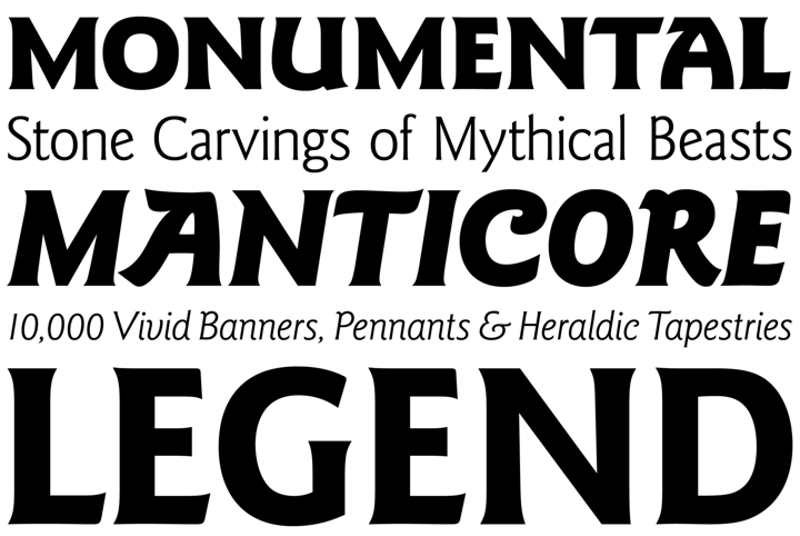
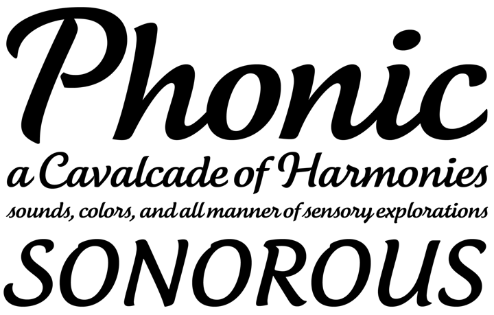
CANILARI
Typeface family of 17 weights
|
| |
|
|
|
|
|
“Canilari is one of those typefaces that I hope to be able to use one day for a client project. Regular and Medium are no-brainers for large bodies of copy — but Bold is my true love. It has such a strong personality contrasted by soft edges and elegant angles, making it so unique from other serifs.”
|
|
|
|
FF TARTINE® SCRIPT
Typeface family of 3 weights
|
| |
|
|
|
|
|
“As a designer who is not great at creating custom script lettering from scratch, I find it important to have an arsenal of script typefaces that I can set as a base then adjust and alter as needed. This script has great organic qualities that can be pushed and pulled or replicated to create unique ascenders, descenders, or swashes.”
|
|
|
|
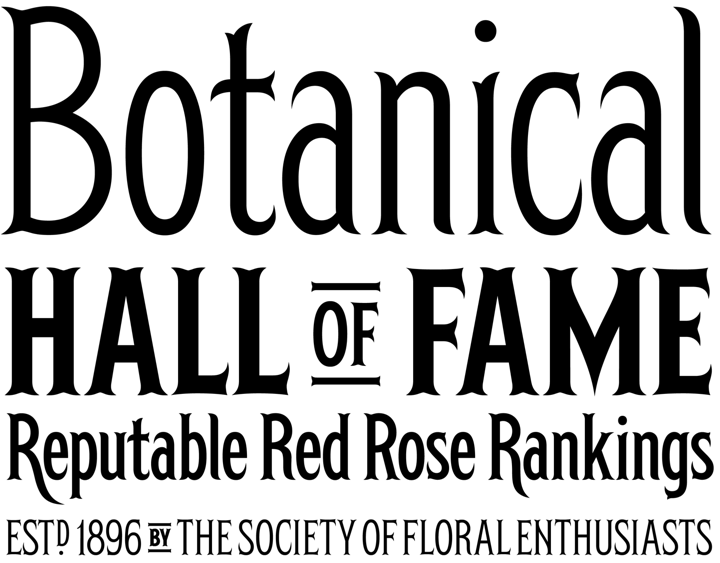
HERSCHEL
Typeface family of 6 weights
|
| |
|
|
|
|
|
“Herschel is a whimsical but elegant family with so many alternate characters! Four alternates for a capital ‘R’? Unheard of. This condensed face makes a statement as it stands tall with a quirky, dry sense of humor.”
|
|
|
|
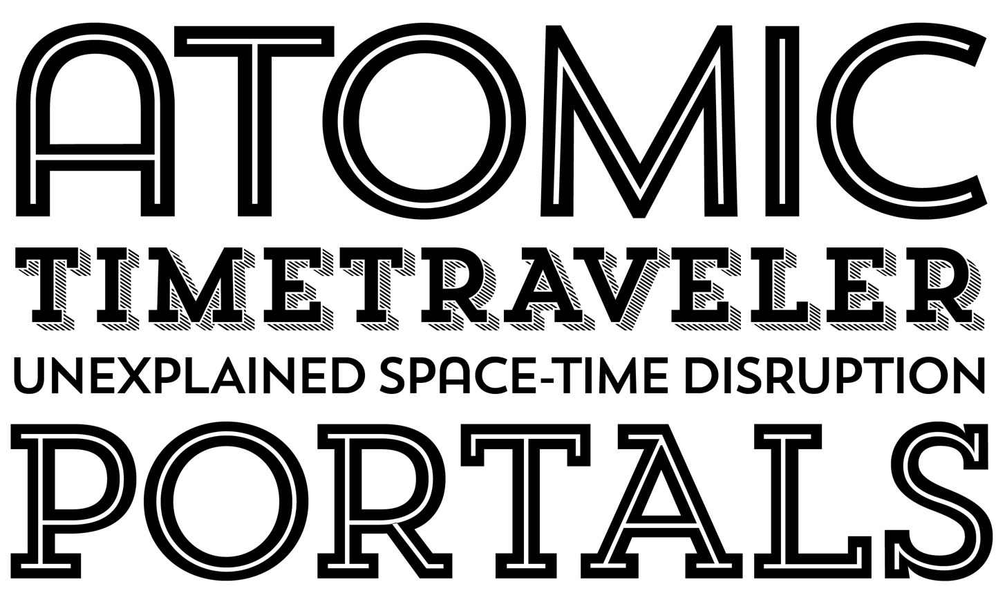
TREND
Typeface family of 21 weights
|
| |
|
|
|
|
|
“I remember the first project I used Trend for nearly four years ago, and I still use it to this day! It’s a huge family — more a series really — that includes both slab and sans offerings, making it extremely versatile. I favor the sans and my favorite characters are the ‘A’ with the rounded apex and the sassy ‘R’.”
|
|
|
|
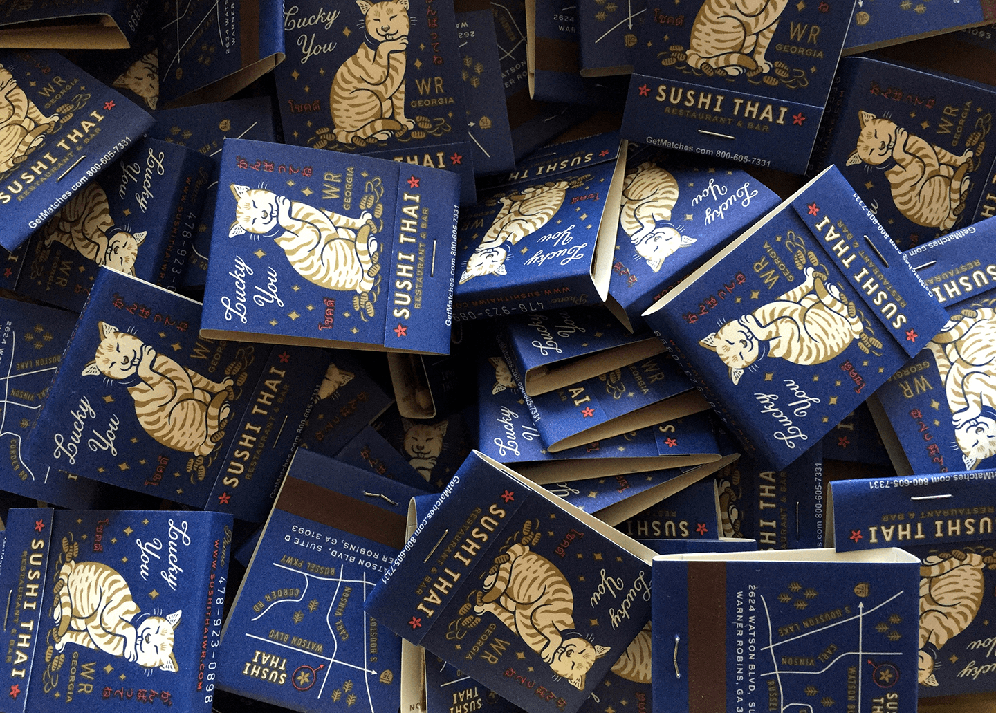
“When the opportunity to design matchbooks arises, always take it. I wanted these to feel like old-timey illustrative matchbooks that you often find in antique stores. The vendor I worked with loved the aesthetic and suggested a printing method that gave them a true offset look.”
|
|
|
|
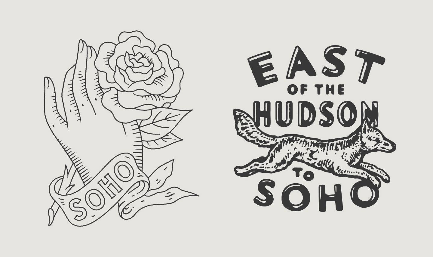
“Made under The Good Folks Co., these designs were created for Alternative Apparel and were printed in limited runs to promote the re-opening of their SOHO New York store. To the left is a representation of the New York state flower and to the right is a more location-centric direction.”
|
|
|
|
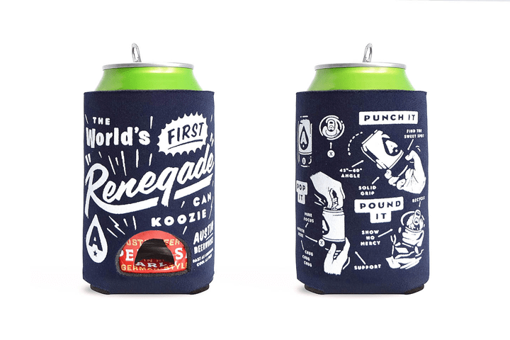
“This is a koozie designed at Helms Workshop for the Austin, TX brewery Austin Beerworks. If you don’t know what ‘renegading’ a beer is, it involves punching a hole on a beer can with your thumb, quickly followed by shotgunning it — a true pastime of our friends at the brewery and members of the Workshop team. These koozies were made with a custom hole on the front, with more details on how it’s done on the back. This is the first time these are being shared!”
|
|
|
|
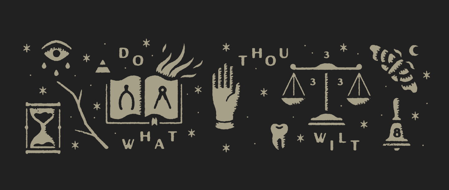
“This was a hero image created to promote the typeface ‘Hedon’ — which by the way is another beautiful font! This is another project done under The Good Folks Co.”
|
|
|
|
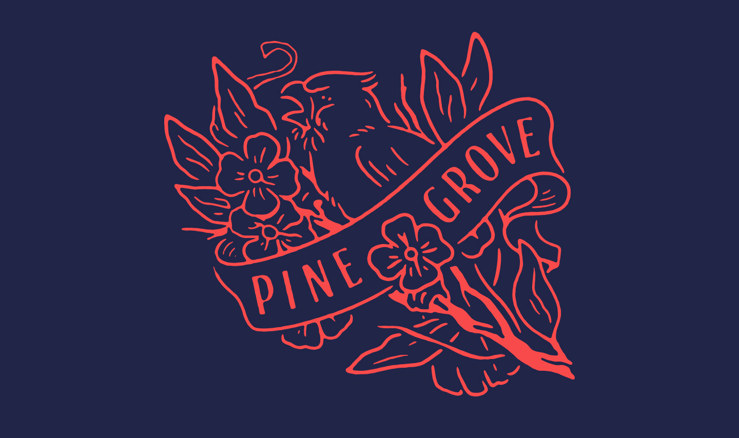
“I was recently a part of the incredible 10x16 project, where visual artists designed their top 10 albums of 2016. Although Pinegrove’s ‘Cardinal’ was released in 2016, it already feels nostalgic to me with countless memories tied to it. I definitely recommend giving it a listen.”
|
|
|
|
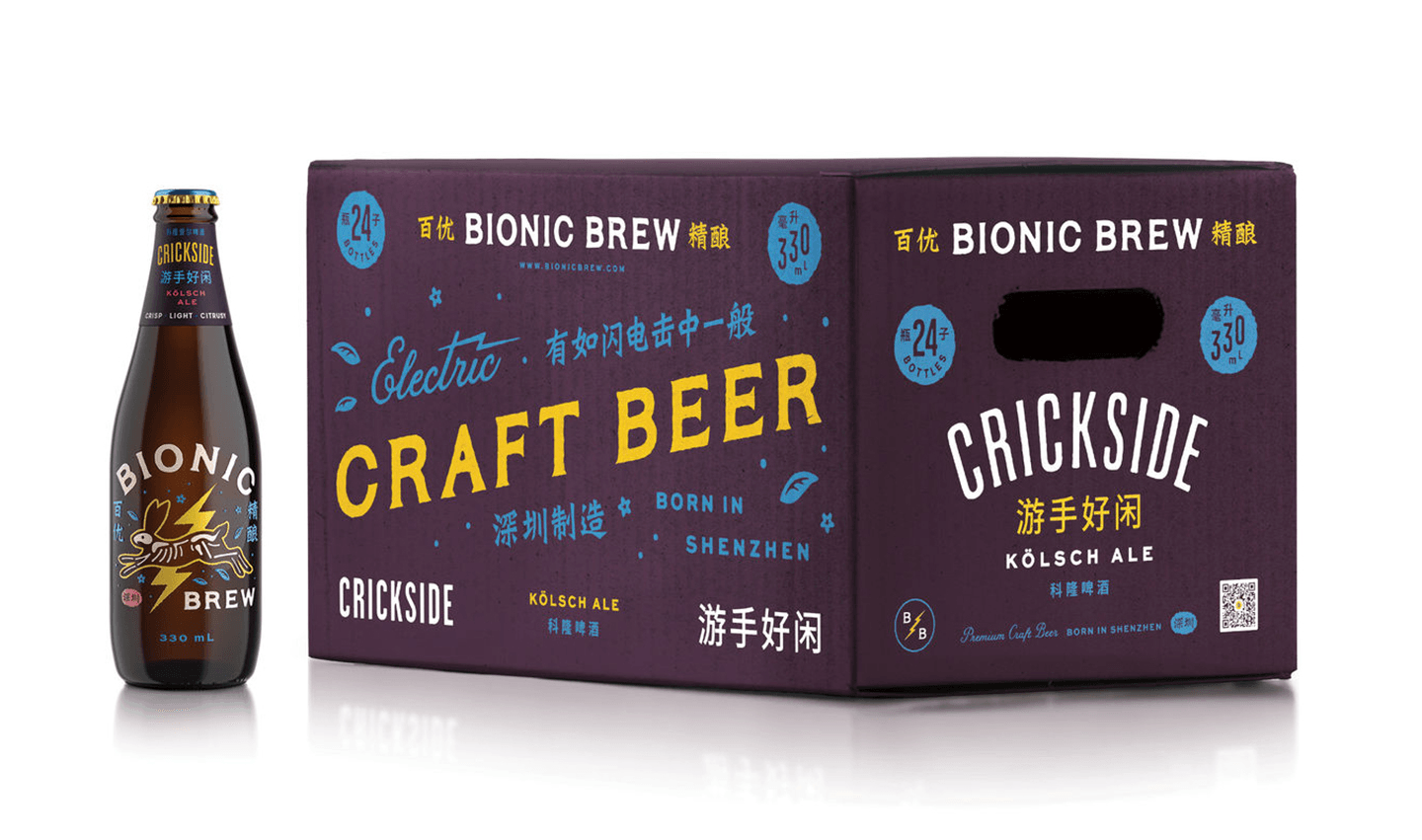
“Another Helms Workshop project, this time for the Bionic Brew brewery in Shenzhen, China. I had the pleasure of leading the design work on an extensive rebrand and packaging system as part of the project. The inspiration for the supercharged rabbit stems from Chinese folklore of a golden rabbit that lives on the moon to brew the elixir of life. See more from this project here.”
|
|
|
|
“Don’t be afraid to use display faces and get weird with it.”
|
|
|
|
Find Alana on Dribbble and the Web
|
|
|
|
|
We want to know what you think
|
|
|
|
|
How do you like My Favorite Five so far? Who would you like to see featured? Interested in being featured yourself? Get in touch at [email protected] and let us know. And while you’re tweeting, use hashtag #MyFavoriteFive to let the world know what your favorite five go-to typefaces are. Stay tuned for our next issue!
|

|
|
|