 his month’s Rising Stars features yet another hand-picked selection of brave new fonts by emerging foundries. Our trend-conscious customers seem to be positively in love with the insigne collection which, besides that persistent #1 on the Starlets list, Carta Marina, recently brought us Natalya, a script with calculated swashes. A more grungy font family in the same genre is the intriguing Panamericana from Colombia. Cotoris from Flat-It is an unorthodox take on the sans-serif. Finally we zoom in on the elegant curves of yet another script: Beurre, which means ‘butter’ in French. You’ll see why! In the Know Your Type Designer section, we give the floor to Alejandro Paul of Sudtipos, a type collective in Buenos Aires known for its professional display fonts. Enjoy!
This month's Rising Stars:
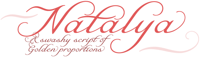
Natalya is a gracious calligraphic script with swirls and swashes based on the Golden Ratio. Its forms are open and its spacing is generous for better legibility. The OpenType character sets are huge and include a wealth of special ligatures. Natalya comes in three combinable versions with differently shaped swashes. Be warned though! Usually in families that have alternate swashes, the Regular font is the most modest one. In Natalya, it works the other way around. Should the Regular be too baroque for your taste, try Alternate Two.
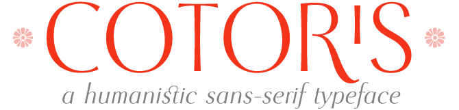
Ryoichi Tsunekawa of Flat-It from Nagoya, Japan, is steadily producing inventive new fonts in a wide range of styles. He’s done awesome grunge fonts, gorgeous scripts and uncompromising geometric fonts. With Cotoris, he is exploring yet another aspect of type design. Cotoris is a sans-serif that is rich in contrast, with the vertical stress of ‘modern’ romans. There’s an echo of German titling faces from the 1920s – but Cotoris has an openness all of its own. Probably the best thing about it is its amazing set of OpenType features: ligatures for lowercase and capitals, nice ornaments and other goodies.
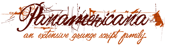
Think pirates, treasure hunts, explorers’ maps, shady contracts, captains' logs cut short by some intruder or natural disaster. That’s the kind of atmosphere evoked by the ten members of the rich and impressive Panamericana family. The font names are a course in basic Spanish: Blanca, Gris, Negra, Uno, Dos, Tres... Panamerican breathes calligraphy, but also plays around with every kind of grungy distortion that you can think of. Designer Carlos Fabián Camargo Guerrero is from Mérida, Venezuela, and now runs the Andinistas studio in Bogotà, Colombia. Two cities on the Andes mountain range – that’s why the studio is called “Andes people”.
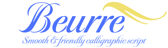
Beurre is an energetic roundhand-like script with remarkable capitals. The caps’ main downstrokes are split, creating an effect that recalls a scene at the breakfast table, as designer Robbie de Villiers explains: “Picture a butter knife that slices into butter, slowly wedging the cut wider so that when it is pulled back, the remaining shape would resemble the main downstroke of any capital letter.” Beurre is ideal for menus, invitations and other occasions where you need a reasonably strong, but friendly legible script.
Know your type designer:


Buenos Aires, the capital of Argentina, has been at the forefront of graphic design in Latin America for decades. One of the most recent and most exciting developments on the Argentinian scene is a veritable type design explosion. We already interviewed Barcelona-based Argentinian Eduardo Manso in the February issue. This month we visit Buenos Aires to meet a remarkable group called Sudtipos. This type collective was founded in 2001 by four experienced designers from the world of corporate and packaging design: Ariel Garofalo, Claudio Pousada, Diego Giaccone – and Alejandro ‘Ale’ Paul, the group’s spokesman. Ale is happy to tell us more about the background of those delightful script and display fonts that make up the Sudtipos collection.
Sudtipos was founded by a group of Argentinian designers who have all worked with major studios. What were your reasons for starting up your own foundry? How did you get together?
We were all graphic designers who had a particular appreciation for type. That is why we began making fonts in the first place. The foundry, or collective as we prefer to designate it, started because of that – packaging, editorial or brand designers making fonts for real designers. The first time we seriously spoke about founding Sudtipos was in 2001, at a Buenos Aires event organized by Ruben Fontana.
To what extent is your work as type designers linked to your practice as graphic designers?
The type link first became evident in design school. As a student I had to make my designs unique in order to stand out. Type is a design element that helps accomplish that in a big way. At first it was just things like applying type effects, or slightly modifying a letter here or there to make the design more personal. After graduation, real-world packaging design was an eye-opening experience as it implied looking at type very closely. For example, when you have to design the front of an ice cream container, common ‘fashion’ fonts almost never work exactly the way you want them right out of the box. There are millions of containers that use the word ‘light’, and the last thing you want as a packaging designer is your design to be plain or impersonal or look like someone else’s.
That original link is still there. Our aim is to always be graphic designers making typefaces for graphic designers. We try not to lose that particular focus. We’re always thinking about how to make a graphic designer’s work easier when it comes to using the type element in his or her design. Personally, I really like the idea of a graphic designer consciously choosing the alternate character that fits a specific design project. It shows aesthetic sophistication and professional maturity. Whenever I manage to get a graphic designer to consciously choose an OpenType feature in one of my fonts, I’m happy.
Could you tell us something about the way the members of Sudtipos collaborate, or critique each other’s typefaces?
This also dates back to when I was in packaging design. At the agency where I worked I was asked to art-direct a project with the designer Angel Koziupa, who had been doing lettering and logo retouching for design agencies for over 30 years. Our working process evolved into something that was a lot like New York City in the 1930s: art director and lettering guy working jointly to create a design. But now of course it’s all digital, so the tasks of each team member usually have something to do with computers and software. When I work with Angel now, it’s usually my idea, his drawing expertise within the vector program, then my technical skills in the font editor. Collaborations with the other guys usually follow the same kind of process that ends with me taking care of the technical details before the work is published.
Are many of the Sudtipos fonts based on typefaces that were originally developed as corporate fonts or packaging type for a specific client?
A few of our fonts have their roots in custom logo work we’ve done for high profile clients. Habano ST, for example, was based on one of the most famous logos in Argentina, the Quilmes beer logo, drawn by Angel Koziupa long before the font existed. But the majority of the Sudtipos fonts are really reflective of ideas we’ve had for something graphic designers would need to help make a difference in their design, especially in packaging.
In Argentinian graphic design and advertising, is it difficult to convince clients to order custom-made type?
It almost never happens here actually. Local agencies don’t recognize the value of type in general. This is mostly an education problem, since design schools here don’t provide adequate focus on type. Designers graduate and begin working for local agencies, and the type-ignorant mentality spreads.
But there are some international agencies here that understand the value of customization, and they consult with us for some special work. We’ve done some custom fonts for local children’s books, banks and TV commercials. Those were mostly commissioned by international agencies. The majority of our custom work is for major American and European agencies.
There has been an incredible boom of type design and typography in Latin America, and especially in Argentina. What do you think are the main reasons for this? Why has Argentina – and notably Buenos Aires – become such an important center?
I think the curiosity and experimentation were always there, but not so conspicuously. Graphic designers are always looking for ways to differentiate themselves from the crowd, and type was still officially uncharted territory in 1990s South America. Then came the internet, which brought it all out to the surface, thus the overwhelming exposure of a lot of South American work at once. And it persisted because the internet suddenly made the whole world an open market for us, instead of the almost non-existent market we’d had here all along.
There’s also something to be said about the Argentinian design process, which is part of the appeal to the world markets. Argentina doesn’t have the European design history, but we do put all of our being into our work, and sometimes because of that it comes out looking more innocent, more real, more human, with less of a machine base.
Could you tell us something about type design education in Argentina?
Type design education in Argentina is very poor. Most of our universities don’t even have a typography class as part of the graphic design course. Most designers interested in type go to an annual series of talks we started three years ago. The event is called T-Convoca. We just learn from each other’s experiences there.
Who are your heroes in type and typography?
My heroes are the American lettering guys from the days before photo composition. People like Charles Bluemlein amaze me with their ability to branch their work out in so many directions for the same project. These days I find myself in love with the Zanerian school of calligraphy, but that’s the way I’ve always been when doing my research for the projects I’m working on at the moment. Pre-tech American lettering has a fantastic history that is mostly overlooked by academics, so whenever my research reveals something new, it feels like I’ve discovered a treasure.
As far as metal type goes, my favorite faces are the ones by Barnhart Brothers & Spindler, from the late 1900s. I also like the timeless work of Hermann Zapf and Ed Benguiat.
Script typefaces are one of the strengths of the Sudtipos collection. Would you say this has to do with Argentinian graphic culture – or is it more of a personal thing?
It’s more of a personal thing. Outside of common product packaging, Argentinian graphic culture is more European and modernist in character, rather than personalized with scripts. My experience in branding product packaging was a natural catalyst for me to be interested in scripts and seek like-minded people for the collective. Since then, my passion for early 20th century American lettering was the main drive for most of the scripts we produced. Sometimes you can find a rhythm expressive of our culture in some of our fonts, like Candombe or Murga, but for the most part our work is done for international users rather than motivated by local culture.
Which are some of your favorites among the Sudtipos fonts?
Sudtipos has had quite an evolution since its inception. But I will always love my earlier works. Reflex and Tierra were made during a time when making a typeface was an adventure for a care-free guy. After that, things evolved and became more focused. I think Amorinda is the font that brought the current Sudtipos/packaging mentality together. La Portenia is one of my favorites because it was a very educational, almost therapeutic, three-way collaboration with Diego Giaccone and Angel Koziupa. Other than that I’ve done some projects that I now consider milestones in my life. Ministry and Affair are to me the climaxes of mature thinking, heavy with experience and coming of age.
Is there a particular project in type design that you hope to be able to work on in the near or distant future?
Perhaps one of these days I’ll try my hand at a serious text font, but for now I’m quite content with the projects I have lined up.
Thanks, Ale! We hope to see more of your most recent work on MyFonts soon.
* For more information about the graphic scene in Argentina, see this recent feature article in Eye Magazine.
Follow-Up:
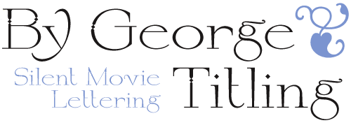
We featured By George Titling in the May Rising Stars newsletter and the font has been doing pretty well since. If this typeface gives you a sense of early 20th century glamour, black-and-white aesthetics and quiet presence, your associations are spot-on. By George Titling was based on an alphabet originally drawn for title cards in silent movies, as featured in the 1938 edition of Ross F. George’s Speedball Text Book. Its letterforms are crisp, elegant and inviting; its capitals feature subtle diamonds in the verticals that add just the right touch of sparkle.
If you like this typeface by Nick Curtis, check out some of his other fonts:

Based on Mirabelle, an German design from 1926, Anna Nicole is a statuesque semiscript. Round, firm and fully-packed, it’s sure to get attention anywhere it’s used. And if you don’t know right away whom its name refers to: welcome back to Earth, and just check out the February 2007 obituaries.
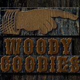
Vintage wood type was made for posters. Its letterforms were not just big, they were LOUD. When letters weren’t enough, the typesetter usually had a case full of inviting vignettes, flourishes, and pointing hands – or, as the old fellows call them, bishop’s fingers. Nick’s Woody Goodies have all been thoughtfully redrawn from authentic historical sources, and are ready to grace your next project with their vintage charm.
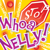
And now for something completely different. With a name that refers to Nelly Furtado’s debut album, this font is decidedly pop. Dan X Solo, the great lettering historian, showed this alphabet in his book of Showcard Alphabets under the name of Funhouse. Wild, wacky and slightly tacky, its digital version is whatever you want it to be: cartoon, food packaging, beach party handout… use your imagination.

This issue’s font credits
featured fonts
Comments?
Please send any thoughts you'd like to share with us about this newsletter to: [email protected]