cript fonts are going strong on our Starlets list. It’s easy to understand why. Packaging, invitations, pizzeria flyers, book covers, film titles… with instant handwriting fonts that often cost less than a designer ballpoint pen, it’s a piece of cake to give your headlines that personal, spontaneous look. Some occasions, of course, call for a display face from the other end of the spectrum – stern, formal, solemn. In that case, the corporate typeface of the Roman empire may just be the font you’re looking for – Jupiter is its latest revival. Or find something in between… and let Rising Stars be your guide.
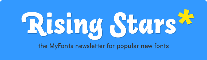
This month’s Rising Stars
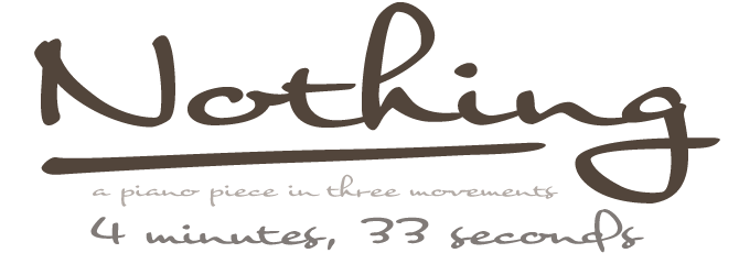
Since its inception in mid-2006, Ryoichi Tsunekawa’s Flat-It foundry has published an impressive collection of script and display fonts. Nothing, a name that is likely to cause confusion in some studios, is among their latest script faces. It’s been a hit ever since it came out in mid-August. Its look is not so easy to describe: it’s spontaneous yet balanced, confident yet unassuming, elegantly connected yet technically simple. It could have been hand-rendered with a brush by one of the few great American lettering artists working for Hollywood or Madison Avenue. But as the PDF proudly states, it is from Nagoya, Japan – another winner from Flat-It.
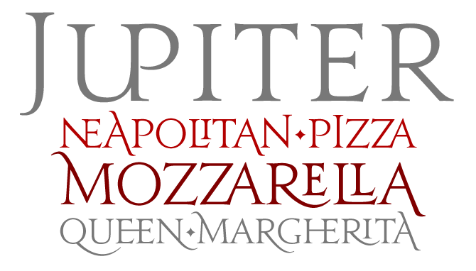
The text on the MyFonts Jupiter page, supplied by Canada Type, must be one of the most whimsical descriptions of typographic goings-on in ancient Rome. But don’t be fooled! Like all Canada Type fonts, Jupiter is a very thorough piece of work. It is designed to faithfully represent the Roman alphabet as it was hammered into marble 2000 years ago. Its design was also influenced by previous interpretations of the Roman alphabet, notably Friedrich Poppl’s beautiful Nero typeface. Jupiter comes with a wealth of alternates and ligatures in all formats; Jupiter Pro, the OpenType version, has all that plus programmed features and stylistic sets for use in programs that support full OpenType functionality.
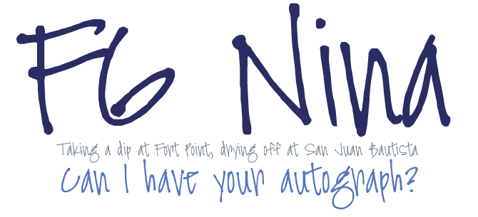
As you may have read in our recent In Your Face newsletter, Font Garden is new to MyFonts: a small foundry specialized in script fonts. FG Nina is one of their bestsellers. A cheeky little handwriting font, Nina has a ‘g’ that looks like a cartoon character about to make a really witty remark.
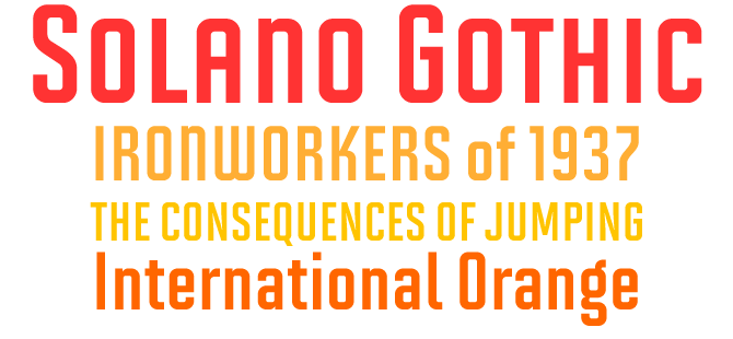
MVB Solano Gothic was originally designed as a display face for the City of Albany, California, located on the San Francisco Bay. Named for the city’s main street, the Solano Gothic needed to work on signage in proximity to older buildings, in contemporary settings, and for general print and web use. Mark van Bronkhorst created a versatile, urban family of robust, condensed faces offering the choice between retro and neutral forms. Before deciding which version to buy, carefully read the description: the Pro versions have a lot going for them.
Text family of the month
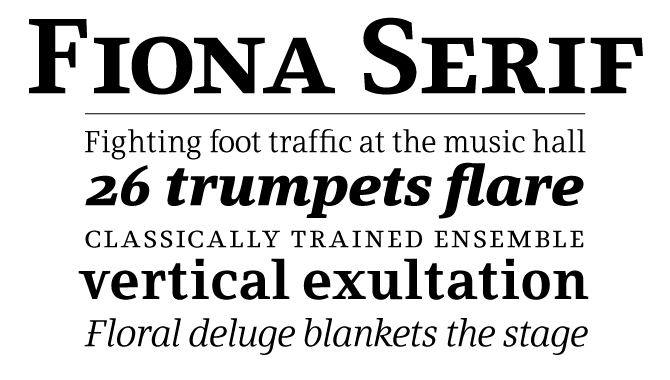
Designer Guido Schneider is the heart and soul of Brass Fonts, a German foundry that started out as a collective in the late 1990s. Many of his fonts are custom typefaces for specific clients, and the versatile Fiona family is no exception. Fiona was designed in 2003 as the “house typeface” of MDR, the broadcast company of central Germany. The family comes in three versions – three striking variations on a theme. Fiona Serif is a text typeface with usual details, such as a tapered bar on the ‘e’ and some asymmetrical serifs, which lend a unique personality to its roman. Fiona Slab is a sturdy, low-contrast headline face. And Fiona Script is simply gorgeous.
Follow-Up
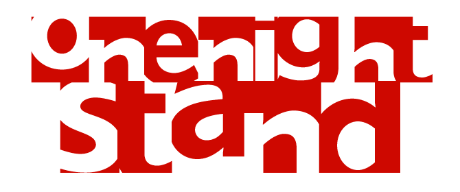
The suggestively named One Night Stand by Torbjörn Olsson has turned out to be much more than that: it’s been selling steadily for the past two months. One Night Stand offers an interesting mixture of sans-serif clarity and designer attitude. In spite of the modularity of its perfectly square glyphs, it dances and hops; alternating light and dark by switching between upper- and lowercase enhances its decorative potential.
If you liked this typeface from T4, check out some of their other fonts:
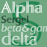
Sergel
Sergel is one of T4’s latest offerings, designed by veteran fontsmith Bo Berndal. With its carefully crafted decorative inline, Sergel has unmistakable sculptural qualities; that’s why it was named after Tobias Sergel, the greatest Swedish sculptor and draughtsman of the 18th century. The Sergel font pack includes four fonts and is an OpenType typeface for both PC and Mac.

Museum Tertia Cursive
For the Museum series, designer Torbjörn Olsson studied the Norstedts type collection in Sweden, a collection of historical type from several European countries. Museum Tertia Cursive was inspired by a splendid set of matrices from 18th century Germany. The varying slopes and subtly built-in irregularities give the font a charming liveliness. Check out the expressive new glyphs added by Olsson, like ‘?’, ‘@’ and ‘€’.
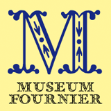
Museum Fournier
Like Tertia Cursive, Museum Fournier is part of the growing Museum type family. It was inspired by a set of flowery Rococo capitals designed by Pierre Simon Fournier le Jeune around 1760, and imported to Sweden in 1818. Please note that the font contains capitals only, no lower case letters and no figures. For a genuinely classic look, try combing it with the border fonts that are also part of the Museum series.
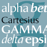
Cartesius
Cartesius is an oldstyle serif typeface inspired by Italian and French letterforms from the 1600s; but the uppercase letters, says designer Bo Berndal “are of pure Roman type.” Its serifs are subtle enough to classify Cartesius as a ‘glyphic’ or ‘flared’ roman: that rare genre to which Optima and Amerigo also belong. Cartesius holds up well under difficult circumstances, and is suitable for magazine and book design.
Font credits
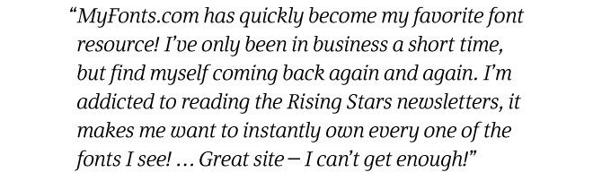
The Rising Stars masthead and subheading are set in Auto 3 and Bryant, respectively. The drop-cap S in the introduction is set in Chateau, and the “Have your say” quotation in Fiona Serif. The small pixel typeface at the very beginning is Unibody 8.
Comments?
Please send any questions or comments regarding this newsletter to: [email protected]
Unsubscribe info
This newsletter was sent to [email]. You may unsubscribe at any time at: http://www.myfonts.com/MailingList