
esigners are getting ready for the beach season as the sun gradually warms up even the the darkest of corners. We’re talking from the perspective of our colleagues in the southern hemisphere, of course. ¡Hola Buenos Aires! Sanibona Durban! G’day Sydney! We happen to have only one southern type in the Rising Stars newsletter this month, a playful alphabet from Bogotá. Our other featured fonts are from places where it’s now getting decidedly chillier, like Ukraine and upstate New York. Support those folks, friends, and buy their fonts.
This month’s Rising Stars
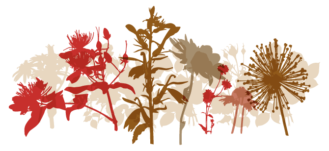
The people from Subtitude in Montreal have created a charming collection of weird and wonderful fonts, and all of them have names that begin with “Sub” - the fonts, that is. About half of these are pictogram and dingbat fonts, and SubiktoTwo is their most successful one to date. It is a collection of flower forms, all reproduced as intriguing silhouettes, beautifully rendered for layering in different colors. Not to be confused with SubiktoOne, which is a set of silhouettes of hands.
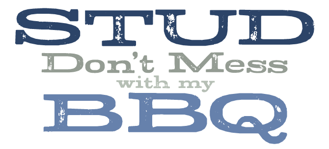
Stud is wood type: those wide, loud, quirky Egyptians seen on 19th- and early 20th-century letterpress posters. Designer Ray Larabie has come up with an interesting trick to simulate the irregularity of hand-printed type. The OpenType version of Stud features letter pairs, coded as automatic ligatures, that help break up the monotony of repeating letters. Various versions of the same letters show clear differences in imprint and wear. Stud supports a wide array of languages including Central European, Baltic and Turkish.
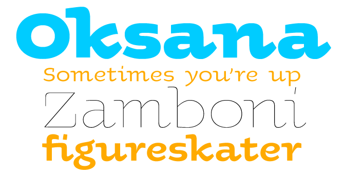
Oksana is a common girl’s name in Ukraine, which is where designer Andrij Shevchenko is from. If he named his typeface after a particular Oksana, she must be a special woman indeed; for Oksana is one of the most original not-quite-sans-serifs we’ve seen in a while. It combines simple forms with a hand-written feel; it’s the kind of font that, when used for a product’s identity, will be recognized even by the man and woman in the street. This is what Andrij has to say about Oksana: “As a true native Ukrainian, this semi-serif type family has a strong structure, but a soft and friendly nature.” What more can you wish for in a typeface?
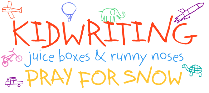
Kidwriting by Columbian designer Manuel Corradine has been riding high on our Starlets chart throughout October. It effectively mimics the charming and somewhat bumbling qualities of a child’s handwriting, but is balanced enough for comfortable reading. Moreover, Kidwriting is not just one font, but comes in a variety of weights, including a very nice shadowed version. One of the best things about it is the double set of dingbat fonts - a captivating series of animals and vehicles. ¡Chevere!
Text family of the month
The release of P22’s Underground Pro is a remarkable event. Based on an iconic typeface from the early 20th century, Underground Pro is the foundry’s most extensive font family to date. It is also also the first time that Edward Johnston’s classic receives such a typographically sophisticated treatment.
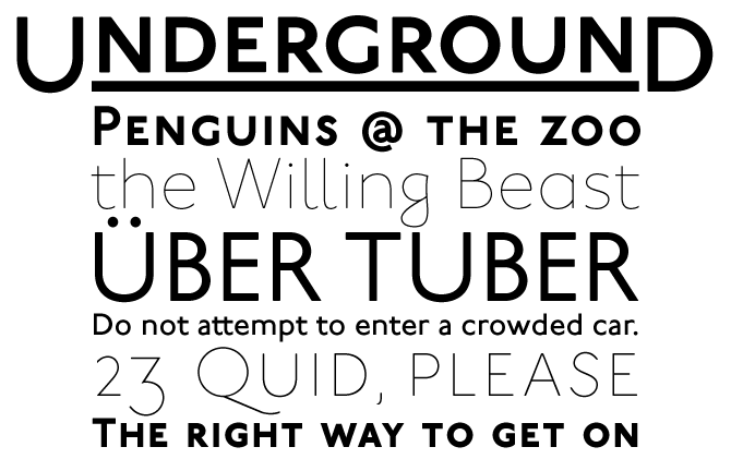
Calligrapher Edward Johnston was commissioned to design a typeface for the London Underground system in 1916. He drew a sans serif with classical proportions – a unique concept at the time, and a huge influence on Eric Gill’s Sans. Johnston’s typeface became an icon in typography. London Transport still uses it, albeit in a modified version designed in 1980.
In 1997, P22 reached an agreement with the London Transport Museum to revive the original design. Ten years later, the time was ripe for a more drastic overhaul. The new Underground Pro expands on the historical design, adding four additional weights while remaining within Johnston’s system of proportions. The entire family now comprises six weights, totaling over 30,000 glyphs, including Greek and Cyrillic versions, small caps and three sets of decoratively underlined headline faces.
The possibilities of OpenType have also afforded a great opportunity to expand on the original design. The Pro version includes alternate caps, “humanistic” and “geometric” alternates and a stylistic set that replaces all the diamond-shaped punctuation and diacritic marks with circular ones. Designer Paul Hunt wrote that he “wanted to make a typeface system which was thoroughly customizable so that the user could change its appearance to suit their particular needs.” It seems he has succeeded.
Follow-Up
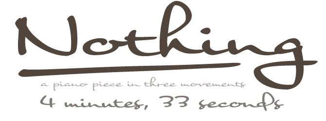
Nothing was one of last month’s Rising Stars, and although it’s faded away from our 50-day chart, it has continued to rise. In fact, it’s one of Flat-it’s all-time bestsellers. Nothing (the font) is different from other script fonts. It emulates the kind of handwriting you can’t call “calligraphic” because it’s so informal; but it is also very regular, and its wide, connected shapes lend it an unmistakable authority. Furthermore, it’s impeccably kerned. Check out the alternate f, h, t and more for that subtle hint of spontaneity.
If you liked this font from Flat-It, have a look at some of their other typefaces:
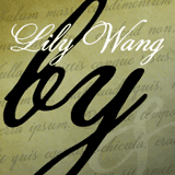
Lily Wang
Lily Wang is the latest in Flat-It’s series of luscious, swashy yet slightly timeworn script fonts, to which the successful Pansy Bo and Daisy Lau also belong. We think of these fonts as sisters - cheeky but with a golden heart.
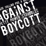
Boycott
The theme of this font is thoroughly heartfelt: “We are calling for a boycott against petty power struggles.” The font is anti-authoritarian: it has no lower case, and the double set of upper case forms are in various states of decline. A perfect piece of grunge.
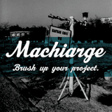
Machiarge
Machiarge was designed to be the child of Machia – and Machia is one of the prettiest scripts that designer Ryoichi Tsunekawa has done so far. Machiarge has similar features, but is kind of rough and heavy. He’s a good kid, though.
Have your say
Linda Donaldson, Donaldson Design
Canisteo, New York, Oct 18, 2007
Your opinion matters to us! Feel free to share your thoughts or read other people’s comments at the MyFonts Testimonials page.
Font credits
The Rising Stars masthead and subheading are set in Auto 3 and Bryant, respectively. The drop-cap D in the introduction is set in Country Western Script, and the “Have your say” quotation in P22 Underground Pro. The small pixel typeface at the very top is Unibody 8.
Comments?
Please send any questions or comments regarding this newsletter to: [email protected]
Unsubscribe info
This newsletter was sent to [email]. You may unsubscribe at any time at: www.myfonts.com/MailingList