agnificent things are happening at MyFonts, and we’re not just talking about the rumored new website design that is waiting in the wings. New developments are taking place in the font department as well. Although script fonts are still riding high and sans-serifs are going strong as ever, we are witnessing a sensational comeback of the serifed roman: oldstyle, modern, classical, the lot. We are presenting two of those this month, plus a robust sans from Holland. And don’t miss the Follow-up section, where we briefly present a great little label that you may never have heard of.
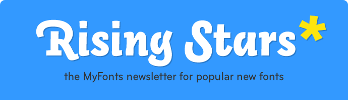
This month’s Rising Stars
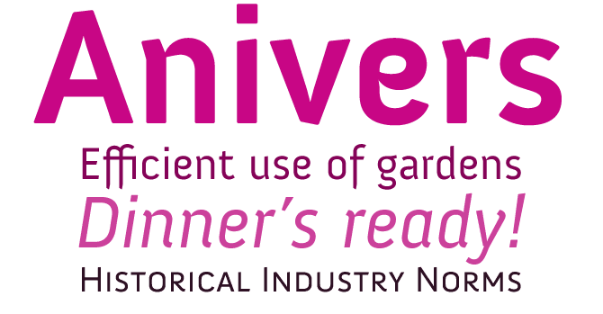
Several months ago, Dutch designer Jos Buivenga made a splash with Museo, a geometric semi-serif font family that was partially made available for free. The strategy worked — countless users also bought the fonts that were not gratis. Anivers is a follow-up to Museo in more ways than one. Again, some of the weights can be downloaded at no cost. And as the designer recently explained on the I Love Typography blog, its curves evolved directly out of Museo’s, although it took major tweaking and redrawing for one font to become the other. Buivenga calls Anivers “robust and rigid, forgiving, flexible and elegant.” A font with built-in contradictions, it is suitable for anything from calling cards to posters. We’d hesitate to recommend it for immersive text, though: it’s probably got too strong a character for that. No pun intended.
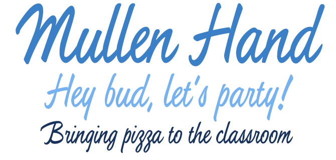
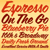
A perfectly connected script was once the holy grail of metal typesetting. Just try making a naturally flowing font with each letter on a rectangular chunk of lead! However, some metal typefaces came pretty close to the perfect illusion, and Jerry Mullen’s Repro (ATF, 1953) was one of them. Mullen Hand is a fresh digitization of Repro, taking full advantage of the possibilities of digital type design. Two- and three-letter ligatures take care of the r, s, x and z connections. These special ligatures are programmed so that they automatically activate in programs that support advanced typography.
Mullen Hand is casual yet elegant; its even strokes and confident connections make it a professional solution for a variety of applications, from posters and signs, to book and music covers and product packaging. The OpenType version of Mullen Hand combines the regular font as well as ligatures and alternates in one font, and includes programmed features for localization, alternation and intelligent substitution.
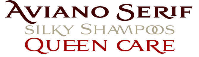
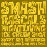
Insigne’s Aviano and Aviano Sans were last year’s “Top display couple.” After Aviano Slab, Aviano Serif is the latest addition to the family. It is an interesting step forward from the other serifed roman in the series, the original Aviano. Although the differences seem minimal at first sight, the new serifs are quite different: less intuitive, more regular, and more sturdy. Aviano Serif features the classically inspired construction and extended proportions of Aviano, but has more weights. It is also larger on the body — that is, it looks bigger at the same point size. Aviano Serif is a font for luxury mastheads, headlines and logotypes. Check out the eagle ornaments for unique custom designs.
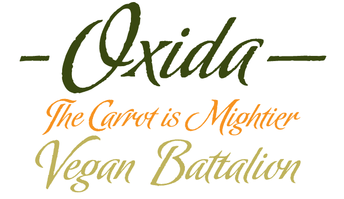
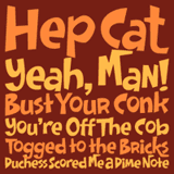
A new script typeface from the Argentinean type tandem Angel Koziupa and Alejandro Paul is always something to look forward to. Koziupa is a lettering artist with forty years of experience in advertising and packaging design; Paul is a specialist of technically complex type design. As part of the Sudtipos collective, they combine their skills to create succulent script fonts like the recent Chocolate, and this beauty. Oxida has the unmistakable calligraphic pizzazz of all Sudtipos scripts, but this time the letters have a ragged, rusty edge — hence the name. You won’t notice it in small sizes, so it works best when used BIG, on posters, book covers and family size potato chip packaging. The script connects impeccably and there are plenty of alternates for the lowercase.
Text family of the month
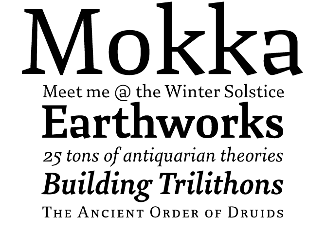
After the hugely successful Marat, German designer Ludwig Übele now presents another exceptional typeface he has been working on these past few years. Like Marat, Mokka is a serifed text face of conventional proportions with surprising and expressive details. In fact, it is an even more idiosyncratic face, with crooked serifs on the v, x and y, unusual tapered strokes, and a lowercase a that looks like a Doonesbury cartoon. But that’s only when you zoom in. Thanks to its savvy design and open forms, the typeface works perfectly in text sizes, giving no sign whatsoever of being a bit peculiar. Although it is not a large family, it offers all you need for basic professional book typography in many languages, including small caps and several sets of numerals.
Follow-Up
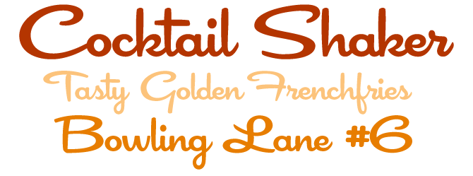
Cocktail Shaker by Stuart Sandler was featured in last month’s Rising Stars and has been doing well since. The font sums up 1950s cool: a swinging, swanky retro script with a connecting forward flow. Check out the alternates! Cocktail Shaker was published by Sideshow, an offshoot boutique type label of the Font Diner foundry that offers new exclusive display typefaces and collaborative type designs with talented lettering artists from across the planet.
If you liked this font by Sideshow, check out some of their other fonts:
Doinky
A collaborative effort from David (Squid) Cohen and Stuart Sandler, Doinky is a bouncy, exciting display font. It comes with cheerful alternates to create logo-like word images, and an inline version to add to the fun. Don’t miss the hilarious Doinkbats.
Creaky Tiki
Although they’re technically separate families, the three Creaky fonts work beautifully together. It’s basically the same design thrice: solid, built with driftwood (Frank) and Pacific-style (Tiki). The latter is a favorite, an exotic tribal face with a crazy jungle beat.
Coffee Service
This speedy retro script has a generous x-height, so although it is narrow and slanted, it’s still very legible. It comes with a wealth of interesting ligatures (like dr, tr and ns) which are substituted automatically when using OpenType functionality. The perfect illusion of handiwork.
Have your say
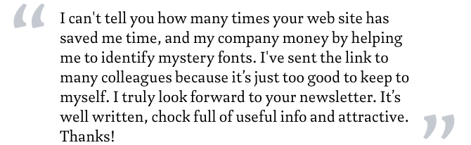
— Annalaise from Ohio, USA
4 June, 2008
Your opinion matters to us! Feel free to share your thoughts or read other people’s comments at the MyFonts Testimonials page.
Font credits
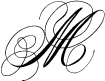
The Rising Stars masthead and subheading are set in Auto 3 and Bryant, respectively. The drop-cap M in the introduction is set in Albion Signature, and the “Have your say” quotation in Mokka. The small pixel typeface used at the very top is Unibody 8.
Unsubscribe info
This newsletter was sent to [email]. You may unsubscribe at any time at: www.myfonts.com/MailingList
Want more?
All of our previous newsletters are available online at myfonts.com/newsletters/
Comments?
Please send any questions or comments regarding this newsletter to: [email protected]