s The Doors once said: summer’s almost gone — for many of us that is. Schools have started, and with some luck, new jobs are pouring in. You may feel a fresh need to keep up with ever-changing tastes, if only to adequately respond to your clients’ or boss’s latest “idea”. That is where this monthly newsletter may come in handy. We give you some of the latest typographic trends in a nutshell, and with a few clicks you’ll be able to update your font collection at the cost of a magenta ink cartridge. Well, probably a little cheaper than that.
This month’s Rising Stars
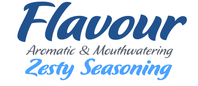
Flavour by German designer Hubert Jocham is an energetic and tasty brush script. What makes it stand out from most of its competitors is its generous range of stroke weights: it is available in five weights, from Light to Bold. Subsequent weights (like Semilight and Regular) are close to each other, which can be a great advantage if you want large and small text, or positive and negative text, to have the same optical effect. Flavour doesn't have a huge character set; in fact, it doesn't need alternates or special ligatures. The well-drawn characters build a tight and lively text as it is — making Flavour an excellent choice for packaging and product branding.
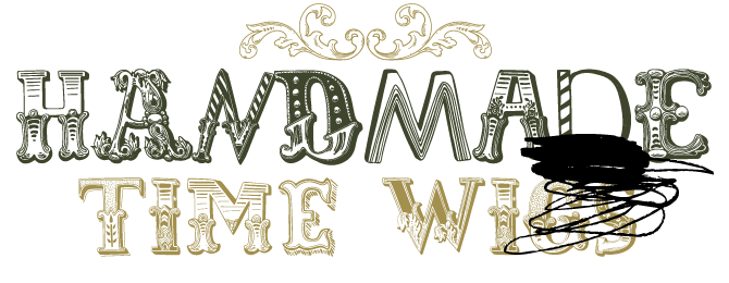
The ominously named Misprinted Type foundry has recently released a series of outrageous, incongruous, schizophrenic yet adorable all-caps display fonts. HandMade is the most successful of the lot, but LeKing is pretty awesome, too. Designer Eduardo Recife must have scanned every ornamented alphabet he’s come across, and possibly invented some of his own as well, combining single letters into fonts that immediately define a style. The atmosphere is somewhere in-between dilapidated-mansion melancholic and thrift-store whimsical. Love it or hate it, there’s no in-between, you can’t ignore it. And if you prefer your nostalgic attributes to be slightly more damaged, there’s the grunge-themed Anti-Romantic. HandMade comes with a separate set of 16 nice ornaments stored in scalable EPS image format.
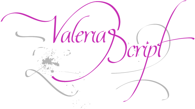
In our recent listings of best-selling new fonts, the calligraphic alphabets by Argentinian designer Maximiliano Sproviero were hard to miss. Young Maximiliano is not one to limit himself to the proportions of a conventional font, and so some of his uppercase letters take up the vertical space of several ordinary lines of type. His fonts, so far, have been technically adventurous (and not risk-free). But many of our users love their rough-and-dirty quality and somewhat naïve pizzazz. Compared to earlier offerings like Quijote, the new Valeria Script is rather well-behaved and legible. It also has a set of ligatures and letter pairs that allow for lively and diversified text setting. For those who prefer it dirty, there’s Valeria Script Cola Pen, a deliberately messy version which, like writing with a self-cut soda can pen, leaves ink splats all over the place.
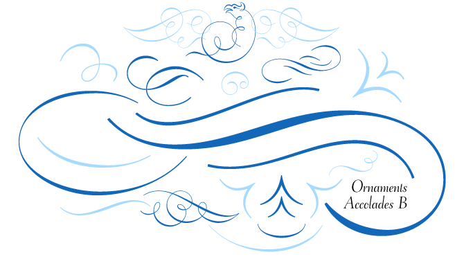
It’s hard to find a more graceful and technically accurate series of embellishments than Ornaments Accolades by Andreas Seidel. The first set in the series was 2007’s ornament font of the year at MyFonts. The new set, Ornaments Accolades B, does not disappoint. Like the first set, the new font mainly consists of sophisticated flourishes, swirls and curly brackets (called “Accolade” in many languages), but it also comes with a few more figural ornaments. Of course, the angel faces, wings and dragons have been skillfully worked into the font’s hypnotizing curlicues. Accolades B and B2 share the basic set of ornaments but differ in some of the major shapes. Courtesy of astype, each package comes with a technical documentation and an Adobe InDesign 2 sample file with lots of ready-made borders.
Text family of the month
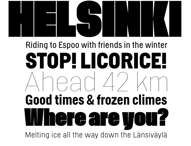
2008 is turning into a triumphant first year at MyFonts for Ludwig Uebele. The success of his first three font families — all text fonts — has been phenomenal so far. After two striking serifed romans, Marat and Mokka, Uebele recently released his first sans serif. Like Interstate, a contemporary classic, Helsinki is based on road signs — in this case, the alphabets used in Finland. Its structures have a certain coarseness, which obviously derives from the fact that engineers, not typographers, drew the original alphabets. Uebele’s expert eye has made sure that, despite the idiosyncrasies, the middle weights create an even text page. The display weights, Hairline and Fat, are quite interesting. Although they were derived from the same no-frills basic structure, their extremity adds a touch of madness to the family. Both are compatible with other Helsinkis, but can also function as display faces in their own right.
Follow-Up
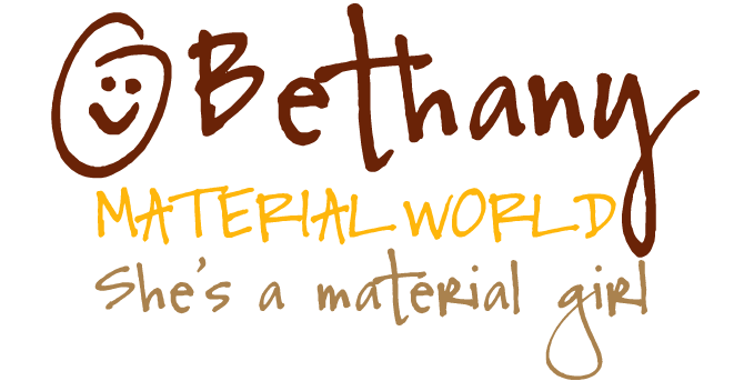
Bethany was one of the featured fonts in last month’s Rising Stars newsletter. It has been doing extremely well since, occupying the top spot of our Bestseller list for weeks. Bethany is spirited and spontaneous, but has better legibility than many other handwriting fonts thanks to the openness and simplicity of its shapes. The smileys, of course, are a very nice bonus.
If you like this font from Font Garden, check out some of their other typefaces:
Nina
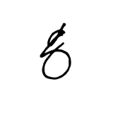
Nina is cheerful and cheeky. The font’s letters lean backward a bit, but it still has a forward-pushing energy. Its best feature is its lowercase g, which looks like a witty cartoon character.
Petra
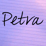
Petra has a natural-looking irregularity about it, alternating wide letterforms with narrower ones. The long connecting strokes on letters like ‘m’ and ‘u’ add a personal touch, as does the large lowercase ‘K’.
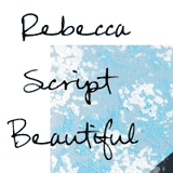
Rebecca
Rebecca was Font Garden’s most popular typeface last year, and has remained a bestseller. What is most attractive about it is probably its naturalness and simplicity. It looks like normal, no-frills handwriting. Very usable.
Have your say
— Jennifer in San Diego, California, USA
25 August, 2008
Your opinion matters to us! Feel free to share your thoughts or read other people’s comments at the MyFonts Testimonials page.
Font credits
The Rising Stars masthead and subheading are set in Auto 3 and Bryant, respectively. The drop-cap A in the introduction is set in Barricada, and the Have your say quotation in Helsinki. The small pixel typeface used at the very top is Unibody 8.
Unsubscribe info
This newsletter was sent to [email]. You may unsubscribe at any time at: www.myfonts.com/MailingList
Want more?
All of our previous newsletters are available online at myfonts.com/newsletters/
Comments?
Please send any questions or comments regarding this newsletter to: [email protected]

