 o many of you, the December Rising Stars newsletter traditionally represents a moment of reflection. What has the old year brought, typographically speaking? What fonts to acquire before we uncork the bubbly, in order to end 2008, as the French say, in beauty? MyFonts proposes some very practical typefaces, each carefully prepared for a wide range of uses. Plus a more single-minded monogram font that allows you to personalize just about everything in sight. Enjoy!
This month’s Rising Stars
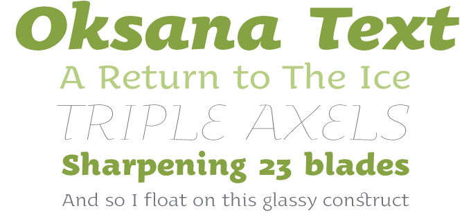
A year ago, Ukrainian designer Andrij Shevchenko brought us Oksana, a likable semi-serif display font with a broad smile. With Oksana Text, the new sub-family, Shevchenko further explores the calligraphic roots of his typeface. Subtler serifs, higher contrast between thick and thin strokes, more elegant proportions: Oksana text is almost a script font. It’s not a text family in the bookish sense — no small caps, for instance — but it will work beautifully in longer, medium-sized texts for brochures and magazines. Besides the full OpenType font, which comes with rich language options including Cyrillic, there’s the “Std” version that has a trimmed-down character set, and is even more attractively priced.
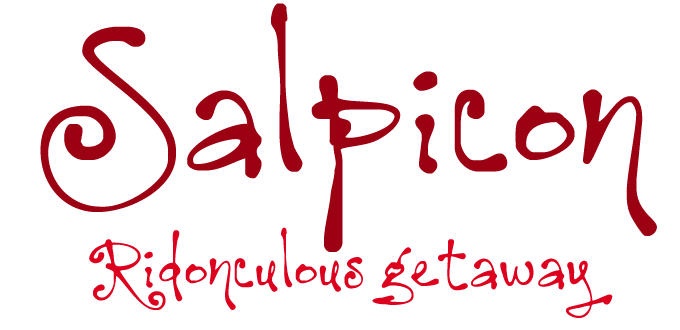
Manuel Corradine’s latest fonts are riding high at the moment. Last month we featured the carefree Happy Day, and here is Salpicon, a spontaneous script based on Mr. Corradine’s very own handwriting. It’s whimsical and funny and it comes in two weights: an informal script with a difference.
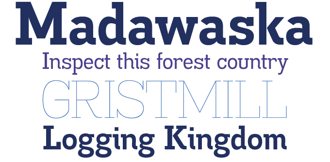
Known for his madly prolific output of display fonts in every possible style and atmosphere, Canadian designer Ray Larabie actually has produced some major text families — check out his Baskerville-inspired Winthorpe, for instance. Madawaska, a rather idiosyncratic slab serif family, has a bit of both. It’s got some of the ruggedness of his display work, and the extensive structure of a text family. With seven weights, including some very subtle hairline versions, it’s versatile and widely usable.
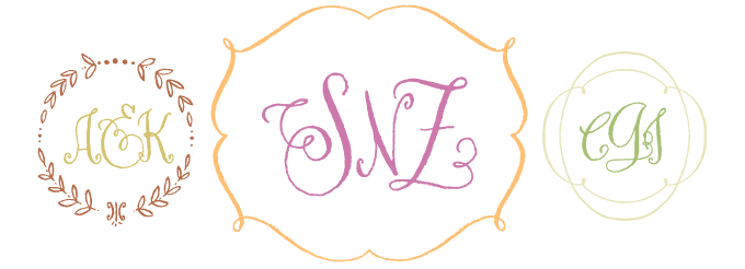
This set from Tart Workshop, lettering artist Crystal Kluge’s company, is something rather out of the ordinary. Darling Monograms is a collection of elements to create charming monograms and frames. Its ragged edges and curly shapes recall the lettering style Andy Warhol used in his commercial art from the 1950s — actually based on his mother’s handwriting. What is quite remarkable about the font is its pricing: all versions are identical, but they are priced according to the number of impressions (items, not projects) you intend to produce. The reasoning behind this is simple: professional users may wish to create and products using this font — anything from custom-printed announcements and stationery to clothing, and gifts. For personal use, the 250 copies version will probably do; for commercial use, just decide what kind of license is best for you know. You can upgrade anytime in the future.
Text family of the month
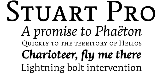
Stuart is one of the most ambitious typeface families to have hit MyFonts’ virtual shelves lately. Its family structure is based on an age-old principle: optical scaling.
As you may know, the punchcutters who used to cut typefaces directly in steel (which was then hardened and used to strike matrices) worked at true size. As they moved down into the smaller sizes, they could not simply use the exact same proportions they had used for the large ones: strokes had to become relatively sturdy, shapes simplified, width and spacing increased. So, each body size had its own design, influenced by the purely physical limits of the punchcutter’s dexterity and eyesight… which made each size just right for the reader’s eye.
Today most text faces use just one basic design which the computer allows you to scale almost infinitely, from tiny to huge. The result isn’t always inviting: texts may become too skinny or headlines too coarse.
Designed by Swiss-born Matthieu Cortat, the Stuart family amends this deplorable situation by offering three designs for a single typeface. It’s not a completely new principle for digital fonts (families like Utopia and ITC Bodoni use it too) but Stuart is beautifully designed and its details are quite original.
The sturdiest is Stuart Caption, suitable for type sizes below 8 points; at the other end of the scale is the more refined Stuart Titling, with Stuart Text in between. The differences are subtle, but make a lot of sense.
Stuart’s “Standard” version has various figure sets and small caps accommodated in separate fonts, whereas the Pro version has it all accumulated in a single glorious OpenType font per weight.
Follow-Up
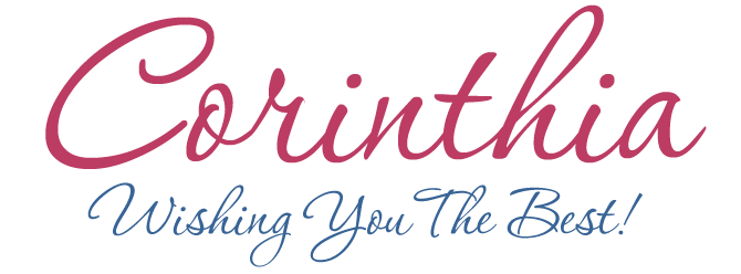
Of the fonts featured in last months Rising Stars newsletter, Rob Leuschke’s pretty Corinthia has been the most steady seller. With its supple curves and vigorous rhythm, it’s bound to add class and energy to brochures, invitations or classy packaging.
If you liked this font from TypeSETit, check out some of their other scripts:
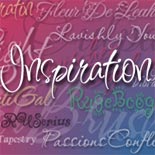
Inspiration
A less-than-serious script font that bounces and jumps in all directions. Festive and cheeky, it’s still riding the bestseller charts in the 5th year of its existence.
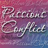
Passions Conflict
A perfect balance between elegance and informality. It’s a script face that has what the Germans call “Schwung” — which is like “swing” with multi-colored lighting.
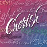
Cherish
Cherish explores yet another area in the calligraphic realm: energetic handwriting with a unflexible brush or maybe a reed pen, resulting in a scratchy effect.
Have your say
— Rosastef in Iceland
7 November, 2008
Your opinion matters to us! Feel free to share your thoughts or read other people’s comments at the MyFonts Testimonials page.
Colophon
The Rising Stars nameplate is set in Auto 3 and Bryant, the drop-cap T in the introduction is set in Facebuster, and the Have your say quotation in Stuart.
Subscription info
Want to get future issues of Rising Stars sent to your inbox? Subscribe at www.myfonts.com/MailingList
Comments?
We’d love to hear from you! Please send any questions or comments about this newsletter to [email protected]