
MyFonts has been busy these past few weeks. Newsletter-wise, we have taken a short break, but elsewhere on the internet our activities caused quite a buzz. Our new website has met with much praise, and some great feedback on possible improvements. Our new blog has begun to accrue entries. And our free WhatTheFont for iPhone has been an overnight sensation, with tens of thousands of downloads in the first few days. Anyway, as this newsletter is about new fonts: without further ado, a big hand for February’s most remarkable debutantes.
This month’s Rising Stars
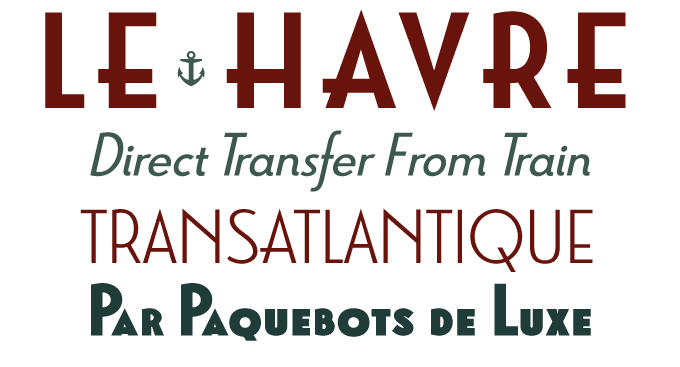
Posters advertising transatlantic voyages are among the great icons of Art Deco design. The lettering they used was as majestic as the stylized ocean liners they depicted. Le Havre, named after a French seaport, takes its inspiration from that golden era of sea travel. With its geometrically constructed shapes, compressed capitals and low x-height, it beautifully captures the atmosphere of 1920s and 1930s poster typography while making full use of contemporary technology. One of the best things about Le Havre is its large character set, with charming titling alternates, ligatures, old style figures and a couple of nice maritime icons.
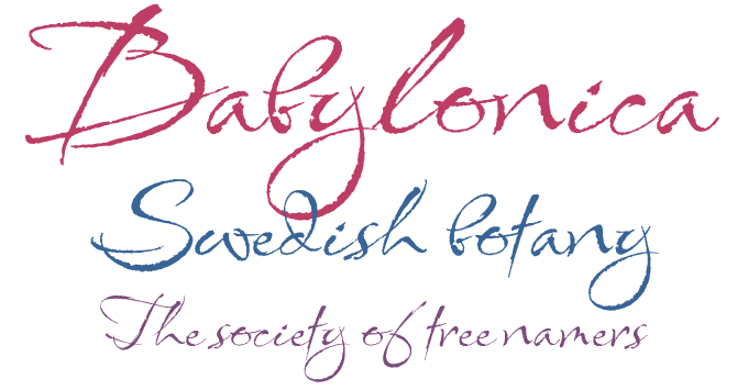
Designer Rob Leuschke is characteristically concise in his description of Babylonica, a “calligraphic, hand-lettered script”. Of course, that casual phrase doesn’t begin to describe the sophistication of this font. Leuschke’s calligraphy is as expressive as it is professional. Babylonica seems to have been jotted down with confident speed, using a hard brush or a reed pen. The rough edges are beautifully rendered and the direction of the strokes is different with each letter, making for a lively, energetic effect on the page. Babylonica will lend personality and drama to your invitation, book cover or wine label.
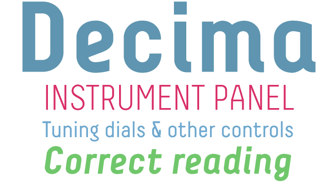
Decima and Decima+ by Ramiz Guseynov are an interesting pair of condensed sans-serif families. Both are monolinear — i.e. with hardly any variation in stroke thickness. Decima has an upright in three weights, with extremely rational, geometric forms; while its italic has more humanist features, including some shapes borrowed from handwriting. Decima+ (“Plus”) is a clever combination of those two: upright, but with the calligraphic elements of the italic, such as the loops on g, y and z, and some bent terminals. The bold weight has been drawn on the exact same grid as the lighter versions, which makes it a compact and striking face for titling. And if you like that techie look of monospaced fonts, check out Decima Mono.
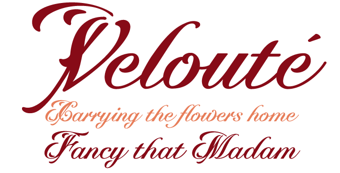
There seems to be an insatiable appetite for smooth, connected scripts, and Velouté by Robbie de Villiers is one of the most savory recent fonts in its genre. Named after one of the original “mother sauces” in French cuisine, it is a bold and velvety script with delicate, attention-grabbing flourishes. Velouté’s tasty mix of classic, contemporary, bold and delicate detail is great for special invitations, coffee shops, restaurants, boutiques and packaging.
Text family of the month
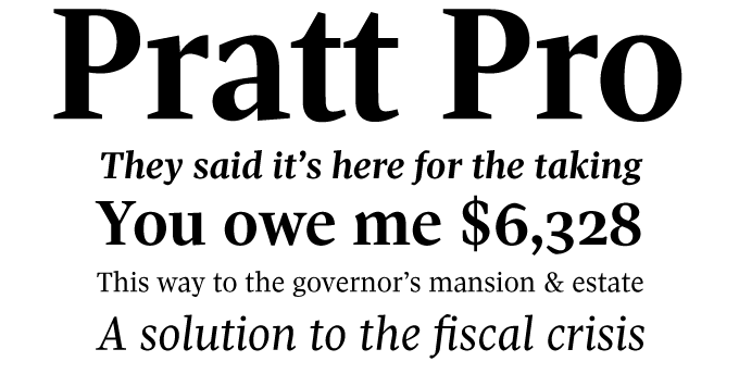
When a newspaper commissions a brand new font family to be developed for its pages, it is always fascinating to see the outcome. Designed in 2007 for the Globe and Mail, Canada’s national newspaper, Pratt Pro is a remarkable tour de force. Nick Shinn’s original news face is crisp and contemporary, lucid and economical, and maximizes readability when space is at a premium.
Named after David Pratt, who led the redesign as design director of the Globe and Mail, the typeface has been used for the paper’s body text since May 2007, setting hundreds of millions of words. Now this family of text and headline styles has been made available to other users as well — a great privilege, so soon after its first appearance as an exclusive custom family.
Pratt Pro was designed to look bigger than almost any other serifed text face — old style or modern — with carefully drawn, short extenders to avoid collisions in tight leading situations. This is obviously important for text sizes, but plays a role in multi-line headlines and decks too, where precise horizontal spacing and tight fit calls for a similar aesthetic in the vertical dimension. When used with normal leading, the effect is spacious and open, with remarkable legibility in small sizes.
Pratt Pro is an OpenType family with an extensive language character set, small caps and multiple styles of numerals.
Follow-Up
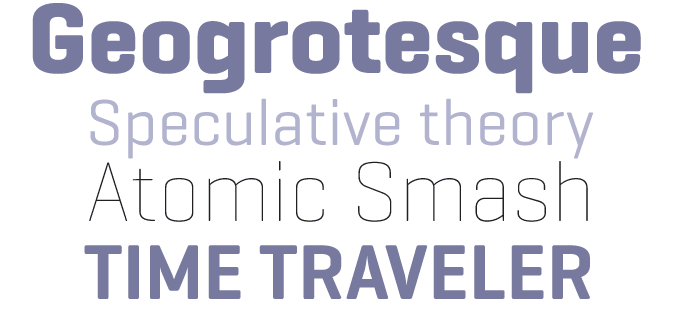
Geogrotesque by Eduardo Manso is a geometric sans-serif that manages to retain an elegant and friendly appeal despite its rational structure. Based on a simple basic shape — a rectangle with curved top and bottom — the typeface is very regular without becoming bland or mechanical. Its sloping horizontals tie the words together into coherent shapes that ensure legibility even at smaller point sizes.
If you like this font from EmType, check out their other typefaces:
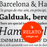
Relato
Relato is a low-contrast, muscular serifed typeface designed for a comfortable immersive reading experience. Although it took its inspiration from renaissance lettering and calligraphy, Relato is decidedly contemporary, showing great originality in the details.
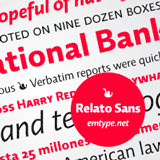
Relato Sans
The perfect companion to Relato, Relato Sans is less idiosyncratic, more austere. Like its serifed counterpart, Relato has humanist traits combined with a contemporary cut. Its wide variety of weights makes it a flexible tool for projects of great complexity.

Dixplay
Based on a rigorous pixel grid, Dixplay was conceived for headlines in web pages and multimedia projects; it works fine in high-resolution on paper as well. It is subtler than most pixel fonts, with 300 man-made kerning pairs to make it fit perfectly into the grid.
Have your say
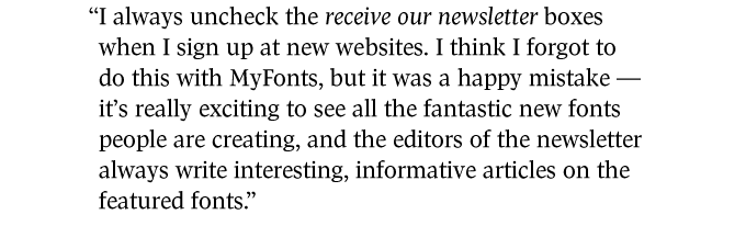
— Paul in Penticton, Canada
28 January, 2009
Your opinion matters to us! Feel free to share your thoughts or read other people’s comments at the MyFonts Testimonials page.
Colophon
The Rising Stars nameplate is set in Auto 3 and Bryant, and the Have your say quotation in Pratt Pro.
Subscription info
Want to get future MyFonts newsletters sent to your inbox? Subscribe at myfonts.com/MailingList
Comments?
We’d love to hear from you! Please send any questions or comments about this newsletter to [email protected]