
We’re working with our windows open today — spring is finally here. Of course, our figurative doors and windows here at MyFonts are seldom closed. We welcome all designers and foundries who have something new to offer (provided that it works and is legally theirs). This past month, dozens of new foundries joined MyFonts. We invite you to explore our What’s New and Hot New Fonts pages to see what they’ve come up with. You’ll also find some familiar faces there: new fonts by established foundries that have been part of MyFonts for a long time. Find out who among them have done particularly well in this new edition of Rising Stars.
This month’s Rising Stars
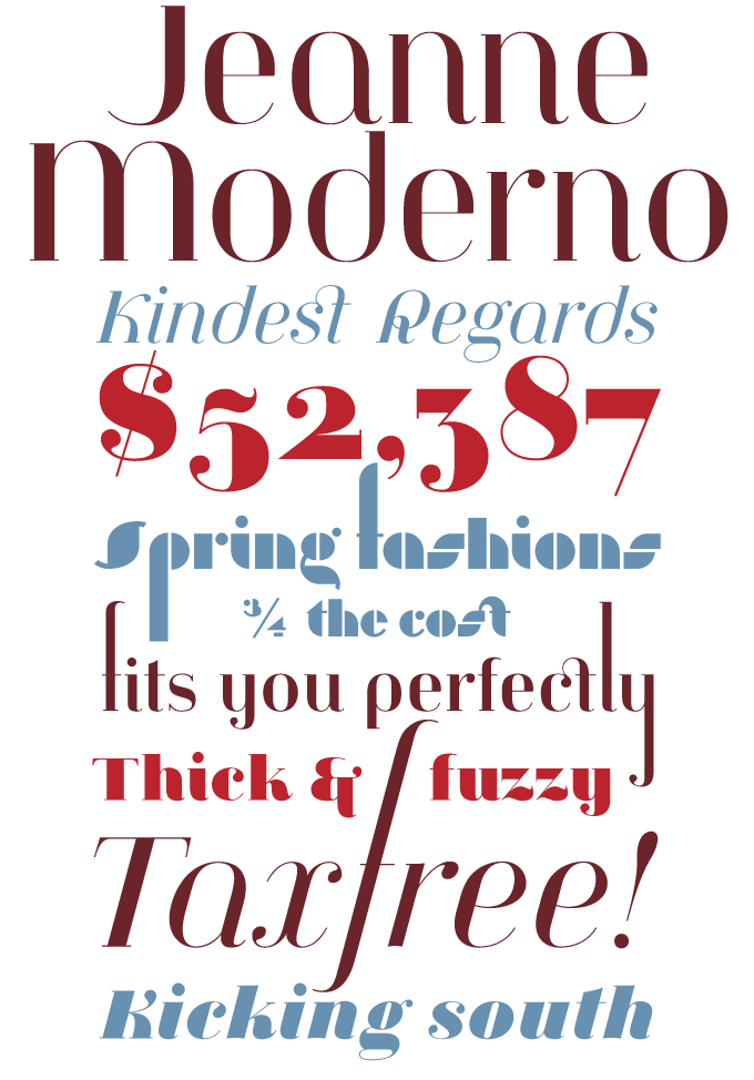
Jeanne Moderno is an unlikely besteller. Not that it isn’t a great typeface — it certainly is — but it is also very unusual. Its basic, vertically stressed features are based on the 19th-century “Fat Face” style, which is like an exaggerated Bodoni. But there are lots of other influences at work, from Bauhaus stencil faces to 1950s advertising. The letterforms are an unprejudiced mix of elements from upper- and lowercase, upright and italic, Latin and Cyrillic. Have a look at the fantastic set of posters submitted by designer Steve Mehallo to get an idea of how many styles and periods can be evoked using this one retro-futurist type family. And that’s probably why so many of our users like it. A remarkable feat.
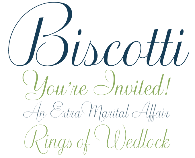
When we presented Biscotti alongside our interview with its designer Cyrus Highsmith, we noted that Biscotti is rather unique among Highsmith’s typefaces. The reason is that this festive script was originally designed for a very special client. Brides magazine wanted “a typeface that makes the reader feel pretty.” Highsmith developed an elegant and clean descendant of the flourished engraved scripts that have adorned millions of wedding invitations. Biscotti truly captures the atmosphere of a happy occasion.
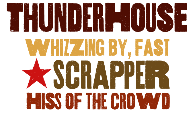
It’s been a while since we had one of these heavy-hitting, in-your-face, distressed wood types at the top of our list of Hot New Fonts. Like Jeanne Moderno above — but in a completely different way — Aerotype’s Thunderhouse, too, is a novelty face. Thunderhouse combines three well-worn gothic alphabets (with different weights and widths) in one font. What makes it different from many similar fonts is a bit of clever OpenType programming. Thunderhouse comes with 26 OpenType ligatures that automatically substitute a unique pairing of characters when any lower case character is typed twice in a row — and thus offers instant diversity!
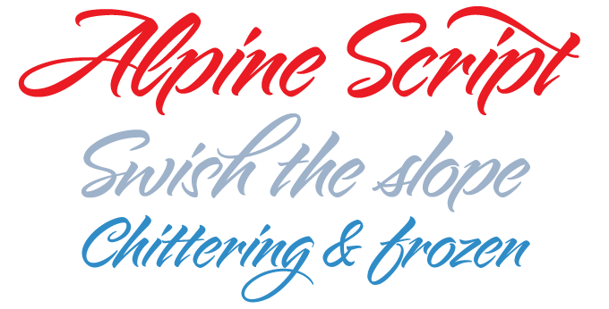
The popular genre of brush scripts is an endless source of delight, and Alpine Script from Charles Borges de Oliveira is one of the prettiest we’ve seen in a while. It’s got dash and confidence, and what’s more — it also features about 30 alternate characters that allow you to customize a headline or b(r)and name, giving it just the amount of flair it needs. Just imagine what you can do with it: Travel brochures. Ice cream packaging. Stationery. Letters to your aunt. Alpine is waiting to be explored.
Text family of the month

This month’s text font is the latest offering from Dino dos Santos of Portugal, one of most prolific designers in the business. Dobra is a multi-purpose sans-serif with a strong personality. Released less than two months ago, it has already been remarkably successful.
Dos Santos explains that Dobra was based on his earlier typeface Dione; however, with Dobra he has resolutely taken the concept to a different level altogether. Dobra is geometric and robust; its unorthodox shapes lend a unique character to medium-sized and large texts. In smaller sizes, the idiosyncrasies tend to disappear, with the open shapes and clear lines providing optimum legibility.
With its well-proportioned small caps and multiple figure styles, Dobra offers ample typographic sophistication for use in non-literary books and magazines; its unique character makes it a strong candidate for your next corporate identity project.
Follow-Up
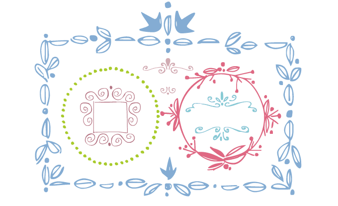
Many users were delighted with Rae Kaiser’s Frames and Borders. It’s a simple-to-use set that allows you to successfully mimic the playful, informal frames of yore — back when these ornaments were actually drawn anew for each occasion.
If you liked Frames and Borders, there’s more where this font came from:
Party Doodles
Six party words in two styles of handwriting — curly script and “print” — as well as 24 drawings of gifts, hats, noisemakers, candles, eats and drinks. What else do you need to design a great invitation? Well, maybe Party Doodles Too. Should your party happen to be a wedding party, you may want these.
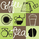
Coffee & Tea Doodles
Coffee and Tea Doodles is equally witty: a collection of hand-drawn coffee and tea things. The ideal clip art for coffee shop menus, ads, invitations, etc. Like Party Doodles, it includes ready-made words that include “coffee break” and “tea for 2”.

Diva Doodles
This is great scrapbook stuff: a pictogram font of girl things such as lipstick, nail polish, perfume, shoes, hats, camera, phone, and clothing items, all in the same playful style as Rae Kaiser’s other Doodles. If you’re not into girlie stuff, try Holiday Doodles instead.
Sponsored font
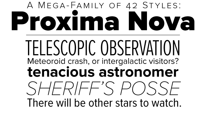
Proxima Nova is an impressive tour-de-force: a sans-serif family spanning seven weights and three widths — 42 full-featured OpenType fonts in all. Stylistically, Proxima Nova bridges the gap between geometric typefaces like Futura and 19th-century “industrial” faces such as Akzidenz Grotesk. The result is a very original hybrid that combines the straightforward clarity of the geometric sans with the excellent readability of humanistically inspired faces. Equipped with small caps and multiple figure styles, the basic Proxima Nova fonts provide the demanding typographer with all they may expect from a professional text font. Supplementary fonts (Proxima Nova Alt and Proxima Nova ScOsf) are included to offer those same features to users of programs that do not yet support all OpenType features, such as Microsoft Office and Flash.
Have your say

— Robert C
26 Feb, 2009
Your opinion matters to us! Feel free to share your thoughts or read other people’s comments at the MyFonts Testimonials page.
Colophon
The Rising Stars nameplate is set in Auto 3 and Bryant, and the Have your say quotation in Dobra.
Subscription info
Want to get future MyFonts newsletters sent to your inbox? Subscribe at myfonts.com/MailingList
Comments?
We’d love to hear from you! Please send any questions or comments about this newsletter to [email protected]