This month’s Rising Stars
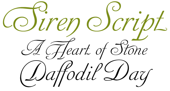
Siren Script from Canada Type is this month’s most popular script font, having lived almost permanently in the top 3 of our Hot New Fonts list. This ravishing unconnected script by by Rebecca Alaccari and Patrick Griffin takes its cue from BB&S’s Stationers Semiscript, produced as a metal font in 1863, and its countless imitations. It also taps into a variety of uncredited film faces from the 1960s. Its mixing of flourished majuscules with more subdued minuscules results in an attractive balance between the formal and the informal — the message is gracefully yet clearly delivered. With four full fonts of different variants, and a fifth that contains alternates, ending letters and some ligatures, the variety is almost endless. Siren Script Pro combines all five fonts into a single one of over 880 glyphs, which includes programming for push-button stylistic alternates and various glyph palette conveniences.
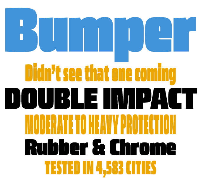
Launched in the early days of January, HVD Bumper is likely to remain one of the year’s heaviest cases – and we mean that literally. Despite its overweight proportions, the font climbed effortlessly to the highest regions of our best-selling new fonts list. Hannes von Döhren’s Bumper is the perfect ultra-bold sans for headlines that want to be LOUD without committing crimes against good taste. A short text set large in Bumper — because of its tiny counters, it won’t work at small sizes — will shout out its message and still fit in with its context. There are three degrees of Bumper: from the broad-shouldered Regular via the narrower Condensed to the artfully squeezed Compressed. For a more anarchic result, try mixing the three widths in one word or line. The effect is one of tension and unrest, but when carefully done, it looks great.
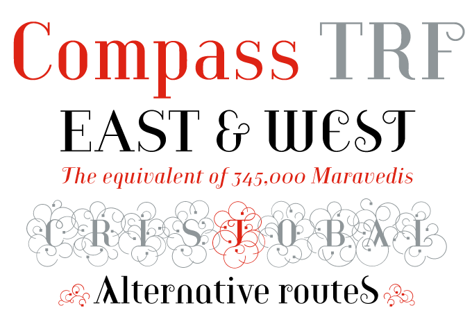
TipografiaRamis published two typefaces on the same day in December, and both became hits. They are both geometric in construction, but otherwise they couldn’t be more different. While Croog is a monolinear face with short rounded serifs, Compass TRF proudly displays its strong vertical stress and has thin, straight lines for serifs. Designed in the vein of the early 1800s “modern face” or Didone types, Compass strikes a balance between the rational and the ornate. It comes in various degrees of flamboyance. While the Regular weight is a rather straightforward roman with some curly elements, the Alternate is an eclectic collection of unusual letterforms. Flourish gets totally decorative in the uppercase, with simple small caps in the lowercase positions.
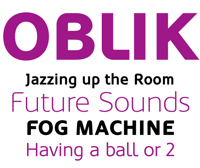
Tour de Force is a microfoundry from Serbia that joined MyFonts early last year. With Oblik, designer Slobodan Jelesijevic has now scored his first real hit. Oblik is a cool, clean sans-serif, more radical than the foundry’s earlier, smooth-looking Belco family. Oblik’s simplified letterforms exude a space-age atmosphere — the kind of optimistic futurism that may also seem subtly retro. It comes in four weights, of which the middle ones — Regular and Bold — will work smoothly in longer, medium sized texts as well. A jazzy face with a strong personality, Oblik is a good choice for flyers, magazines, posters and packaging. Don’t forget to check out Oblik’s sturdy-looking sibling, the rounded slab serif Oblik Serif.
Text family of the month
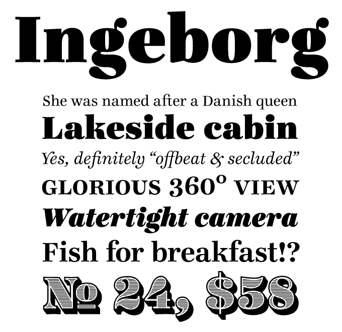
Having obtained an MA in Type Design in Reading, Michael Hochleitner from Vienna decided he wanted “to work as a designer without selling his soul.” To this end, he founded the Typejockeys studio with like-minded designers Anna Fahrmaier and Thomas Gabriel. Michael’s first text family, Ingeborg, was designed with the intent of producing a readable modern face. Although its roots are historical — late 18th to early 19th century, to be precise — its approach is very contemporary. Ingeborg’s Text Weights are functional and discreet. Yet they have retained the classic characteristics of a Didone typeface: vertical stress and high contrast. The Display Weights on the other hand were designed to grab the reader’s attention with their idiosyncratic shapes and with a lot of ink on the paper. In addition, striking headlines and logos can be created using the “unicase”; alphabets, a mix of lowercase and small caps, hidden in the text fonts’ Stylistic Sets. As Ingeborg’s text and display varieties share a common origin and approach, they work together in perfect harmony.
Follow-up
Ministry Script is one of Alejandro Paul’s best known and most elaborate script fonts. It is also one of those OpenType-programmed scripts that (when used with contemporary layout software) magically help you select the ideal version of each letter in a particular combination. With Ministry Script, you have amazing headlines and logos at your fingertips. The font was made available at MyFonts a couple of months ago, and it comes as no surprise that it has been doing really well ever since. A single face with over 1,000 glyphs, Ministry Script comes with a galaxy of alternates, swash characters and ligatures to explore. Check out the Ministry Script Guide PDF for detailed info.
If you like this typeface from Sudtipos, check out some of their other fonts:
La Portenia
La Portenia pays homage to early 20th-century show card writers and type designers. The face has two variations.
La Portenia de Recoleta is slightly more formal and polite, while La Portenia de la Boca has more extravagant flourishes and indulges in more generous interletter space. This showier variant is reminiscent of signs found in Buenos Aires.
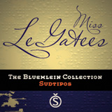
The Bluemlein Collection
The Charles Bluemlein Collection is based on a 1940s catalogue from the Brooklyn-based Higgins Ink Co., which contained a portfolio of script alphabets credited to lettering artist Charles Bluemlein. Ale Paul took extreme care to render the scripts authentically, keeping the fictitious names that Bluemlein originally assigned to each alphabet.
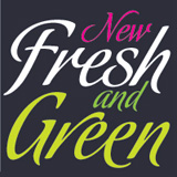
Inoxida
Inoxida is one of many script fonts designed by the winning team of Ale Paul and Angel Koziupa. It is a smoother version of the earlier rough-edged Oxida. Ideal for for food packaging and advertising, Inoxida is characterized by energetic gestures and smooth curves. It also has a nice set of alternate characters to build harmonious word shapes.
Sponsored Font
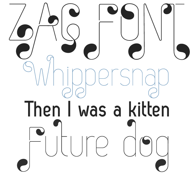
Bulgarian designer Svetoslav Simov has a predilection for geometric fonts with a distinct 1970s–1980s flavor. The successful Zag published by his one-man foundry, FontFabric, represents an unusual variety of this genre. It has the characteristics of a constructed alphabet made with ruler and compass, yet contains elements that are quite unusual for this kind of font — such as conspicuous ink traps in sharp corners, or exuberant drop-like ornaments. While Zag’s ‘straight’ weights are industrial sans-serifs along the lines of the DIN typeface, well-suited to performing administrative tasks, the decorated varieties suggest a different kind of use, from magazine headlines to T-shirts.
Have your say
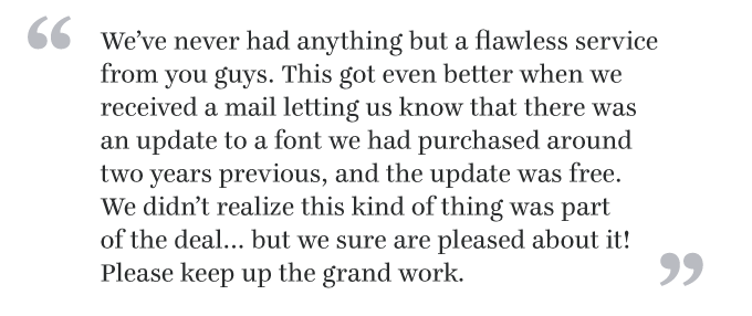
— Paul, Birmingham, UK, January 22, 2010
Your opinion matters to us! Feel free to share your thoughts or read other people’s comments at the MyFonts Testimonials page.
Colophon
The Rising Stars nameplate is set in Auto 3 and Bryant, and the Have your say quotation in Ingeborg.
Subscription info
Want to get future MyFonts newsletters sent to your inbox? Subscribe at myfonts.com/MailingList Want to get future MyFonts newsletters sent to your inbox? Subscribe at myfonts.com/MailingList
Comments?
We’d love to hear from you! Please send any questions or comments about this newsletter to [email protected]


