
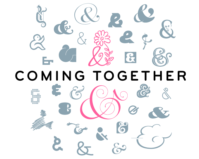
Each Rising Stars newsletter is different, but this month’s issue is more different than usual. We feature work from two designers that are new to MyFonts, as well as versatile families from two of our most productive foundries. We are introducing the first new typeface in decades from the living legend that is Mike Parker. And the biggest news is an extra-special collaborative font uniting hundreds of designers: Coming Together, a Font Aid project for Haiti.
This month’s Rising Stars
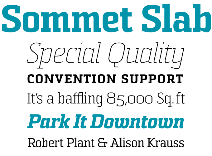
At the time of writing, Jeremy Dooley’s insigne foundry has two new font families in the top 5 of our list of Hot New Fonts. We chose Sommet Slab to feature in this newsletter because it’s such a versatile (and quite original) addition to his Sommet family. A six-weight subfamily with narrow letterforms and sturdy serifs, Sommet Slab is an unconventional yet flexible solution for magazine design or identity projects. It is a powerful headline font, but will also work well in medium-sized texts such as intros and pull quotes. For more variety, combine with the companion sans-serif, Sommet. Sommet Slab includes oldstyle figures and small caps.
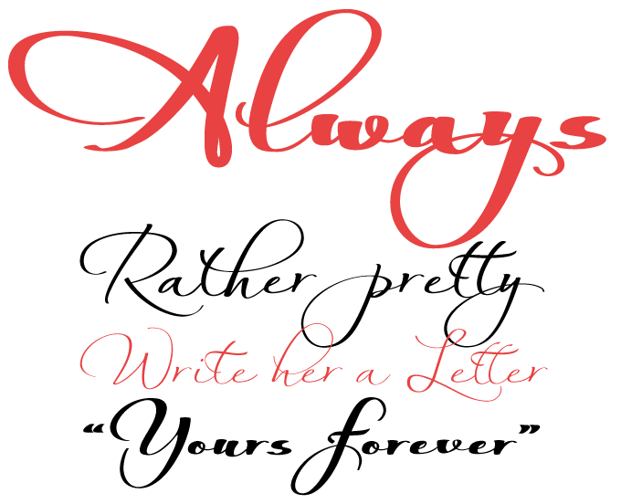
There is a style of handwriting fonts that we at MyFonts have dubbed “creative common” — inventive variations on what may initially seem to be ordinary handwriting, but is rather fancier when you take a close look. Check out bestsellers like Satisfaction and Nothing, and you’ll know what we mean. The successful new script Always from Anton Scholtz is a family in the same vein but is a somewhat more ornate variation on the informal script theme. With its four weights, from Light to Fat, it offers four distinct flavors, giving you plenty of variety for all possible uses — from packaging and book covers to greeting cards and advertising. All weights come with a set of automatic ligatures for a more natural, handwritten effect.
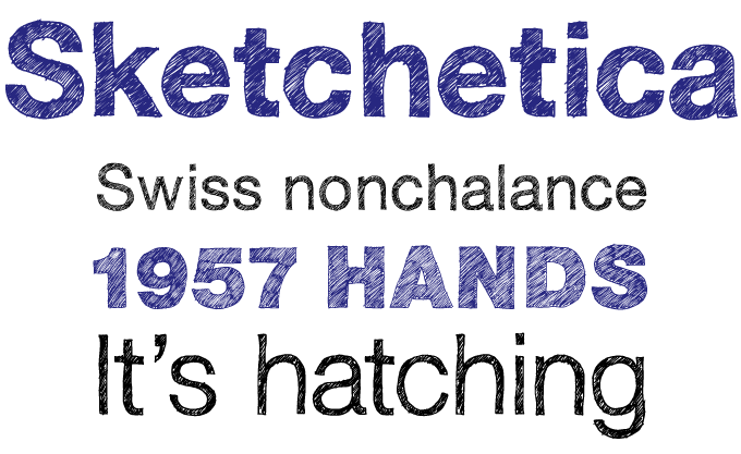
Ever since German design student Lukas Bischoff had a surprise hit with Sketch Block, sketched versions of well-known typefaces have been all over the place. We’re not supposed to mention the trade-marked classic that was the model for Hiekka Graphics’ Sketchetica but the name sort of gives it away, and that original is probably #1 in our bestseller list right now. Sketched lines of type were what the graphic designer used to draw to give the typesetter a clear idea of how he wanted a text to look. Today, these hand-made imitations are an end in themselves as display fonts full of character. If you’d like to see more of that stuff, check out Gert Wiescher’s Perfect Sketch and assorted Sketched Franklins.
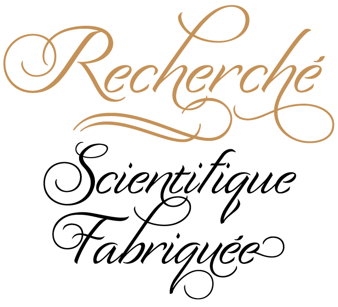
Designer Laura Worthington calls Recherché “modestly extravagant”, and that is a very nice way of putting it. In the sample above, we’ve played with some of the font’s flamboyant swash forms — for example, it has a whopping 11 different versions of the “h” — but the good thing is, they are not absolutely necessary to make the font work. When refraining from any whimsical decoration, the result is a very readable and, indeed, modest informal script suited for more than just headlines, such as the text of an invitation or ad. Based on real hand-lettering with a pointed brush, Recherché contains over 100 alternate swash letters and a set of formal capital letters. Its name is a French word meaning "with studied refinement and elegance”, and Recherché lives up to that brilliantly.
Extra: Font Aid IV
Text family of the month
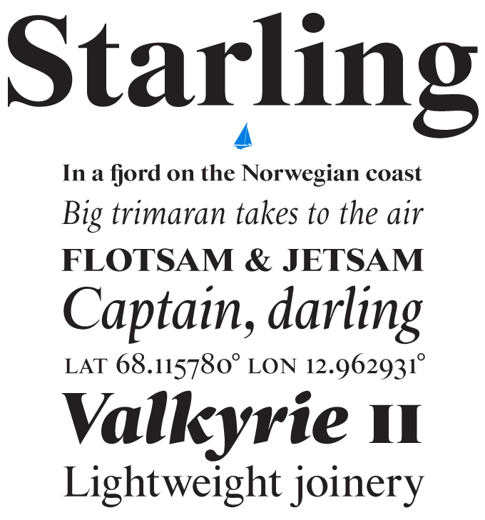
Starling is the outcome of one of typography’s greatest whodunit stories. Its designer Mike Parker, grand old man of American type design and type history, has a fascinating theory about the origin of the world’s most famous oldstyle, Times (New) Roman. While the accepted story is that Stanley Morison worked with an artist from The Times’ advertising department, Victor Lardent, using Plantin as basis, Parker discovered another possible model. It is an anonymous typeface drawn decades earlier, possibly by the colorful William Starling Burgess, a designer who abandoned typography to become a yacht designer and aviation pioneer. Parker examined the alleged Burgess drawings and found them superior to the famous newsface — and Starling is his tribute to this nameless predecessor.
Produced at Font Bureau, Starling is a state-of-the-art OpenType family in four weights, including a striking Ultra Black headline set. It comes with lining and oldstyle figures as well as small caps (accommodated in separate fonts). While the roman recalls the simplicity and strong contrasts of the many versions of Times that we know so well, the italic is something different altogether: energetic, sharp and spirited — a beauty.
Follow-up
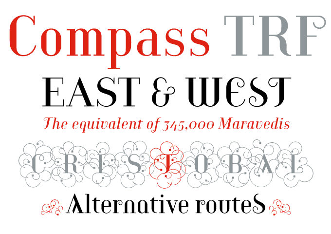
Featured in our February newsletter, Compass TRF has caught the imagination of hundreds of users, becoming TipografiaRamis’ best selling typeface to date. Although geometric in construction, Compass’s strong vertical stress and thin, straight serifs lend it a neo-classical appeal, striking a balance between the rational and the ornate. While the Regular weight is a rather straightforward roman with some curly elements, the Alternate is an eclectic collection of unusual letterforms and Flourish’s capitals get wildly decorative.
If you like this typeface from TipografiaRamis, check out some of their other fonts:
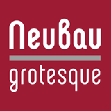
Neubau Grotesque
Neubau Grotesque is an upright italic variation of Ramis’ Neubau (Sans) and is built in three weights. The main difference with its counterpart is that Grotesque presents a softer and more human look — less techno — while retaining the condensed geometric structure of the original Neubau.
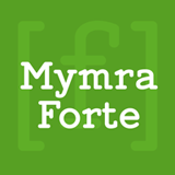
Mymra Forte
Both Mymra Forte and Mymra Piano are monolinear serif faces inspired by the lettering work of Charles Robinson. With its simplified and straightened terminals and serifs, Forte has a more rigid presence than Piano. While ideally suited for display use, Mymra Forte will also work well in short text settings, especially its Light and Regular weights.
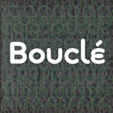
Bouclé
Ramis’ latest offering is a monoline decorative typeface family of three subfamilies: Plain, Round and Loopy. Plain and Round come in two weights — regular and bold. While Bouclé Plain works well in designs that require a certain degree of legibilty, Round and Loopy fonts are reserved for highly decorative cases.
Sponsored Font
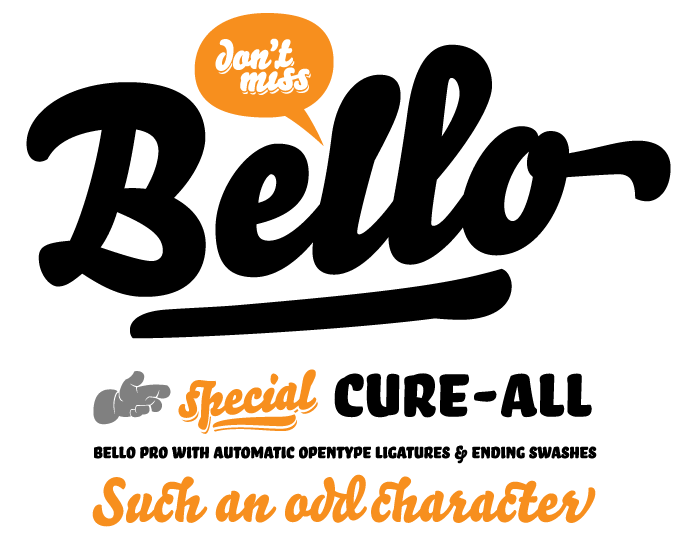
This month’s sponsored font Bello comes from Underware, the designers of Liza, the most popular brush script font of 2009. Like Liza, the earlier Bello convincingly mimics the work of the sign writer. It is big, beautiful and well-equipped. Its glamorous ligatures and swashes allow the user to give each word its individual layout. Besides the appealing flow of the Bello Script face, there’s the upright and sturdy Bello Small Caps. In Bello Pro (the OpenType version) the Small Caps are integrated, together with a set of striking word logotypes. When you opt for the separate logotype font, Bello Words, there’s a companion font of drop shadows to play around with in different colors. Bello is the ultimate brush font toykit.
Have your say
— Jessica, February 24th 2010
Your opinion matters to us! Feel free to share your thoughts or read other people’s comments at the MyFonts Testimonials page.
Colophon
The Rising Stars nameplate is set in Auto 3 and Bryant; the Coming Together fontname is in Bryant caps. The Have your say quotation is set in Starling Italic.
Subscription info
Want to get future MyFonts newsletters sent to your inbox? Subscribe at myfonts.com/MailingList Want to get future MyFonts newsletters sent to your inbox? Subscribe at myfonts.com/MailingList
Comments?
We’d love to hear from you! Please send any questions or comments about this newsletter to [email protected]