
The first rule for enhancing your productivity at the workplace or at home is: don’t allow yourself to be interrupted by random stimuli such as an incoming newsletter. Hm. You may have broken that rule already. Luckily there is a second rule that says that both your mood and your creativity can get an enormous boost from seeing some really well-made eye candy, typographic or otherwise, especially if it has some depth and weight. All of which implies that devouring this newsletter may well be a very efficient start to the rest of your day. Enjoy.
This month’s Rising Stars
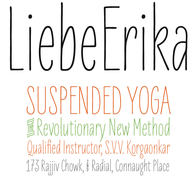
About a year ago, LiebeFonts (which is German for “sweet fonts” or “dear fonts”) began publishing witty picture fonts based on the work of illustrator Ulrike Wilhelm. LiebeErika is Ulrike’s first alphabetical font, and it has skyrocketed into the upper reaches of our Hot New Fonts list. A thin, compressed typeface with a hand-drawn look, LiebeErika shares some characteristics with recent fonts such as Amarelinha or Strangelove Next but the differences are obvious. LiebeErika’s curves are smoother and its shapes more regular — without being stiff. More importantly, it has lowercase forms (and very charming they are), plus more extras than you can shake a stick at: cheerful alternate forms and figures, ligatures, nicely designed key words (“and”, “the”, “by”) and more. While you need OpenType-enabled software to use these advanced features, you'll be able to enjoy LiebeErika’s graceful shapes with other programs as well.
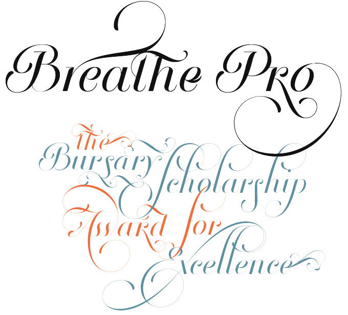
Breathe is the latest script font from Buenos Aires-based designer Maximiliano R. Sproviero, and it may well be his most accomplished and subtle typeface to date. Following his Parfait Script, Sproviero wanted to make something more universal so, inspired by the work of Didot and other typographic designers from around 1800, he began working on a font that would travel from very formal and conservative letterforms to a world of swashes and flourishes. His aim: to makes the letters feel alive. “Cuando las letras respiran...” became his catchphrase, which translates as “when letters breathe” — hence the name. Breathe Pro comes with over 1000 glyphs, including huge sets of alternates, swashes, historical forms, ligatures and more. If you want a less intricate font in the same style, choose Breathe Standard.

MVB Embarcadero lies in a space between the nineteenth-century grotesque sans-serif and vernacular signage lettering drawn by engineers. It conveys credibility and forthrightness without pretense, making it a most versatile typeface, capable of delivering any kind of message without getting in the way. The family originated in a very different project: in the 1990s designer Mark van Bronkhorst began digitizing a blocky slab serif from the Victorian era, which was then set aside. When he later revisited the design, its outline evolved and took on curves that echoed the rigid skeleton of the original, eventually becoming a complete text sans-serif family while maintaining the subtle eccentricities of its inspiration. Embarcadero’s OpenType Pro set of 20 fonts contains two widths and five weights, each with italics, small caps, a full set of figures, bullets and arrows, and support for most Latin-based languages.
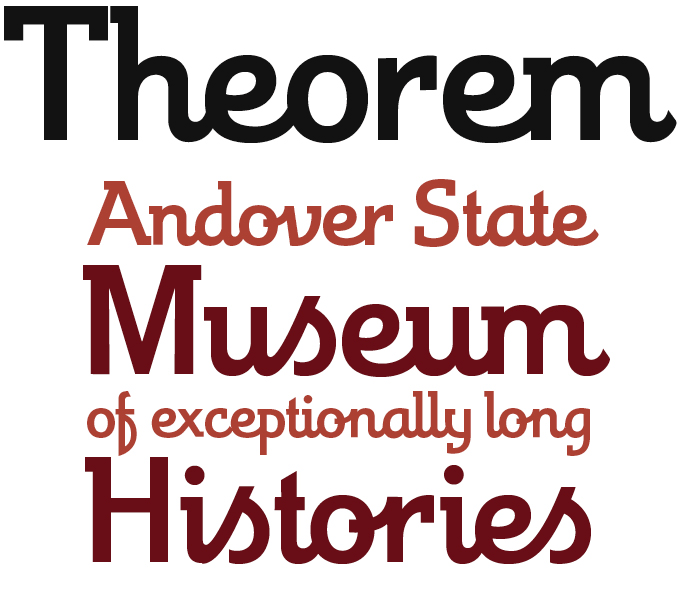
Theorem is yet another collaborative project from Sudtipos’ team of lettering artist Angel Koziupa and type designer Alejandro Paul. It is, however, an interesting change from their usual calligraphic fonts such as Amorinda and Chocolate. Theorem combines the geometric simplicity of Art Deco type with the connected shapes of handwriting or 1950s streamlined lettering. Theorem’s lowercase characters were designed to achieve the best optical spacing automatically. Use the automagic of OpenType to utilize its variety of alternates and vowel-focused ligatures. The result is a very versatile typeface that is particularly useful for packaging and many different applications of display typography.
Text family of the month
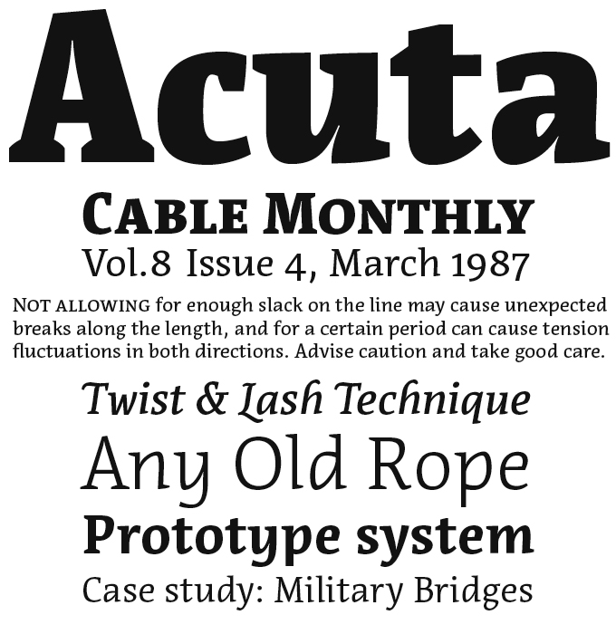
With Acuta, Berlin-based designer Elena Albertoni joins the ranks of young European female designers creating confident, innovative text faces. Published by her microfoundry Anatoletype, the Acuta family has been years in the making, and the result is a thorough as it is striking. The typeface is both robust and supple: designed for optimum legibility in text sixes, distinctive when used for headlines, signage or logos. While respecting the proportions and diagonal stress of oldstyle text faces, the differences between thick and thin strokes are less pronounced, making the typeface work well at small as well as larger sizes. Its “acute” angles and its elements of italic construction lend dynamism to the text.
The family consists of seven weights with their respective italics. The huge character sets include oldstyle and tabular figures, small caps and ligatures, accessible through OpenType features. The italics include unobtrusive swash alternates to emphasise their written feeling. Both the Book and Medium weights, relatively close to each other, can be used as “plain” weight, depending on the size of the text, background color or backlighting.
Follow-Up: St Ryde
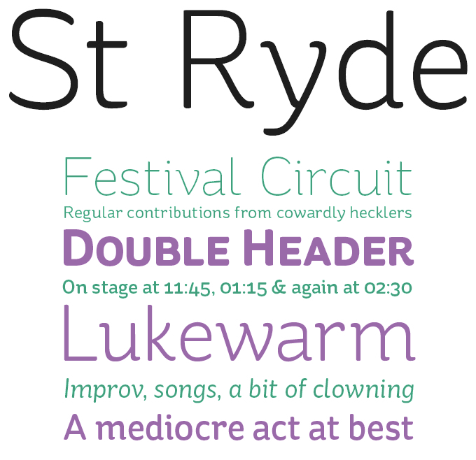
St Ryde by Sascha Timplan has enjoyed considerable success after being featured as September’s Text Face of the Month. Combining a sophisticated structure with playful details, St Ryde is a lively text face with rounded terminals — a semi-serif rather than a sans. It swings at display sizes yet looks regular and readable when used small. With multiple figure sets, small caps and open italics, it was made for serious typographic work, in spite of its unorthodox forms. To allow all users to test the possibilities of the full font, Stereotypes offers the Regular at no cost.
If you like this typeface from Stereotypes, check out some of their other fonts:
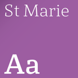
St Marie
St Marie is a vivacious mixture of old-style proportions and slab-serif detailing, resulting in a clear and contemporary text and display face for use in newspapers, books and any other printed media, as well as on-screen publications. Italics are in the making.
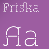
St Friska
St Friska is Stereotypes’ latest typeface, a striking headline face that comes with a wealth of alternates and ligatures. Based on old movie title lettering, Friska oozes the charm of 1920s Art Deco but it is bang up-to-date in its sharp details and smart technology.
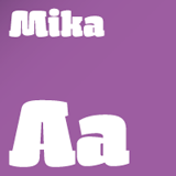
St Mika
Most of Sascha Timplan’s typefaces are individualist and witty, and St Mika is a case in point. An ultra-fat headline face, Mika is dark in color yet friendly in character: with its unusual shapes it lends an unmistakable personality to headlines, logos and slogans.
Sponsored Font: Beau Sans
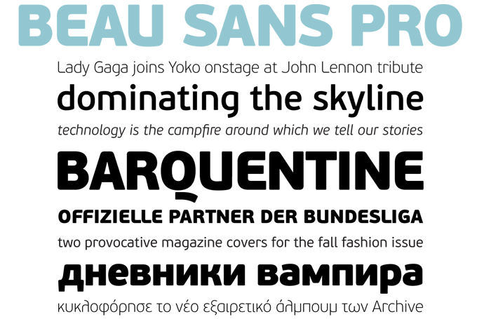
Beau Sans Pro was inspired by Bernhard Gothic, designed by Lucian Bernhard in the 1920s. Beau Sans' first incarnation, named Traffic, was a minimalist text typeface with details drawn from Bauhaus typography. A drastic makeover resulted in Beau Sans Pro. Although the modernist influences are evident, there is hardly a trace of Bernhard’s original left in Beau Sans — a contemporary sans-serif with a distinct personal style. The family comes in a generous range of eight weights with true italics and several styles of numerals.
Have your say
— Betsy, Orange, CA, Sept. 9, 2010
Your opinions matter to us! Feel free to share your thoughts or read other people’s comments at the MyFonts Testimonials page.