
The month is February, and we figure it’s going to be such a good month that twenty-eight days simply won’t do this year. So we’re in for an extra day to enjoy work, make an early start on the spring cleaning or, for some of you, celebrate that all-too-rare birthday. More importantly, we’re getting one more day to enjoy good typography and gorgeous fonts, monomaniacs that we are. This month’s crop offers you scripts from some of the best specialists around, unruly fonts from a couple of newcomers, and three eminently usable text fonts. Enjoy.
This month’s Rising Stars
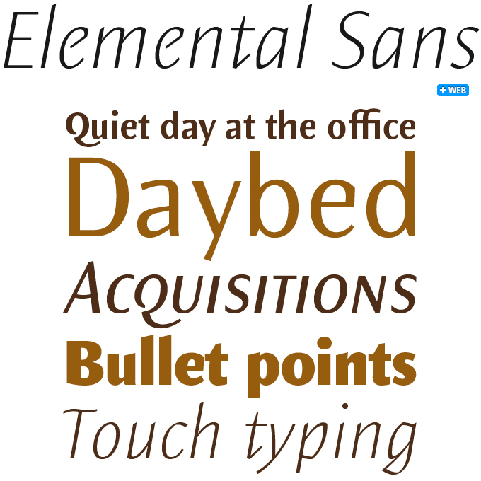
Last month’s Creative Characters interview introduced you to Daniel Hernández of Chile’s Latinotype foundry. This font family is by another contributor to the foundry’s rapidly growing library. Francisco Galvez created the original Elemental more than ten years ago; the font family was drastically redesigned and expanded for Chile’s bicentenary in 2010 and thus became Elemental Sans Pro. While technically a humanist sans-serif, Elemental does not have the quietly subservient character of most of the fonts in this genre: its strong contrasts and lively, calligraphic italic make it a striking family for text and display. With four weights plus italics, small capitals and multiple figure styles, Elemental is a good choice for flamboyant typographic designs.
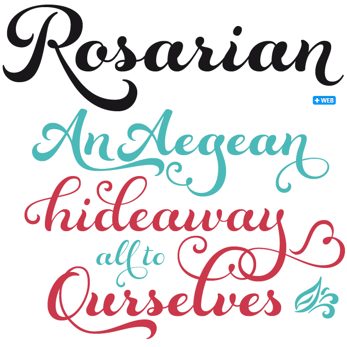
Rosarian could well be Laura Worthington’s most sensuous font — words like voluptuous come to mind. Its hand-made basis is lettering done with a pointed brush — a craft that Worthington revels and excels in. “The lushness and sensuality of a brush can create thick and round shapes that quickly turn into hairline-thin strokes with a flick of the wrist. The flexibility and broad range of styles that can spring forth from the brush is incredible…” Manipulating the brush resulted in interesting letterforms, such as the curvy stems on the letters a, g and u — drawn by looping the brush around to create the down-stroke rather than lifting the brush off the surface to join two strokes together. The bottom part of each stroke has some extra stress to keep the look lively, playful and a bit retro. Rosarian comes with 215 alternates and 10 ornaments, allowing for a wide variety of looks. When using OpenType-savvy software, use Stylistic Alternates to switch to an unconnected script for a more informal appearance.

Who needs more worn and weathered grunge fonts? Well, you’d be surprised! True, it is a style that dates back to the early nineties, when grunge was a musical attitude found in Seattle and the word just seemed perfect for those new, cheeky, damaged fonts. But in today’s Alphabet City, grunge has found a place next to other period styles, just around the corner from the 19th-century wood type museum, across from the old typewriter shop. So here is Anodyne, a distressed yet personable font family from Yellow Design Studio. An all-caps font with a hand-printed texture, Anodyne is significantly more sophisticated than those grunge fonts of twenty years ago. It comes in four distressed variations for each letter and at least two for other characters. Layering regular and shadow versions allows independent control of the shadow color. Switch between lowercase and capital letters to change texture, or use OpenType contextual alternates for extra-distressed variations.
Text families of the month
Text typefaces for demanding editorial work need to possess quite specific qualities: excellent readability, a generous range of widths, italics and small caps for all weights, multiple figure sets (lining, oldstyle, tabular) and ample language coverage. In this section of the newsletter we cover recent releases that meet these standards. All work beautifully in print; however, if you are a web designer considering using any of these typefaces as a web font for body text, test thoroughly!
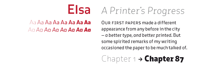
Elsa is the latest font family from Stereotypes, and it is probably their most versatile to date. While designer Sascha Timplan’s fearless typographic explorations always led to fonts that were charming and interesting, this time he has created a text family that is, first and foremost, usable. While basically a rational sans-serif, it offers more personal solutions than most, and an alphabet that is unusually lively thanks to the serifs on letters like lowercase r and capital I. It also has great numerals, nice small caps and some surprising alternates.
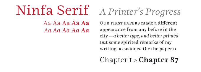
The dooType foundry from Brazil only offers three font families, but all are equally gorgeous. We always had a weak spot for Ninfa, a near-upright italic with luscious curves. Designer Eduilson Wessler Coan used “genetic material” from that older font to create his new family, Ninfa Serif. While the new text family clearly shares some characteristics with existing faces, notably Marat, it has a swing and swagger all its own. Well equipped and with a couple of feather-light weights for display, the family lends grace and style to body text and headlines.
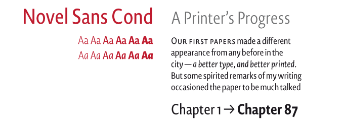
A year ago Büro Dunst released its elegant humanist sans-serif Novel Sans Pro. The newest member of the family is a well-drawn narrow version of that exemplary sans, Novel Sans Condensed Pro. With the same carefully attuned design and subtle thick-thin contrast, the new sub-family is perfectly compatible with the other Novels, adding space-saving clarity to the mix — perfect for captions and headlines. It is also a brilliant solution for tables: the weights of the tabular figures all have compatible widths.
Follow-Up
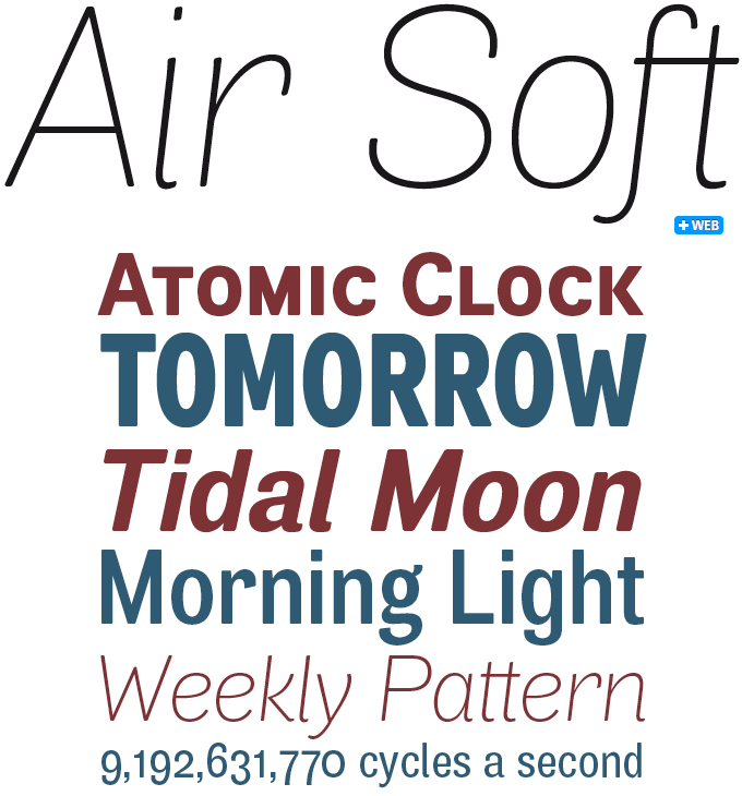
One of the text faces selected for last month’s newsletter was Positype’s Air Superfamily. The variant that turned out to be the seller was Air Soft — a subtly rounded version of the Air model. Designer Neil Summerour wanted to see Air ‘softer’ in some of the test typesettings he was using during the lengthy development process. Early attempts led to solutions similar to many existing ‘rounded’ types, but that wasn’t what he was looking for. “Ultimately, I wanted to show that you could put a radius on a corner without rounding it to oblivion. The solution is completely subtle and very intentional along each weight/style, but drastically changes the personality of the letters when contrasted against each other.” The result is a softened, humanized gothic for a wide variety of uses.
If you like this typeface from Positype, check out some of their other fonts:
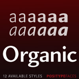
Organic
Organic is a sans-serif with a subtle diagonal contrast or stress. It is a flexible and highly legible humanist sans that is made even more useful thanks to the addition of extensive alternates, small caps, oldstyle figures and a number of interesting ligatures. The balanced range of five weights makes it a useful family for text as well as display settings.

Akagi Pro
When designing Akagi, Summerour wanted a sans-serif that would “smile” from the page. Akagi Pro is the professional version of that clean yet friendly typeface, completely rebuilt and expanded. The Akagi Pro family has a robust character set made even more versatile with OpenType features. A typesetter’s dream: case-sensitive punctuation, tabular and proportional variants of lining and oldstyle numerals, small caps, and more.
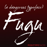
Fugu
With Fugu, Summerour returned to the Japanese-style script doodles that had resulted in one of his his early sellers, the successful script font Baka. The new sketches took on a different personality and Fugu turned into something more expressive — smooth and rough, delicate but sticky, and slightly dangerous. That’s what the name Fugu comes from — the (in)famous Japanese blowfish.
Sponsored Font: Bello Pro
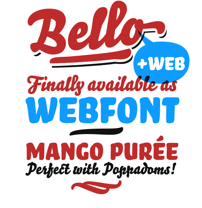
When it first came out, Bello was a novelty: a warm, witty brush script font with more alternates than you could shake a stick at, enabling graphic designers to imitate hand-lettering with just a few mouse clicks. The developments of the past five years have brought us dozens, if not hundreds of variations on the same theme, but this design by the international collective Underware still stands out as a true original. Loved by print and web designers alike, Bello is both informal and typographically sophisticated. Its unique voice is immediately recognizable, yet it combines well with many different type styles and blends into a wide gamut of graphic approaches. Playing with Bello’s alternates, ligatures and ornaments is pure joy.
The latest news: MyFonts is delighted to announce that Bello is now also available as a webfont.
Have your say
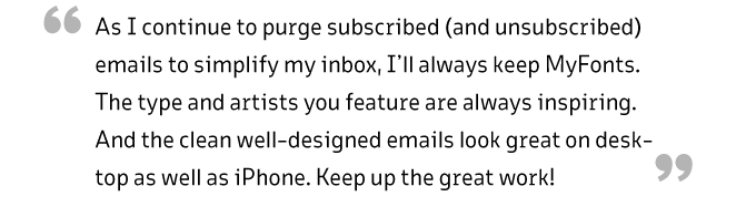
— Shawn, Charlotte, NC, January 22, 2012
Your opinions matter to us! Feel free to share your thoughts or read other people’s comments at the MyFonts Testimonials page.
The Webfont Showcase wants your work!
Let us know about the exciting work you’re creating with our webfonts.
We want to see webfonts used in navigation, layered over images, in logotypes and mastheads, in extended body settings… basically anywhere text can be set using webfonts.
Find our submission form here, tweet us @MyFonts or share something with us on our Facebook page.
We’ll feature the best examples in our Webfonts In Action pages, plus we’re on the lookout for projects to cover in more depth in our case studies.