Over the past year or so, we’ve seen a subtle shift in typographic tastes. While until recently the top 10 of our Hot New Fonts was dominated by witty, wild display fonts and scripts, these days there’s a more serious-looking bunch of fonts up there.
Of course the success of large sans-serif and slab-serif families is influenced by the many generous introductory offers. But even so: more and more users seem to want their designs to have that cool, clean look of modernity and need the fonts to match. But diversity is still the name of the game today — which is what the range of choices in each and every newsletter reflects. Enjoy.
This month’s Rising Stars
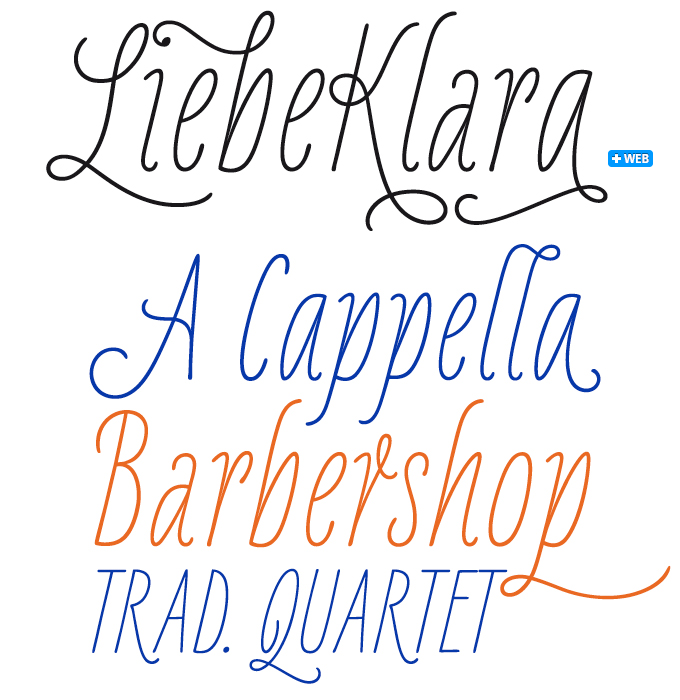
LiebeFonts, the one-woman foundry of Berlin illustrator Ulrike Wilhelm, started out with a collection of witty picture fonts, but has since gravitated towards lovingly crafted alphabet fonts. The handmade touch is still there, although Ulrike’s typefaces are smoother and more refined than many hastily scribbled display fonts out there. Her latest creation is called LiebeKlara — and it’s kind of an italic companion to the successful LiebeErika. It will work fine as a standalone display face too: on menus, in brochures or (used big!) on the web. It’s a festive font with mouth-watering swashes and gourmet contextual alternates and ligatures available through OpenType features — check out the subtly and not-so-subtly different characters in the sample above. Combine with LiebeOrnaments or LiebeMenu for added fun.
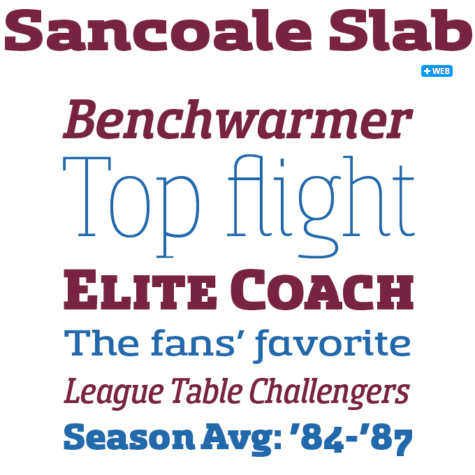
In early 2011, insigne launched Sancoale, Jeremy Dooley’s personally flavored take on the contemporary sans serif. Combining a lucid silhouette with unusual detailing, Sancoale is both readable and full of character. The new Sancoale Slab is basically the same typeface with serifs on, but the new family has some interesting features that make it a smart and striking text-and-display face. As shown in the sample above, several letters have alternates that can thoroughly change the nature of the set text: a single and a double story “a”, two varieties of the “e” and “n”, and more. Have a look at the informative PDF brochure to see these and other features in action.
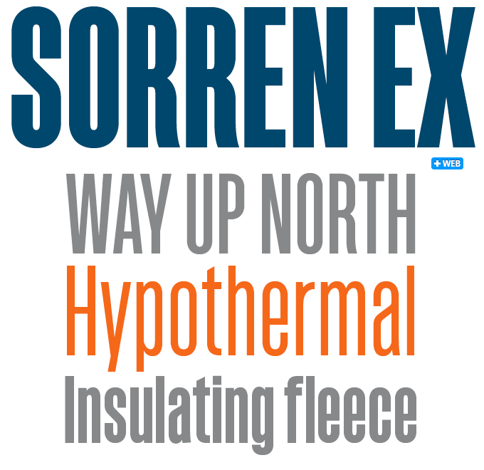
Based in San Diego, California, designer Michael Jarboe joined MyFonts in 2010 with his Reserves microfoundry. In just two years he has produced an impressive string of text and display fonts, including the consistently popular “sans-serif Bodoni,” Vanitas. His latest success is Sorren Ex — a slightly less condensed, more robust version of his earlier Sorren. Both font families are highly regular, condensed designs influenced by nineteenth-century grotesques and their modern offspring. Strong, uncompromising, yet graceful, Sorren Ex is a sturdy alternative to other condensed headline fonts: a useful and well-made building block for posters, identities and editorial design.
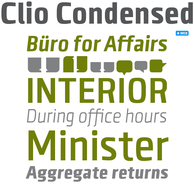
Clio Condensed is one of those typeface families that owe their success in part to aggressive pricing: who can say no to a 90% discount on a very useful sans-serif? But then again, even a discounted font needs to be well-made to have any success at all, and the Clio family does not disappoint. Brazilian foundry LeType (the designer remains anonymous) has looked at aspects of a range of squarish sans-serifs, from Klavika to Stainless, and added some original solutions to the mix. The result is a flexible family that will work in headlines as well as medium-sized text; the new Condensed version is ideal for compact display settings.
Text families of the month
In this section of the newsletter you’ll find our monthly pick of recently released text typefaces. These fonts have the qualities needed for high-profile editorial work: excellent readability, a good range of weights with italics and small caps, multiple figure sets (lining, oldstyle, table, superior, inferior, etc.) and ample language coverage. This month we introduce two brand new families, plus a lovely one from a couple of months ago that we wouldn’t want you to miss: Henriette, a streetwise typeface from Vienna.
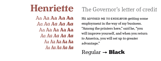
Typejockeys from Vienna have produced only a limited collection of typefaces, but each one is a gem, investigating aspects of European typographic culture. Henriette is based on the custom typeface designed for Vienna’s street signs — or to be more precise, on the sixteen different versions drawn by subsequent sign factories over eight decades. Henriette is not a digitization of any specific version; it is influenced by all of them, and the italic is a completely new design. With its systematic range of widths and weights the family is much more than a slightly nostalgic signage font: it works well in all kinds of editorial work. There’s a free weight, too: the tasty Black weight comes at no cost. Here’s a plan: if you like the Black, reward Typejockeys (and yourself) by acquiring at least one other weight.
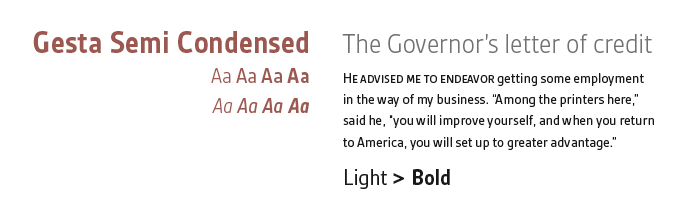
Gesta Semi Condensed from Rui Abreu is an extension of the designer’s Gesta family, a permanent member of our Bestsellers list. Narrow enough to save space and wide enough to maintain legibility at text sizes, Gesta Semi Condensed is a versatile economic sans-serif that can be used independently or as a companion to the original Gesta family. With the same clean shapes and slightly curved strokes, this narrower version combines a distinctive and warm feel with a modern look. It is available in four weights from light to bold with matching italics. Its OpenType features include small caps and old style figures for every weight.
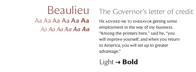
Designed by Nicholas Garner of London’s Aviation Partners, the Beaulieu family only has a suggestion of serifs remaining. In typographic terms, it is a “glyphic” or “incise” face, referencing letters cut into stone (think Optima or Pascal). Beaulieu is modeled on traditional serif letterforms, with subtly contrasted strokes and a generous x-height. The family has a clean appearance and excellent readability. Six weights plus italics, small caps and extended language support make Beaulieu a good choice for editorial work in print and and on the web.
Follow-Up
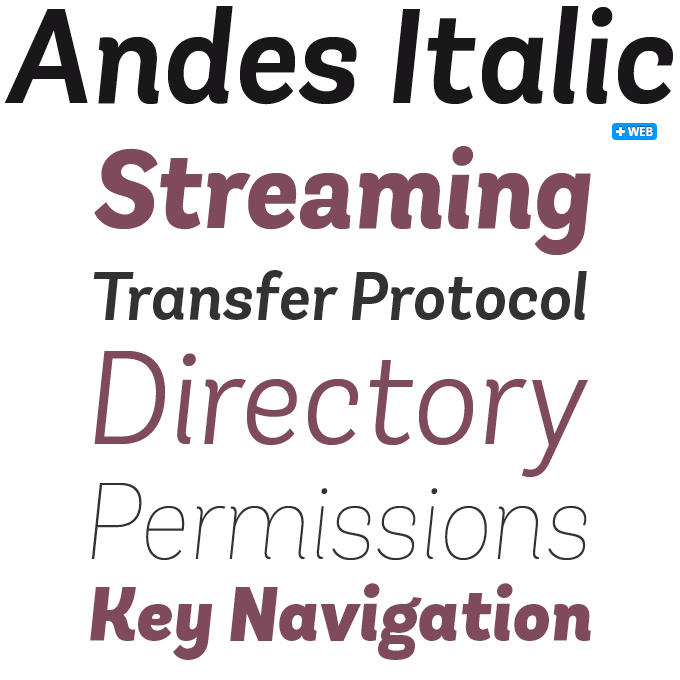
After last month’s mention in this newsletter, Latinotype’s Andes Italic has continued to be successful. Andes is a spirited display and text face; its new Italic adds extra calligraphic flow to the family DNA. With a range of 10 weights of uprights and italics, Andes is now a very usable text-and-display family. The recent addition of Andes Condensed makes the family all the more versatile. Like its older relatives, the Condensed version has been a big success — helped by yet another generous introductory discount. See below!
If you like this typeface from Latinotype, check out some of their other fonts:

Andes Condensed
Having acquired Andes and its Italic at a too-good-to-be-true price, demanding users may have felt the need for a narrower and more economic version. Andes Condensed is just that, available at a fantastic discount until September 17, 2012.

Ride my Bike
This is the first alphabetic font by illustrator and bookbinder Guisela “Co” Mendoza. Ride my bike has the quirky and adorable style of her pictures and patterns. The font contains more than 600 glyphs, including 91 witty dingbats.

Kahlo
Kahlo by Luciano Vergara is described as a “Latin hipster” typeface: sober and stylish, an almost monolinear family of four weights with elegant italics and initials, and a set of alternates. Use for magazine headlines, posters, logos, packaging and more.
Sponsored Font: Adelle from TypeTogether
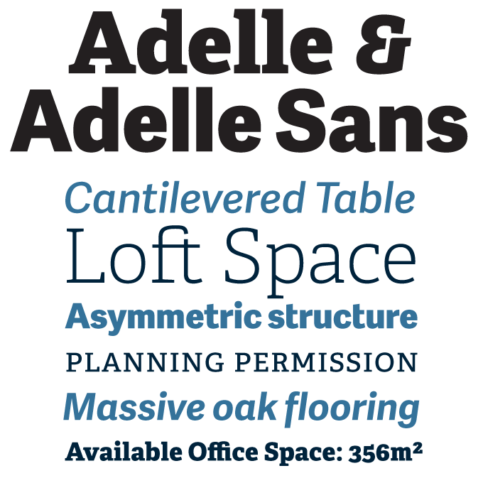
Adelle and Adelle Sans by TypeTogether’s Veronika Burian and José Scaglione form one the most successful pairs of typefaces in recent years. They can be encountered across the world in magazines, newspapers, books and on the web. A slab-serif face conceived specifically for intensive editorial use, Adelle’s personality and flexibility make it a real multi-purpose typeface. It is legible and neutral in text sizes, while showing its personality through a series of measured particularities when used larger. The sans-serif companion Adelle Sans is a clean and spirited take on the traditional grotesque, combining an unobtrusive appearance with lively detailing. With seven weights and wonderfully readable italics, the slab-serif and its sans counterpart collaborate gracefully on the page. Equipped with small caps, several sets of figures, support for over 90 languages and icons, Adelle and Adelle Sans epitomize flexibility and functionality. Adelle, the winner of the gold prize at the 2010 ED Awards, is already available on MyFonts as a webfont; Adelle Sans will follow soon.
Have your say
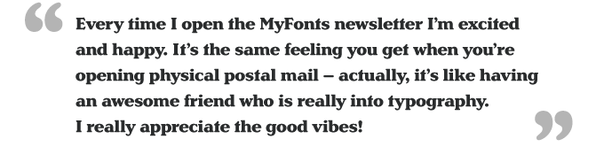
—Rosa from Costa Rica, August 15, 2012
MyFonts is on Twitter and Facebook!
Your opinions matter to us! Join the MyFonts community on Twitter and Facebook, and feel free to share your thoughts or read other people’s comments. Plus, get tips, news, interesting links, personal favorites and more from MyFonts’ staff.