January is a packed month at MyFonts. Following the ever-popular Fonts of the Year newsletter, we go back to the future with this edition of Rising Stars, our choice of best-selling new typefaces. Attention all bargain hunters: we probably never had this many fonts at such breathtaking introductory discounts. Each of our four top Stars can be had at less than $20 for the entire family — make your decision before the end date of each promo!
This month’s Rising Stars
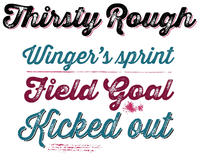
Thirsty Script was one of a run of wildly successful typefaces released last year by Yellow Design Studio. Designer Ryan Martinson has now decided to give Thirsty Script the weathered-look treatment that made some of his other families, notably Veneer and Anodyne, so irresitable and successful. Thirsty Rough’s texture captures the natural charisma of mediocre letterpress printing. Its four alternate versions of each weight, ranging from very light to heavy distress, make it highly customizable. It’s remarkably detailed, which makes it look great when printed at large sizes — but also kind of risky to use as a web font. For extra customization and fun, it includes an set of matching texture pieces…for free! Thirsty Rough is still available at the the stunning introductory price of $9 for 21 fonts (until Jan. 28, 2013).
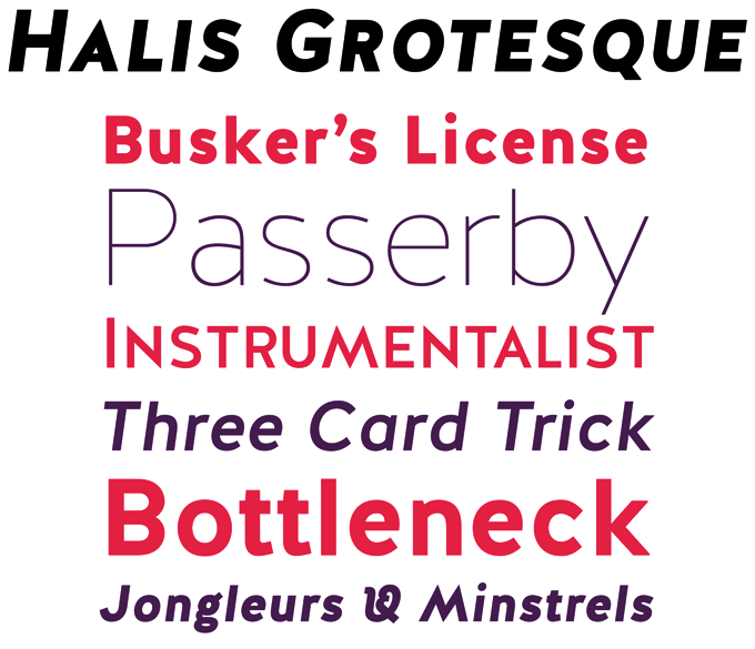
Stylistically, Halis Grotesque from Turkish designer Ahmet Altun sits somewhere between the subtle nostalgia of Brandon Grotesque and the modernist overtones of Avenir: a functional text and display family with Art Deco elements. Halis is very well-equipped: it comes in eight weights plus italics, has small caps for romans and italics, and multiple figure sets. The small caps are accommodated in separate fonts, making their use in web typography even easier. The name of the font is a Turkish word that mean “pure” or “clean”; it is also the first name of one of Turkey’s best know teachers of typography, Prof. Halis Bicer, whose idiosyncratic alternative ampersand (shown in the last line above) has pride of place in this type family. The font was given generous letterspacing, which makes it legible even in very small sizes. Use for logos, branding and lettering on products as well as magazine and book design.
Check out the new Halis Rounded, which is selling at an incredible 90% discount until Feb. 26, 2013!
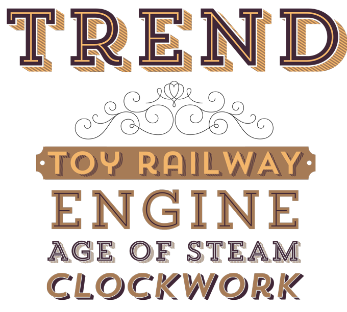
“I am always looking at type,“ said Latinotype designer Daniel Hernández when we interviewed him a year ago. “I really want to know what fonts people are using … I want to know what the trends are, what is successful and what isn’t.” This may sound like a very calculating way of taking creative decisions — but it certainly doesn’t imply that the fonts are made without passion and dedication. Trend is the tell-tale name of Hernández latest font family, designed with Paula Nazal Selaive. It captures the latest craze of chromatic fonts, using layers to create dynamic multi-colored headlines with three-dimensional effects. Trend may be capitalizing on current fashions, but it does so in an inspired and aesthetically pleasing way. Basically a set of capitals in sans- and slab-serif varieties, the sensitive and balanced shading, inline and shadow effects make it a joy to play with. Check out the lovely Ornaments font with elegant curlicues, icons and English key words. Trend’s intro offer is fabulous: the entire family of 21 fonts at $19 — until Feb. 18, 2013.
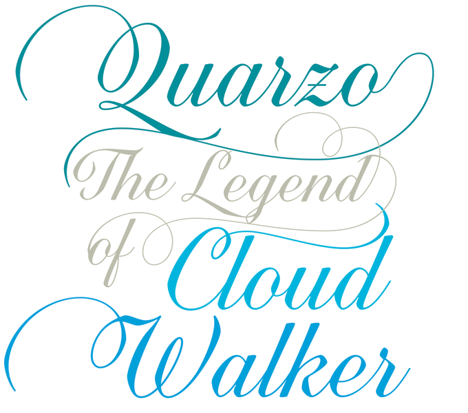
Quarzo was first presented in last month’s Creative Characters interview with designer Manuel Corradine. Designed in collaboration with Sergio Ramírez, Quarzo is a connected script font based on writing with the flexible pointed-nib pen. It comes with a wealth of swashed letters — mostly capitals — plus a stunning collection of flourishes which connect seamlessly to beginning and ending letters, and which can be selected using the glyph palette in your layout program. The lettershapes are basically those of roundhand calligraphy, but some strokes have a subtle angularity that lend the typeface a modern touch. Along with sensible inktraps, this gives the font a better performance when printing. Stroke angles and spacing are very consistent, so lines set in Quarzo have a dignified, regular rhythm. The icing on the cake: a set of independent flourishes to be placed around the words.
Quarzo is 50% off until February 9.
Text families of the month
Text typefaces for demanding editorial work need to possess special qualities: excellent readability, a generous range of weights with italics and small caps for all of them, multiple figure sets (lining, oldstyle, table) and ample language coverage. In this section of the newsletter you’ll find recent releases that meet these standards.
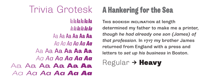
Czech designer František Štorm created the Trivia suite of typefaces as a demonstration to all the people who “still can’t distinguish three basic latin type categories”: serif, sans and slab-serif, three distinct ways to look at printed word. Storm recently released a fourth variety — Trivia Grotesk, a Sans with a more pronounced 19th-century look. It’s a large family with unusual names for the four widths; once you get used to that, it is a wonderful toolkit for making consistent, readable yet striking magazine, newspaper and web layouts.
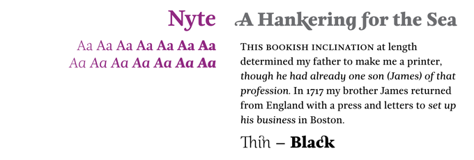
Nyte from DSType is one of the most elegant and complete serif text families to have appeared on our virtual shelves lately. With its rather vertical stress and open italic, it references transitional faces from the late eighteenth century; yet in it detailing and structure it is totally contemporary. It has everything you’d wish for in a seriously usable text face — and more: seven weights with small caps for all, multiple numeral sets, and splendid special ligatures and alternative lettershapes.
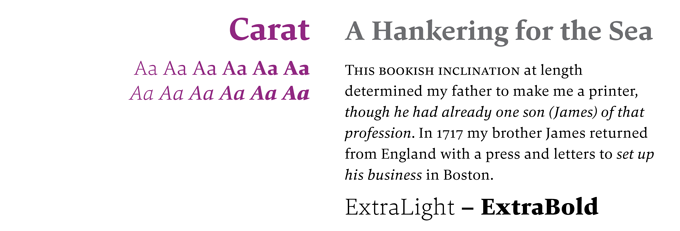
Carat is the latest oldstyle in the ever-growing Hoftype collection. Like most of Dieter Hofrichter’s text fonts, it is a fresh and modern take on classic models. Straightforward, unsentimental and objective, Carat is ideally suited for text, but will show off its crisp detailing when used in display sizes. Well-equipped for ambitious typography, the Carat family consists of six weights plus italics, all containing small caps multiple figure sets and matching currency symbols.
News Round-Up
In this section we pick out interesting news snippets from MyFonts’ own kitchen and from the greater world of fonts, lettering and typography.
150 years of London Underground
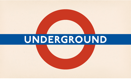
This month in 1863, 150 years ago, saw the opening of the London Underground, the world’s first urban mass transit system. Londoners are celebrating with mugs, cufflinks, sofas and subterranean steam train rides. In his new book, London Underground By Design, Mark Ovenden celebrates the system’s architecture, textiles, posters, signs, Harry Beck’s seminal map (first published in 1933 and still with us), and of course its typefaces. Commissioned 100 years ago this year, Edward Johnston’s influential masterpiece has been in use since 1916, surely a record. Until Jan. 31 you can pick up all versions of P22 Underground, true to Johnston’s original design, at 50% off. (Even the expansive Pro family and fab Extras symbols.)
Type design: a student’s perspective
One of the questions we often get at MyFonts is: “How do I get started on designing fonts?” The answer is more complex than you might like. Whipping up a font is fairly easy with today’s nifty software, but designing a professional typeface that others will use and admire is a different game altogether — it requires knowledge, skill, dedication and a lot of patience. For those that are serious about learning type design, New York’s Cooper Union has set up two courses, a year-long Extended Program, and a five-week-long Condensed Program. In a witty and energetic lecture, student Matthew Wyne shared his experiences of a Condensed summer course — his and his classmates’ expectations, exercises, frustrations and joy. The video of his talk is required watching for all of you with fontastic ambitions.
Sponsored Font: DIN Text Pro
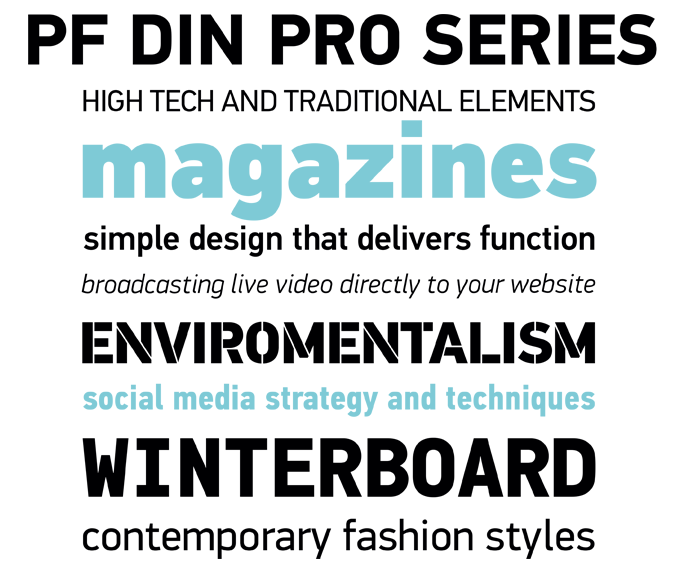
The PF DIN Pro series is Parachute's version of the DIN typeface, a design with a long history that goes back to the lettering of the Prussian railways around 1900. That alphabet became part of the German system of industrial standards known as DIN (which stand for “German Standardization Institute”). The DIN typeface was designed to be the standard lettering model for simple, hand-painted signage: monolinear, geometric, easily made with ruler and compass.
In order to use DIN as a text face, drastic optical adaptations need to be made. That is exactly what Parachute did. Based on the original standards, DIN was completely redesigned to fit typographic requirements. Besides the standard version, the series includes condensed, compressed, and display varieties, with true italics for all. The Pro version was enhanced with more weights, multilingual support and OpenType features in all styles. With its wide range of weights and widths, extensive language support and additional copyright-free symbols, the PF Din Pro series is an impressive family — a versatile tool for corporate design, branding, signage and editorial design. To enhance unsability, Parachute has developed stencil, monospaced and Arabic versions as well.
Have your say
Geoff West (@tieguydesign) on Twitter
MyFonts is on Twitter and Facebook!
Your opinions matter to us! Join the MyFonts community on Twitter and Facebook, and feel free to share your thoughts or read other people’s comments. Plus, get tips, news, interesting links, personal favorites and more from MyFonts’ staff.