
Belated best wishes for 2013 from the MyFonts team! The time for our Fonts-of-the-Year list has finally come. Perhaps you wonder how it was put together. We’ll be brief. Basically, this is a list that you, as our users, have voted for — with your wallet. It is based on sales (revenue, not number of copies sold) of fonts that have first appeared on MyFonts since December 1st, 2011. It’s not simply the total sales volume across the year, because that would give an unfair advantage to those that have been on sale longest. So we’ve looked at average sales, correcting for what we might call the Introduction Sales Peak (ISP), kept the number of font families from the same foundry down to a maximum of two, and made sure popular genres are fairly represented. There you go: a type hit parade like no other. Thanks for helping us put it together.
Nexa
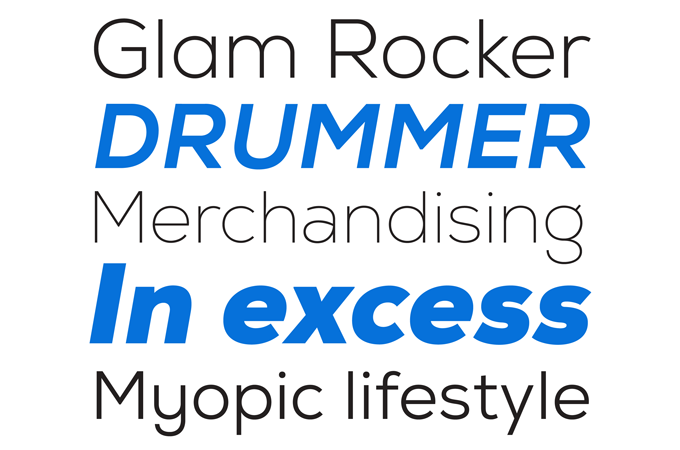
If 2012 was the year of anything in particular at MyFonts, it must have been The Year Of The “Gulp! Did-I-Read-That-Right!?” Promo, with many foundries offering new fonts at amazing discounts of 80 or 90 percent off their normal retail price. Fontfabric used that crowd-pleasing sales tool to spectacular effect. Introduced at a record-breaking discount, their Nexa family jumped to the number one spot on our Hot New Fonts chart, and stayed there for quite some time. But obviously, even at a 90% discount a font family must be original, well-made and complete in order to deserve its success; and Nexa is all that. A minimalist yet pleasant sans-serif in 16 styles, Nexa is a versatile text and display family that is likely to remain successful at its (very affordable) full price.
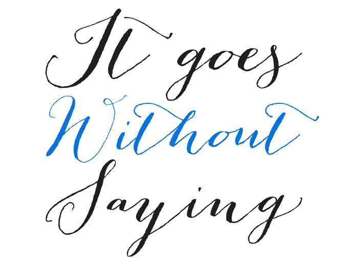
Hipster Script Pro
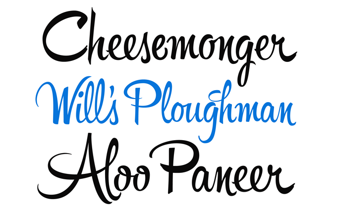
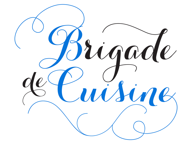
In the continuing avalanche of new script fonts, those designed by Alejandro Paul of Sudtipos still stand out. Stylistically spot-on, technically smart, well-equipped: each Sudtipos font matches the high standards in display type that they have themselves helped establish. Their most successful font this year was Hipster Script, based on a style of hand-lettering that was created for advertising in the 1940s and 1950s and stills looks fresh today. Back in the day, commercial artists painted those letters on board or paper with a round brush, creating thinner and thicker strokes by exerting less or more pressure, varying letterforms according to context, interrupting the connected flow by lifting the brush. Hipster Script does a great job emulating all these aspects of brush lettering, using OpenType programming to create natural-looking character groups. Use with OpenType-enabled software!
Veneer
Two young foundries have been particularly successful this past year, and one of them is Yellow Design Studio, run by Ryan Martinson of Madison, Wisconsin. Veneer was his biggest success, and in its genre — distressed display capitals inspired by vintage wood type — it’s a beauty. It contains no less than six varieties of each letter of the alphabet, enabling the user to select various grades of damage, for that attractive look of imperfect printing. As the wear and tear in Veneer is remarkably detailed, it looks great even at very large sizes. In addition it includes an “Extras” set of funky dingbats and pictures… for free!
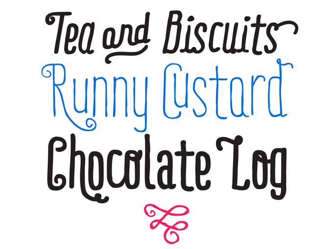
Carolyna Pro Black
The other foundry that vaulted onto the type scene like a shooting star in 2012 was Emily Conners’s one-woman company Emily Lime. Carolyna Pro Black was introduced a year ago as the bolder sister of Emily’s successful Carolyna, and soon became a major hit. The family’s whimsical and charming take on contemporary calligraphic styles has obviously charmed many users. It uses OpenType wizardry to assist with letter flow and to give each creation that modern, hand-lettered touch. With over 1000 characters, there are many stylistic alternates and fun swashes to choose from. Note: both the Black version and its older sibling Carolyna, work best with OpenType-friendly applications.
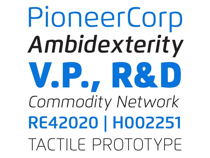
Pluto Sans and Pluto Sans Italics
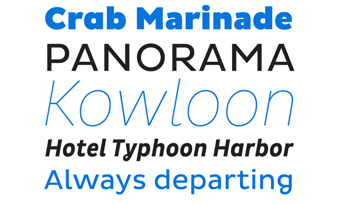
Hannes van Döhren of HVD Fonts may be single-handedly responsible for the trend of too-good-to-be-true introductory offers, that paradigm shift in font pricing on MyFonts. His Pluto, 2011’s absolute best-seller, was the family that started it all. Of course HVD also has a knack for creating spirited fonts in a style that users suddenly realize they were actually waiting for... a rare gift. In the past year, he introduced Pluto Sans and its Italics, the quiet companion to the tail-wagging original Pluto. While the earlier Pluto’s somewhat eccentric details made it not so ideal for longer text settings, Pluto Sans solves that problem. Its straight strokes and simple forms make it a perfect typeface for body texts in smaller sizes and for usage on screens. And just like its older brother, Pluto Sans is a hit.
Mercury Script
Helsinki-based designer Emil Bertell has carved out a recognizable style of attractive informal scripts; his Mishka made last year’s edition of our list of best-loved fonts. He scored again in 2012 with Mercury Script, arguably his most elegant typeface to date. Loosely based on hand-lettering found in a vintage lingerie advertisement, it displays the same lust for life as his earlier scripts, but its curves are more luscious, its features more ambitious. When used in an OpenType-savvy application, Mercury Script offers a wealth of swashes and alternates; it also has a lively set of capitals under the Small Caps button. The family comes in three carefully balanced weights, with matching sets of ornaments.
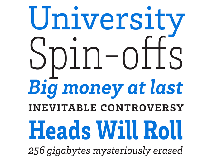
RBNo2.1
New to MyFonts, German designer Rene Bieder published two type families this past year with no-nonsense names based on his initials — RBNo3.1 and RBNo2.1. Both are technical-looking sans-serifs firmly tied to a rounded square skeleton, and both became immediately popular. RBNo2.1 has done best. A narrow sans with clean-cut shapes, it conveys a sense of geometric precision and engineered dryness. Yet, like the geometric display lettering from the mid-twentieth century, its simple silhouettes build powerful headlines. The family comes in two versions in seven weights with italics and several alternate shapes.
Aire
Frontage
Frontage from Paris-based designer Juri Zaech is the odd one out on this list: an ingenious type system meant to be used in multicolored layers — a chromatic typeface, in the jargon. When used in a layout application that allows for creating stacks of type frames, it offers endless design possibilities using different combinations of fonts and colors. You can simply use the capital letters of the regular and bold cut for stark artwork, or fill them with polka dots. By using the Shadow font, you achieve a realistic 3D effect. Based on a simple grid and generously spaced for maximum impact, the typeface has the friendly, handcrafted look of facade signs. A playkit for the typographically hooked.
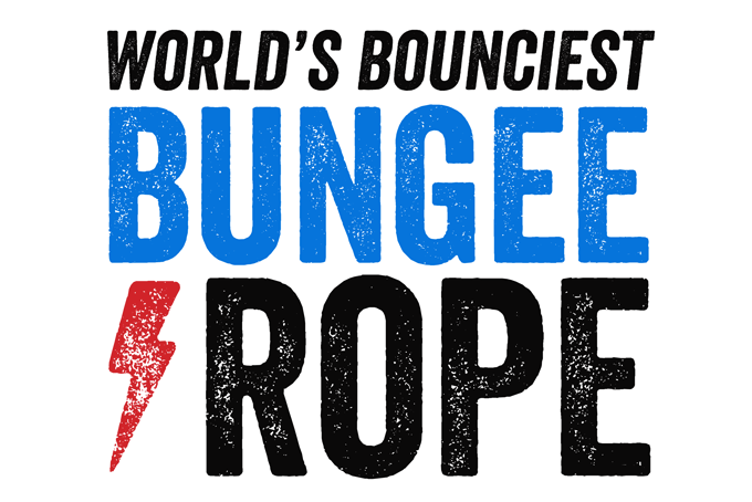
Flexo
Ride My Bike
Skinny typefaces with a hand-made feel have been all over the place in the past couple of years, but some have more character than others. Ride My Bike is particularly lively. Playful and irregular, it is a typeface with a streetwise attitude and a mischievous smile. It is the first alphabetic typeface by Chilean illustrator-bookbinder Guisela Mendoza, who previously contributed several charming picture fonts to the Latinotype collection. Ride My Bike’s Pro version has initial caps, terminals, alternates and dingbats — more than 600 glyphs per font — but for those who don’t need all that, there’s the cheaper Essential version, with no OpenType features. In 2012, lots of people had fun with both.
Funkydori
“I am a child of the Seventies,” wrote Laura Worthington, and with Funkydori she sent us into a time warp that included rainbow striped bellbottoms and afro hairdos. Somewhere in that scene there must also have been orange lampshades, and an Isaac Hayes LP. Often dubbed “the decade that taste forgot”, the Seventies were actually an exhilarating time for formal experiments in popular culture, and Funkydori perfectly captures the groovy atmosphere of the era. The font is wickedly usable too, with 213 alternates, 13 discretionary ligatures and 38 ornaments allowing for a wide variety of looks. When used with OpenType-enabled software, the automatic Contextual Alternates keep it looking ideal; activate Titling Alternates to switch the font to an unconnected script.
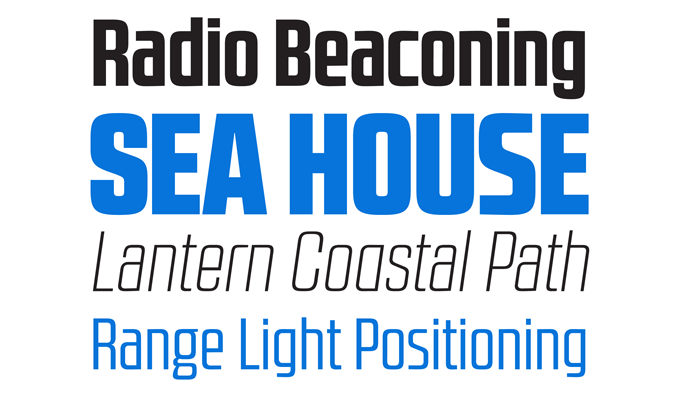
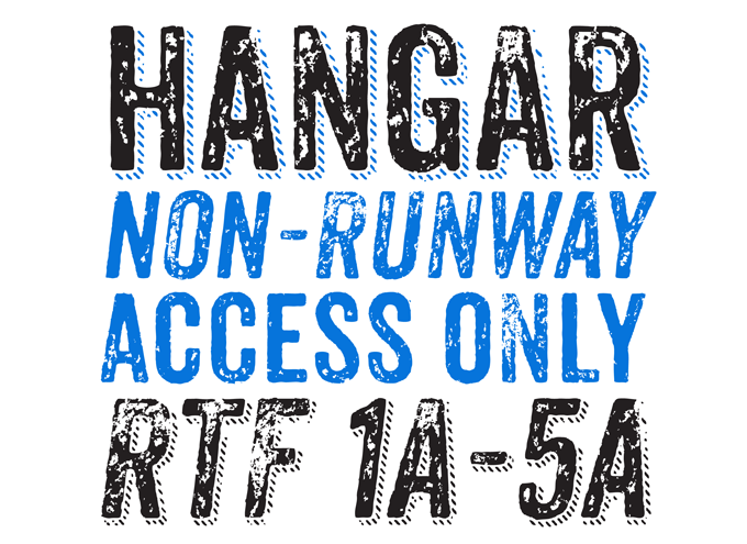
Brix Slab
HVD Fonts is one of three microfoundries that did so well this past year that they have two typefaces each on this list. Besides Pluto Sans, shown above, HVD issued several other successful typefaces in a wide range of styes. Brix Slab was the most popular serifed text face of the year — a versatile family in normal and condensed widths. Text faces, we have been taught, are the basic building blocks of graphic design; and Brix Slab offers construction material of a particularly robust calibre. With 24 fonts, equipped with small caps and a useful collection of numerals, arrows and more, Brix Slab is a great typographic tool for demanding editorial and corporate design work.
Bombshell Pro
Anodyne
Like Emily Lime and HVD Fonts, Wisconsin’s Yellow Design Studio was so popular in 2012 that it deserves two slots on this list. Anodyne was their first hit of the year — a distressed yet personable font family in a style you could define as “grunge”. Anodyne, an all-caps font family with a hand-printed texture, comes in four distressed variations for each letter and at least two for other characters. Layering regular and shadow versions allows independent control of the shadow color. Switch between lowercase and capital letters to change texture, or use OpenType contextual alternates for extra-distressed variations.
Colophon
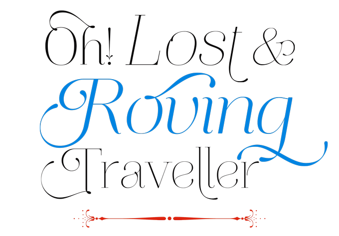
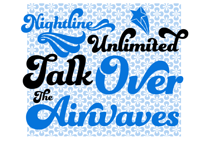
The Most Popular Fonts of 2012 was edited and laid out by Jan Middendorp using Nick Sherman’s template, with type specimens by Anthony Noel. The title graphic is set in Nexa Heavy, Hipster Script Pro and Frontage.
Subscription info
Want to get future MyFonts newsletters sent to your inbox? Subscribe at myfonts.com/MailingList
Comments?
We’d love to hear from you! Please send any questions or comments about this newsletter to [email protected]