

Best wishes for the brand new year from the MyFonts team — all twelve of us. From our respective locations in Massachusetts, Berlin, Sacramento, Bristol, and Siem Reap, we wish you a splendid, happy and successful 2012 wherever you are.
It’s been quite a year for MyFonts. But unlike most listmakers, we are convinced that the year ain’t over till it’s over. So we have waited until the very last moment to put the finishing touches on this list — giving the fonts that were released during the last months of the year a fair chance to make the cut. As it is based on sales in a broad range of typeface categories, it’s you, our customers, who have ultimately put this list together. Thank you! Here they are, in no particular order: the fonts of twenty-eleven. Each of them available as a webfont, too.
Reina
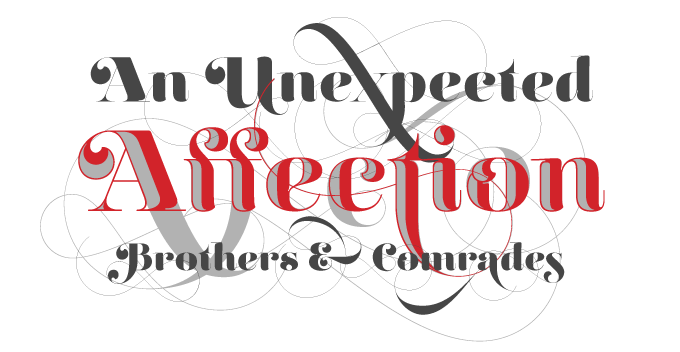
Lián Types from Buenos Aires and its sister foundry Typesenses have been a staple of this list for several years now, and their typefaces are becoming more intricate each year. Introduced in March, the award-winning Reina is a sophisticated and imaginative variation on the high-contrast Didone model. Inspired by the classics Didot and Bodoni, and spiced up with influences from 1960s New York magazine lettering from the likes of Herb Lubalin, Reina is up there with the most whimsical of classicist and modern-face display type. A fine toolkit and plaything for making dazzling headlines.
Calluna Sans
It can be a big help to the discerning typographer when an oldstyle text face comes with a sans-serif companion that harmonizes beautifully with it, yet is different enough to add a new color to the typographic palette. This is exactly what Calluna Sans is to exljbris’s popular Calluna family. Like its older sister, the new family member respects oldstyle proportions and makes lucid statements with crisp details — but it does so in its own calm, sans-serif way. Its humanist qualities make it wonderfully readable; it comes with all the attributes needed for sophisticated typography: small caps, four numeral sets, and more.
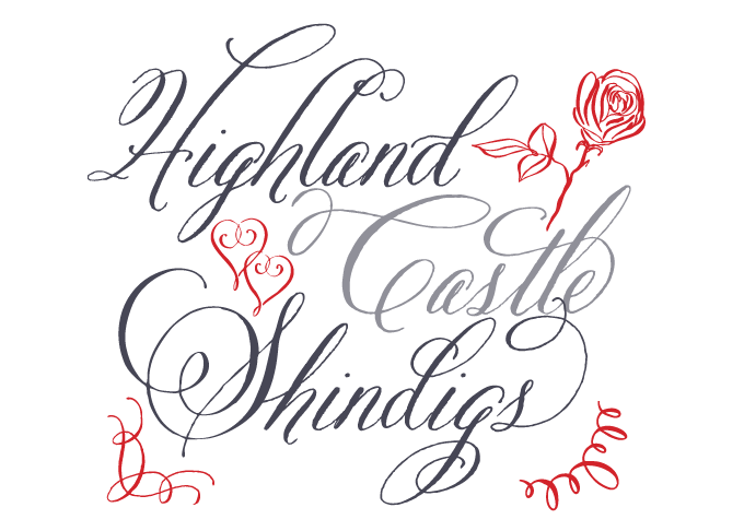
Alana
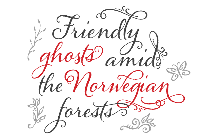
Lettering artist Laura Worthington added several beautifully made script fonts to her popular typeface collection last year, including Samantha Script and her latest offering, Rosarian. But it was Alana that outsold all her other work — one of the year’s biggest hits. Natural-looking and subtly irregular, Alana strikes a nice balance between a casual and a formal script face. Based on hand lettering, it indulges in elaborate swashes and ornaments without losing its friendly character and slightly nonchalant look and feel. We recommend OpenType-enabled design software to get the full effect of Alana’s features.
Sánchez
Belluccia
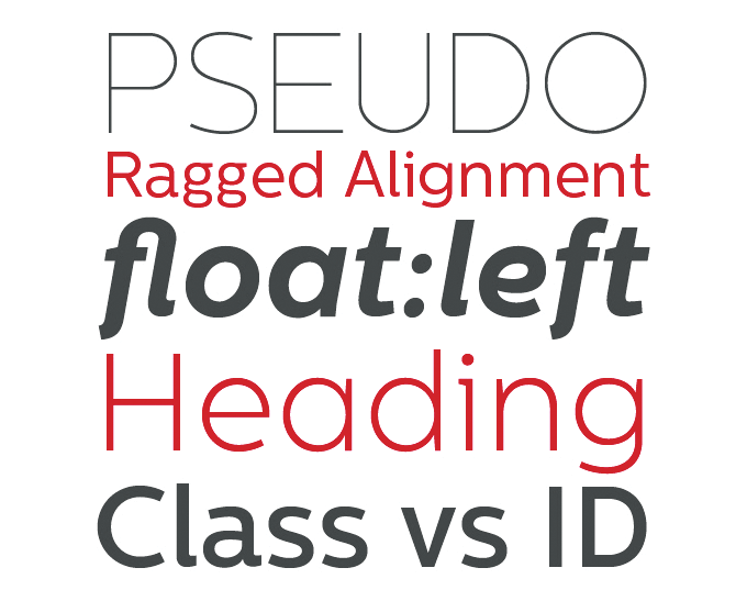
Hera Big
Centrale Sans
Burgues Script
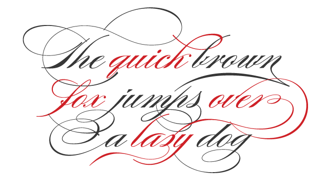
Burgues Script is yet another monumental script face from Sudtipos. Based on the work of American calligrapher Louis Madarasz, Ale Paul’s typeface is an interpretation rather than a straightforward digitization. In order to be able to produce digital calligraphy with a natural flow, Paul had to reinvent many of the letterforms, adapting the flexibility and connectivity of the original lettering to the logic of digital machines. The digital flourishes of the prize-winning Burgues are no less dazzling than Madarasz’s hand-lettering. Burgues is a great choice for spectacular lettering — from wine bottles to tattoos.
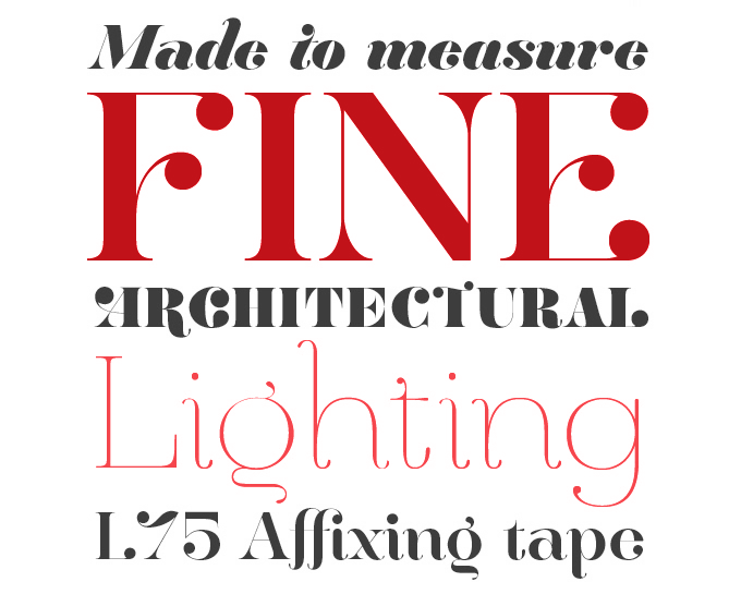
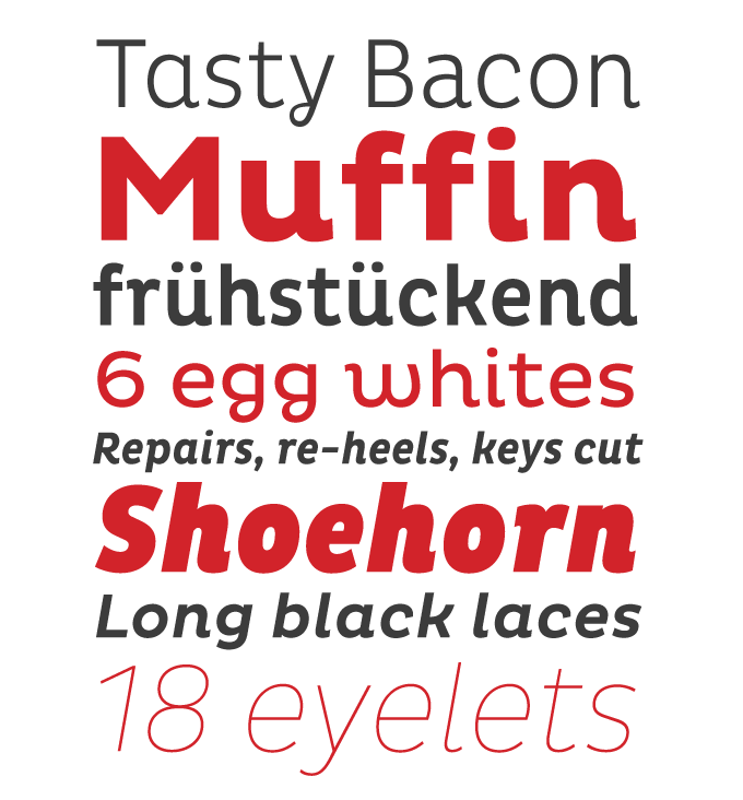
Cassia
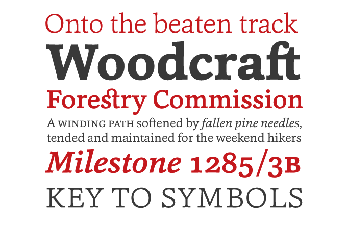
One of the year’s nicest surprises was the emergence of the one-man foundry Hoftype, directed by Dieter Hofrichter. A veteran of the Berthold studios, Hofrichter worked with the late Günter Gerhard Lange, who was probably the most exacting taskmaster German type design has ever known and whose meticulously corrected proofs are the stuff of legend. In less than a year, Hoftype launched a stunning collection of text families — well-made, versatile and affordable — with Cassia as the biggest success. A dynamic modern-face, somewhere halfway between a humanized slab serif and an updated Clarendon, it is more individual and agile than most slab serifs. Superbly readable, Cassia comes with small caps for all weights, a wealth of ligatures and multiple figure styles.
Melany Lane
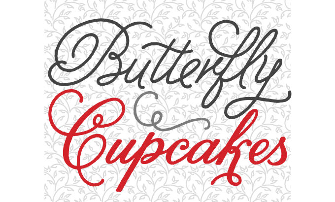
This year’s crop of most popular fonts has more connected, swashy scripts than ever — and yet, each is surprisingly different from the rest. For Melany Lane, Yellow Design Studio took the flourished shapes of traditional lettering, and added the quirks and warmth of informal hand-drawn type. The regular version is monolinear — its strokes don’t change in thickness — which gives it the feel of an alphabet drawn with a felt-tipped pen. Melany Lane comes with swashes and stylistic alternates for extra funkiness and fun, as well as 118 lovely ornaments and a free set of fourteen seamless background patterns.
Code Pro
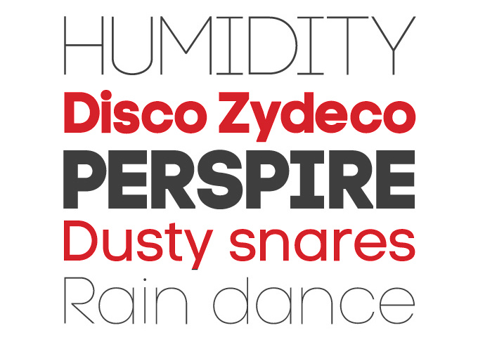
In September we interviewed Svetoslav Simov, the young Bulgarian designer who runs Fontfabric. An admirer of 1930s and 1960s constructed letterforms and icons, Simov has a knack for geometric alphabets with a logo-like quality. Of his 2011 releases, Code Pro did extremely well, and has remained a steady seller to date. It is a kind of ITC Avant Garde on performance-enhancing substances. Even the lighter weights have a muscular assertiveness thanks to the disciplined geometry of their glyphs. Its extreme Light and Black weights offer great possibilities for spectacular headlines, while its middle weights will work both in headlines and medium-length text settings. The demo versions of Code Pro Light and Regular are still offered free of charge.
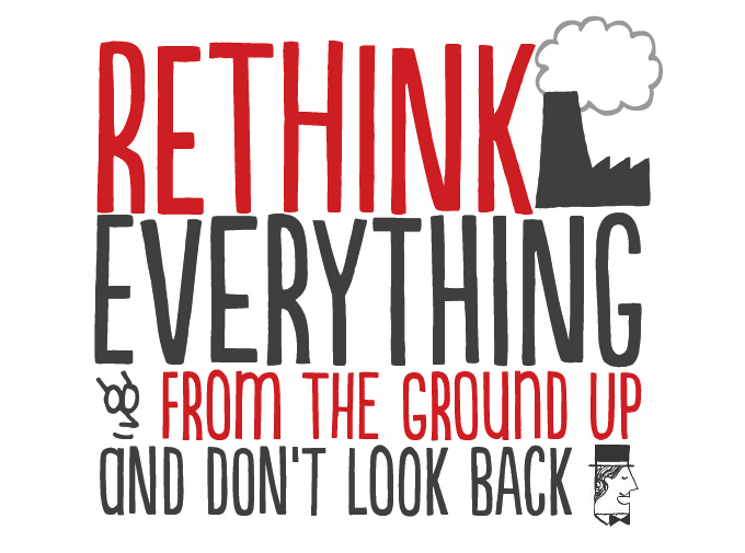
Mishka
the Fenotype foundry, recalling hand-made pub and shop lettering. While several of the earlier fonts — fonts like Verner and Pepita Script — were mildly successful, the playful Mishka joined the year’s elite of best selling fonts. Mixing clear and informal lettershapes with a taste for the exuberant, Mishka is a pleasant upright script with a decorative touch. It offers plenty of options to customize headlines — just activate Swashes, Stylistic Alternates or Contextual Alternates in any OpenType-savvy program. Its small caps are a font within a font: an energetic set of caps that combine well with the scripts but offer a distinct style.
Populaire
Brazil’s PintassilgoPrints found its groove last year, producing a stream of spirited display fonts with a playful, handcrafted feel. As they pointed out in their recent Creative Characters interview, they like the happy mistakes of hand-drawn letters, the “wrong notes” in the design — but at the same time they want their fonts to be technically perfect and eminently usable. Populaire is a case in point. Inspired by the posters made during the May 1968 student revolt in Paris, Populaire taps into the energy of that period’s hand-drawn and silkscreened posters, while using digital font technology to offer four exchangeable glyphs for each letter. The result is a flexible font that looks as fresh and spontaneous as hand-rendered lettering.
Gelato Script
The mouth-watering, smoothly flowing Gelato Script lives up to its name (Italian for “ice cream”), and consequently became the year’s most successful brush script font — ideal for packaging, café menus and magazines. Influenced by both formal scripts and mid-twentieth century hand lettering, its luscious curves make it attractive to a wide audience. For expert users, it has the additional benefit of being equipped with all the amenities of meticulous OpenType programming. With 781 glyphs, this font has many faces and speaks many different languages.
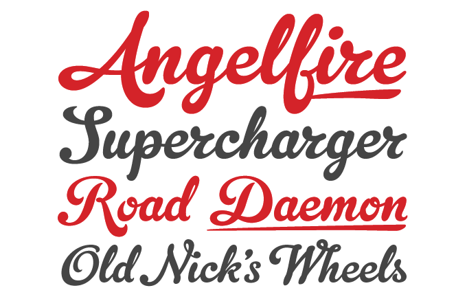
Pluto and Pluto Italics
Berlin’s HVD Fonts has a knack for coming up with the right typeface at the right moment, and marketing strategies to match. Pluto’s release at an introductory offer that seemed too good to be true resulted in sensational sales; some months later, Pluto Italics all but repeated that meteoric success. As the fonts are decidedly lovely — a happy-looking, lively sans-serif family with a strong personality — it comes as no surprise that Pluto continues to sell well at the full, but still quite reasonable, price. There is little doubt that MyFonts’ best-selling typeface of 2011 has a bright future ahead of it.
Colophon
The Most Popular Fonts of 2011 was edited and laid out by Jan Middendorp using Nick Sherman’s template, with type specimens by Anthony Noel. The title graphic is set in Pluto and Pluto Italics.
Subscription info
Want to get future MyFonts newsletters sent to your inbox? Subscribe at myfonts.com/MailingList
Comments?
We’d love to hear from you! Please send any questions or comments about this newsletter to [email protected]