
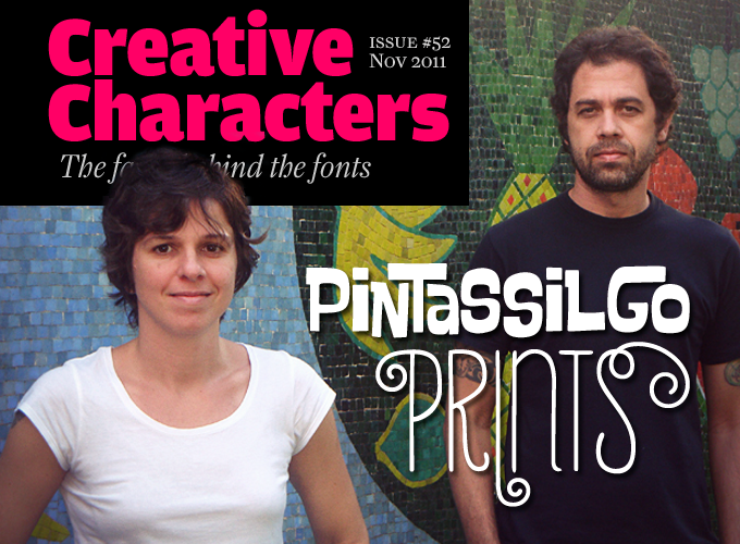
They used to do it all: illustration, graphic design, product development, screen printing — hence the name of their company, PintassilgoPrints. Lately this young couple from the seaside city of Vitória, Brazil, has concentrated almost exclusively on type design. And quite rightly so. Their fast-growing collection of playful and informal display and script fonts has met with increasing success, and these past few months they’ve scored more than one bestseller. Don’t be fooled by the apparent nonchalance of their letterforms: technically, their fonts are painstakingly made. Meet the bird-loving, hard-working, type-enamored Erica Jung and Ricardo Marcin.
You live and work in Vitória, Brazil. What kind of city is it? Is there something like a graphic or typographic scene?
We’ve been living and working in the seaside city of Vitória, in the south east of Brazil, for about three years now. The days here are most often sunny with mild temperatures and plenty of outdoor activities, which is truly lovely if you have kids, like we do. It’s a nice place to live. We’ll certainly miss it on the next move — as we miss Florianópolis, where we stayed for almost a decade, and Rio de Janeiro, where we lived for most of our lives and which we now visit about twice a year.
Vitória is one of the oldest Brazilian state capitals, but curiously has remained quite unknown. And curiously again, some very active typographic folks live here, like Ricardo Esteves from the Outras Fontes foundry, who teaches at the Federal University’s design department. Which makes us think that on the Brazilian scene you could say that Vitória is quite a prolific typographic town now.
You both seem have a wide array of skills: printmaker, graphic artist, web designer. Where and how did type design come into the picture?
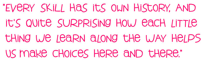
It seems every skill has its own history, and it’s quite surprising how each little thing we learn along the way helps us make choices here and there. We love making stuff, from baking bread to creating new furniture for the home, maybe finished with a colorful mosaic. And we dive really deep into all we do. But to be honest, lately we’ve been putting all our skills into making fonts — and it seems we have finally found our way. We simply, absolutely, love what we do and we put our very best into it.
It has now been two years since our first commercial font release and recently we found ourselves wondering why on earth we hadn’t started sooner. After all, we approached — and seriously fell in love with — the typographic world some 15 years ago, as we were finishing our graduation course. We have both been engaged in various activities since those days, together or individually, but of all those things, printing is perhaps most significant for what we do today. It started when we quit our full-time jobs to stay closer to our girl, who was then one year old. We began working for a local non-profit organization that taught people inside Brazilian prisons to make handmade paper from recycled sources. They also produced a myriad of incredibly beautiful paper products. We were in charge of creating artwork for these products, which resulted in a working relationship with the guys at the silkscreening workshop. Once we got to know this process we started doing all sort of experiments with hand-printing, from building lightboxes to trying new ways of making matrices. We printed virtually everything that came our way, always on a shoestring budget. We remember being especially motivated when the technician told us that something was not possible — which was probably typically youthful, defiant behavior.
So looking back on that period, having experienced this somewhat winding journey seems to have been really important to what we are doing today; it also allowed us to take time to seriously train our eyes.
Quite a trip! Now we know where the “Prints” in your name comes from. What does Pintassilgo mean?
The pintassilgo is a small passerine bird. Years ago our most productive working hours were late at night. There was a tree right in front of our studio balcony and one day a bird came by that turned out to be a very meticulous timekeeper: from then on it began singing every night towards two o’clock. This was quite annoying at first, but we soon became friends; it became our alarm clock to stop and get some sleep. When we needed a name to offer our printed stuff for selling in a store, we had no doubt: the bird! Now and then we think about changing our name, as it sounds a bit complicated and doesn’t reflect our full-time occupation now. But things are going fine, so we always postpone it until tomorrow.
There are different birds in the city where we now live. Each day, three beautiful macaws come flying in circles making a great noise — it’s such a gorgeous scene. They stay a while in the palm trees of the park in front of our window, and then fly away. Really cool. If only we were looking for a new name … But we won’t think about it now. Maybe tomorrow!
Populaire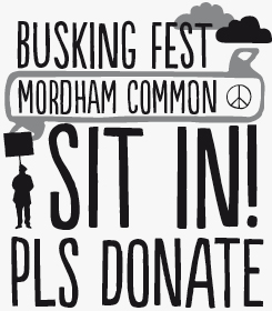
Intended as the first of a series of fonts based on revolutionary movements, Populaire was based on the posters created during the May 1968 uprisings in Paris. Created for the strikers by the screen-printing workshop Atelier Populaire, these posters have become influential icons of low-budget, do-it-yourself design. In the digital Populaire, each letter has four versions, all painstakingly kerned and tested by hand for the best visual effect. The four versions are used in random order through OpenType contextual alternates to create a convincing hand-cut aesthetic that evokes the spontaneous urgency of grass-roots protest movements. With a set of gutsy and imaginative pictograms and illustrations, Populaire is a handy all-round digital screen-printing atelier for office anarchists everywhere.
Changing
Rough, wobbly and lively, Changing employs an array of interlocking OpenType ligatures to create a handmade energy perfect for promoting live music, dance and street theatre performances. The font benefits from OpenType technology to assist in creating weird and wonderful letter combinations. But even when OT automatic glyph substitution is switched off — for instance when used as a web font — the wonky characteristics of the glyphs themselves and the mix of upper and lower case letters will look fantastic in huge sizes on the home pages of those same bands and theatre troupes.
Would you say that there is a direct relationship between your experience with techniques like silkscreening, and the style of your alphabets and fonts?
There certainly is a relationship, maybe not directly from the techniques but from the fact that we have been steeped in manual processes that stop us worrying about rulers and compasses, and instead make us trust our eyes. This really changed our way of working, and is still present in the fonts we make now.
When making stylistic choices, what are the things that inform and inspire you? Brazilian vernacular lettering styles? International trends? Voices from the past?
We have always paid special attention to artists who make use of words in their work; in Brazil, Leonilson and Arthur Bispo do Ros?rio come to mind. Both employed a variety of techniques and materials, and we have deeply admired their work for a long time. But our interest in the use of words — and therefore lettering — in art goes beyond Brazil, as is evident from our fonts Horst and Polygraph, which are both based on artists’ letterforms. It was stunning to see a movement in the opposite direction: one of our fonts was used to inscribe a poem on a huge steel sculpture in the Scottish town of Cumbernauld. Totally amazing!
We also feel a strong gravitational pull towards the graphic arts of the 1960s and 1970s, especially from countries where there was an energetic use of handmade elements in graphic compositions, such as Poland and Cuba. This attraction has manifested itself in many of our fonts, most notably in Transmogrifier, Dynatomic and Transitore.
Additionally, we are dedicated users of public archives and libraries, researching in publications from the past and present, local and international. It is wonderful how easy it has become to access collections and publications from all over the world now, both electronically and physically. Fifteen years ago the first books we bought over the internet took months to arrive. Now it is a matter of days. We never cease to be amazed at how fantastic this is, really.
As for Brazilian vernacular lettering styles, we’re not quite sure if they directly inspire us, but we certainly love observing them. There is one specific style that had such a strong presence in Rio de Janeiro, our former hometown, that it must have engraved something deep inside us: the writings of “Profeta Gentileza”, a so-called (and so-dressed) urban prophet who painted dozens of murals with a strong visual flavor on the pillars of a big viaduct with his peculiar messages of kindness. When he died in the late ’90s, the murals weren’t maintained and were, sadly, completely painted over in grey. Interestingly, these were so deeply rooted in the identity of the city that people complained. There has since been an unbelievably meticulous restoration of the murals.
You’re very productive. Among other things this means you have to come up with ever new names. How do you find names for fonts?
It is curious how hard this can be! We often start a font with some idea for a name, but never with a definitive one. And after putting in a whole lot of work on every stage of the design, the name also has to make some sense ... But not only this! Practically speaking, in many situations a font is displayed showing the font name. So it is great to include some of our preferred glyphs … Maybe with no repeating letters … Maybe not very long … and so on. Sometimes we make fun of ourselves, as if we were trying to make a kind of one-word-poetry while we’re just looking for a simple font name!
Polyspring
Based on a design by the Keystone Foundry from the early twentieth century, Polyspring is a decorative display face rooted in a tall, elegant serif. The fleurons are entirely optional — they can be selected by hand through your application’s character palette or activated automatically by turning on OpenType contextual alternates. The leafy ornaments lend this typeface a sober, autumnal feel which is distinctly late Victorian in tone. Would complement artwork for an album of acoustic songs, or branding for a seasonal fashion collection.
Amarelinha
While some of Pintassilgo’s fonts can get pretty sophisticated in their use of OpenType programming to attain their ingenuous personality, Amarelinha is a simpler tool that will appeal to web typographers as much as illustrators and book jacket designers. An all-caps font, each letter has two versions — one in the uppercase set, the other in the lowercase, meaning no complicated programming is required to achieve a casual, informal character. Available in two weights, Amarelinha is recommended for short display or medium length call out settings.
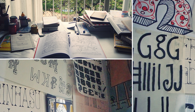
Top: Pintassilgo’s desk looking out over a leafy corner of Vitória.
Below and right: Sketches, tracings and various idle doodles are hung about the walls of their studio.
Most, if not all, of your fonts are credited to both of you. How does it work, that four-handed design process?
We both work on every single font we release. We keep an ever-growing number of sketched alphabets, often but not always drawing inspiration from something we saw along the way. And it is certainly not only visual references that inspire us, but also the books we’ve read, the movies we love, the music we’re listening to, the manual skills we’ve learnt, our children. We let all these things influence our choices. In fact, we’re not sure there is any other option!
When starting a new font, we choose one of those sketched alphabets to work on and begin working on the possibilities — which features the font could have and so on. We sit and are very focused on our work. Generally speaking, one of us concentrates on building the font from the final paper sketches, while the other focuses on reviewing shapes, spacing and kerning. Then we both work together on the programming of special features and final revisions. And it’s not over yet! Next comes the naming, writing a description in English (a foreign language for us) and designing the showcase images. Honestly, we put a lot of energy into every step to make the best product we can.
It will often happen that we leave a font unfinished for a while, and head over to some other project, returning with fresh ideas to the previous one later. This happened, for example, with our very successful Populaire font, which we initially intended to be part of a major family of “revolutionary faces’’. It gained more alternates and a gorgeous random effect, something we’ve been experimenting with a lot. Our fonts are very much conceived as toolkits for designers, so we often take the time to include some extras on the way, such as illustrations, ornaments and decorative elements, depending on the feel of the typeface.
Brazil is a country with an incredible musical tradition that has influenced popular music across the world. Does music have a special significance for you as designers and artists?
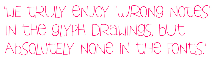
It certainly does, in more ways than one! Not only do we keep a collection of vinyl LPs with many great album sleeves — and of course with great songs as well! — and always enjoy listening to music, we also love it as a means of experimentation and expression. Stuck to our wall for a long time was a copy of a note on handwritten sheet music from the American modernist composer Charles Ives, who wrote to his copyist: “Mr. Price, Please don’t try to make things nice. All the wrong notes are right.” This always sort of appealed to us and was especially inspiring when we were working on one of our first releases, Tonal. This font has these dissonant asymmetries in its lettershapes and was going to be named Atonal but we just couldn’t resist placing one more “wrong note” into it. Very often our fonts have some approximation with the music universe, such as Swung Note, Sforzando, Ritornelos, Arca and Berimbau. Music is very present in our promotional graphics too.
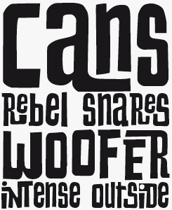
Smashing
Smashing is a roughly hewn, muscular display face built for impact, yet its subtle detail and intelligent OpenType programming soften the blow, making it more useful and flexible than initial impressions may let on. Try it for kids’s books, for example, or on signage around family-orientated tourist destinations.
Ritornelos
As any fashion expert will tell you, casual and effortless style is rarely accidental, or achieved without some effort. Tapping into the aesthetics of seemingly nonchalant spontaneity, Ritornelos oozes a feeling of almost childlike delight. Like Amarelinha it brings a variable and somewhat random effect within reach of non-OpenType empowered users simply through mixing its upper and lower case letters.
Could you mention a few things you haven’t tried yet (styles, design techniques, typographic technologies), but hope to do in the foreseeable future?
We’re often testing new tools, normally without a clear purpose, just for experimenting. Recently, for example, we bought some calligraphy pens and tried them out in many ways, even though we absolutely don’t intend to start making calligraphic fonts.
Lately we’ve been really enjoying exploring the possibilities of OpenType technology, and it seems we’ll continue on this track, always trying to get a step ahead. Each new font has been a new puzzle.
There’s a puzzle we’ve been planning to assemble, based on pages from a Brazilian weekly publication from the 70s called ‘O Pasquim’. Besides its amazing written content, in a time when Brazil was governed by a military dictatorship, it has stunning hand-composed pages with awesome lettering styles by Ziraldo, a prolific graphic artist, draughtsman, cartoonist and writer. Inspiring and complex, this puzzle will certainly bring us new adventures in OpenType.
Your new font Polyspring is based on an early 1900s typeface from the Keystone Foundry. Do you have an archive of old type specimens? Are you collectors of printed ephemera?
We’re quite relaxed collectors, in the sense that we don’t feel the need to possess the actual items. If we get to see things in public archives or libraries, requesting a photocopy of something is pretty sufficient. And there’s also the amazing “Internet Archive”, an invaluable source for research. However, if nice stuff comes our way we can’t help keeping some of it. We do have assorted magazines and publications from the 1940s to 1970s, but it really isn’t an extensive collection. What we have most of are books. We love books, on many subjects, and are serious consumers of them. After reading and seeing them, if they’re of some use as a reference (and many are!) we keep them. Otherwise we donate them to public libraries in our neighborhood.
Horst
Horst Janssen was a German artist and printmaker, working in the second half of the twentieth century, and part of a rich tradition of illustrators known almost as much for their inventive lettering as their imagery. In Horst, Pintassilgo bring the full potential of OpenType into play in creating a font from Janssen’s uniquely playful yet somehow powerful and disturbing letters — with lots of ligatures, four versions of each character and stylistic sets that add additional overlaps to those already present in the ligatures. This won't be an everyday font, but Horst will be ideal for anyone seeking an energetic, organic edginess.
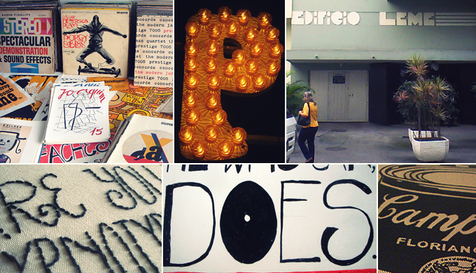
Some of Pintassilgo's sources of inspiration: old album covers, prints and publications at the studio; a parking sign around the corner; a building in their old neighborhood in Rio; an embroidery experiment; a hand-drawn test for the Horst font, a silkscreen print on fabric.
Fonts need to look nice, but they also have to function impeccably on a technical level. How do you do your testing?
Our fonts have their peculiarities, so they demand peculiar testing: often they are, for example, all-caps fonts with four versions for each letter. For testing purposes we usually program some glyph cycling behaviors just in order to check if they are all being displayed correctly and are getting on okay with their neighbors. Our fonts are mainly for display use, but we like to take as much care of them as if they were intended for longer texts — we’ve already seen them doing this quite well. This reviewing process takes an immense amount of time and patience. After implementing the final programming, it is time to re-check everything from a new point of view. We’ve built a consistent library of testing sheets alongside a record of errors we experienced through testing — and we’ve encountered quite a lot of tricky things on the way. We truly enjoy “wrong notes” in the glyph drawings, but absolutely none in the font functioning. This has to be just as perfect as it can be. And getting better all the time!
You are partners in daily life as well as work. What are the main advantages of such an arrangement? Any disadvantages you want to share?
Maybe the main advantage is the same as the possible disadvantage: we’re pretty much together most of the time. We can share insights or discuss ideas even if we are waiting in the line at the grocery store, but there’s a risk that we’ll never stop working and it’s crucial to have a break. As we’ve been sharing life and work for quite some time now, we know our escape routes and we take them very seriously. And, like the Corleones, we never, ever, discuss business at the table!
Erica and Ricardo, thank you so much for your insights and stories. Keep those clever fonts coming — including the “wrong notes”!
Berimbau
Slender and innocent, Berimbau is a neat and thoughtfully drawn handwork great for those quiet headlines and display notices loved by boutique retailers’ websites and personally-flavored greetings cards and invites. Available in two weights, Berimbau is offered as a full featured, fully tooled-up OpenType font as well as a more modest basic version, making it a good choice however you plan to use it.
MyFonts is on Twitter and Facebook!
Join the MyFonts community on Twitter and Facebook. Tips, news, interesting links, personal favorites and more from MyFonts’ staff.

Who would you interview?
Creative Characters is the MyFonts newsletter dedicated to people behind the fonts. Each month, we interview a notable personality from the type world. And we would like you, the reader, to have your say.
Which creative character would you interview if you had the chance? And what would you ask them? Let us know, and your choice may end up in a future edition of this newsletter! Just send an email with your ideas to [email protected].
In the past, we’ve interviewed the likes of Michael Doret, Laura Worthington, Jonathan Barnbrook, Rob Leuschke, David Berlow, Ronna Penner and Jos Buivenga. If you’re curious to know which other type designers we’ve already interviewed as part of past Creative Characters newsletters, have a look at the archive.
Colophon
This newsletter was edited by Jan Middendorp and designed using Nick Sherman’s original template, with specimens and type descriptions by Anthony Noel.
The Creative Characters nameplate is set in Amplitude and Farnham; the intro image features Swungnote and Berimbau; the pull-quotes are set in Singela; and the large question mark is in Farnham.
Comments?
We’d love to hear from you! Please send any questions or comments about this newsletter to [email protected]
Subscription info
Want to get future issues of Creative Characters sent to your inbox? Subscribe at www.myfonts.com/MailingList
Newsletter archives
Know someone who would be interested in this? Want to see past issues? All MyFonts newsletters (including this one) are available to view online here.