
Useful: that’s the key word in this month’s newsletter. Whether you’re a professional or a hobbyist, a web designer or an art director developing corporate publications or packaging — you’ll find some extremely affordable as well as extremely sophisticated typefaces in this edition of Rising Stars. Enjoy.
This month’s Rising Stars
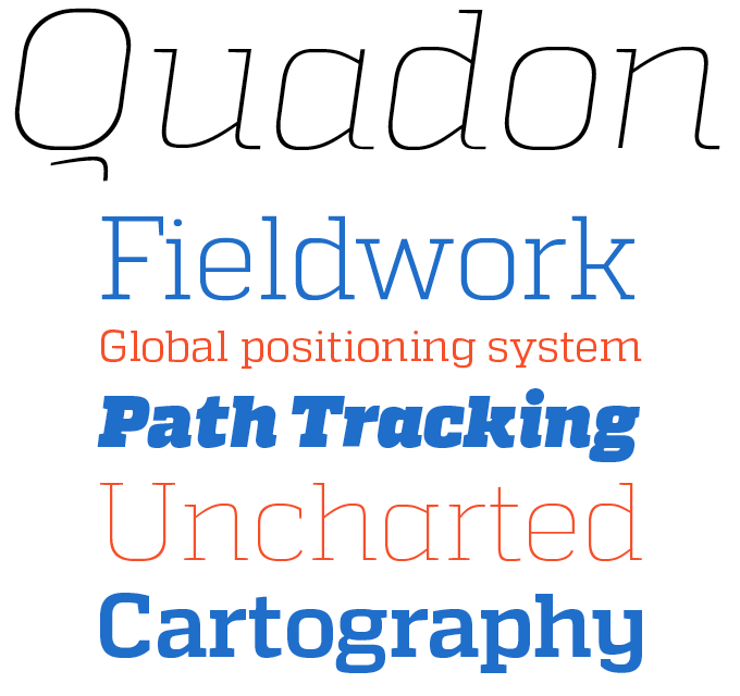
Berlin’s Rene Bieder is one of those rare typographic one-man bands who has been successful with each of his releases — three in a row. After two sturdy sans-serifs (one of which, RBNo2.1, made it into MyFonts’ “Fonts of 2012”) Bieder has now struck gold again with Quadon. A squarish variety of the popular slab-serif genre, the family has been sitting comfortably at the top of our Hot New Fonts list for a couple of weeks. With nine weights and matching italics, Quadon is a modern, clear and flexible interpretation of the slab-serif model. The open shapes and large x-height keep the font legible in small sizes, while short descenders support the compact powerhouse center. Its wide range of typographic features and alternative glyphs allow for a fair degree of personalization. From the sensitive-but-sharp thinner weights to the punchy heavy weights, Quadon is well-suited for a wide range of tasks. Quadon is 80% off until April 30, 2013.
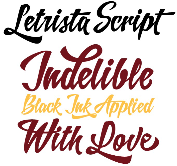
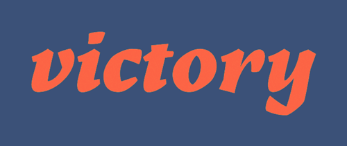
Letrista Script is the first font from Colombia’s Calderón Estudio, and it’s one of the most striking script font releases in recent months. Designer Felipe Calderón is a talented lettering artist, whose Behance portfolio shows his skill in a wide variety of styles. His Letrista typeface (the name means “Signpainter”) sums up years of study and analysis of the work of lettering artists. Calderón looked at American alphabets, but also work from other parts of the world where hand-painted brush scripts still play a role in everyday communication. With more than 1000 glyphs, Letrista was conceived to make the most of OpenType functionality: its ligatures, alternate lettershapes and keywords make it a smart toolkit for creating witty pseudo hand-lettering. Despite its lively and striking texture, the font remains legible throughout, as can be seen from the specimen and samples. Letrista Script is 70% off until April 21, 2013.
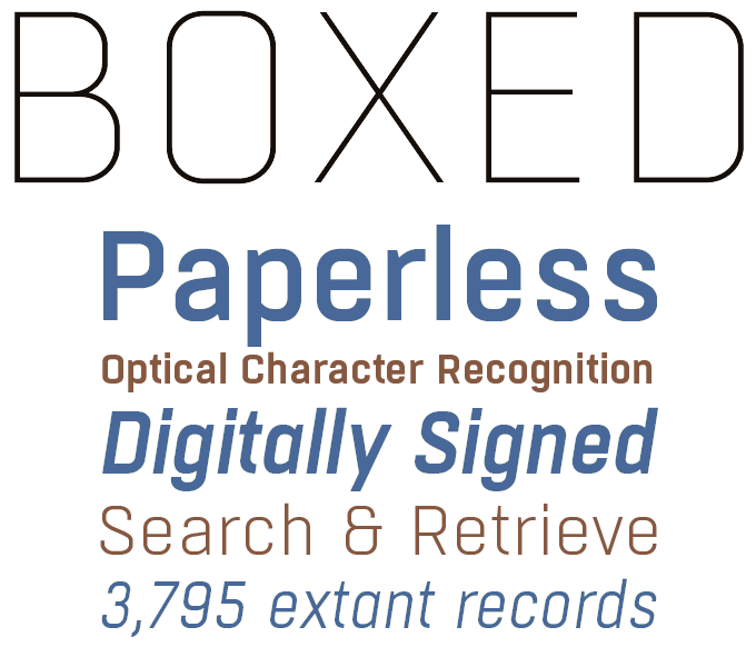
Is there still room for new variants of the populated genre of squarish sans-serifs? With Boxed, Spanish foundry Tipo Pèpel strives to prove that this is indeed the case. Designer Josep Patau has opted for an approach that is both rational and undogmatic: the shapes are based on geometry and modularity, but not rigidly so; where characters such as ‘e’ and ‘o’ show the strict basic shape of the rounded rectangle, the arch of the ‘a’ has a more classic roundness and its angled bowl also adds liveliness. Boxed comes in nine weights with italics for all, and offers an extensive character set that includes Cyrillic. Boxed is 70% off until April 14, 2013.
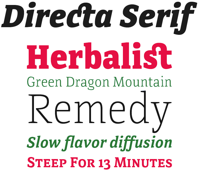
In the past, Brazil’s Outras Fontes has brought us sophisticated display fonts such as Jana Thork and Alegria. The new Directa Serif is something quite different: an extensive text and display family for demanding editorial work. Directa Serif has many features that make it both space-saving and legible at small sizes — a somewhat condensed skeleton, large x-height, low contrast, sturdy serifs, articulate lettershapes. This results in economic typesetting that make the typeface a good choice for magazines and corporate communication. The Directa Serif family comes in seven weights and their italics, with ample language coverage, small caps, sets of lining, old style and tabular figures, and more.
Text families of the month
Text typefaces for demanding editorial work need to possess special qualities: excellent readability, a generous range of weights with italics and small caps for all of them, multiple figure sets (lining, oldstyle, table) and ample language coverage. In this section of the newsletter you’ll find recent releases that meet these standards.
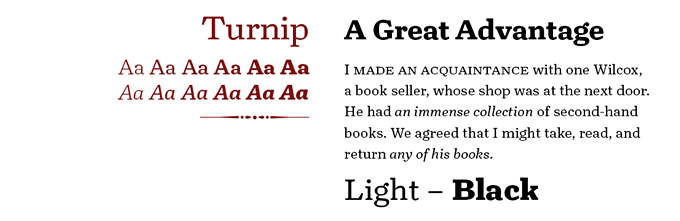
Font Bureau’s Turnip was designed to present a cheeky yet usable alternative to the cliché of the well-mannered, classic serif face. Turnip is coarse and down-to-earth — the kind of type that feels completely at home with salty language. David Jonathan Ross crafted an energetic tension between its inner and outer shapes, giving it personality and vigor. “This ain’t your grandpa’s book face,” says Font Bureau, “but it reads just as well!”
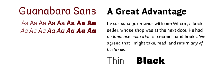
Guanabara Sans is the third type family from Rio de Janeiro’s Plau typefoundry. It started out as a proposal for a wayfinding typeface that was to double as the city’s brand typeface. In other words, it had to combine supreme legibility with distinct and recognizable shapes — no mean feat. The result is a workhorse with attitude, and with plenty of features for sophisticated typographic use.
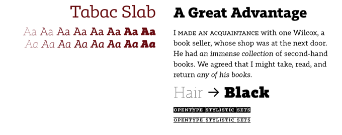
Tabac Slab from Suitcase was created by combining several contradictory influences. The combination of brisk serifs and refined calligraphic details in the structure of the characters have resulted in an original concept as well as an extremely readable typeface. Serifs aid legibility in long texts, while small drawn details realize their full potential in large sizes. Needless to say, the Tabac Slab family has the superior quality and configuration we’ve come to expect from Tomáš Brousil’s foundry.
News Round-Up
In this section we pick out interesting news snippets from MyFonts’ own kitchen and from the greater world of fonts, lettering and typography.
TDC Typeface Design 2013: the winners
Each year, a jury of specialists picks the winners of the Type Directors Club’s Typeface Design Competition, and the 2013 winners are now in. Out of a total of 200 entries from 33 countries, the jury (which included David Berlow, Stephen Coles, Abbott Miller and James Montalbano) chose 14 winners. The list is a diverse selection of text and display fonts including Japanese, Hebrew, Arabic, Greek and multi-lingual families. Among the winning fonts that can be found on MyFonts are Bernini Sans by Tim Ahrens, Daniel Sabino’s Karol (above), Iskra by Tom Grace, Agmena by Jovica Veljovic and Jocham by Hubert Jocham. Winning new typefaces from Maximiliano Sproviero and Neil Summerour will hopefully become available soon.
Mediterranean Type Conferences
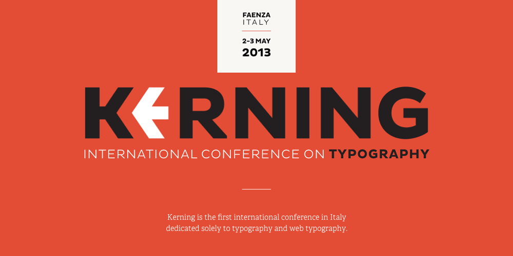
The world of type is no longer the centralized elite it was decades ago. Research, design and production is now taking place in hundreds of places around the world. This ongoing development is underlined by the many events that are taking place in cities that weren’t on the typographic map before. MyFonts has played a role in opening up the global market to designers and users located just about everywhere, so we support events that happen in emerging typographic centers. We’re contributing to Kerning (Faenza, May 2–3), Italy’s first conference dedicated solely to typography and web type. And for the second time we’ll be at ISType (mid-June), a growing initiative in Istanbul, Turkey, where MyFonts’ Adam Twardoch and Jan Middendorp gave presentations on web fonts last summer.
MyFonts on your favorite social network
 Believe it or not — the MyFonts team is made up of individuals with personal tastes. And each of us has preferences regarding the social and creative networks we’re most involved in. So it’s only natural that some of us tweet for MyFonts, some spend lots of time on Facebook, others collect inspirational imagery or hope to build geeky typographic archives on Tumblr, Pinterest and Flickr. There’s even a blog in German. So take a look, and follow, like, add, join, pin or talk to MyFonts.
Facebook | Flickr | Tumblr | Pinterest | Twitter | MyFonts.de
Sponsored Font:
Geogrotesque from Emtype
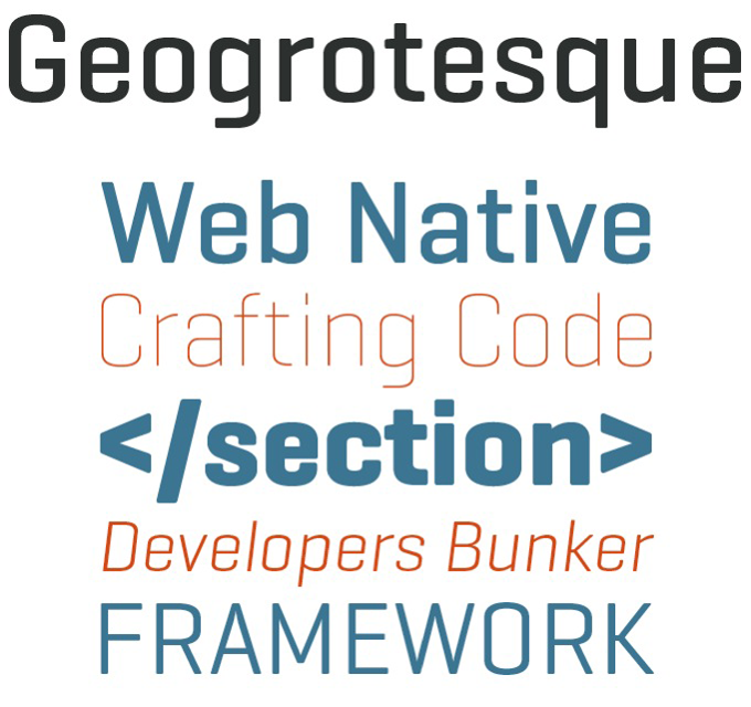
Ever since its release in late 2008, Geogrotesque from the Barcelona-based Emtype foundry has remained a steady seller. Geogrotesque belongs to the popular genre of the “squarish sans-serif ” — the children of Eurostile, so to speak. Designer Eduardo Manso managed to strike a smart balance between clean-cut geometry and reader-friendly elegance. Based on a simple basic shape — a rectangle with curved top and bottom — the typeface is pure and regular without becoming bland or mechanical. With seven weights, Geogrotesque is a great headline family for magazines or annual reports, but will also work in text of intermediate length and point size. Its companion Geogrotesque Stencil offers an unusual and flexible set of headline fonts.
Webfonts at MyFonts
All of the top four Rising Stars fonts, and usually the sponsored font as well, are available for licensing as webfonts. Visit Webfonts.info for HTML and CSS versions of this month’s Stars, plus lots of articles, resources and a showcase of web typography in the real world.