If the Best Seller lists on MyFonts are something of a barometer of trends in typography, then there are two main currents — and they are diametrically opposed. One: the minimalism of cool, clean slab and sans-serif fonts. Two: the delight in exuberance, ornament, cheerful irregularity and all that looks handmade. This month, with summer in the air for many of us, the scale has most definitely tipped towards the latter. It’s May, and our Rising Stars — even the Text Fonts of the month — are bursting with joie de vivre. Enjoy!
This month’s Rising Stars
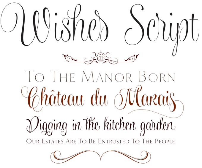
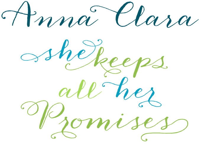
It’s been almost two years since Sabrina Mariela Lopez of Typesenses released her successful Parfumerie Script Pro. Her new typeface Wishes Script proves that in type design, taking one’s time is usually a good thing. With this script, Lopez has truly found her own voice. It has plenty of swashes, ligatures, beginning and ending shapes — but none of the solemnity and pompousness that characterize so many scripts in the Copperplate and Spencerian genres. Its grace, wit and playfulness are more 1950s than 1750s. When used in OpenType-savvy layout programs, Wishes Script Pro offers the designer an additional decorative toolkit full of frames, ribbons, hearts, flowers and ornaments, plus a collection of caps and small caps. For users of simpler programs or for the web, the scripts, ornaments and caps are available as separate fonts. The family even offers optically optimized Display and Text styles for each of the weights — Light, Regular and Bold. For more details on this impressive suite, download the User Guide PDF in the Gallery Section.
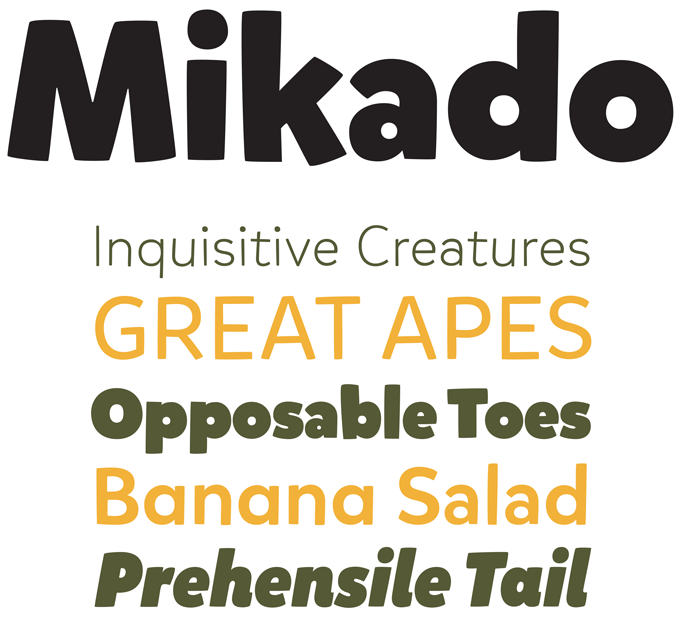
Berliner Hannes von Döhren of HVD Fonts has an uncanny knack for inventing typefaces that perfectly capture current trends in graphic and type design, yet display enough personality and new ideas to be true originals — and become trendsetters themselves. His Mikado merrily strolls further along the path that his Pluto walked before. A pleasant, casual sans-serif, it is many things at once: it has the openness and regularity needed for agreeable reading, and a lively and informal appearance that makes it shine in large headlines, slogans and logos. Mikado is equipped for professional typography with alternate letters, ligatures, arrows, fractions and language coverage. Mikado is 50% off until May 15, 2013.
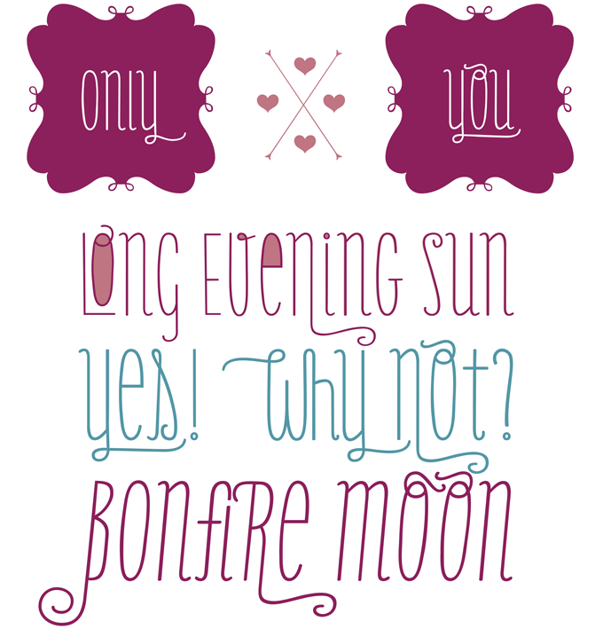
In popular culture, there’s nothing wrong with taking a catchy style and carrying it one step further. In this respect, display type design has been a lot like pop music or fashion for, well, almost a hundred years now. Only You Pro from LeType is another variation on the theme of skinny monolinear condensed semi-scripts (see also Populaire, Mr Moustache, etc.) but adds some nice personal touches to the genre. Its lowercase letters have the same height as the capitals, resulting in a striking unicase effect; with 887 glyphs, it offers swashy alternatives as well as an impressive arsenal of crazy ligatures. It also has a special version with closed counters (Hole) and two sets of keywords. Finally, Only You Icons is an attractive set of pictures, ribbons and frames. Check out the free Ornaments font! Only You Pro is best used with programs that support full OpenType functionality.
Text families of the month
Text typefaces for demanding editorial work need to be designed for readability, and offer a generous range of weights with italics and small caps, as well as multiple figure sets (lining, oldstyle, table) and ample language coverage. In this section of the newsletter you’ll find recent releases that meet these standards, shown in a sample text from Benjamin Franklin’s autobiography — a different fragment each month.
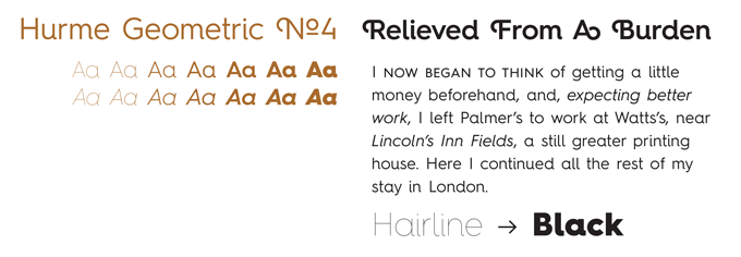
The Hurme Geometric Sans suite from Finnish designer Toni Hurme is an ambitious project: it consists of four complete sans-serif families based on the same skeleton, each with slightly different characteristics. They are all well-equipped for use as text fonts, with simple, open shapes that reference geometric predecessors from Futura to Avant Garde to Museo. As we have no space for all of them, we feature Hurme Geometric Sans No.4 here, the most fanciful of the lot. Like its siblings, it comes in seven weights with true small caps, obliques and swash alternates. Alternate characters and other OpenType features make for a versatile text and display family that can be adjusted for specific needs.
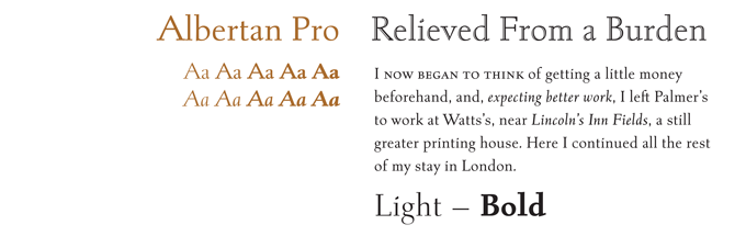
The late Jim Rimmer originally made Albertan as a 16pt. metal book face for his own Pie Tree Press. In its digital form, this modern oldstyle with its straight serifs (a kind of link between Joanna and Scala) became a well-respected text face. Canada Type has now produced what could be the definitive version of this Canadian classic. Albertan Pro is the result of many months of correcting and remastering; the family was expanded with new weights and huge glyph sets. The new family contains six weights and an inline set, all with true italics, small caps and six styles of figures. 20% of Albertan Pro’s revenues will be donated to the Canada Type Scholarship Fund, supporting typography education in Canada.
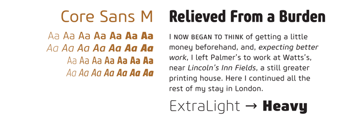
Core Sans M is part of the Core Sans Series from the Korean foundry S-Core. It’s a squarish sans-serif with a subtle techno feel; despite its futurist connotations, its rounded finishes give it an overall friendly appearance. Legibility is enhanced by lucid shapes and a tall x-height, as well as balanced, not-too-tight letter spacing. The Core Sans M family comes in two widths (Normal and Condensed), each in 7 weights. The character sets are highly professional, with small caps, ample language support (including Greek and Cyrillic), multiple figure styles, arrows, geometric shapes, miscellaneous symbols, and more.
News Round-Up
In this section we pick out interesting news snippets from MyFonts’ own kitchen and from the greater world of fonts, lettering and typography.
Pencil to Pixel in New York
For those who are currently in or near New York City, this newsletter may just come in time to alert you to one of the typographic events of the year: the Monotype exhibition Pencil to Pixel. Like the London edition (see our December issue) this spectacular show is only on for a few days, hosted by the Tribeca Skyline Studio until May 9, 2013. Pencil to Pixel features treasures from Monotype’s legendary archives, treating typography lovers to a rich selection of typographic material — from original type designs by Eric Gill to rare type samples, tools, matrices and much more. It takes the viewer through a century of rapid technological changes but also looks ahead at the future of type in the digital age.
TypoBerlin, bigger than ever
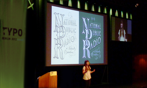
Jessica Hische was a speaker at TypoBerlin 2012
Since 1995 our friends at FontShop Germany have been organizing TypoBerlin, one of the world’s major typography and design conferences. In the past few years, the conference has branched out to London and San Francisco, but the Berlin mothership is still sailing majestically. The 2013 edition takes place next week, May 16–18, at its usual venue, Berlin’s splendid House of World Cultures. This year there are more speakers than ever before. Kickstarting the conference (theme: Touch) will be British design guru Ken Garland; speakers include Anthony Burrill, Jessica Walsh (Stefan Sagmeister’s partner), Erik van Blokland and Neville Brody. There are extensive threads on Polish and Russian design.
Webfonts at MyFonts

All of the top four Rising Stars fonts are available for licensing as webfonts. Visit Webfonts.info for HTML and CSS versions of this month’s Stars, plus lots of articles, resources and a showcase of web typography in the real world.