|
As we are writing this newsletter, spectacular things are happening on soccer fields in Brazil. The world is holding its breath. How unpredictable can a game get? How euphoric a street full of fans? Most of us here at MyFonts are sports fans of one sort or another, but we can’t help wondering: in a world taken over by football*, who wants to read about fonts? Questions, questions. We don’t have a choice. We have to present you with simply the best and the most popular typefaces in a brave attempt to compete with twenty-two men having a ball, and maybe we’ll get your attention. The fonts, mind you, are worth it.
*Yes, our European team does mean the ball game played with one’s feet
|
|
|
This Month’s Rising Stars
|
|
|
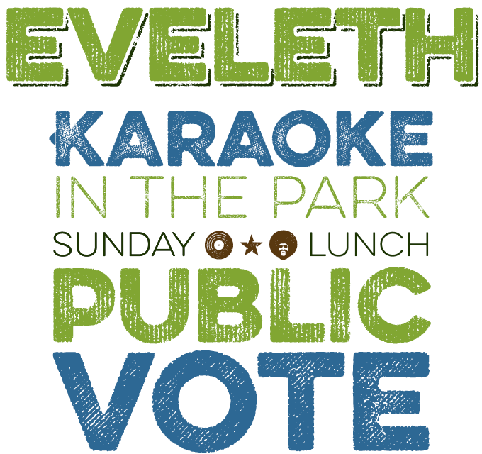
Ryan Martinson of Yellow Design Studio is a master of textures. Earlier typefaces such as Veneer and Thirsty Rough had the random wear of roughly printed letterpress. This new one, Eveleth, is more sophisticated and specific. It features three different sub-families, each with its own printed texture, each offering six distress options per letter and three options for other characters, allowing incredible customization. You can sense the surface of the paper, or the abrasion of a battered old cardboard box. Additional features include funky icons, shapes and emblems, as well as clean versions. As the high-resolution wear and tear involves complex outlines, the fonts do not load very fast in some applications — so for web use, either use the clean versions… or experiment with subsets of just a handful of letters. |
|
|
|
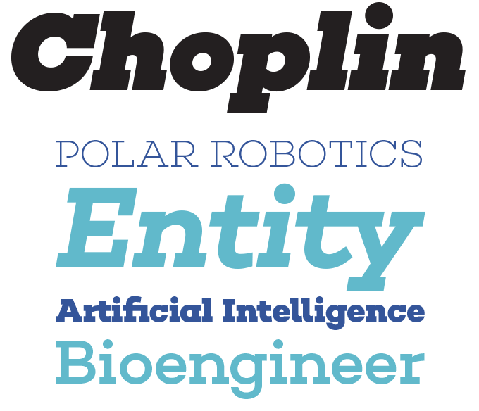
Berliner René Bieder is one of the hardest working Germans on MyFonts. Less than four months after his sans-serif Campton, presented in our interview with Bieder, he released another extended family — Choplin, a sturdy slab serif. Designed on Campton’s skeleton, it shares the same principles: geometry, simplicity and neutrality. While the families work very well together (we can imagine designing a powerful magazine layout combining these two), Choplin is not simply Campton-with-serifs-snapped-on. Many details were changed during the process in order to sharpen the slab serif character. While the middle weights work well in longer texts, the lightest and boldest weights make headlines look loud and strong. The extended range of alternative glyphs, ligatures and OpenType features lends the Choplin family flexibility and uniqueness. Choplin is 85% off until July 26, 2014.
|
|
|
|
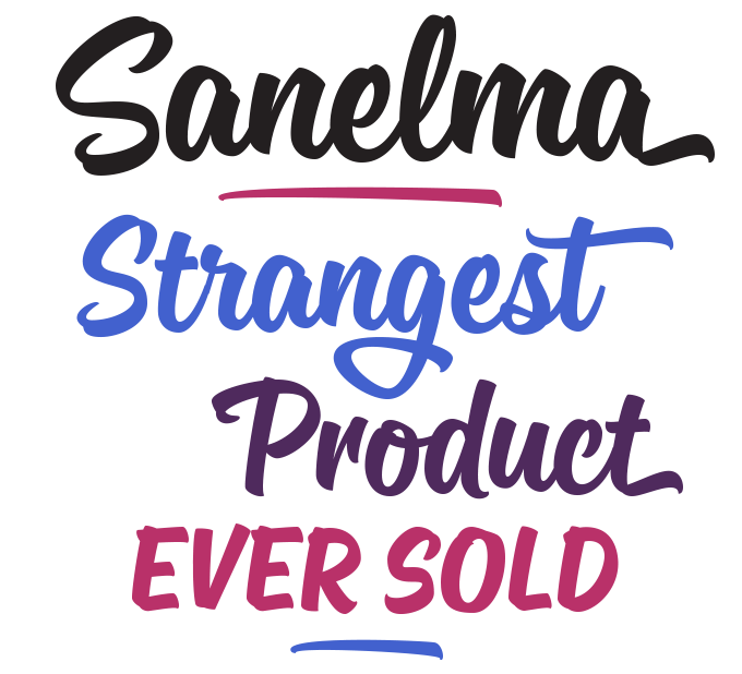
There have been several very nice brush script fonts in our top 10 Hot New Fonts these past few weeks. Currently, the most successful one is Sanelma from Finnish designer Mika Melvas. Inspired by lettering and sign painting from the golden age of Hot Rods, Sanelma is versatile and well-equipped. It offers two styles of end swashes, swash caps, small caps, lots of alternate characters and underline option. All in one single font of over 1,200 glyphs! Bouncy and supple, Sanelma very convincingly captures the work of master signpainters. Its many options for customizing it make it perfect for logos, packaging and titles. Sanelma is 35% off until August 2, 2014.
If you like this style, here are two more great new scripts to check out: Rukola by Nikola Giacintová (50% off until July 28, 2014) and XXII YeahScript from Doubletwo Studios.
|
|
|
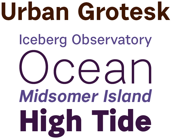
The appeal of cool, clean sans-serifs such as the inevitable Helvetica® typeface seems universal and everlasting. But demanding graphic and web designers do want to have a choice of alternatives. And type designers like to come up with personal varieties that have a voice of their own. Urban Grotesk from Prague’s Suitcase foundry is a fine example. Designer Tomáš Brousil has focused on selected details. Look at the flag of the ‘r’, or the spur on ‘g’, the way curves connect abruptly to the verticals, the confident round dots… details that lend the typeface the appeal of a highly efficient and contemporary face, not something borrowed from 1895 or 1958. With its small caps and multiple figure sets, Urban Grotesk is a fine choice for complex editorial typography, branding and corporate identities. |
|
|
Text fonts of the month
Typesetting for books, scientific magazines, or annual reports requires font families with special qualities: excellent readability, a generous range of weights with italics and small caps, multiple figure sets (lining, oldstyle, table) and ample language coverage. Here is a selection of recent, hi-quality text typefaces.
|
|
|
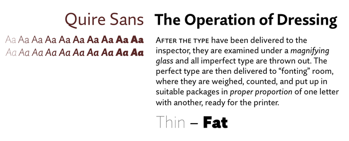
Quire Sans™ is the latest major text type family from Monotype — and it is a beauty. “My goal,” says designer Jim Ford,“was to make a design that might fit in anywhere. I wanted it to be highly functional and sexy at the same time.” With one foot comfortably in the realm of oldstyle design and traditional book typography, and the other in the purpose-driven engineering of electronic media, Quire Sans does have a broad appeal. What makes it “sexy” is not just its attractive shapes, but also its confidence, performing in virtually any setting. With small caps, multiple figure styles and alternates, Quire Sans is both gorgeous and usable. It is also 80% off until August 12, 2014. |
|
|
|
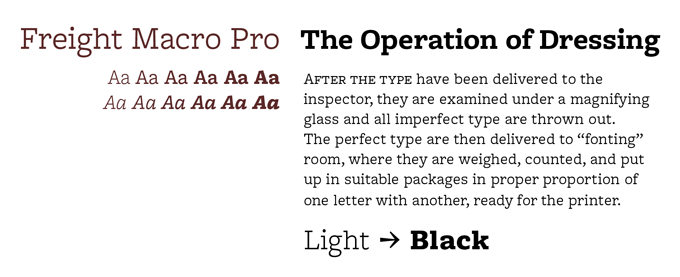
Freight Macro Pro is the latest addition to Joshua Darden’s fabulous Freight family, as licensed to GarageFonts. While the rest of the family consists of daring varieties on classic serif and sans-serif designs, the new member is a sturdy, practical slab serif. The medium and bolder weights are well suited for magazine and newspaper headlines and subheads, while the light and book weights are geared for body text in newspapers, magazines, manuals, and more. All Freight Pro fonts have small caps, proportional oldstyle and tabular lining figures, extended ligature set, alternate characters, and dingbats.
|
|
|
|
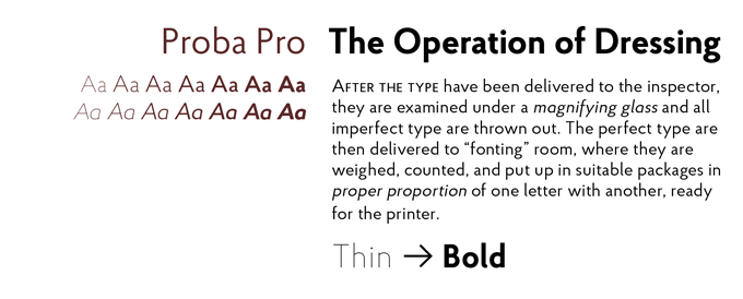
Proba Pro from Mint Type is a geometric sans with a subtle humanist touch. Its round shapes and high ascenders are reminiscent of lettering and typefaces for the 1930s — the era of Art Deco. That doesn’t make it nostalgic, just very agreeable and friendly. With seven weights plus matching italics, ample language support (including Cyrillic), small caps, four sets of digits and many more OpenType features, it offers discerning typographers
ample possibilities and an attractive new color on the typographic palette.
|
|
|
News Round-Up
In this section we pick out interesting news snippets from MyFonts’ own kitchen and from the greater world of fonts, lettering and typography.
|
|
@font-face in emails!

If you’re one of our 80-odd percent of readers looking at this email in a mail client that support webfonts, you should be enjoying the benefits of Jan Fromm’s Rooney Sans, which we’ve used to set all the headers and body text in this email. You can use MyFonts webfonts in your emails too! Sorry Gmail and Outlook users (roughly 15% of all our subscribers) you’ll either have to wait for your favorite email client to improve its support, or vote with your feet and pick a better way to read your email!
|
|
The 50 most used web fonts
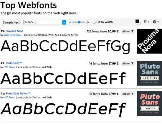
As webfonts are being universally accepted in web design, we thought it would be nice to present a list that shows which are the most successful fonts on the web right now. While our charts of Hot New Fonts and Bestsellers are purely based on fonts sold, we figured it makes sense to measure the popularity of web fonts by listing the fonts currently in use. So there you go: the new Top Webfonts page lists the fifty most used MyFonts webfonts on the web. It’s a great resource for finding webfonts that can walk the talk: typefaces that work well on the screen and that people keep coming back to. Navigate to the list by clicking the Webfont link in the header of our site. Based on actual web font use by our customers, It updates hourly, making sure that you have the most current information possible.
|
|
MyFonts on Facebook, Tumblr, Twitter
Your opinions matter to us! Join the MyFonts community on Facebook, Tumblr and Twitter — feel free to share your thoughts and read other people’s comments. Plus, get tips, news, interesting links, personal favorites and more from MyFonts’ staff.
|
|
|
|
|
|
|
|
|
MyFonts Inc. 500 Unicorn Park Drive, Woburn, MA 01801, USA
MyFonts and MyFonts.com are registered service marks of MyFonts Inc. Other technologies, font names, and brand names are used for information only and remain trademarks or registered trademarks of their respective companies.
© 2014 MyFonts Inc
|
|
|
|