|
Several of MyFonts’ team members have just returned home from Washington DC, where we enjoyed the 2014 edition of the yearly TypeCon event. It’s always a great occasion to meet type designers in person — and to spend some quality time with other team members, as we’re usually spread out over two continents. All is back to normal now, which in the case of MyFonts means: permanent change. We’re constantly adding new typefaces, new foundries and new features to our website. If you want to know more about the latter (i.e. the features), scroll down … ’cos we also added a new section to this newsletter: a monthly snippet of home-made awesomeness. Enjoy!
|
|
|
This Month’s Rising Stars
|
|
|
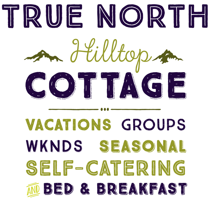
True North from Cultivated Mind is part of a new trend. Not exactly a genre, but rather a novel way of grouping fonts into toolkits made up of typefaces from miscellaneous display categories, designed to work well together. Following the success of Laura Worthington’s Charcuterie package (and her more recent Adorn), several other foundries have come up with their variations on the same theme. True North from Cultivated Mind is one of the more elegant and successful of its kind. It offers sixteen subtly nostalgic styles of all-caps fonts, a monoline Script, Labels, Extras and a free set of banners. Extras include wild animals, catchwords, numbers, symbols, tools, maple leaves and trees. The Script is pretty sophisticated: equipped with a wealth of ligatures and alternates, it automatically creates the feel of hand-lettering when used in a fully functioning OpenType environment. |
|
|
|
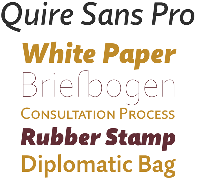
The Quire Sans™ family is the latest major text typeface from Monotype. A timeless and elegant design, it was designed as an all-purpose family that fits in well in any situation, yet is never bland. Says designer Jim Ford: “I wanted it to be highly functional and sexy at the same time.” With one foot comfortably in the realm of oldstyle design and traditional book typography, and the other in the purpose-driven engineering of electronic media, Quire Sans does have a broad appeal. What makes it “sexy” is not just its attractive shapes, but also its quiet confidence and professionalism. With small caps, multiple figure styles and alternates, Quire Sans is both gorgeous and usable. It is 80% off until August 31, 2014.
|
|
|
|
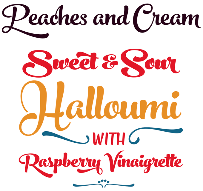
It is always fascinating to see how artists and craftspeople develop and mature — how each new work adds confidence and finesse to their vocabulary. With Peaches and Cream, Finnish type designer Emil Karl Bertell of Fenotype seems to have reached a new level of sophistication. Designed for branding and packaging, Peaches and Cream references 1950s brush script hand-lettering and pulls this off remarkably well, with loads of alternate shapes, swashes, and ready-made letter combinations. To be used with OpenType-savvy applications, or by manually selecting characters from a glyph palette. Peaches and Cream comes in three weights; combine with Ornaments and Caps to create striking headlines with a custom-made feeling. For the best price purchase the complete family.
|
|
|
|
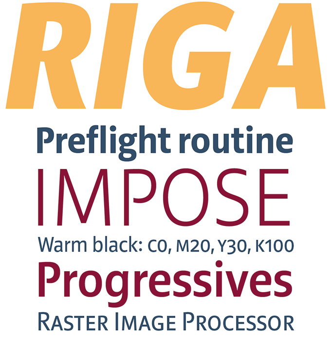
Ludwig Übele’s foundry Ludwig Type offers a small but exquisite library of text and display faces. Each of his families represents a sensitive, personal take on a well-known genre: humanist oldstyle and humanist sans for the Marat family, industrial sans for Helsinki, 1970s-style display for Daisy. His new Riga family is probably his most versatile sans-serif to date. The open, somewhat condensed lettershapes make it both highly legible and space-saving; it was designed to work equally well on paper and on the computer screen. Lucid and practical, yet warm and personable, Riga is suitable for a wide range of typographic projects — from editorial and websites to packaging and corporate projects. For on-screen design, check out Riga Screen, optimized for small sizes in lower resolution. The Riga family is 80% off until August 31, 2014.
|
|
|
Text fonts of the month
Typesetting for books, magazines or annual reports requires font families with special qualities: excellent readability, a generous range of weights with italics and small caps, multiple figure sets (lining, oldstyle, table) and ample language coverage. Here is a selection of recent, high-quality text typefaces.
|
|
|
|
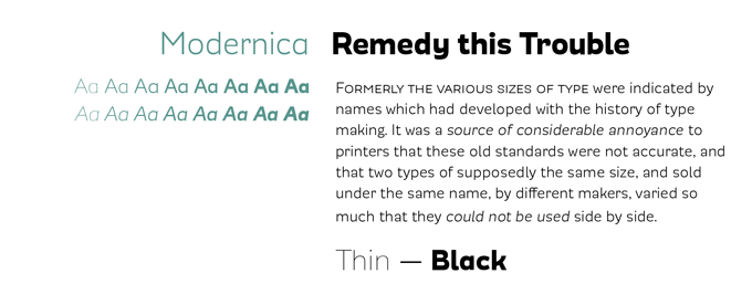
In their quest for an ever more diverse typeface library, Chile’s Latinotype has recently focused on adding more text faces to their repertoire. Modernica by Javier Quintana does a nice job at being both usable and visually interesting. This simpático sans-serif family comes in eight weights plus matching italics; all contain small caps, ligatures, modern and old style figures, numerators and denominators, and more. Modernica seeks to go beyond the grotesque style (which can be graceless at times), enabling the user to set headlines and text columns with a friendlier and more fluid look.
|
|
|
|
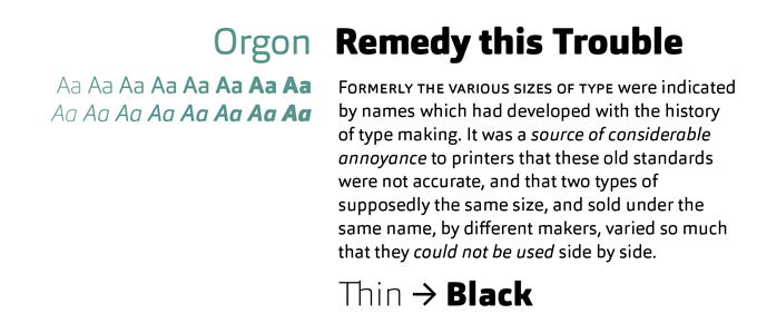
Dieter Hofrichter at Hoftype has an impressive ability to bring something new to every typeface genre he tackles. All of his text families have a special quality: a combination of modesty, precision, and shapeliness. His latest, Orgon, can be described as a “squarish sans” with rounded terminals; but it’s much easier on the eye than many other faces in this genre. It is unpretentious and unobtrusive, but still stands out through its warmth and smoothly flowing lines of text. Comprising eight weights plus italics, together with small caps, multiple figure sets with matching currency symbols, and specially drawn arrows, Orgon is well suited for ambitious typography.
|
|
|
|
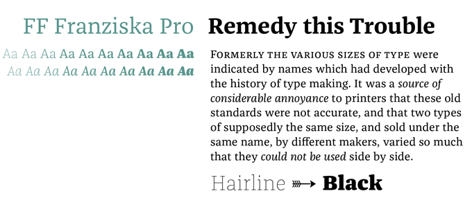
German designer Jakob Runge arrived at MyFonts in June with two very accomplished type families, published at two different foundries. Muriza is a no-frills slab serif with which his own microfoundry, type me! fonts, has just made its debut. The other one, which we present here, is a humanist oldstyle published at the prestigious FontFont library: FF Franziska. With 20 weights plus italics, FF Franziska is ideally suited for advertising, packaging, branding and editorial design. It provides advanced typographical support with features such as ligatures, small capitals, alternate characters, case-sensitive forms, fractions and super- and subscript characters.
|
|
|
News Round-Up
In this section we pick out interesting news snippets from MyFonts’ own kitchen and from the greater world of fonts, lettering and typography.
|
|
Hans Eduard Meier dies at 91
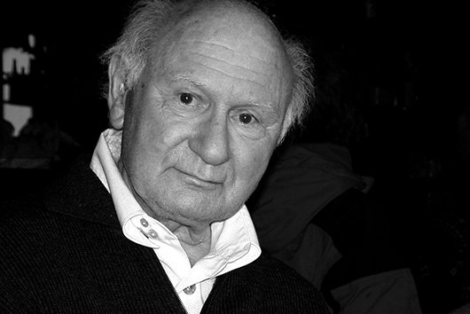
One of the most influential type designers of the late twentieth century has passed away. Hans Eduard Meier, born 1922, died peacefully in Horgen, in his native Switzerland. Meier was best known for his Syntax family, possibly the first fully realized humanist sans-serif. Begun in 1954, the original typeface took five years to find a home after completion, and was produced in 1968–1972 at Germany’s Stempel Typefoundry, as their last metal typeface. Meier went on to design many more typefaces, including Barbedor, Elysa, ITC Syndor, the official SNB typeface for the Swiss banknotes, and ABC-Schriften, a family of fonts for primary schools. In his obituary, Meier’s long-time friend and former publisher Erich Alb wrote of him: “He was a tireless, quiet craftsman, alone in his room, away from everything, who worked with endless stamina.… The high quality of his calligraphic work, his sure eye in drawing letterforms, his teaching skills, his drawing, painting and graphic work… distinguish him as a unique international figure.”
|
|
MyFonts Feature Focus
Where we take a moment to turn the spotlight back on some of the great features we’ve built over the last year or so.
|
|
Free 30-day webfont trials
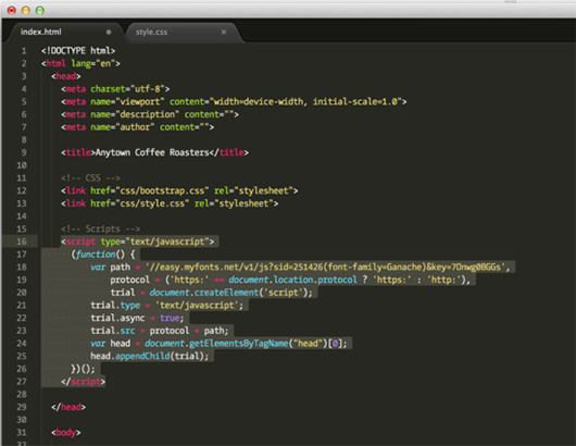
Do you like a particular webfont but need to convince your client to adopt it? Not a problem; using our free trials feature you can try out any webfont for free, for 30 days. You’ll just need to copy and paste a short bit of code into the head of your site’s HTML to see (and show off!) the results. A more detailed tutorial is available on our blog, meta.myfonts.com, or check out our video walk-through over at Vimeo.
|
|
MyFonts on Facebook, Tumblr, Twitter
Your opinions matter to us! Join the MyFonts community on Facebook, Tumblr and Twitter — feel free to share your thoughts and read other people’s comments. Plus, get tips, news, interesting links, personal favorites and more from MyFonts’ staff.
|
|
|
|
|
|
|
|
|
MyFonts Inc. 500 Unicorn Park Drive, Woburn, MA 01801, USA
MyFonts and MyFonts.com are registered service marks of MyFonts Inc. Other technologies, font names, and brand names are used for information only and remain trademarks or registered trademarks of their respective companies.
© 2014 MyFonts Inc
|
|
|
|