This month marks the second anniversary of a change at MyFonts that most of our regular customers have remained unaware of. Since late 2012, a review team of renowned type specialists has reviewed all the work proposed by new foundries. In order to be included on MyFonts, foundries need to prove they’re able to produce well-made, original and technically sound fonts according to our specifications. This has sometimes resulted in months of hard work, but it’s paying off: the quality of new work has been steadily improving. This month’s newsletter of popular new fonts contains the work of several new designers who successfully jumped the hurdle of MyFonts’s scrutiny. Enjoy! |
|
|
This Month’s Rising Stars
|
|
|
|
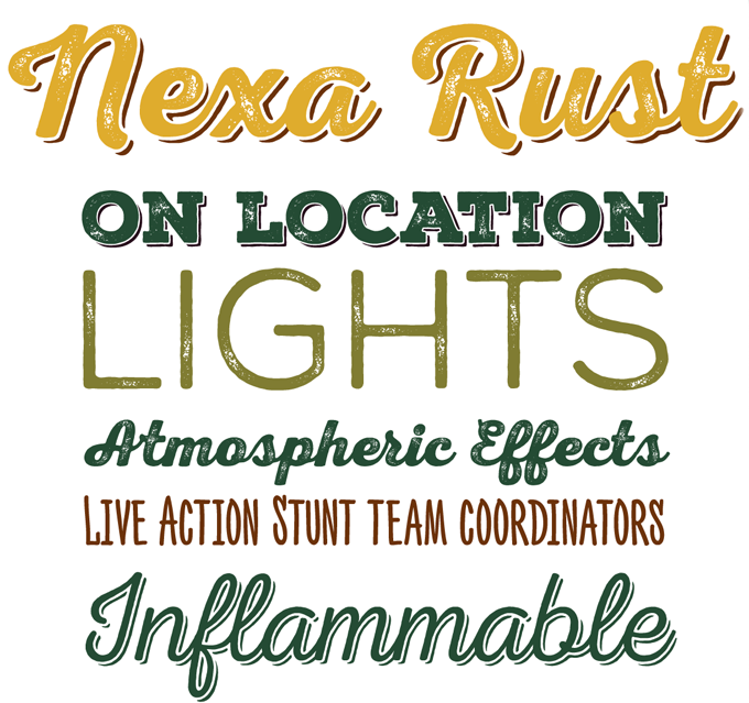
Nexa Rust is the product of four designers working collectively under FontFabric’s Svetoslav Simov, who set up a true collaboration project to develop this attractive display suite. Nexa Rust consists of five sub-families (Sans, Slab, Script, Handmade and Extras) containing various styles — different weights or widths, with or without shadows, etc. The weathered-looking Sans, Slab, and Script come in a range of variations, showing increasing degrees of roughness. A weathered version of the popular Nexa and Nexa Slab families, Nexa Rust brings an attractive texture to these typefaces’ shapes, adding matching Script and Handmade fonts. The Extra series consists of a series of useful icons and catchwords, plus swashes and ornaments to spice up the Nexa Rust Scripts.
Nexa Rust is 82% off until October 16, 2014.
|
|
|
|
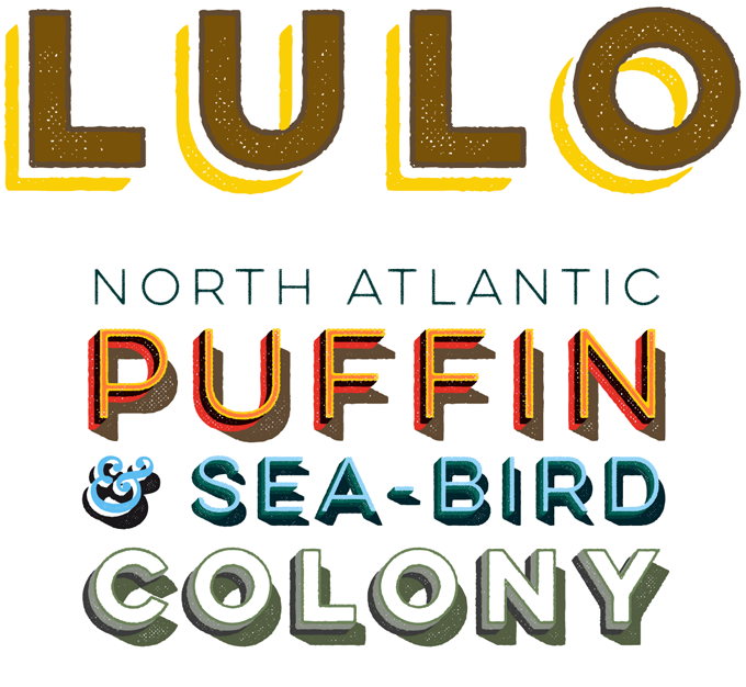
Lulo from Yellow Design Studio combines two popular trends of the moment: rough textures and multi-colored layering. Designer Ryan Martinson has experimented with distressed and textured looks before, in successful families such as Veneer, Thirsty Rough, and Eveleth. This time, he has taken the concept one step further. As in Eveleth, the suggestion is that of letters printed on textile or structured paper; added to that is an elaborate series of colorable 3D effects. The fonts can be stacked in up to five layers, achieving endless variations by adding different colors to each font. Lulo is all-caps, and has subtle texture variations between the upper- and lowercase characters so double letters placed side-by-side within a word never need to look identical.
Because of its complex outlines, Lulo may process slowly in some applications — the very detailed weights are not recommended for web use.
|
|
|
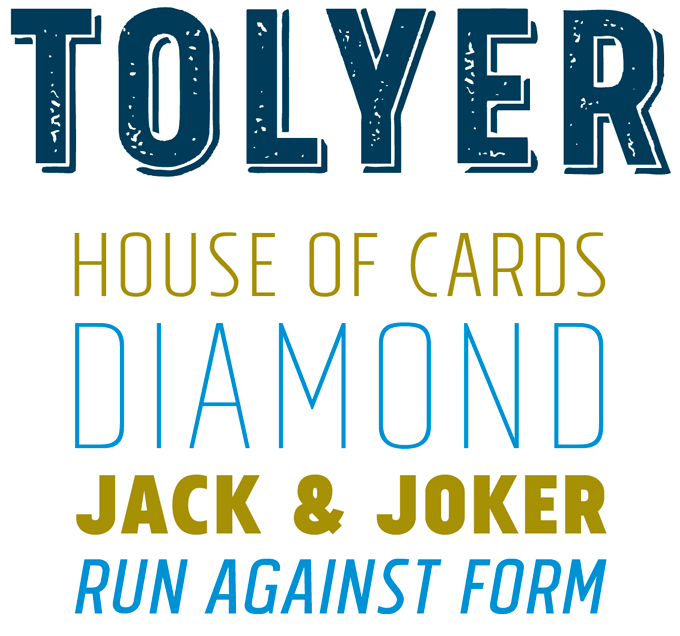
Tolyer from Thailand’s Typesketchbook offers a rather novel take on the idea of the type family. The all-caps family offers five weights (Thin to Bold), all with their Oblique companions; what is unusual about these series is that they all contain four different heights. This allows for settings in caps-and-smallcaps, but also for interesting multi-line posters and headlines where the varying heights provide variety within the unity. The icing on the cake is a range of stylized and distressed versions. Besides Handmade, Outline, and Vintage, the family offers idiosyncratic varieties such as Monster (your Halloween font!) and Petroleum. |
|
|
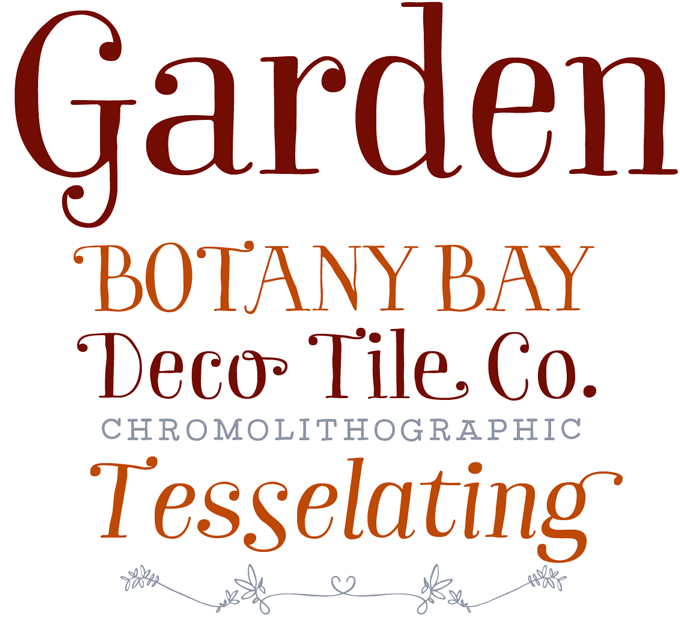
Garden from Los Andes was inspired by a visit to Brazil. Captivated by the cheerfulness and warmth of its people and culture, Mendoza Vergara created an endearing typeface family based around a series of ornaments and dingbats. The result is a serif display family with a handmade, spontaneous feel. The Pro versions are versatile OpenType fonts with a wide range of options, offering over 700 glyphs. For those with less OpenType capability, the Essential, Swash and Alt fonts offer roughly the same characters in separate fonts. And there’s more: Garden Catchwords is a small set of script-style catchwords in Spanish, English, German and French (be warned there are no standard alphanumeric characters in this font!); the family also offers sets of Ornaments and botanical Dingbats. All in all, a charming and playful toolkit to make typographic and illustrative layouts for packaging, cards, scrapbooks, and more. |
|
|
Text fonts of the month
Typesetting for books, magazines or annual reports requires font families with special qualities: excellent readability, a generous range of weights with italics and small caps, multiple figure sets (lining, oldstyle, table) and ample language coverage. Here is a selection of recent, high-quality text typefaces.
|
|
|
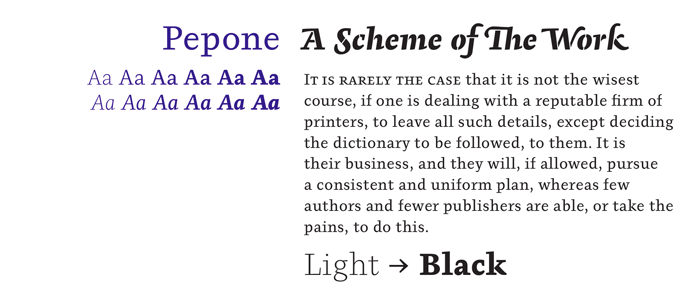
Whenever František Štorm of the Czech Storm Type Foundry takes on a historical style or genre, the outcome is sure to be something lively, unorthodox, and personal. Pepone is Štorm’s modernized oldstyle: a typeface that contains some references to Gill’s Perpetua but, more importantly, is very much a contemporary face — confident, readable and unmistakably Štorm. The extreme weights — Light and Black — offer excellent headlining possibilities to what is a wonderful text family, and the splendid Stencil variety adds a sub-family of attractive display fonts. |
|
|
|
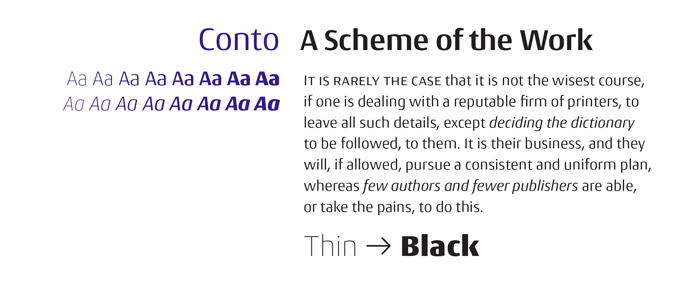
Nils Thomsen is a graduate of the prestigious Type & Media course at The Hague’s KABK art college, and true to this background, his second typeface on MyFonts is an ambitious text and display family. Conto is a simplified sans serif with no spurs on a, b, m, n, u, etc. (as pioneered by Hans Reichel in Barmeno and FF Dax). It comes in eight weights with true italics, offers small caps and a wealth of numeral styles, as well as special ligatures for added sophistication. So if you need a modern-looking face for a complex typographic project — consider Conto.
Download three DEMO versions with limited character sets for free!
|
|
|
|
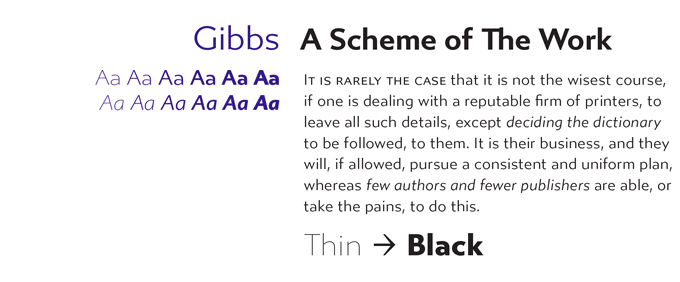
Gregory Shutters and his Typetanic Fonts are also relatively new on MyFonts, and Gibbs is his most successful family so far. The typeface is an homage to maritime architect William Francis Gibbs, the builder of the great luxury liner SS United States. Taking cues from the unique cast aluminum signs found on board, the result is truly transatlantic — somewhere in between industrial American vernacular lettering and the English humanist styles of Gill or Johnston. Both stylish and comfortable to read, and equipped with small caps, multiple numeral styles and other OpenType features, Gibbs allows you to set quality type with ease at text and display sizes. Gibbs is 50% off until October 19, 2014.
|
|
|
News Round-Up
In this section we pick out interesting news snippets from MyFonts’ own kitchen and from the greater world of fonts, lettering and typography.
|
|
Web FontFonts are here!
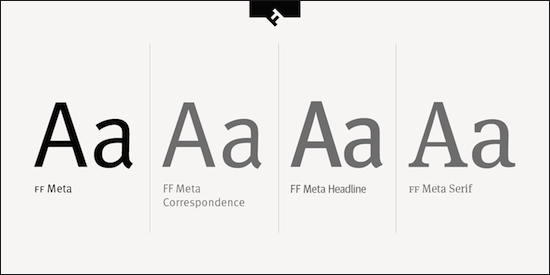
Web FontFonts are now available for licensing. If you’ve been searching for a sharp, clean typeface for your website, you’re in luck: FontFont has become known for their hand-hinted, bestselling faces like FF DIN and FF Meta. Both font families were created with web design and on-screen readability in mind and have lots of advanced options to choose from.
Excited to experiment with the latest additions to our webfont library? You can play around with FontFont’s webfonts in our preview tab, make side-by-side comparisons of them in the Typecast application, or take them out for a free 30 day trial.
|
|
MyFonts on Facebook, Tumblr, Twitter & Pinterest
Your opinions matter to us! Join the MyFonts community on Facebook, Tumblr, Twitter and Pinterest — feel free to share your thoughts and read other people’s comments. Plus, get tips, news, interesting links, personal favorites and more from MyFonts’ staff.
|
|
|
|
|
|
|
MyFonts Inc. 500 Unicorn Park Drive, Woburn, MA 01801, USA
MyFonts and MyFonts.com are registered service marks of MyFonts Inc. Other technologies, font names, and brand names are used for information only and remain trademarks or registered trademarks of their respective companies.
© 2014 MyFonts Inc
|
|
|
|