Trick — or treat? The nice thing about modern typefaces is that you can have both. Many of the fonts offered in this month’s newsletter are amazing bags of tricks. Some offer a totally different set of capital letters if you ask them to, link characters with surprising ligatures, look just like messy handwriting, or offer the perfect conditions for reading a 500-page novel. And of course, each of these fonts is a treat — not just visually. Their introductory discounts also make many of them very affordable. Now, it’s not always easy to use all the goodies that these fonts offer. Many layout applications make it unneccesarily difficult to take advantage of OpenType, and keep the fonts’ features hidden from the user. A worldwide group of designers and experts is now asking a major software manufacturer to finally get its typographic act together. Scroll down to learn more about this, and chip in. |
|
|
This Month’s Rising Stars
|
|
|
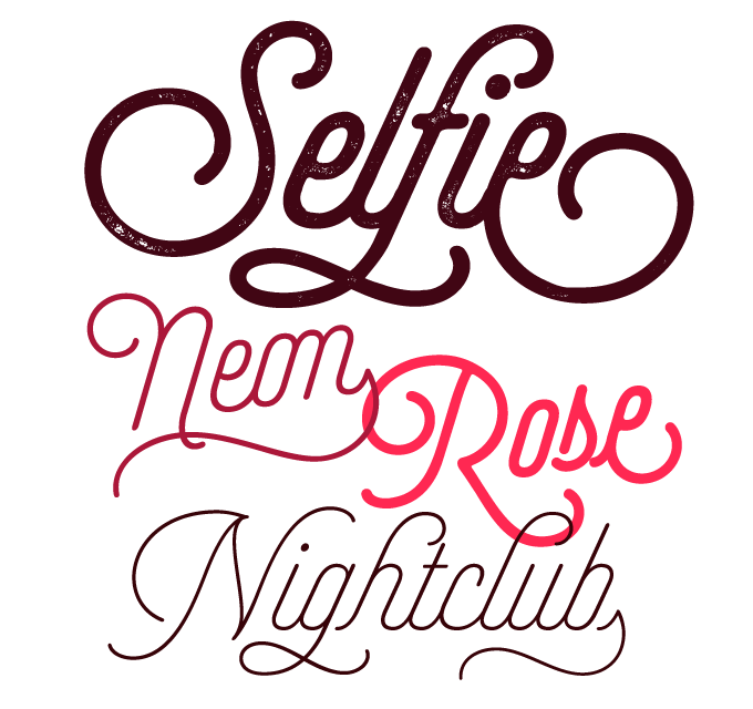
Selfie: it’s the word of the year. Never were so many silly self portraits taken and posted across the globe as in 2014 — even monkeys do it. So what about Maximiliano Sproviero’s typeface named after this crazy phenomenon? Was it called Selfie because there’s something narcissistic about it? Maybe just because it is such a perfectly eclectic product of its time. That sums it up pretty well: geometric construction combined with neon tube lines, penstroke connections and abundant swashes. Based on vintage signage scripts as seen in Buenos Aires’ Galerías, Selfie combines vintage charm with digital versatility. Check out the rugged Printed version for that popular letterpress look, and the attractive construction set of banners in Selfie Flags. Selfie is 25% off until November 18, 2014. |
|
|
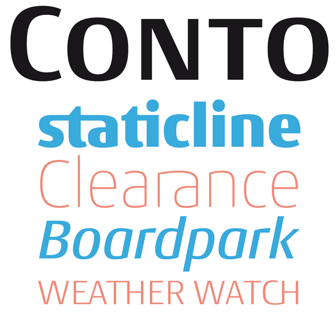
Last month, we presented Nils Thomsen’s Conto family as part of our Text Fonts of the Month section. The typeface has been doing so well that it fully deserves its spot in this newsletter’s main section. Conto is a clean sans serif with no spurs on a, b, m, n, u, etc., and with increasing contrast between thin and thick strokes as the weight increases. Available in eight weights with true italics, small caps and a wealth of numeral styles, Conto is an accomplished tool for demanding typographic projects. But there’s more: recently Nils Types brought out Conto Slab, a slab serif based on the same skeleton. What is more, that new font family is now very affordable: Conto Slab, the companion to the the Sans shown above, is 75% off until November 30, 2014. |
|
|
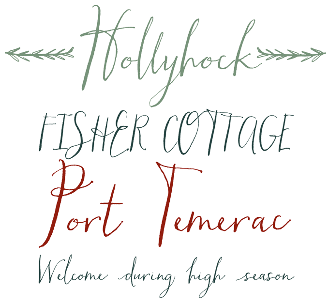
Hollyhock by Angie Baldelomar looks like the kind of whimsical calligraphy that is so popular right now with lettering artists and their customers. You may think that a font like this is made in no time — what’s easier than digitizing messy handwriting? In reality, it takes a lot of precision to make a font look convincingly wild. Under Hollyhock’s hood is an impressive mechanism of OpenType tricks, which reveal themselves when you type a text in a program that can handle this kind of magic. With each letter you type, the font may select a different version of the preceding letter, or a special ligature, to make it all connect and flow naturally. The typeface also comes with two full sets of capital letters: one set that is tall and energetic, another tamer and more subdued. The icing on the cake is a great set of doodles, swirls, and swashes to manually add flair and flavor to your text; there’s also a separate Hollyhock Ornaments font to access the swashes and doodles more easily. |
|
|
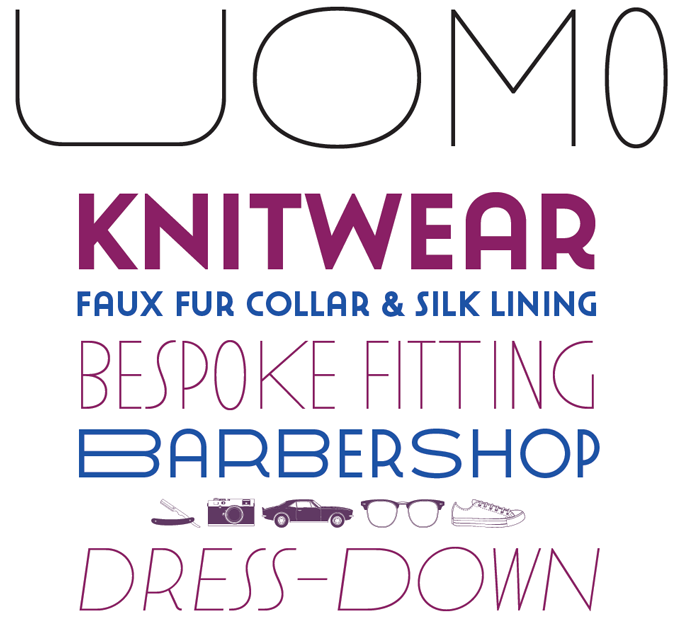
Chile’s Latinotype seems to be obsessed with fashion and style; but what makes their dressing up and role-playing so enjoyable is the flamboyance with which they tackle each genre. The Art Deco-style Uomo by Tania Chacana and Miguel Hernández kind of mixes ideas found in Porchez’ Anisette with charming details as found in mid-century Italian posters and ads. The family comes in four widths, each in three weights plus italics, plus two sets of small caps and some paparazzi-style icons. Quirks such as the top-heavy B and 8, or the forward-moving narrow S give the font its own special personality. Uomo is 80% off until November 18, 2014. |
|
|
Text fonts of the month
Typesetting for books, magazines or annual reports requires font families with special qualities: excellent readability, a generous range of weights with italics and small caps, multiple figure sets (lining, oldstyle, table) and ample language coverage. Here is a selection of recent, high-quality text typefaces.
|
|
|
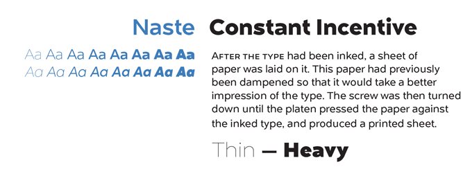
Naste from Tipo Pèpel is designer Josep Patau’s take on the modernist sans-serif. A wide range of influences went into the mix — from Futura, the quintessential European geometric sans, to American display types like Eagle. The result is a balanced text and display family with nice details, such as the long descenders on some italic shapes, that break the linearity and bring rhythm and liveliness to the typeface. Thanks to its open, wide lowercase, and its simple elegance, the typeface is easy on the eye. The fonts come with ample language support, including a Cyrillic character set. Naste will be 70% off until December 6, 2014. |
|
|
|
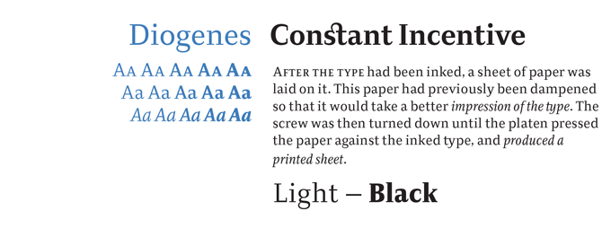
Some type designers produce a new font every few weeks. Others work equally hard, but take their time, allowing their design to fully blossom out before being released to the world. With about one major release a year, Ludwig Übele clearly belongs to the latter category — and it pays off. His new text family Diogenes is beautifully drawn, well-produced and very complete. It seems to have a bit of ITC Tyfa in its DNA, but above all, it’s very much a Ludwigtype face, with some of Übele’s own Marat in the mix. The result is one of our favorite text faces of the year: lucid, original, and eminently readable. Attention: the small caps are in separate fonts. Diogenes is 50% off until December 13, 2014.
|
|
|
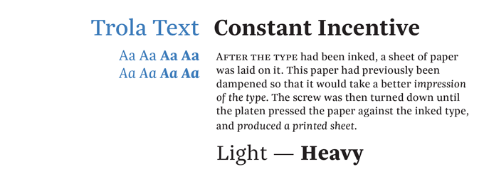
In early 2013, Barcelona’s Tipografies released Trola, an elegant family for text and display use. Designers Jordi Embodas and Noe Blanco have now developed Trola Text, a companion face that keeps the original spirit of Trola, but has been optimized for text sizes. Subtle but decisive modifications were made to the lettershapes to facilitate immersive reading: the characters are wider and more open, the spacing is slightly looser, serifs have been simplified. The letters have a slight inclination to the right to propel the reading forward. It’s a textbook example of smart text type design. Both Trola Text and Trola are 30% off until November 20, 2014. |
|
|
News Round-Up
In this section we pick out interesting news snippets from MyFonts’ own kitchen and from the greater world of fonts, lettering and typography.
|
|
Support for WOFF2
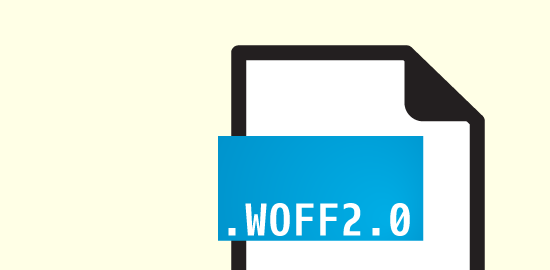
Since the middle of October we’ve been supporting the WOFF 2.0 web font compression format, and it is now the default format in our webfont kitbuilder. WOFF2 offers a significant saving on file size with an average of 30% over the WOFF 1.0 format. Browser support is also widespread, with the latest versions of Chrome, Firefox and Opera all able to support the format. For more information read our post on the meta.myfonts.com blog or just go and take out our webfonts for a test-drive.
|
|
Better typographic tools: sign the petition
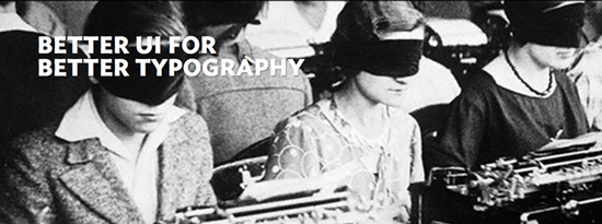
Every day on MyFonts, you see the results of smart font technology. Thanks to the OpenType format, type designers can now equip their fonts with swash caps, ligatures, and many more alternate shapes to create amazing typography. But users increasingly have problems finding and using those great features — even experienced users of professional graphic design software. A major problem is that the font menus in the leading software – such as Adobe’s InDesign®, Illustrator® and Photoshop® — don’t offer easy access to all the goodies that fonts offer today. Adobe was among the pioneers of OpenType fifteen years ago, but it has lagged behind in giving designers what they desperately need, and have been requesting for about ten years: a better user interface for OpenType fonts.
Now a group of internationally renowned graphic designers, type designers and consultants has launched a petition to urge Adobe to focus again on the development of functional menus to help us all explore the richness that’s inside today’s fonts. There’s no lack of savvy: Adobe has some of the best UI designers in the world — it’s only a question of prioritizing typography over other concerns.
So if using fonts to splendid effect in Adobe products is your concern too, sign the petition, hosted by the I Love Typography blog (don’t forget to confirm).
|
|
MyFonts on Facebook, Tumblr, Twitter & Pinterest
Your opinions matter to us! Join the MyFonts community on Facebook, Tumblr, Twitter and Pinterest — feel free to share your thoughts and read other people’s comments. Plus, get tips, news, interesting links, personal favorites and more from MyFonts’ staff.
|
|
|
|
|
|
|
MyFonts Inc. 500 Unicorn Park Drive, Woburn, MA 01801, USA
MyFonts and MyFonts.com are registered service marks of MyFonts Inc. Other technologies, font names, and brand names are used for information only and remain trademarks or registered trademarks of their respective companies.
© 2014 MyFonts Inc
|
|
|
|